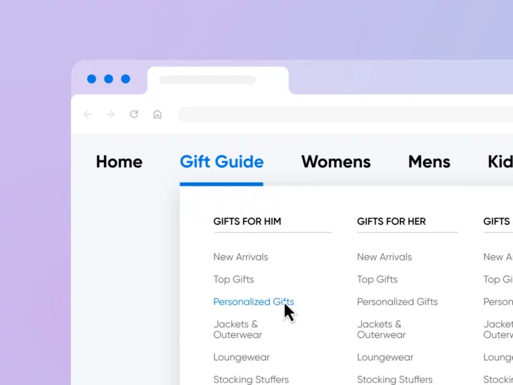
You’re searching your phone, riding on the bus, desperately trying to find that discounted matching pajama set you saw last week, purchase it, and stop by the store for pick up so you don’t show up empty-handed for grandma’s holiday dinner.
But the confusing mobile menu, teeny-tiny links, and lack of a search bar on the retail site you’re looking at might just drive you to *gasp* resort to Amazon instead.
If you can even imagine one of your shoppers having the above experience with your website —it’s time to get to work.
In the competitive online world, anything that makes it difficult for users to view and interact with your site today is likely to lead to bounces, lost sales, and even potentially lower search engine rankings.
The first line of defense against a bad user experience is your site’s navigation menu. It’s usually one of your customers’ first points of interaction with your brand and website and the best tool to help them quickly find the content and offerings they want to engage with. This is what you want if you are looking to convert customers, as most small businesses do.
In this post, we’ll introduce you to the critical website element that is the navigation menu, why it matters so much, how to craft yours flawlessly; and finally, how to keep an eye on it to make sure its performance is always up to your standards.
An Introduction to Navigation Menus
Navigation menus display an organized list of all your web pages from one dedicated area. Typically, they appear as headers or sidebars, so that they’re clearly visible and accessible for your website visitors.
Menus enable users to navigate around your site more easily, but they also help them to make sense of your content. For instance, by viewing your menu, users can better understand the relationships between your web pages.
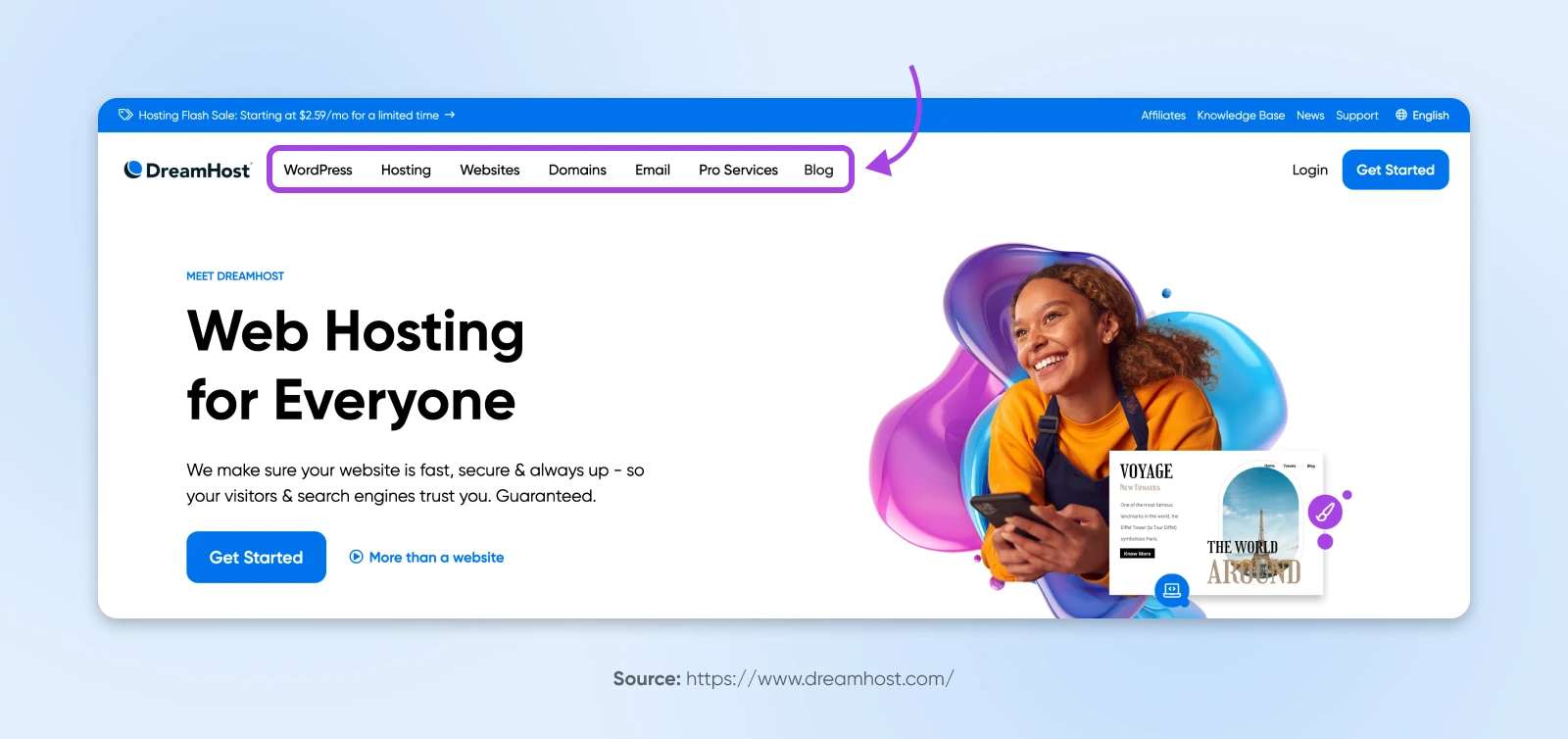
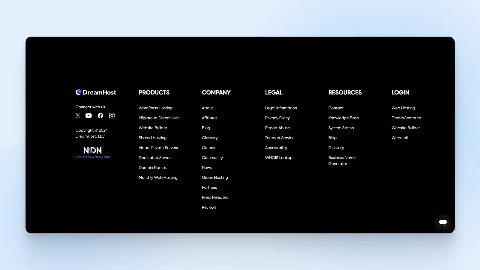
For example, here are the menus we’re currently working with on the DreamHost website:
16 Tips for Designing the Perfect Navigation Menu
Now that you know how essential navigation menus are, let’s take a look at 16 useful tips for designing one.
1. Readability is Everything
Improving how readable your website navigation menu is is essential for ensuring visitors can quickly find what they need, enhancing the user experience (UX) — more on that soon.
Here are some actionable tips for ensuring readability in your menu:
- Choose readable fonts: Use legible fonts that are optimized for digital and at a size large enough to read easily across devices. Avoid overly decorative or complex fonts.
- Deploy visual cues: Consider adding icons next to text labels to make menu items even easier to understand.
- Keep it simple and concise: Stay away from jargon or overly creative terms, and stick to commonly used words that users expect to see in a menu.
- Organize logically: Group similar items together in categories or submenus, and use an intuitive hierarchy to guide users through the menu items.
- Make it visually distinct: Use contrasting colors for the menu text and background to ensure readability. Consider separators or whitespace to visually distinguish groups of menu items. And implement a design feature that highlights the active page, or menu item a user is hovering over.
2. Optimize the User Experience
Enhancing user experience (UX) increases customer satisfaction, which ultimately drives a healthy return on investment (ROI) on the money you put into making your website flow.
In fact, investing in improving elements of your website UX can boost your key performance indicators (KPIs) by as much as 83%.
To put it simply —making the effort to optimize your UX in places like your website navigation is a smart, engaging, money-making move.
To optimize your UX, a great goal is to keep your menu simple. You don’t want users to wrestle with a complex system — There’s a lot to be said for neat, clean designs that allow visitors to breeze through your website.
Pro Tip: It’s a general rule of thumb that in three clicks or less, people should be able to land where they want to be on your site. That’s why websites, like this one from Puma, with lots of content areas often choose mega menus:
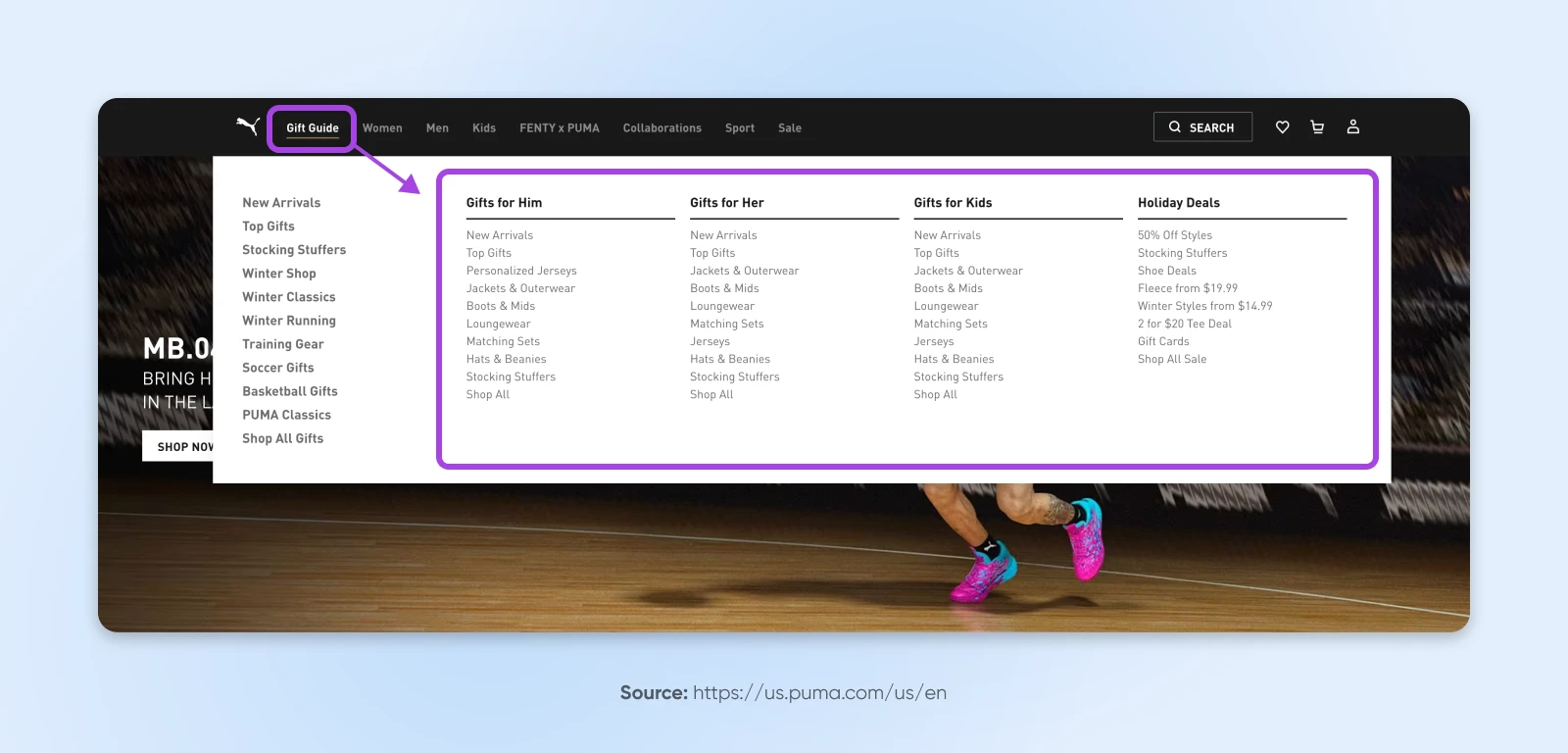
These mega menus are frequently used by large e-commerce stores since they make all pages accessible from one space.
3. Stick With Straightforward Designs
You might be tempted to fill your menus with lots of effects to impress your visitors. However, consider saving the flashy features for other elements of your web design.
This is because you really want to make sure your navigation is fast to load and easy to read and use, no matter who the visitor is or what device they’re on. Blinking or moving text and heavy graphics or photos can bungle up the experience.
All that said, it may make sense to utilize relevant, helpful, and overall simple icons, such as directional arrows, to guide users through your sections. Just use your best judgment!
4. Cater to Your Audience
Typically, very experienced website users, as well as those who are familiar with your brand, can navigate complex menus with ease. But, naturally, more infrequent and unfamiliar users may struggle.
So, design your navigation based on what you know about your existing and target audience.
With this in mind, you can choose color schemes, typefaces, and structures that are more likely to appeal to your market. This can make your navigation way more usable.
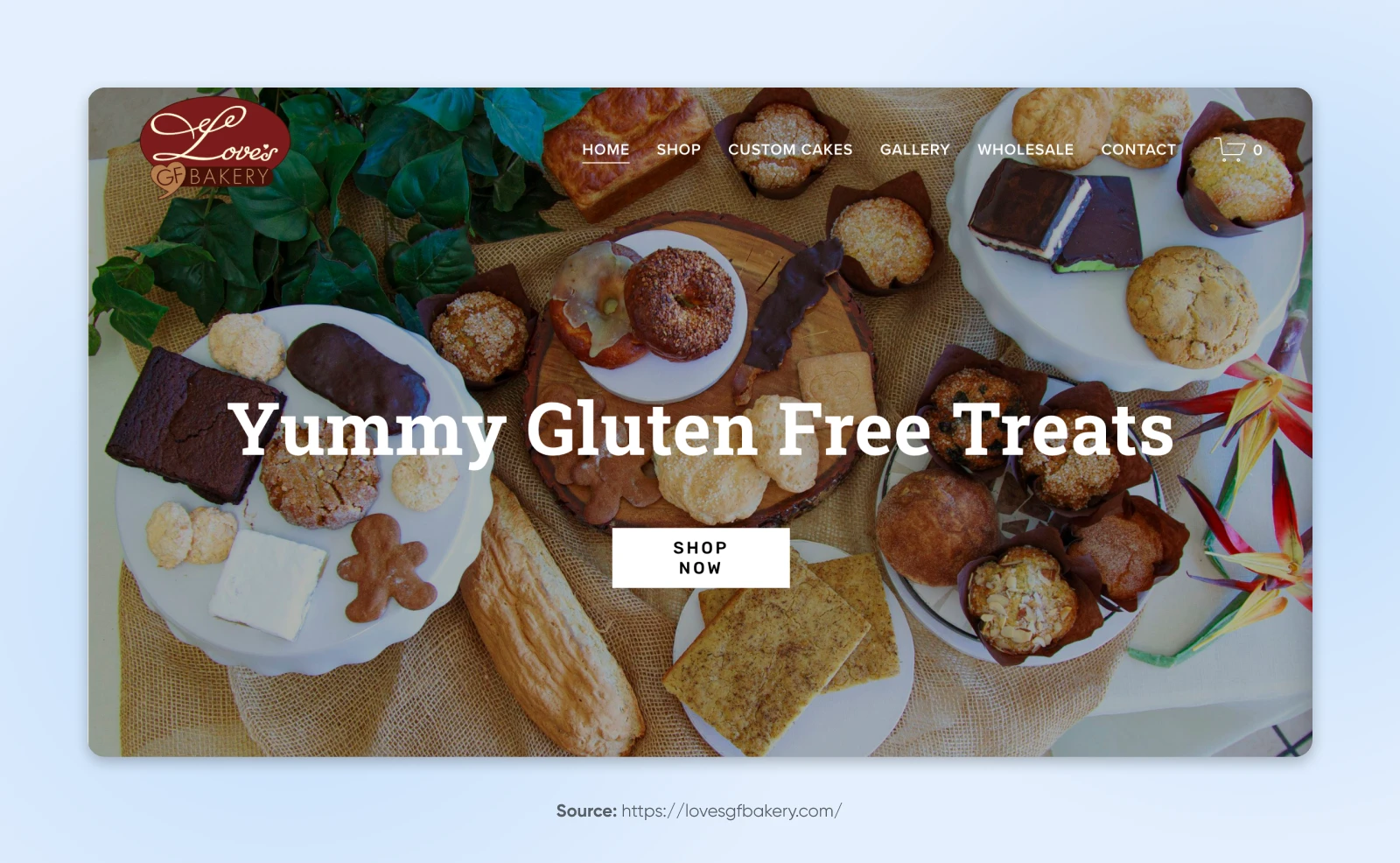
For example, a news website is unlikely to focus on design simplicity, imagery, and branding the same way a small bakery would:
5. Be Consistent
Nothing should be a surprise when it comes to your navigation menu. It’s important that the format and design of your menu meet your visitors’ expectations, and remain the same across your site.
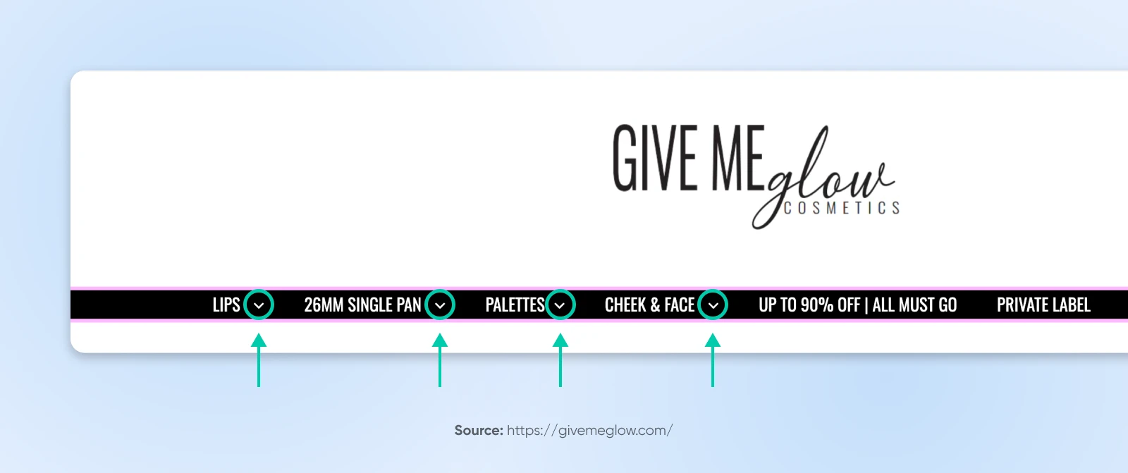
For example, the Give Me Glow website uses directional arrows very clearly, consistently, and traditionally. They always appear beside menu items that can expand into dropdown menus:
6. Organize Content Appropriately
A navigation menu can be an ideal place to organize product pages if you have a lot of different categories. Plus, it enables users to view your content in a way that makes sense.
For instance, a retail website might group products by categories right in the main navigation:

Once you’ve identified the main categories of your content, you can build your navigation menu around this. It’s also useful to choose relevant headings, or images in cases where it makes sense, that properly describe the page.
7. Establish a Clear Hierarchy
Implementing a hierarchy within your menu enables you to break content up into smaller chunks. This makes it more digestible for users. As such, try to group relevant information together.
For some websites, it can be useful to organize information according to what is most popular or important to visitors. Then, you can make these headings stand out within your menu. Strive to achieve a balance between showing users pages of interest while also leading them towards pages that best serve your business goals.
8. More Complex Sites Don’t Need More Complex Menus
Even websites with an extensive number and network of pages don’t have to have levels upon levels of navigation.
Consider whether all pages need to be accessible through the menu. What if only the first two, or maybe three, levels of pages were shown in the menu — with deeper pages available in other ways, such as via search, on-page links, or footer menus?
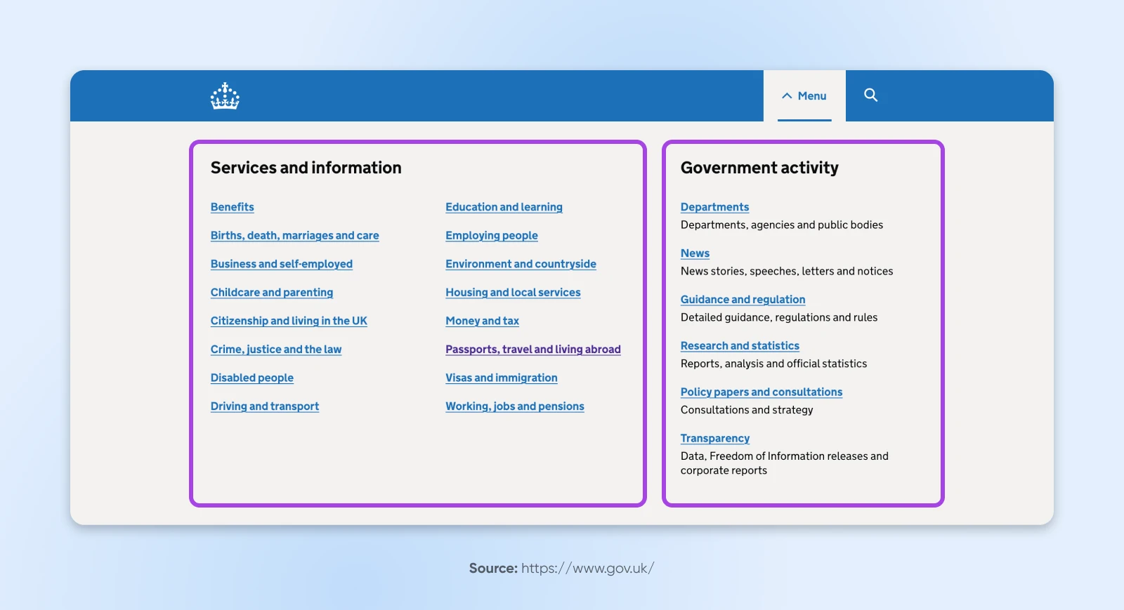
For example, GOV.UK, despite its size, limits its menu to two main sections, leaving deeper navigation accessible through links on separate pages:
Before adding tons of levels to your menu, test if simplifying to just a few might suffice. It often does, and in turn, improves clarity for users.
9. Consider the Mobile Experience
Nearly 100% of consumers have made at least one purchase via a mobile device, and a third of them make up to 40% of all their purchases on mobile.
Suffice to say, optimizing your site for mobile with a responsive menu is critical for today’s small business owners.
How do you do this? There are a few key tactics:
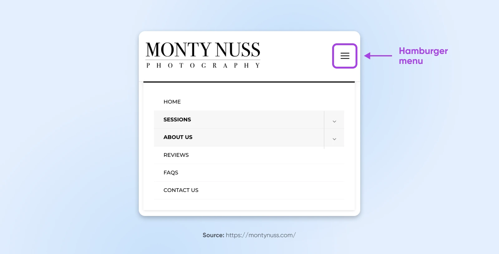
- Use a hamburger menu: Replace traditional navigation with a compact hamburger icon (see the three lines in the upper right corner of the example below). It conserves space and is widely recognized by users. And if you squint, it almost looks like a stacked burger, doesn’t it?!
- Optimize for touch: Ensure menu items are large enough to be tapped easily and spaced to avoid accidental clicks. Aim for at least 48×48 pixels per tappable area.
- Prioritize key items: Display only the most important menu options on mobile. Use dropdowns or submenus for less critical items.
- Implement sticky navigation: Keep the menu accessible by making it sticky, so users can access it without scrolling back to the top. (We’ll talk about this more later.)
- Include a search bar: Add a search bar to help users quickly find what they’re looking for, especially when navigation options are limited or hidden like they often are on mobile.
10. Use Familiar Web Conventions
How do you expect a website to behave? Those expectations are guided by web conventions —practices website builders use so often they become the “standard.”
For instance, one of these conventions is clicking on a website’s logo to return to the homepage. So, if your logo leads to a signup or product page, this may confuse your visitors and send ‘em packing.
Designing your menu with unfamiliar conventions requires users to learn new practices, which can be inconvenient, annoying, and bounce-inducing.
Consider well-known web practices (how dropdown menus usually behave, how search bars typically look, etc.) when designing your menu to enable users to navigate to all of your website pages intuitively.
11. Get Descriptive With Your Labels
When possible, navigation labels should focus on the topic of the content, not just the format.
For example:
- Formats: Articles, whitepapers, webinars, etc.
- Topics: Baking, cooking, cookbooks, etc.
This is important because people don’t usually visit websites searching for a general type of content; they’re looking for specific answers or information, which descriptive and topic-focused labels help them find.
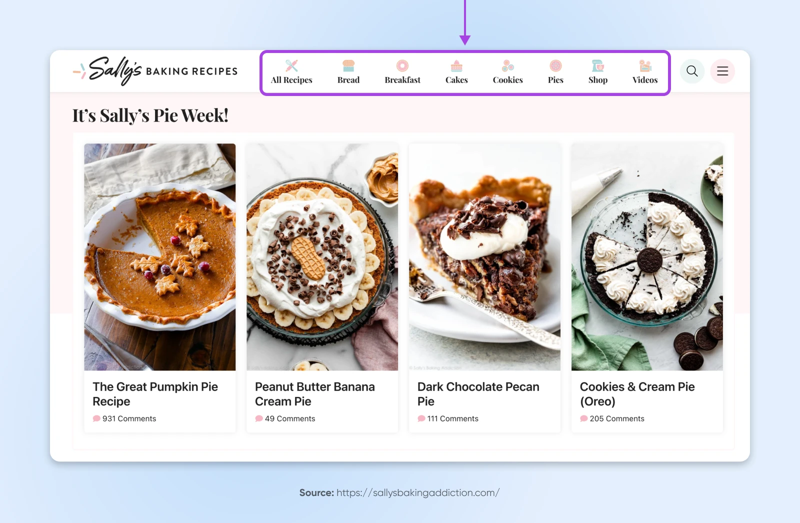
Case studies may be an exception to this rule, since visitors seeking real-life examples are well aware of this content format.
12. Optimize for Search Engines
To drive more organic traffic to your website, you can optimize your navigation labels with popular phrases found via keyword research. Then, include these key terms within your menu. As a result, your website may just rank higher in search engines.
In addition, there are lots more strategies you can try when structuring your website and navigation to boost search engine optimization (SEO). Find out what you need to know at Mind Those URLs: How to Create an SEO-Friendly Website Structure.
13. Prioritize Accessibility for People With Disabilities
Website accessibility measures how well a site accommodates individuals with disabilities, including visual, auditory, mobility, and cognitive differences. These people make up about 15% of the world’s population —over a billion people!
Here are some tips to get you going in the right direction:
- Provide thoughtful navigation: Organize menus logically, use consistent layouts, and add skip-to-content links for quick access.
- Make content clear: Use simple language, short sentences, and a straightforward layout to accommodate a wider range of cognitive abilities.
- Allow keyboard navigation: Make sure users can navigate your site using only a keyboard, catering to those who cannot use a mouse.
- Increase readability: Use high-contrast colors and scalable fonts, and provide volume controls for multimedia content.
- Use text alternatives: Include alt text for images, captions for videos, and transcripts for audio content so users with visual or hearing impairments can access the information.
- Avoid blinking or flashing content: Reduce the risk of triggering seizures by avoiding content that flashes more than three times per second.
Learn more about website accessibility, why it matters, and how to check and upgrade yours at How To Design An Accessible Website (A Complete Guide).
14. Consider Human Psychology
There are many types and shapes of navigation menus to consider. Horizontal menus, which list major pages in a row format, are probably the most common. And there’s a good reason for that —they work with how we read web pages!
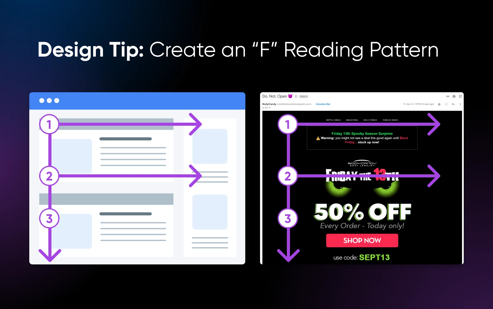
The F-shaped reading pattern is one of the most common ways readers scan blocks of content.
It goes like this:
- Readers first horizontally scan across the top of the page, where your menu typically lives, to form the upper line of the “F.”
- They then move down and scan another horizontal section, creating the second line of the “F.”
- Finally, their eyes follow a vertical path down the left side of the content, completing the “F” shape — making this a wise place to put your most important and/or longest dropdown menus.
15. Add Breadcrumbs
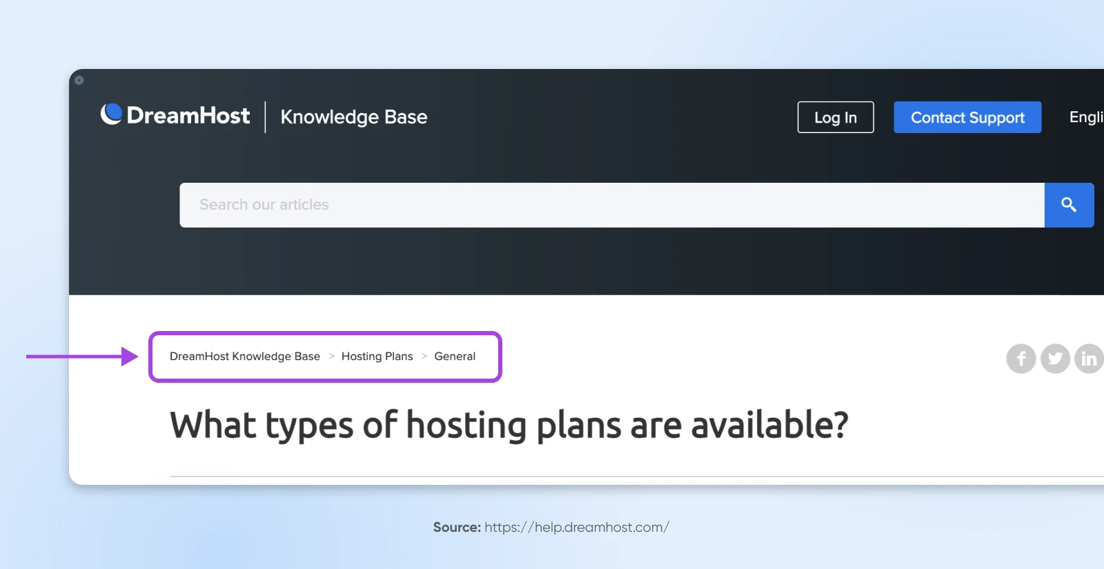
Not everyone is going to enter your site from the same point. Breadcrumbs enable users to see where they are within your site’s structure, no matter how they got there. This makes it easier for them to orient themselves, figure out where they want to go next, and ultimately navigate to the areas where they’re likely to convert.
16. Longer Pages? Use Sticky Menus
Users at the bottom of a long page often face the hassle of scrolling back up to access the main menu at the top of the page. It’s a competitive world for a small business like yours —don’t introduce more navigation friction than necessary for shoppers and scare them off to your competition!
Fixed menus, AKA sticky menus, that stay visible at the top of the page even while scrolling can eliminate this issue and provide a more seamless experience (especially on smaller screens!)
Excellent Examples of Small Business Navigation Menus
Now that you know how to design the perfect menu for your site, let’s take a look at some examples from a handful of small businesses that are crushing it.
Mostly Serious Breaks the Rules Wisely
Mostly Serious is a creative agency with a fittingly creative website. When you first land on the site, you’ll notice a hamburger icon, which makes room for and puts the focus on the fun animation at the top of the page:
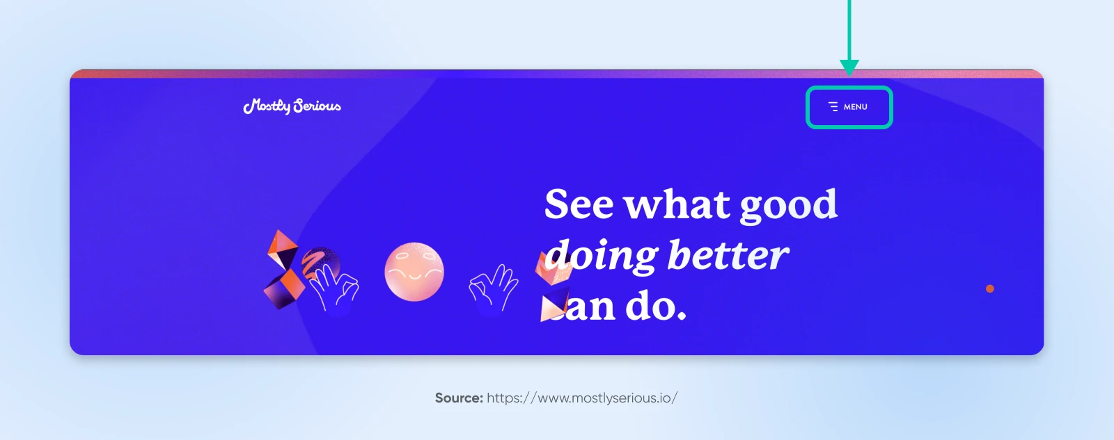
When you click on the icon, it opens a large, crisp vertical sidebar menu, with only the primary headings displayed:
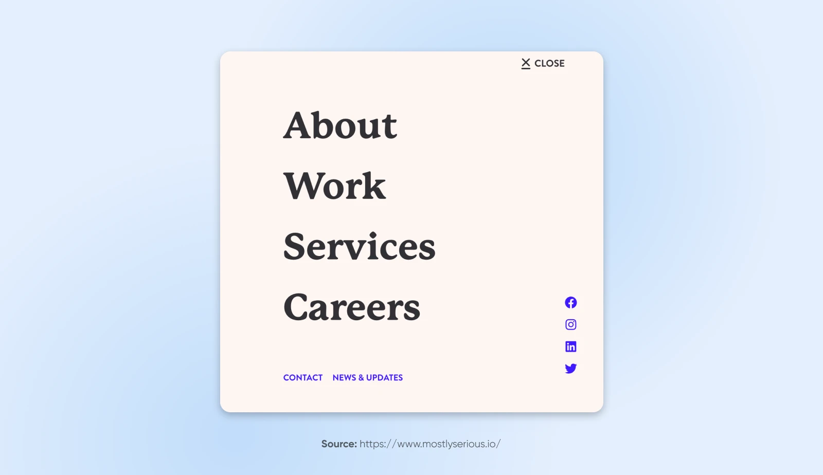
However, if you start scrolling past the animation at the top of the page, you’ll see a sticky horizontal menu appear. This more traditional layout remains accessible but takes care not to distract from the experience of reading the page.
This website gets creative with its menu, making it a great example for brands that want to think outside of the box without breaking too many rules.
Claude Home Prioritizes Accessibility
The mobile website and navigation (pictured here on iPhone) for Claude Home’s interior goods are just as elegant as the wares they sell.
However, it’s their choice to implement accessiBe that we really want to highlight.
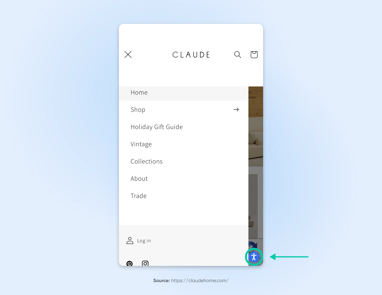
accessiBe is a web accessibility company with AI-driven features for making websites available to individuals with disabilities. Since it can be difficult to decide exactly how to design your mobile website and menu in a way that’s navigable for everyone, we appreciate that Claude Home exemplifies bringing in an existing tool that lets users do all kinds of things like enhance visuals, adjust contrast, optimize for screen readers, and much more.
Golde Knows That Less Can Be More
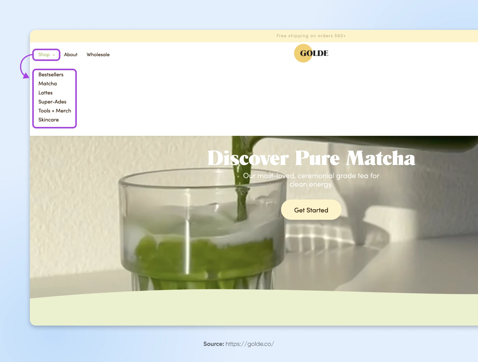
Golde is a superfood brand with a menu that’s as simple, and therefore powerful, as the ingredients in the products they carry.
It’s immediately easy to see and laid out in the order in which they want customers to engage. Only one item in the menu — ”Shop” — features a dropdown to dive deeper into the site. This is a call-to-action of sorts that immediately funnels visitors to the product pages where they can complete their purchases.
Mented Offers Mobile Gold
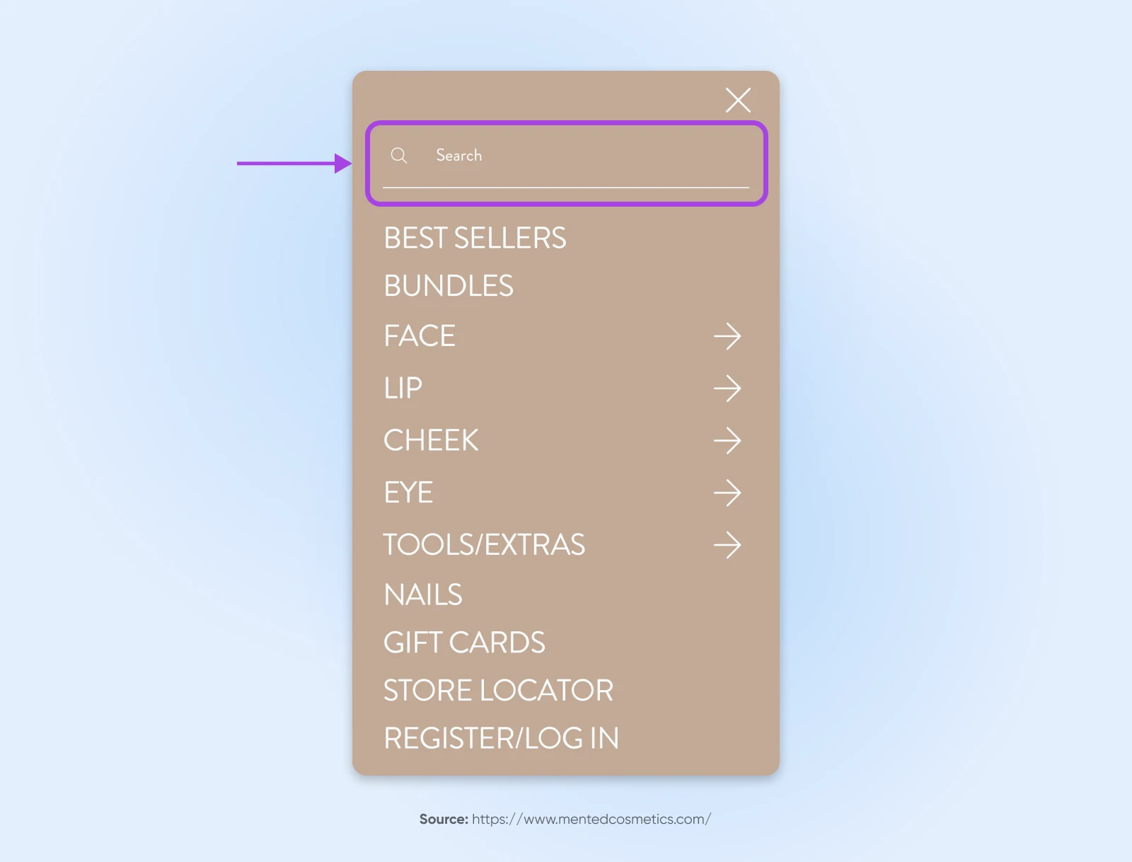
The cosmetics brand Mented gets everything right on their menu for mobile devices (shown here on iPhone).
Compared to the desktop version, the mobile version of the website features a stripped-down menu that features exactly what they want shoppers to focus on. It’s easy to see and use, encouraging visitors to dive right into engaging with the site.
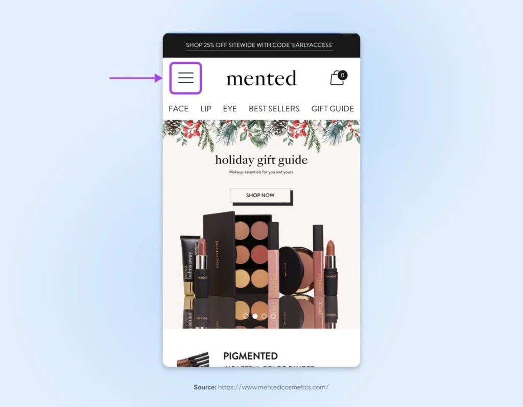
Clicking on the hamburger icon to the left of the site logo pulls up the rest of the menu, as well as a very obvious search bar. This makes it exceedingly easy for visitors to quickly navigate to the product they’re looking for, therefore, very likely boosting conversions for their business.
Why Is It Time To Revisit Your Menu Design?
If you haven’t taken a look at the state of your website’s navigation in a hot minute, we’ll help you understand why it’s time by diving into the many benefits for small businesses.
Boosts SEO
Well-organized navigation isn’t just for users, it’s for search engines, too!
A main menu that’s labeled and structured thoughtfully helps search engines quickly understand what your website is all about, and how navigable it is for its users. That’s how modern and smart navigation design can improve your site’s ranking, visibility, and organic traffic.
Encourages Shopper Retention
When users can breeze through your website with ease and achieve their goals effortlessly, they’re much more likely to browse for longer, return, and even recommend your brand to others.
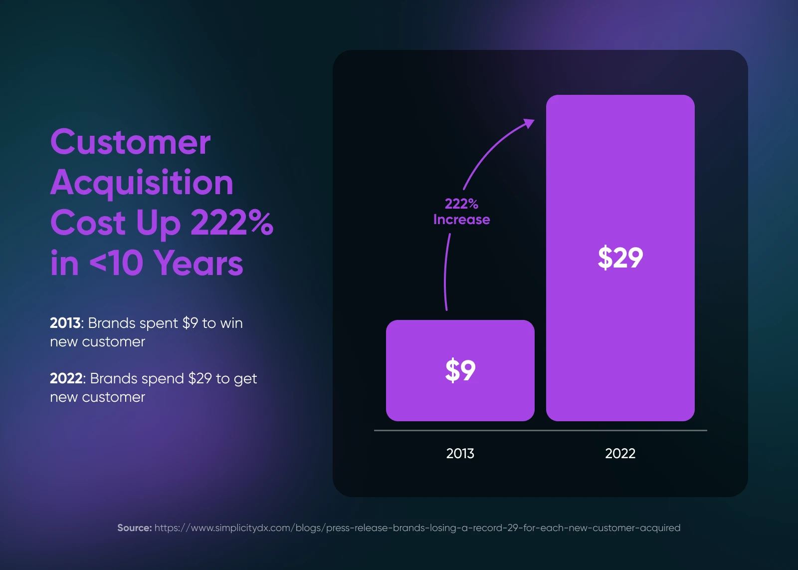
With the cost of user acquisition on a steep incline, user retention is becoming more and more important to business success. As such, great navigation can play a big role in the performance of your small business.
Simplifies the All-Important User Experience
As we dug into above, the user experience is one of the most important things a small business can focus on to heighten its success.
Well, great navigation is core to the user experience.
When navigation is intuitive, it reduces frustration, removes barriers, keeps engagement high, and can even create delight for shoppers who long to be treated as more than a wallet.
Honing in on, and simplifying the experience of navigating your website reinforces your brand as a user-centered business to create satisfaction, trust, and even long-term loyalty.
Instills Users With Confidence
Clear paths and intuitive menus can help your users feel comfortable and in control of your website. This can greatly encourage further exploration: keeping visitors on site longer, increasing your SEO rankings, and improving the likelihood of making a sale.
Strengthens Business Identity and Credibility
Your menu design may be one of the very first things a potential customer sees about your brand, making it a key part of your first impression. A clean, functional navigation layout reflects attention to detail, leaving users with a clear and positive perception of your business identity.
In addition, an easy-to-navigate design shows that you have both the awareness and means to prioritize the user experience for all your shoppers. It’s a subtle yet powerful way to build your credibility and foster trust in your product’s and business’ overall quality.
Promotes Inclusion
Intentional navigation design that takes accessibility into account ensures everyone can navigate your site effectively. Think of it as a rising tide that lifts all boats. A commitment to accessibility broadens your audience and displays your brand values.
How To Measure the Success of Your Navigation Menu
Your website’s navigation plays a critical role, but how do you know if it’s performing at its best?
There are a variety of methods, tools, and reports small business owners can use to track and improve the success of their website menus.
Watch Your Core Web Vitals
Core Web Vitals are a handful of metrics Google measures to grade your website’s performance. They evaluate the user-friendliness of your site, including your navigation menu, with a focus on speed, responsiveness, and visual stability.
There are a few ways to access and track your vitals so you can ensure you’re doing the best you can on the usability front:
- Online tooling: Pingdom, GTmetrix, and probably the simplest: Google PageSpeed Insights, can all help you access a Core Web Vitals report.
- Chrome UX Report: Available through Google Search Console, this report offers real-world data from your visitors, providing valuable insights into how users interact with your site and highlighting areas for improvement.
- Chrome Web Vitals Chrome extension: If you use Chrome, the Web Vitals extension makes it easy to assess Core Web Vitals for any site you visit. Yep, including yours!
A/B Test Navigation Options
A/B testing is a powerful way to refine pretty much any element of your website by relying on real performance data.
Start by selecting an element to test, such as one of the labels in your navigation, or how you structure it.
Then, create two versions (A and B) with just one variable changed between them. Display both versions simultaneously to audiences of similar size and composition. Once the test concludes, compare the results to identify and implement the version that performs better.
Conduct Attribution Reporting
Attribution reports, sometimes called lead attribution reports, reveal how interactions on your website directly contribute to converting visitors into leads. They enable brands to understand exactly what content, menu items, and other features are most effective, so you can make data-driven decisions to optimize your navigation and other site elements.
Several marketing platforms offer a version of attribution reporting, including Wicked Reports, HubSpot, and LeadGenius.
Check Out Reporting in GA4
Acquisition reporting in Google Analytics 4 (GA4) provides valuable insights into the sources of your website traffic. Additionally, the path exploration report then visualizes the rest of the user journey through your site.
Together, these reports can tell the story of how potential customers interact with your site, including the navigational elements, so you can spot opportunities to enhance the user experience.
Get out There and Upgrade Your Website Experience
A navigation menu is a necessary part of any website, so it’s important to make sure that yours is user-friendly and effective. Otherwise, your content can be difficult to find and hard to make sense of.
Hopefully, when you follow a few (or all) of our tips today, you’ll be able to more easily design the perfect navigation menu.
But don’t forget about another very important factor that can impact your website’s UX — your hosting provider.
DreamHost provides quality shared hosting that can set you up with customizable themes and must-have plugins for all types of fast, secure, and lovely websites. We also offer user-friendly interfaces, plus regular updates and around-the-clock support.
At DreamHost, we understand the importance of getting your content online quickly. That’s why we offer tons of hosting options with SSL certificates, a domain, and privacy protection to get you set up in no time. You can also engage our team of pros at any time for further support in designing, marketing, and managing the small business site of your dreams.

DreamHost Makes Web Design Easy
Our designers can create a gorgeous website from SCRATCH to perfectly match your brand and vision — all coded with WordPress so you can manage your content going forward.
Learn More