Back in my day, a stylesheet was just a stylesheet.
You hand-coded the CSS for every element. And we liked it that way.
Ahem. Okay. Disengaging curmudgeon mode.
CSS has come a long way since the days of raw HTML pages, and one of the most important developments is the creation and proliferation of CSS frameworks. These tools make it light years easier for developers and designers to build and launch new projects, both big and small.
They also have a huge impact on users and the way we experience the web. Frameworks create a shared language for UI and UX on websites and web applications, making nearly every site easier to understand, navigate, and use.
Today, about 1 in every 4 websites on the internet is built using a CSS framework.
In this article, we’ll explore 16 of the most popular frameworks and how they’re used by everyone from the enterprise to indie hackers.
What is a CSS Framework?
A CSS framework is a pre-prepared library of code to help implement fast and consistent website styling and layouts. Frameworks include pre-written, reusable code for common design elements and components that can be easily applied to base HTML to create familiar and consistent user interfaces or website designs.
CSS frameworks are used by front-end developers to quickly deploy things like responsive grids, styled forms, buttons, or other important UI elements on web pages and apps.
Benefits of Using a CSS Framework
Okay, but why bother using a framework?
Couldn’t you just build all of this stuff yourself? Well, yeah. But that’s kind of the point. Frameworks are the inevitable outcome of a world where designers and developers write the same basic CSS over and over again for each website or app.
Why not just write it once and use it everywhere? That’s why they exist.
Speed Up Development Time
The simplest answer as to why people use frameworks: Speed. Frameworks come out of the box with plenty of elements and styles you would otherwise need to build from scratch when developing a website.
So why recreate the wheel?
Many developers and web designers also use frameworks as a tool for rapidly prototyping new websites or apps before building a custom design system.
Consistent Style and Design
The other key benefit of using a CSS framework is that all of your styles, UI elements, buttons, and more will look consistent out of the box. You won’t have to spend hours (or days or weeks or years) tweaking individual styles to ensure they all have the same padding, spacing, and font sizes.
Since the framework has already been meticulously crafted, all the tedious work is done.
As an added benefit, the most popular CSS frameworks are widely used, helping the website look and feel familiar to users. That’s clutch from a UX standpoint.
Last but not least, consider accessibility. Most popular frameworks are built for a wide range of devices and screen sizes, making them more accessible to a broader range of users.
Facilitate Responsive Design
Let’s be honest: Building a perfectly responsive layout is a pain.
There are so many variables and factors to consider. Then extrapolate from there to all the millions of devices, and your perfect grid system quickly becomes a mess.
Once again, modern CSS frameworks have you covered. They’ve done the hard work (and math) to build a pixel-perfect responsive design system. All you have to do is apply the correct CSS classes.
Improve Collaboration and Maintainability
Raise your hand if you like maintaining someone else’s code, creating docs, and deciphering someone else’s comments.
That’s a big no.
Since most frameworks come with an extensive documentation library and a community of users, you get the benefit of a common codebase and extremely well-documented information on exactly how to use said system.
Plus, most of them are open-source projects. That means you can freely use, adapt, and even (in some cases) redistribute your own version if that’s your thing.
Key Features of a Modern CSS Framework
CSS frameworks run a pretty broad gamut, but most of them have some key features in common.
Predefined Grid Systems and Layouts
Grids make the web go….not ‘round? They make the web into perfectly-proportionate boxes. That’s what they do.
Most CSS frameworks have a built-in grid system that helps create a flexible and fluid layout for the website. The system usually offers lots of customization that makes it easily adaptable to different screen sizes, resolutions, and page structures.
Responsive Media Queries
The other nice thing that most frameworks handle out of the box is media queries to automatically adjust styles based on device characteristics.
These systems can be complex and tedious to develop from scratch, but they’re a critical part of the modern web to ensure content scales and displays properly on various devices
Pre-built UI Components and Templates
Most CSS frameworks come with a library of pre-built, pre-styled UI components. Things like buttons, forms, tables, toggles, and more – all ready to use by just applying a simple class.
This makes it faster to build interfaces and pages, plus it creates a foundation for a consistent look and familiar UI throughout the website (and across the web).
Typography and Theme Customization Options
Many of the frameworks shared here come with built-in customizing and theming options. This makes it super simple to apply things like your brand colors, preferred fonts, and other personal touches that transform the look and feel to match your brand’s style.
Typography
Typography is a process of arranging a typeface in variations of font, size, and spacing. This involves making text’s appearance, style, and arrangement readable and visually pleasing.
Read More16 Popular CSS Frameworks
1. Bootstrap
Bootstrap began as a side project built and shared by developers at Twitter. Now it’s the most widely-used CSS framework for responsive, mobile-first web design. Millions of people use Bootstrap to craft clean, consistent, and familiar web layouts.
Key features:
- Responsive grid system
- Pre-built UI components
- Customizable and extensible themes
- Extensive documentation
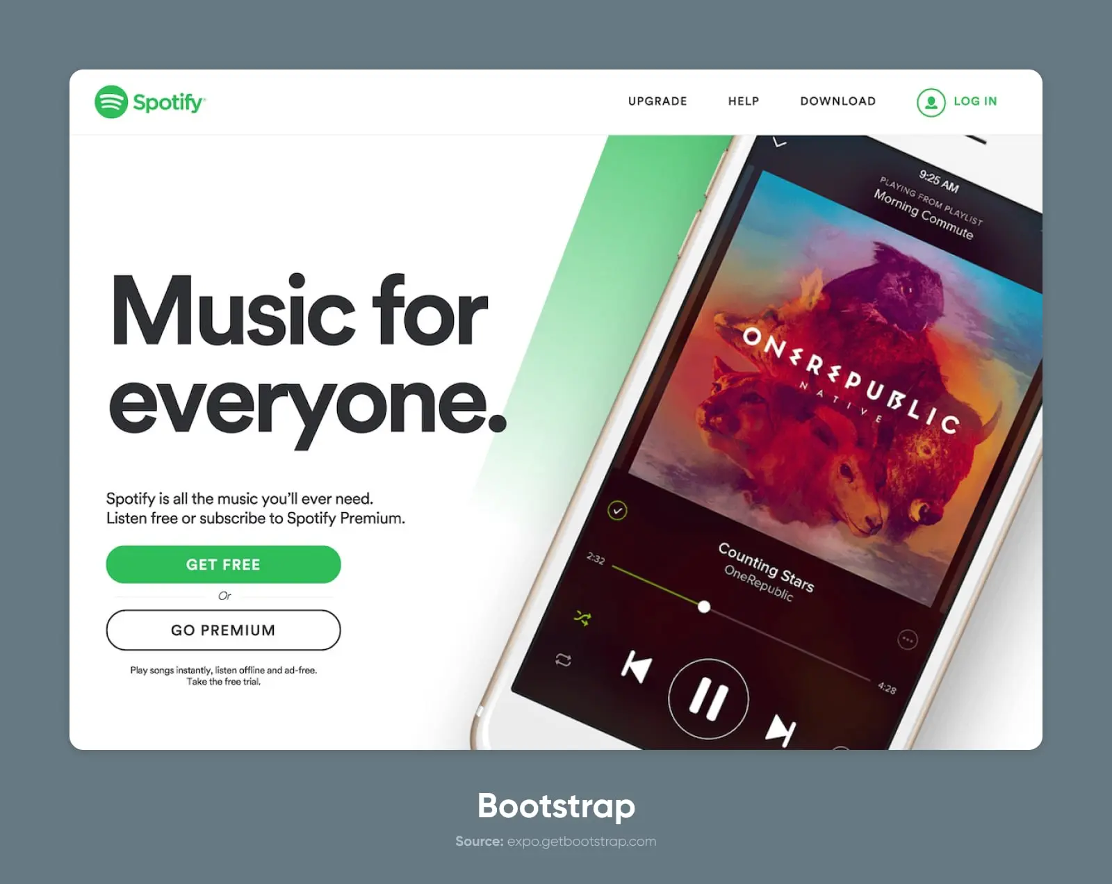
Many companies, including Twitter (obviously), Spotify, and Udacity, have used the Bootstrap framework in part or fully on their websites.
Why People Love Bootstrap
The reasons to love Bootstrap are the reasons to love frameworks– it’s simple, clean, and easy to use.
There’s a huge community of experts with experience building with Bootstrap to answer almost any question you can imagine.
And, although it sometimes gets a reputation for being vanilla, Bootstrap is pretty dang customizable if you want to go beyond what comes out of the box.
What People Don’t Like About Bootstrap
By far, the biggest knock on Bootstrap is that all of the sites using it look the same.
“They’re boring,” some will cry.
But that’s generally just the result of people using it exactly how it comes without taking much time to experiment or customize.
One other thing to be aware of is that the framework is quite bulky overall. The file size may be bigger than you’d expect for a simple website. That’s probably part of the reason why the State of CSS Survey found that satisfaction with Bootstrap is split about 50/50.
2. Tailwind CSS
Tailwind is perhaps as much a movement as it is a framework.
The creator, Adam Wathan, wrote something of a manifesto about the thinking behind Tailwind. And essentially, the idea is that CSS shouldn’t be descriptive and semantic (e.g., “.header” class), but instead should be functional (e.g., “.center-flex-3”).
He calls it a utility-first CSS framework.
And this approach seems to work for many people. Tailwind ranks highest in satisfaction on the State of CSS survey at about 80%.
Key features:
- Utility classes for easy styling
- Responsive design capabilities
- Customizable configuration
- Component-friendly approach

Many well-known tech companies like OpenAI (ChatGPT), Shopify, Wealthfront, and Loom use Tailwind CSS.
Why People Love Tailwind
Since Tailwind is utility-first, it has nearly endless flexibility.
There aren’t really prebuilt layouts in the same way as, say, Bootstrap. Instead, you can combine and layer classes to position your HTML elements in a nearly infinite number of layouts and CSS grids.
The main thing people like about this approach is that they can style their divs without referring to the documentation. Since the utility classes are intuitively named (for the most part), you can quickly apply styles without constantly flipping between the CSS library and the markup.
What People Don’t Like About Tailwind
In a nutshell: People don’t like change, right?
Tailwind breaks some well-worn traditions for CSS frameworks and even web development more broadly.
There are many arguments for why this approach to CSS code is suboptimal. The “separation of concerns” is the underlying principle behind how CSS (and most other code) is written. Tailwind puts that concept, well, on its tail.
Bonus: Daisy UI
If Tailwind’s utility framework isn’t your cup of tea, there is a great library called Daisy UI, written by Pouya Saadeghi, a plugin that builds on-top of Tailwind CSS giving you a set of classes that feels more reminiscent of Bootstrap.
Daisy UI provides class names for common UI components like buttons, cards, toggles, and more, allowing developers to focus on more critical aspects of their project instead of styling basic elements. It is built on top of Tailwind CSS, and hence everything can be customized using utility classes.
One of the significant benefits of using Daisy UI is that it significantly reduces the number of class names you need to write, by approximately 80%, and can make your HTML size about 70% smaller. Furthermore, it adds a set of customizable color names to Tailwind CSS, providing developers with the flexibility to create Dark Mode and other themes without adding new class names.
3. Bulma
Bulma is a lightweight CSS framework based on Flexbox.
The syntax of this framework is plain-language, meaning it relies heavily on descriptive utility classes or modifiers like “.button” and “.is-large”.
Key features:
- Flexbox-based grid system
- Modular architecture
- Sass-powered for easy customization
- Minimalistic code and design
Examples of well-known websites using Bulma: CSS Ninja and Signal.
Why People Love Bulma
Bulma can feel a bit like the Lego set of CSS frameworks. It’s extremely simple and easy to understand which makes it great for beginners or folks who just want a quick solution.
By applying a few logically-named classes, you can build out modules, apply CSS animations, and create more advanced styling. There are no JavaScript dependencies, so you can use it in combination with pretty much any JavaScript framework.
JavaScript
JavaScript is a flexible programming language that makes websites more engaging and interactive. It teams up with HTML and CSS to improve how users experience websites and apps.
Read MoreWhat People Don’t Like About Bulma
The simplicity of Bulma can be a double-edged sword.
While it’s great as a tutorial or introduction to CSS frameworks, more advanced developers would likely complain that it lacks the sophistication or extensibility of more robust options.
4. Foundation
On the opposite end of the spectrum from Bulma, we have Foundation.
Foundation makes no qualms about being advanced and, as such, fairly complex compared to some of the other choices. It’s a responsive front-end framework designed for mobile-first development and used for both sites and emails, and it’s used by approximately 500,000 websites worldwide.
Key features:
- Responsive grid system
- Comprehensive set of UI components
- Customizable Sass variables
- Integration with popular front-end tools and libraries
Why People Love Foundation
Foundation is kind of the O.G.
It’s been around since before the Willennium millennium, which means many developers are well-versed in Foundation and familiar with its syntax and conventions.
It’s also a mature product. It has tons of features, extensive documentation, and resources.
Plus, it’s considered one of the best frameworks for accessibility.
What People Don’t Like About Foundation
Like most mature products, Foundation can feel a bit bulky compared to modern, lightweight frameworks.
It’s accrued a lot of requested features and customization options that make the codebase and file sizes a bit heavier. Plus, because conventions have shifted, the learning curve is a bit steep for a beginner used to something like Tailwind or Bootstrap.
5. Semantic UI
“Everything arbitrary is mutable.”
That’s the dogma of Semantic UI.
At its core, this framework is built to help build and scale familiar-feeling interfaces for websites and web applications.
Key features:
- Intuitive and human-readable class names
- Wide range of UI components and layouts
- Customizable themes and styles
- Integration with popular JavaScript libraries and frameworks like Angular
Many sites and companies use Semantic UI, including Accenture and Snapchat.
Why People Love Semantic UI
Semantic UI has an easy-to-understand syntax that makes it easy to build out from its vast collection of UI components, including buttons, modals, cards, toggles, text fields, and more.
But perhaps the most popular wizardry is the theming and customization.
Semantic includes a theming library with over 3,000 customizable variables and then inherited across all of your UI components.
What People Don’t Like About Semantic UI
Since Semantic is so UI-focused and so extensive, it may contain a lot of code that goes unused in your project. This means that some folks will find it overly bulky for simpler projects compared to more contained frameworks.
6. Materialize
Materialize CSS framework is based on Google’s Material Design principles.
It emphasizes bold visual design and UX-focused animation (motion).
Materialize is pretty popular, with over 38,000 stars on GitHub.
Key features:
- Material-design-inspired components and styles
- Responsive grid system
- Sass-powered customization
- Built-in JavaScript plugins
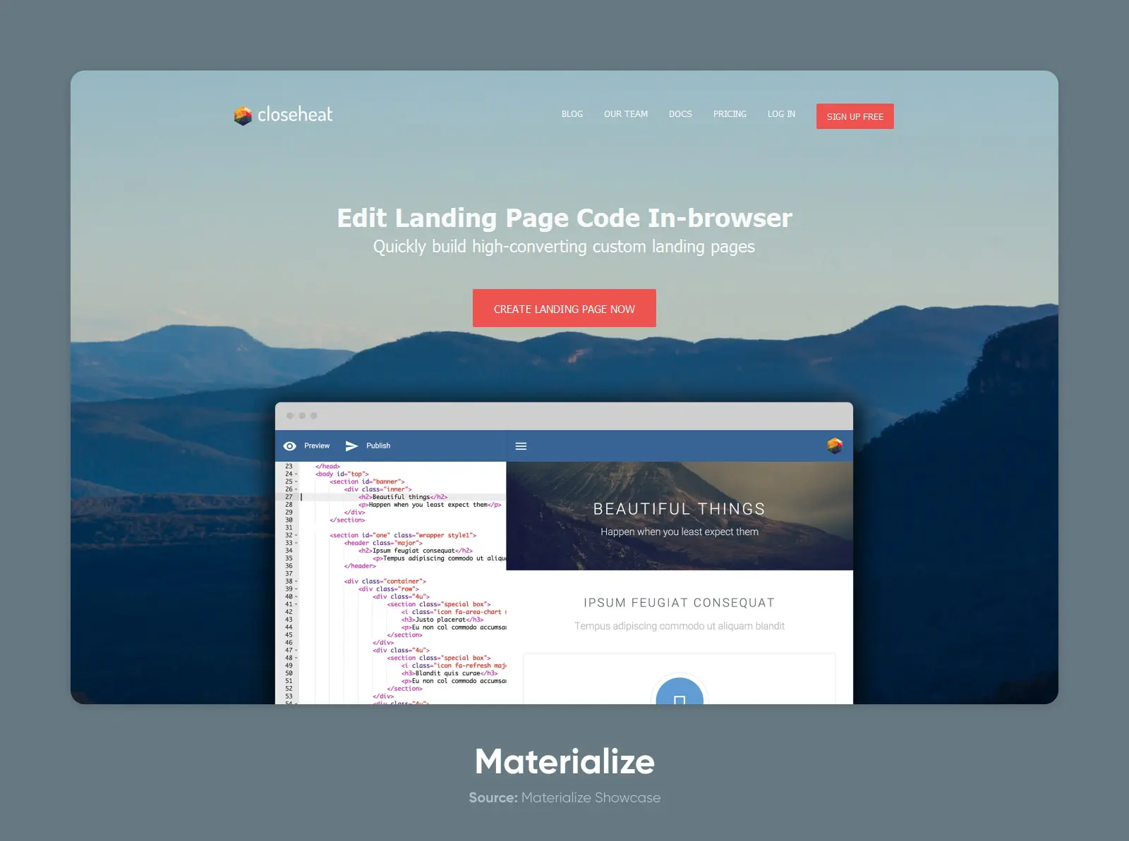
Materialize is used by a broad range of sites, but most sites in their showcase are small businesses and personal projects.
Why People Love Materialize
Materialize is a simple, few-frills solution for setting up a clean and usable website. They don’t really offer the moon, but that’s one of the reasons people like it.
What People Don’t Like About Materialize
As is always the case, simplicity also means limitations. Materialize is not as robust or extensible as other frameworks, and relies on JavaScript for specific motions.
7. UIkit (UI Kit)
Another modular framework focused on website and web app interfaces, UIkit is slightly less popular than Semantic UI, but that doesn’t make it any less powerful.
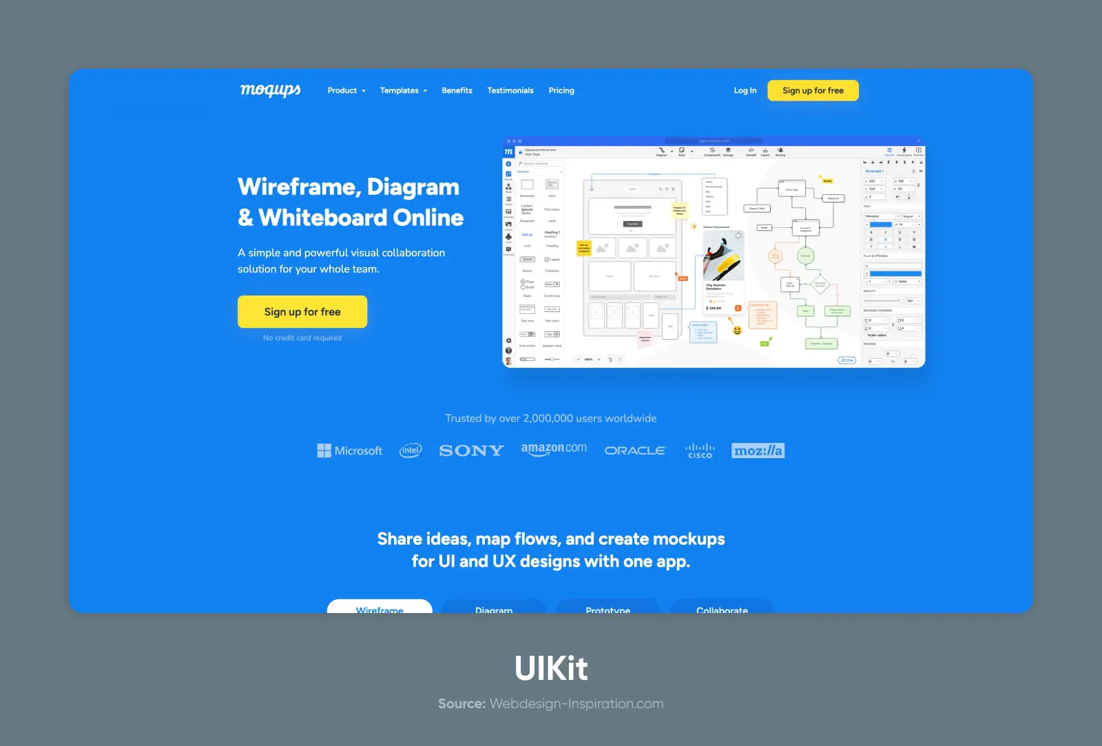
UIkit is a UI-focused framework used by many sites and web apps, including Crunchyroll, Moqups, and Rover.
Key features:
- Modular architecture with selective imports (huge!)
- Responsive grid system
- Sass variables and mixins for customization
- Extensive UI component library
Why People Love UIkit
UIkit is perhaps a bit smaller in market share, but it’s also smaller in footprint, file size, and complexity.
Without losing much in the way of functionality, UIkit offers an extremely lightweight and comprehensive UI component library. It’s highly customizable with simple setup – using either the provided build process or using your own (with Less).
What People Don’t Like About UIkit
Probably the biggest drawback to UIkit is that it’s a bit more under-the-radar than some of the bigger and more popular frameworks.
But, you know, that makes it cool, right?
On a serious note: There’s a smaller community of users, which may make it more challenging to find answers to questions or find tutorials on specific implementations.
8. Ant Design
Ant Design is a bit more than a CSS framework; It’s a design system with a set of high-quality React components for building rich, interactive user interfaces.
Built and released by Ant Group (parent company of Alibaba), Ant Design is similar to design systems released by US tech companies like Alphabet and X (née Google and Twitter).
Key features:
- Comprehensive set of UI components
- Consistent design language and style
- Customizable themes and appearance
- Extensive documentation and community support
Examples of well-known websites using Ant Design (unsurprisingly): Alibaba, Tencent, and Baidu
Why People Love Ant Design
Ant Design is an extremely robust collection of resources for designers and developers. Going beyond just the CSS framework, there’s an entire system (nay, language) that can be applied directly to your own projects.
There’s a huge community, and the design system has been tried, tested, and proven across businesses and projects, generating billions of dollars in revenue.
Think of it like a franchise model for your web project.
What People Don’t Like About Ant Design
As you perhaps guessed, with extensive functionality comes extensive file size.
The entire Ant Design system (un-minified) weighs in at about 100MB.
The other limitation is that Ant Design is pretty purpose-built for React projects. If you’re using another JavaScript library, it might be difficult to adapt the components.
9. Primer
The CSS framework behind GitHub’s design and UI components, Primer is a super popular framework choice for developers and developer-first websites and apps.
It’s purpose-built and feels familiar to anyone who’s spent time rooting around the repos.
Key features:
- Modular architecture with selective imports
- Responsive grid system
- Sass-powered customization
- Built-in accessibility features
Why People Love Primer
Primer is like a great piece of infrastructure; It’s understated and simple, but does the job really well. Plus, knowing that the team behind GitHub created (and maintains) the library is a big boost to the longevity and reliability of the project.
What People Don’t Like About Primer
As you may have guessed, GitHub’s design aesthetic isn’t the right choice for every project.
So the main complaint is that Primer isn’t as universal as other frameworks, and isn’t an ideal choice for projects or websites not built for developers. It also has a limited UI component set that makes sense in the GitHub ecosystem.
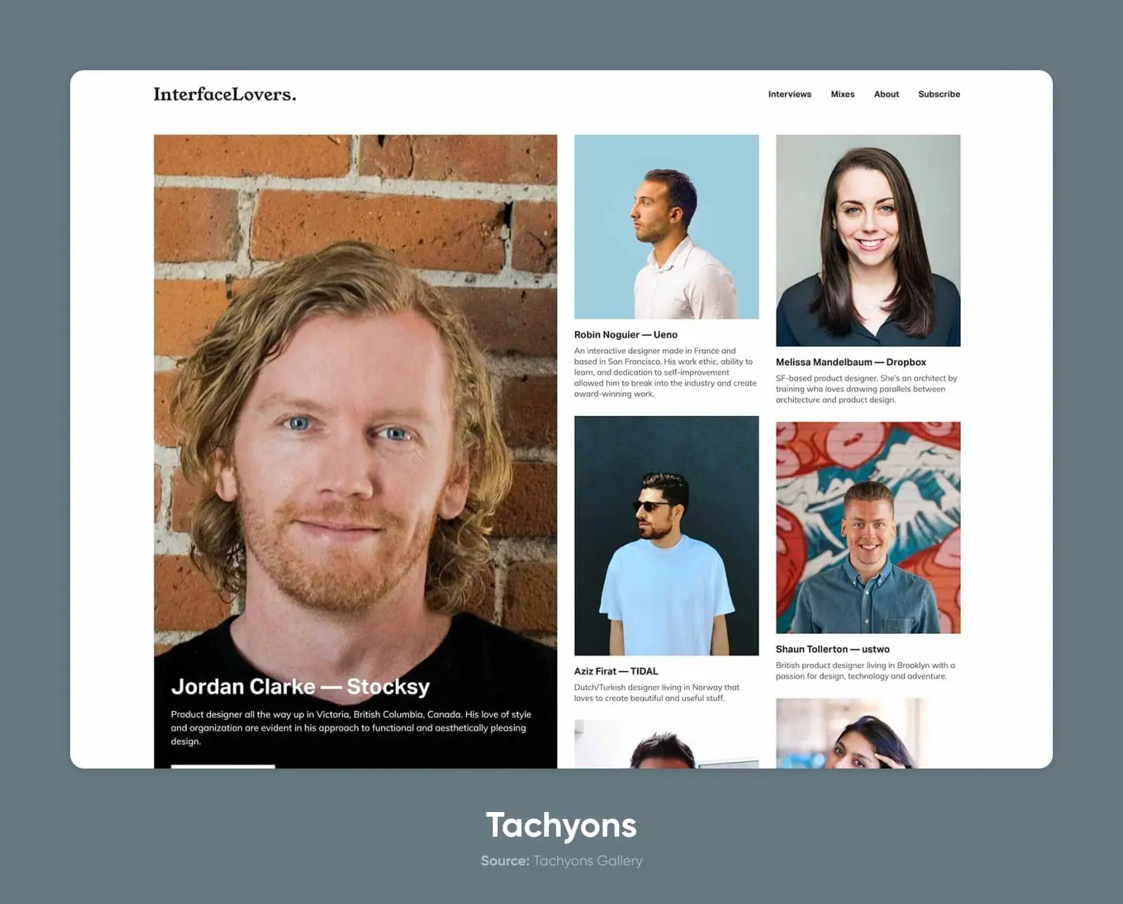
10. Tachyons
“Fast-loading, highly-readable, and 100% responsive interfaces” is the promise of the Tachyons framework.
Built to use minimal CSS, Tachyons is ideally suited for standing up a quick homepage, personal portfolio, or project site.
Key features:
- Atomic CSS architecture with utility classes
- Responsive design capabilities
- Minimal setup and configuration
- Small file size for fast loading
Why People Love Tachyons
People love Tachyons because it’s a quick and simple framework. It’s lightweight and fast-loading, which makes it ideal for small projects, personal sites, and other simple use cases.
It’s like the Honda Civic (base model!) of frameworks.
You know what you’re getting. It works. And it’s reliable.
What People Don’t Like About Tachyons
It would take quite a bit of work to use Tachyons for a more complicated or visually-complex project, meaning it won’t be the first choice for anyone looking for more than a simple, grid-powered page or two.
11. Pure (Pure CSS)
Yahoo!
That’s a name you don’t hear all the time. (Unless you’re on Jeopardy answering a question about alternatives to Google, maybe.)
But their CSS framework, Pure CSS, has become quite popular for hackers and hustlers alike. With 23k stars and 2.5k forks on GitHub, it’s definitely one of the most popular choices on this list.
Key features:
- Small and lightweight
- Responsive grids
- Built on Normalize.css
- Out-of-the-box form handling
Why People Love Pure
PureCSS is a favorite powerup for custom CSS or as an addition to other frameworks. It’s ultra-lightweight and offers many useful components that can easily bolt onto existing systems.
This makes it simple to add grids, forms, buttons, tables, and more to your current stack.
What People Don’t Like About Pure
Pure works best as an add-on rather than a standalone framework. It doesn’t have a comprehensive library like other solutions and doesn’t offer theming or other features that make it easy to customize the look and feel of the project with a few quick edits.
12. Material Design Lite
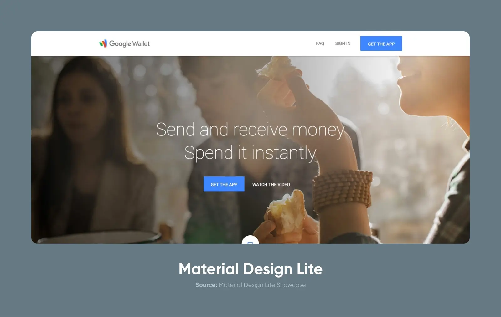
Speaking of Google, in addition to Materialize, they’ve also open-sourced their Material Design Lite framework. As the name suggests, it’s a lighter, simpler version of the Material Design-inspired framework.
It uses less JavaScript and is built to be more accessible on a broader range of devices and browsers.
You can see Material Design Lite (MDL) on full display by visiting sites like Google Wallet, Google for Work, Google’s developer site, and more.
Key features:
- Material Design philosophy and UI components
- Large number of components out of the box, such as buttons, cards, sliders, spinners, and more
- No external dependencies
- Theming options
Why People Love MDL
MDL comes with an ultra-functional set of components for apps, forms, and more.
Since it’s built on Material Design principles, usability and accessibility are front and center in the designs and the components.
What People Don’t Like About MDL
MDL is technically depreciated at this stage, so the system won’t receive any updates or support.
Beyond that, the whole aesthetic can feel a bit limiting. It feels very much like it was created for Google products, for better or worse.
13. Spectre.css
Spectre is another great option for getting up and running quickly. This lightweight, minimalist framework gives you many of the building blocks you need to go from zero to launch with a good-looking site and familiar UI components.
Key features:
- Small (~10KB gzipped) filesize
- Flexbox-based grid
- Built-in utility classes
Why People Love Spectre
Spectre is ideal for a simple, minimal, and clean aesthetic. The focus here is on pure usability and efficiency — You won’t get a lot of extra bells or whistles, but it’ll do the job.
What People Don’t Like About Spectre
If you’re looking for a sprawling framework with advanced theming options, a thriving community, and tons of documentation, this probably isn’t the pick for you.
Spectre is a little more under the radar. It’s a capable tool for the job but doesn’t have anywhere near the kind of popularity and adoption as Foundation or Bootstrap.
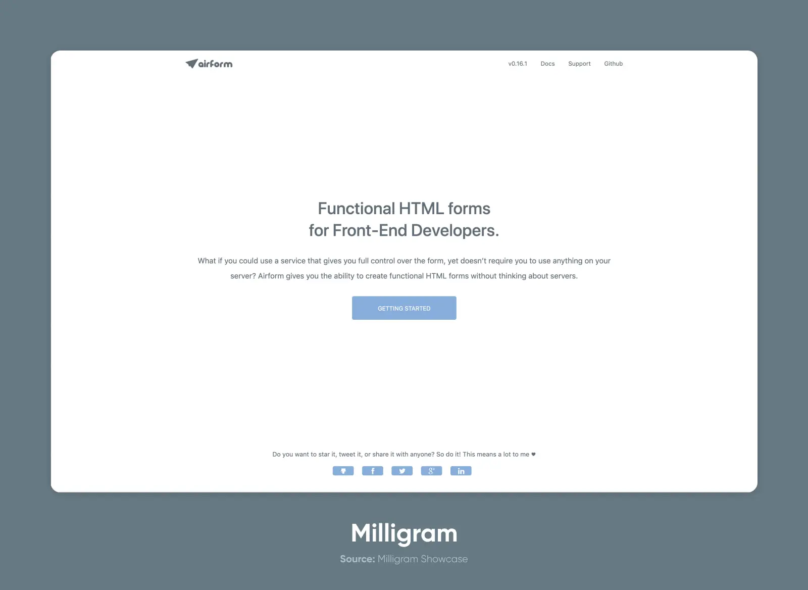
14. Milligram
Another lesser-known framework, Milligram is extremely small and lightweight. Even more so than the other small frameworks we’ve covered.
It’s the ultimate option for minimalist design and a quick, straightforward solution for standing up a project.
Key features:
- Minimalist design
- Very small (~2kb gzip)
- Flexbox grid system
Why People Love Milligram
Milligram is potentially the lightest, simplest CSS framework you can use to build a project right out of the box. It has many of the most important features of other frameworks but with an astonishingly small footprint.
The conventions and classes also make it pretty easy to learn on the fly.
What People Don’t Like About Milligram
Milligram suffers from the same drawbacks as other lesser-known systems on the list. Lower overall popularity means that there’s less community support. Even so, the documentation is on par with much larger frameworks, and the simplicity may reduce the need for any additional help.
15. Water.css
Water is a classless CSS system that you just drop into a static site. It’s not a system in the way that the other frameworks are designed. Instead, it applies the styles directly to the HTML elements on the page, giving you a quick design system without the need (or ability) to build more complex layouts.
Key features:
- No classes
- Extremely lightweight
- Two themes out-of-the-box: light and dark mode.
- Fully responsive
Why People Love Water
Water is great for a quick CSS solution, a boilerplate of styles, or a simple mockup.
It does what it says on the tin, making it a great, ultra-fast, no-fuss solution.
What People Don’t Like About Water
Water’s simply not going to work for any complex website or app project. It doesn’t have grids, it lacks many components that you’d need for larger projects, and ultimately prioritizes simplicity (to the extreme) at the expense of customization or extensibility.
16. Vanilla
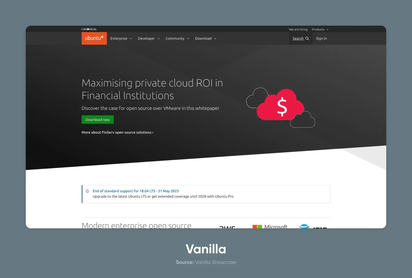
Vanilla Framework or Vanilla CSS (not to be confused with the colloquial term vanilla CSS, referring to base-level or traditional CSS) is a framework created and used by Canonical, the parent company of Ubuntu.
Key features:
- Scalable architecture suitable for large web projects
- Modular systems
- Built on Sass
Why People Love Vanilla
Although less popular than the big frameworks like Bootstrap, Vanilla has the backing, resources, documentation, and even support of an enterprise-level product.
There’s an extremely detailed analysis related to accessibility and meticulously detailed notes on compatibility with different browsers (down to the specific version) and screens.
The components and styling are simple and universal, too.
What People Don’t Like About Vanilla
The project might indeed be a bit vanilla for some tastes. That is to say, the design aesthetic is largely neutral and functional without much flare.
Choose the Best CSS Framework for Your Project
Now that we’ve shared 16 awesome options, how do you choose the right one?
As always, there is no right or wrong answer here, but there are some key questions that you might use to narrow down your options.
Project Requirements and Goals
The best place to start is by understanding the type of project you’re building. If you’re creating a simple website for a small project or personal use, then a lightweight and simple system like Water or Milligram.
But if you need something more robust, you might opt for Foundation or Bootstrap.
Learning Curve and Ease of Use
Next, consider the system’s complexity versus your or your team’s capabilities. Are you experts at diving into new CSS frameworks? Or is this your first time using something that’s not home-baked?
Understanding how to use a CSS framework takes a bit of learning in-and-of itself. If you’ve never worked with a framework, you’d probably be better off choosing a simple starting option. Then, once you have the hang of the meta, you can dive into learning more complex systems.
Customizability and Flexibility
Are you building something that needs to adhere tightly to existing brand or design guidelines?
Then you’ll want to choose an option that has built-in theming and customization to make it easy to match the necessary styles and design systems.
If you’re more adaptable, you can choose a system with a distinct style but lacks some of the flexibility of the more robust systems.
Community Support and Resources
Having a community of folks using the framework can make all the difference. Look for community forums, Discord servers, or subreddits to see how many people are helping other users and how active the community is for each framework.
Performance and File Size
Be sure to consider the file size and performance of the frameworks you evaluate.
While your website’s performance is influenced by many factors (like your web hosting), the CSS can also greatly impact your pages, file sizes, and loading speed.
Keep Building
Hopefully this list of CSS frameworks gave you an idea of where to start on your next project.
Whether you’re building the next Facebook or a personal website to showcase your rock collection, we love helping creatives and entrepreneurs build a beautiful internet.
Be sure to sign up for our newsletter to get the latest how-to guides, trends, and tips on building and growing your website and business.
