You may have heard before that email returns over $30 for every dollar you spend on it.
That’s a pretty powerful return on investment for anything — but especially for a marketing campaign.
As such, it pretty much cements the importance of email marketing for small business success.
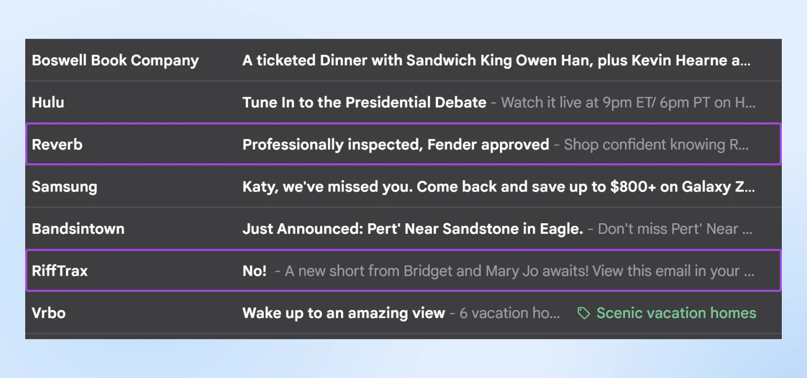
But alas, emails can’t have that influence if no one is opening or reading them!
When was the last time an email really got your attention or captured your heart?
Endeared you to a brand?
Made you laugh?
Or, perhaps most importantly: led you to click, convert, and become a loyal customer?
We’re sure it wasn’t just about what was said, but how it was said.
This is where email design comes in.
Using tricks like optimizing loading speed, leaning on color theory, building a flow that taps into the innate way people read, and creating a layout that’s friendly on all devices and at all ability levels naturally creates irresistible emails.
And irresistible emails get opened, get read, and bring you the engagement you need to make the work of email marketing worth the return.
Here’s why, and how, to design your own emails.
What Do We Mean by Email Newsletter Design?
We’ve all done it before. Writing an email is simple, right? (For the most part, at least.)
Not so fast.
Effective email marketing involves much more than just typing out a message and hitting send.
If your email lacks an attention-grabbing subject line, relevant content, a smart layout, and visually appealing elements —it’s all too easy for recipients to overlook and ignore it in the avalanche that is their inbox.
Email design is the process of thoughtfully crafting and structuring emails to make sure they’re visually engaging, easy to read, and inspire action.
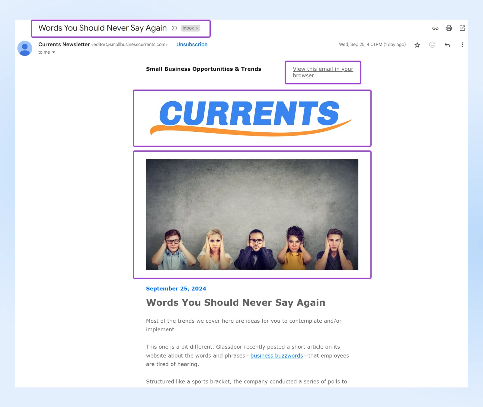
In essence, the design of marketing emails focuses more on the visual layout of your emails than the content itself. It involves organizing and optimizing text, images, and key information in a way that makes the email unignorable. Given that people typically skim through emails quickly, a well-designed email ensures that your message is on-brand, clear, and even captivating.
And a well-crafted email design guide can teach you how to bring all of the above to life to strengthen your voice, attract new customers, and build long-term relationships with your audience.
Which is what you’re about to read, right now.
Why Email Design Matters
We already touched on why small business owners and marketers should focus on growing their email lists — email marketing has a great ROI!
What specifically is so important about the design of your emails? It has a way of bumping up email opens and engagement.
We’ll show you how.
Maximize Readability
A well-structured email with clear hierarchy, ample white space, carefully chosen fonts, and thoughtful design elements ensures that recipients can quickly, easily, and even excitedly read whatever content you want to share with them. No drab marketing snooze fest here!
Drive Measurable Action
Ultimately, well-designed emails guide their recipients toward a clear next step, whether it’s signing up for an event, making a purchase, or visiting a website.
When design and content align perfectly, it makes it easy for recipients to act on your message, and for you to set and hit measurable goals around conversions.
Build Brand Trust
Consistently using your brand’s colors, fonts, and logos in email design reinforces your brand identity. When recipients see an email that visually aligns with a brand they’re already familiar with, it creates trust, making them more likely to open future emails!
We love that sweet, sweet marketing momentum.
Welcome All Readers Through Accessibility
Email design should always consider accessibility, making it easy to digest for as many people as possible.
Accessibility
Accessibility is the practice of making a website accessible to as many users as possible. Accessible websites can be viewed by anyone on any device.
Read MoreThoughtful design choices that we’ll cover in depth in the next section — like appropriate font sizes, color contrast, and alt text for images — guarantee that more people are welcome to engage with your content, regardless of how they access your email.
15 Email Design Best Practices
Take a look at your current marketing metrics.
Are you designing emails that hit the mark every time?
If not, it’s time to stop wasting your resources and start getting more effective.
The next section will walk you through some of the best practices for creating an email experience that captures attention, delivers value, and encourages action.
1. Single Column Keeps It Simple
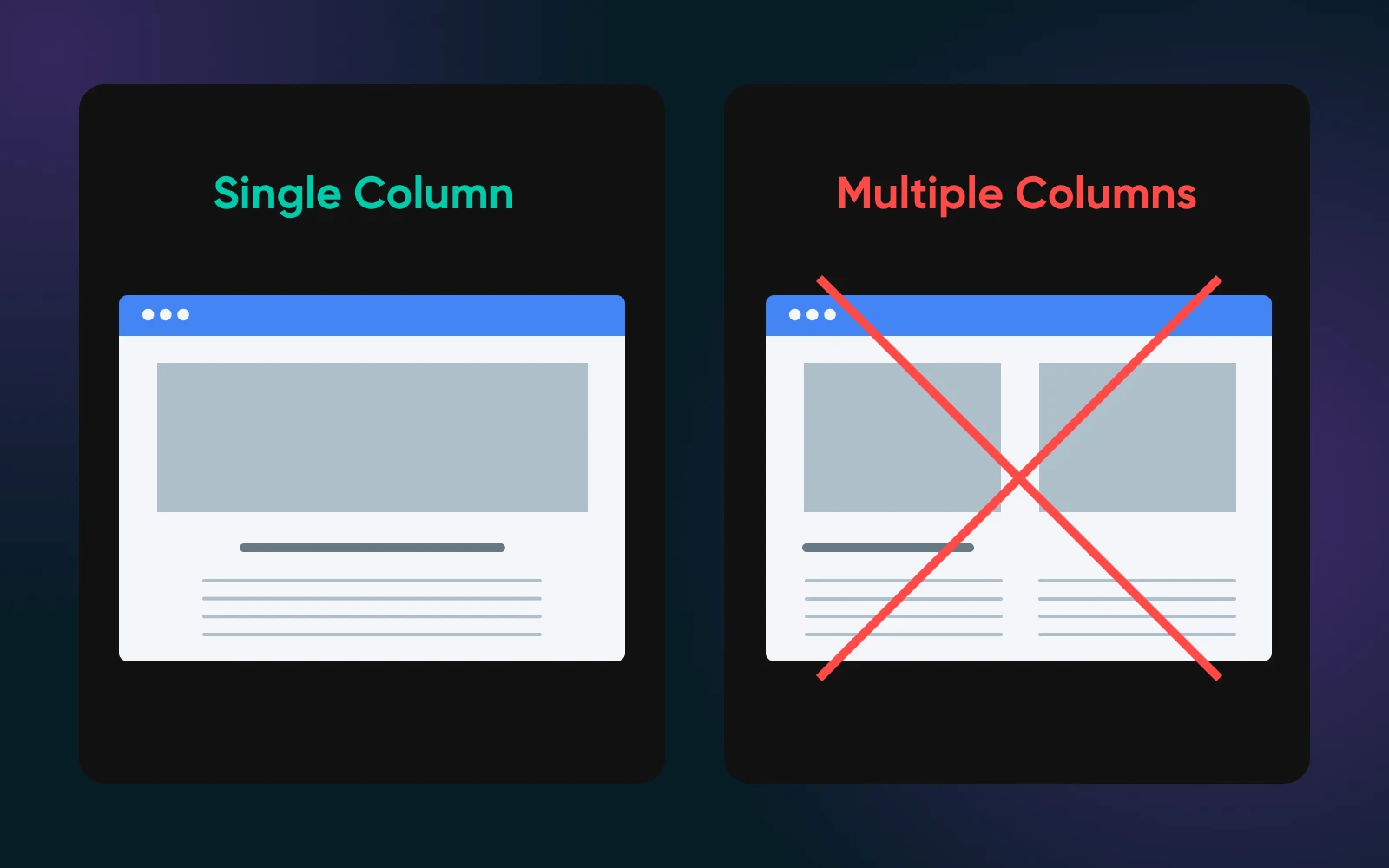
We typically recommend opting for a single-column layout in your marketing emails for several reasons:
- One, it’s just straight up easier for you to design!
- Another reason is that this makes it much easier for readers to quickly scan and take action, which is truthfully what many want when it comes to working through emails in their inbox. This simplified layout is also more foolproof for assistive technology to process, making it more accessible.
- And last but certainly not least, single-column emails are more adaptable to different screen sizes, making them more mobile-friendly. (An important factor we’ll talk about more later.)
2. Get Familiar With the Common F Reading Pattern
Identified by the Nielsen Norman Group via an eye-tracking study, the F-shaped reading pattern is one of the most common ways readers scan blocks of content.
The pattern works like this:
- The reader starts with a horizontal scan across the top of the content, forming the top line of the letter “F.”
- Next, they move down and scan the next horizontal section that catches their eye, this lower line of the “F” is typically shorter than the first.
- Lastly, they follow a vertical path along the left-hand side of the content, completing the “F” shape!
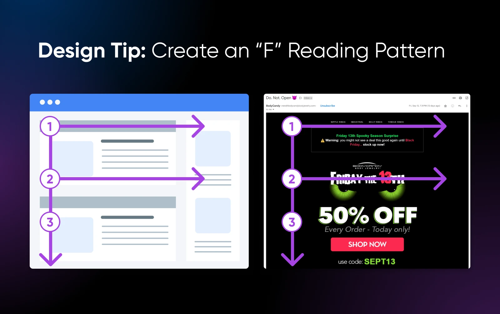
When designing your emails, here’s how to optimize with this scanning behavior in mind:
- Place the most important information where readers are likely to focus, along the F pattern.
- Begin new paragraphs or sections with attention-grabbing words to continue to catch the eye as it moves down.
- Make sure the most prominent element in your email stands out immediately, and try to place it in the path of the eye as it flows through the pattern. Later in this article we’ll talk about how to choose the best font type and size as well as how to apply contrast effectively to draw attention.
3. Take a Page From Writers With the Inverted Pyramid
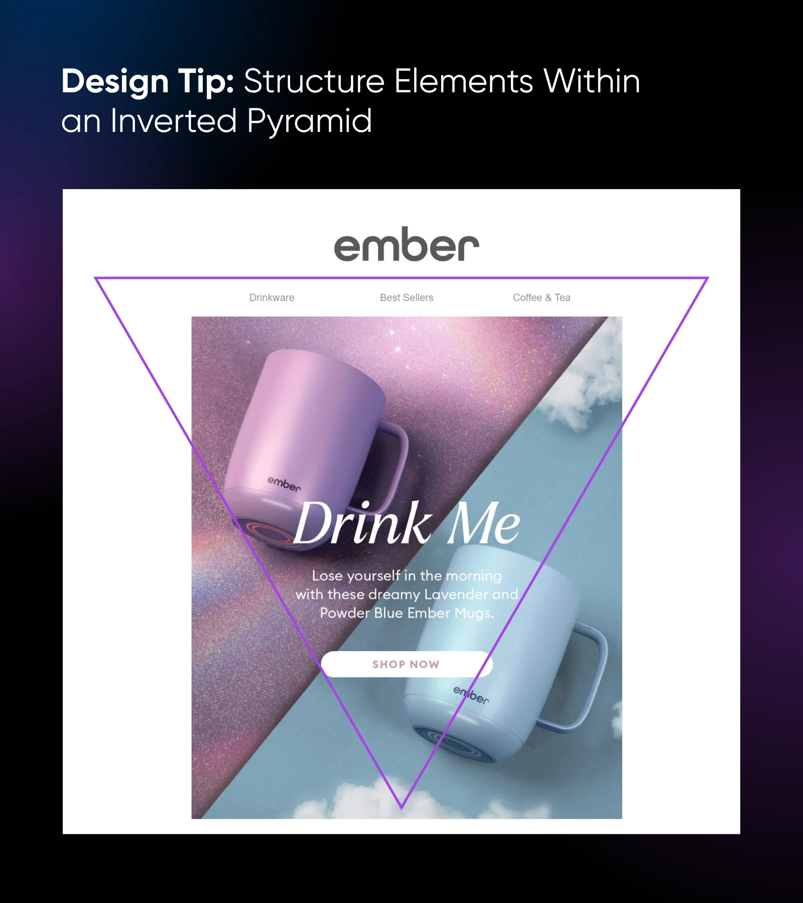
The inverted pyramid layout is a powerful design strategy borrowed from writers and journalists. In the email world, it’s all about placing the most critical information first, then quickly guiding readers down to a clear call to action (CTA) in an upside-down triangle shape.
The structure is simple:
Start with an attention-grabbing headline or hook, followed by concise supporting information, and end with a prominent CTA.
And it’s not only about the words you use. Get clever with creative fonts, colors, and design! And use whitespace strategically to really get the reader engaged.
By minimizing distractions and keeping the content streamlined and exciting, the inverted pyramid layout leads the reader’s eye naturally toward the CTA, making it more likely they’ll engage with it.
4. Consider Emojis (Really!)
Whether it’s conveying disdain (?) or sharing thrilling news with nary a word written (?): emojis are a powerful and modern communication option.
Anecdotes aside, emojis have even been found to increase engagement on social media. So, why not try to use them to do the same in your marketing emails?
When used thoughtfully (this is critical!), emojis can add personality and visual interest to your emails, helping them stand out and keep recipients reading. They create an instant emotional connection and make your message more engaging.
The most important part of this best practice is understanding your audience and the message at hand to ensure that the emojis you use fit and further it. Not distract from it.
5. Optimize Image Size
The email marketing pros at Campaign Monitor built their email templates to be 600 pixels wide on desktop and 320 pixels on mobile. In addition, the top 300-500 pixels are usually what folks can see in an email before needing to scroll. With all of that in mind, any images you use in marketing emails shouldn’t exceed those parameters.
But it’s not just about measurements, it’s also about “weight” — which impacts loading time. Compress images to minimize their file size so they load faster and comply with email client regulations.
Got questions about what file format to use for your images?
- JPEGs are crisp and small and still ideal when featuring professional photographs.
- PNGs compress well.
- And SVG files are lightweight and remain sharp at any scale, making them good for icons and logos.
An important note is that, however you approach images, they should always be embedded in your email. Why?
Because attachments today are too easily flagged as spam.
6. Keep Branding Consistent
A big reason emails don’t get opened, or get quickly deleted once they do, is that they feel like they’re coming from out of left field. Often, this is the result of poor branding.
Incorporating your brand’s visual identity into every email is essential for reinforcing brand recognition. Without this, recipients may think they’re getting spam they didn’t sign up for — thereby increasing your bounce and unsubscribe rates.
The trick here is to ensure your emails feature key design elements from your brand by:
- Featuring your brand’s core elements, like fonts, colors, and imagery across all email communications.
- Making sure the design of your emails is in sync with your website, landing pages, social media presence, etc., to create a unified front.
- Placing your logo prominently in the header or footer of every email to reinforce brand identity.
- Creating reusable templates once you’ve nailed the right vibe, to streamline future email campaigns and ensure consistency.
7. Prioritize the Mobile Experience
At the end of 2023, more than half of all web traffic around the world took place on mobile devices.
In other words, there’s no way you can ignore those small, smart screens when it comes to email design.
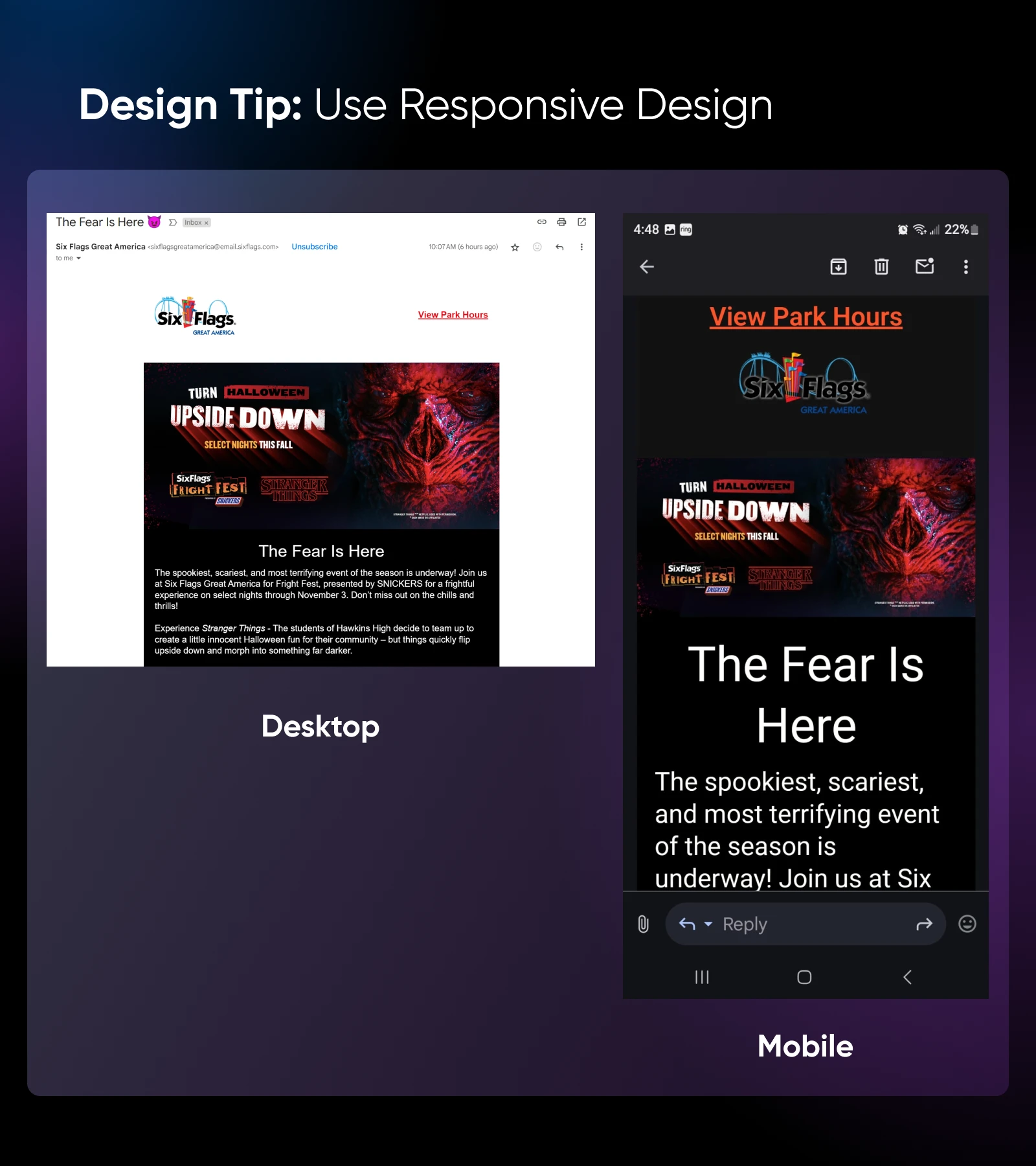
Design that adjusts depending on screen size and type is known as responsive design. Luckily, most email design tools — like Mailchimp, Stripo, Unlayer, and dozens more — are responsive, and will automatically resize and reorganize emails to make sure they’re mobile-friendly.
However, there are several things you can do to make sure this doesn’t go awry and your email newsletters always look flawless:
- As we’ve mentioned here and there, streamlined and simple design is often best for emails, especially when you think about readability on hand-held devices. Also, simple layouts are faster to load, which we all want when we’re on the go.
- Buttons should be large enough to be easily tapped with a thumb. The rule of, well, thumb is 44×44 pixels. There should also be enough space around buttons that users can click without accidentally tapping nearby links.
- White space is more important than ever for readability on mobile devices, so use it generously but wisely.
- Place your most important content near the top of your email so it’s visible before the scroll.
- Mobile devices typically display shorter subject lines (around 30 to 40 characters), so keep it short and sweet.
- Overall email size should be under 100KB, or it will take too long to load or get clipped by the email client.
8. Gimme Some Space, Please!
In design, white space refers to the empty or negative space around elements.
It plays a crucial role in email design by helping to organize content based on importance, enhancing readability and legibility, and directing attention to key components.
Truthfully, white space is one of those things that you just know when you see it —when it’s done well, it’s the difference between a pleasing, calm interaction and one that feels outdated, stuffy, and hard to digest.
That said, here are some basic tips to keep in mind around implementing white space in emails:
- Leave enough padding (aka space) around paragraphs, images, and other sections to prevent the email from feeling cluttered.
- Equalize the margins between all of your text blocks, to help guide the reader’s eye smoothly from one section to the next.
- Increase the spacing between lines of text to improve readability.
- Add more space around key areas to naturally draw attention to them, without extra design flourishes.
- Resist the urge to pack too much content into a single email. By keeping text and images spaced out, you reduce visual clutter and make your message more digestible.
- Remember, less is often more when it comes to email layout!
9. Create Emails With Clear Hierarchy
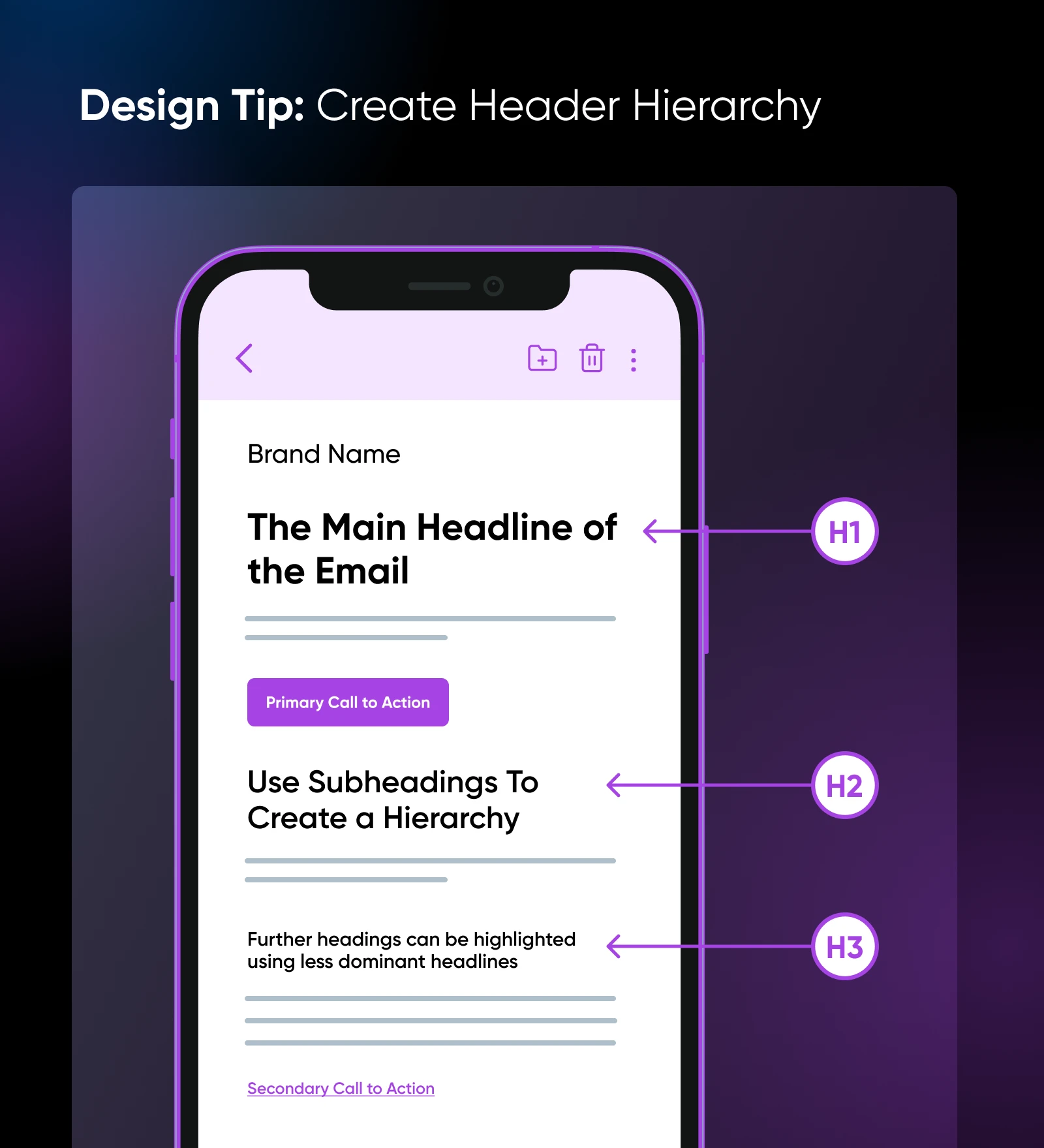
Creating hierarchy — arranging elements in a way that indicates level of importance —in a marketing email ensures that your recipients can easily navigate the content, absorb key information, and take desired actions.
Similar to applying white space, nailing hierarchy is something that comes with observation and practice. But, once you get it, you get it.
Still, there are some pretty straightforward tricks you can deploy when crafting emails to help guide the reader’s eye and convey your message effectively:
- Feature headers when introducing key points. Headings should be larger and bolder than all other text, clearly signaling the most important parts of your message. Subheadings can introduce supporting information.
- Use larger and more bold text to naturally draw attention. Smaller text can add context as needed.
- Contrasting colors make important elements stand out. Highlight your most important CTA with your most bold color that contrasts with the background. And don’t overuse this color or you’ll lose power.
- Images as well as white space can direct a reader’s attention to important information.
- Iconography featuring arrows may also help readers understand what to look at first, or next.
10. Choose Your Fonts Carefully
It’s important to strike a balance between branding and readability when choosing fonts for your emails. Overall though, we’d probably give readability the edge — which is heavily influenced by font choices.
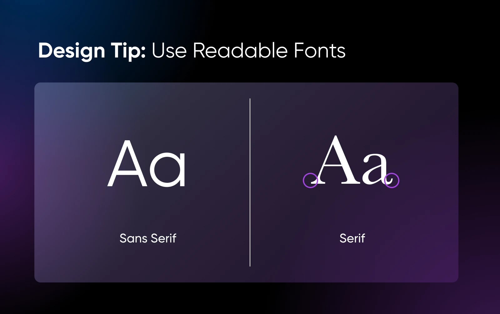
- For headers and short text blocks, opt for sans-serif fonts that are clean, modern, and display clearly on most screens. These fonts tend to be the most legible in small doses and large sizes, making them ideal for titles and other attention-grabbing snippets.
- For longer paragraphs, serif fonts are typically easier to read. That’s why many newspapers and magazines use serif fonts for longer stretches of text.
In addition to choosing the right style, you also want to prioritize web-safe fonts, which are widely supported across most web browsers, email clients, and operating systems. Using web-safe fonts guarantees that your emails will look the way you intended, whether they’re opened in Gmail, Outlook, or any other popular services.
Popular web-safe sans-serif fonts include:
- Arial
- Helvetica
- Verdana
- Tahoma
- Lucida Sans
- Geneva
Common web-safe serif fonts include:
- Times New Roman
- Garamond
- Georgia
11. Size Font Between 10 and 16 Points
Font size is just as important as font style. It’s also about branding mixed with balance.
While there are no strict standards for font sizes in emails, it’s best to keep your font above the 10-point size, as anything smaller can be difficult to read.
On the other end, 16 points is a nice large size, but anything above that has the potential to appear distorted or “break” your design on certain email platforms.
It’s important to remember that accessibility guidelines recommend at least a 16-point font. To find your best fit, we highly recommend experimenting with size to see what works best for your typical email style across platforms, devices, and screen readers.
12. Consider the Impact of Colors
Color, of course, impacts the way your emails are perceived.
Not only do colors help portray your brand, they can also impact readability and inform recipients of the content’s hierarchy.
Consider the tone you want to portray when using color in emails. While the blue that many websites famously use (Facebook, Dell, etc.) may elicit trust, yellow can boost mood, green can introduce peace, and black may help you get a more somber (or luxurious) message across.
How you use colors together is also important. For 40 different ideas on how to combo colors to share your message loud and clear, don’t miss our recent guide to website color schemes.
13. Don’t Forget About Dark Mode
The email platform Litmus found that around 35% of their subscribers (and growing) using Apple email viewed their emails in dark mode:a setting that darkens the color scheme of everything a recipient views on their device.
Many email clients attempt to automatically adjust emails for dark mode, but this process isn’t always flawless. To ensure your emails look great in both light and dark settings, consider the following:
- Use transparent PNGs because these images don’t have a background. By using transparent PNGs, you avoid awkward background contrasts when your email transitions from light to dark.
- Outline black logos in white because if part of your logo is black, it can blend into a dark background and look bad, really fast. To prevent this, add a tiny white border around the black elements. This makes them visible in dark mode while allowing them to still blend seamlessly if the background is white.
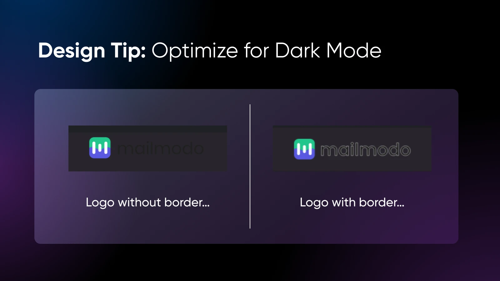
- Optimizing colors for both palettes means colors on your buttons, links, icons, and elsewhere may look totally different in dark mode than you’re used to. To avoid poor contrast, garish colors, or readability issues, consider slightly muting your hues to ensure they’re easy on the eyes in all modes.
- Test! Test! Test! Once you’ve designed your email for dark mode, it’s important to test how it renders. Send a test email to yourself and check its appearance in both light and dark mode across different email clients.
14. Accessible Email Copy Is Key
Since email is an extension of your brand, email accessibility design is just as important as website accessibility design.
Here’s a cheat sheet for making sure your emails are beautiful and consumable for all audience members:
- Ensure that important information — promo codes, dates, times, and CTAs — is presented as text at least once, rather than only being embedded in images. This guarantees that all recipients, including those using screen readers or with images disabled, can still access crucial content.
- Use alt text for images. If a subscriber has images turned off, the alternative text will still provide context and convey the message.
- A minimum font size of 16 points is recommended for legibility.
- Align text to the left as left-aligned text is easier to read than centered paragraphs, which can disrupt the flow for readers.
- Letters and lines that are too close together can reduce readability, so provide enough spacing between them.
- Relying solely on color to convey all of your meaning can be confusing for those with color blindness. Additionally, most screen readers do not interpret colors. Instead, use text and icons in addition to color to convey information.
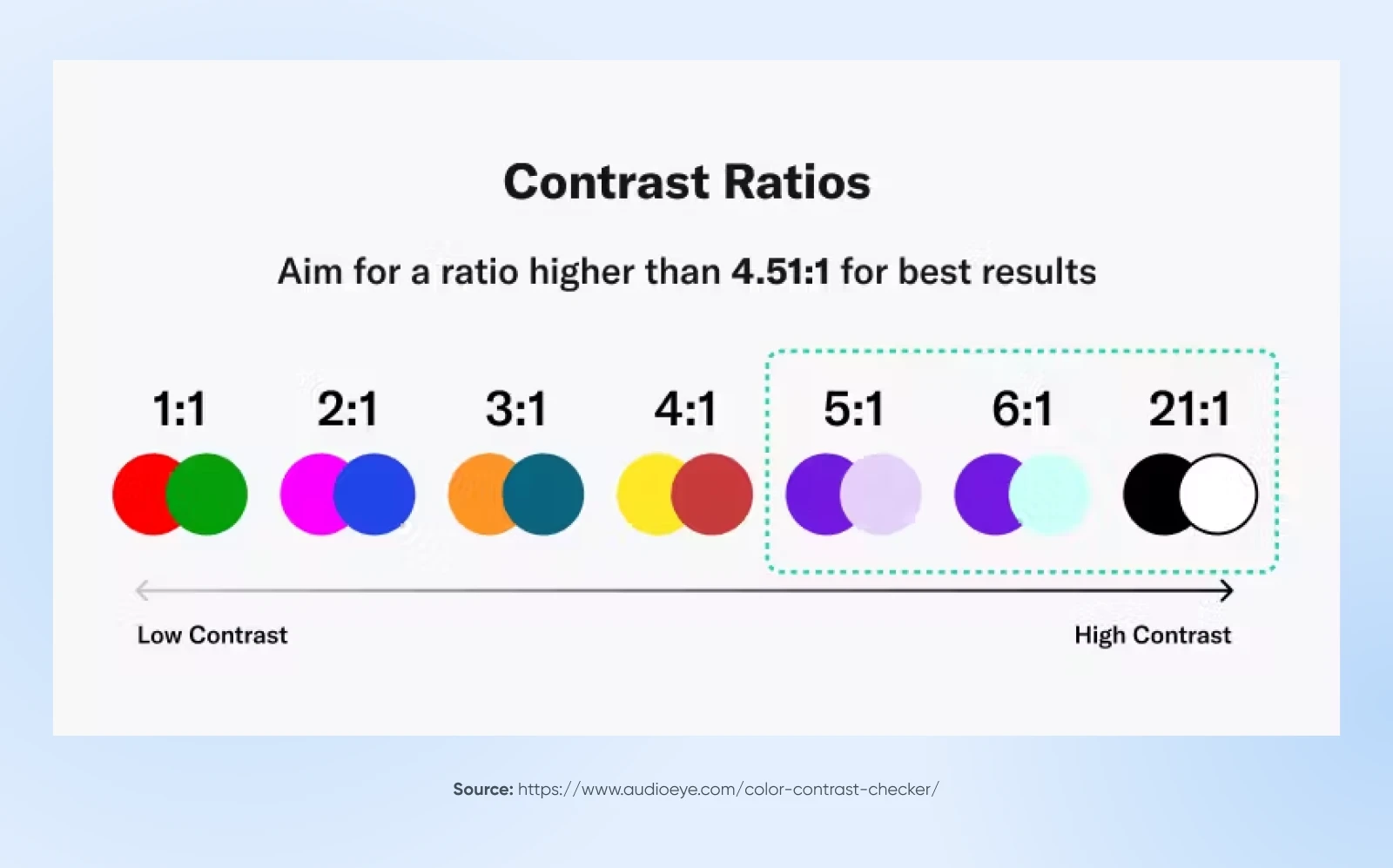
- Make text stand out clearly against the background by creating strong color contrast. A contrast ratio of at least 4.5:1 is recommended to ensure legibility for all users.
If you’ve never had to check the contrast of a design before, there are a lot of helpful, free tools online — like this one from WebAIM.
15. A/B Test and Iterate
One of the most crucial steps in ensuring successful email design is conducting A/B testing.
This process involves creating two versions of an email and sending each to different segments of your subscriber list. By analyzing the results — such as open rates, click-through rates, or conversions — you can determine which version resonates more with your audience.
Let’s cover the quick and dirty steps of running an email A/B test:
Step 1: Define what you’ll test. Focus on one element at a time, such as email copy layout, number of images, or CTA button color. This allows you to isolate the impact of each change.
Step 2: Segment. Divide your subscriber list into two equal groups for a fair comparison. Ensure both groups are representative of your overall audience.
Step 3: Set goals. Determine what success looks like. Are you aiming for more opens, higher click-through rates, or increased conversions? Having a clear goal will guide your analysis.
Step 4: Analyze results. Once the emails have been sent, compare metrics based on your goals. Identify which version performed better, and why.
Step 5: Implement learnings. Apply the winning elements to future email designs and continue testing other components, to keep the improvements rollin’.
4 More Resources for Website and Email Marketing Success
Looking for more ways to achieve email and website design excellence?
We’ve pulled together some of our favorite resources for achieving even more success when you’re navigating the world of online marketing:
- For a web design refresh or first-time crash course, don’t miss the Top 7 Basic Elements of Web Design.
- Trying to decide if it’s time to shell out for a digital upgrade? Check out Time for a Website Redesign? 7 Ways To Know.
- Decided your website needs a renovation? Allow us to be your guide in Your Website Redesign Checklist for an Incredible Revamp.
- Design isn’t everything. Deliverability is also key to email marketing success. WP Mail SMTP increases email reliability for WordPress users.
Which Best Practices for Email Campaigns Will You Try?
Just like that (OK it was kinda long, sorry!), you’ve now got 15 proven email design best practices in your toolkit, from optimizing for mobile and creating clear hierarchies to choosing the right fonts, learning the ins and outs of white space, and of course, A/B testing.
The next step is simple enough —get out there and start applying these tips to your email campaigns and see the results for yourself!
Feeling the pressure now more than ever? Slow down, we have just the solution.
For those readers out there who need to get more subscribers, visitors, and sales but simply do not have the time to upgrade their website and marketing campaigns, check out our Pro Services team.
From SEO to social media and beyond, our diverse and skilled experts can do exactly what you need to boost the marketing experience and help grow your small business.


