Steroids aren’t just for bodybuilders.
Imagine: Website analytics on steroids.
Using Looker Studio (formerly Google Data Studio) to build a custom analytics report is like juicing up your most important data to help you track, understand, and optimize your website.
Looker Studio is extremely powerful, which means it can also be a bit complicated.
But, for this guide, we’ll start with the basics. Together, we’ll walk through setting up your first analytics report and starting to customize it for you, your team, and your business.
What is a Google Analytics Report?
Google Analytics reports display, combine, and visualize key analytics data in a single dashboard to make it easier for stakeholders to understand and make decisions. Using data from Google Analytics (a website analytics tool for measuring and tracking your site’s traffic), an analytics report helps you understand how many people are coming to your site, where they are spending the most time, and how quickly they leave your site.
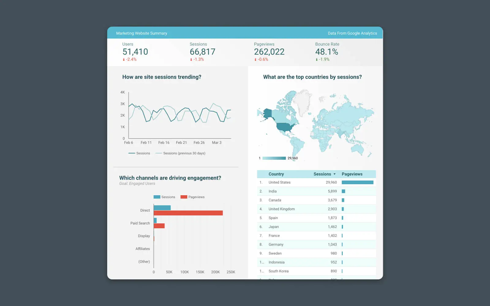
These reports can combine multiple types of data together, making it easier to identify valuable insights, discover trends, and benchmark KPIs from different date ranges.
Why Do You Need an Analytics Report?
You may ask, “What’s the point of building a dashboard if the data is already in Google Analytics?”
Fair question.
And you’re correct that the data you’re adding to your analytics report might already be – technically – available inside Google Analytics. But finding the right data, combining it with other relevant data, and identifying trends is not always easy or obvious. Plus, if you work with a team, other stakeholders may not understand how to read and understand the data from inside Google Analytics properly.
Google Analytics
Google Analytics is a web analytics service offered by Google that tracks and reports website traffic. It is currently a program within the Google Marketing Platform brand.
Read MoreIn other words, creating a custom analytics report just makes everyone’s life a bit easier.
Building a Real-Time Analytics Report in Looker Studio (Google Data Studio)
The simplest way to build a real-time analytics report using Google Analytics data is with Looker Studio.
This reporting tool makes it incredibly easy to build insightful visualizations, charts, and graphs that show your key website metrics and provide more context than traditional reporting tools.
Looker will pull the data from your existing Google Analytics account, format it, and display it in a dashboard. No other tools required!
Best of all, building a basic report with Looker Studio is simple — You only need two things to get started:
- Google account
- Google Analytics installed on your website
Step #1 – Choose a Report Template
Looker Studio has a gallery of 100+ free report templates.
Each template is customizable but offers a great starting point for working with Looker Studio. So before we discuss building a custom report, let’s begin with a template.
Browse the template library and click on the one that best matches your needs.
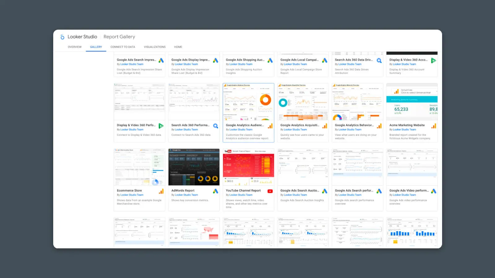
(Note: Some “Featured” templates are only available for purchase.)
For this example, I’m using the Google Analytics Audience report template.
Once it’s opened, click the “Use my own data” option at the top.
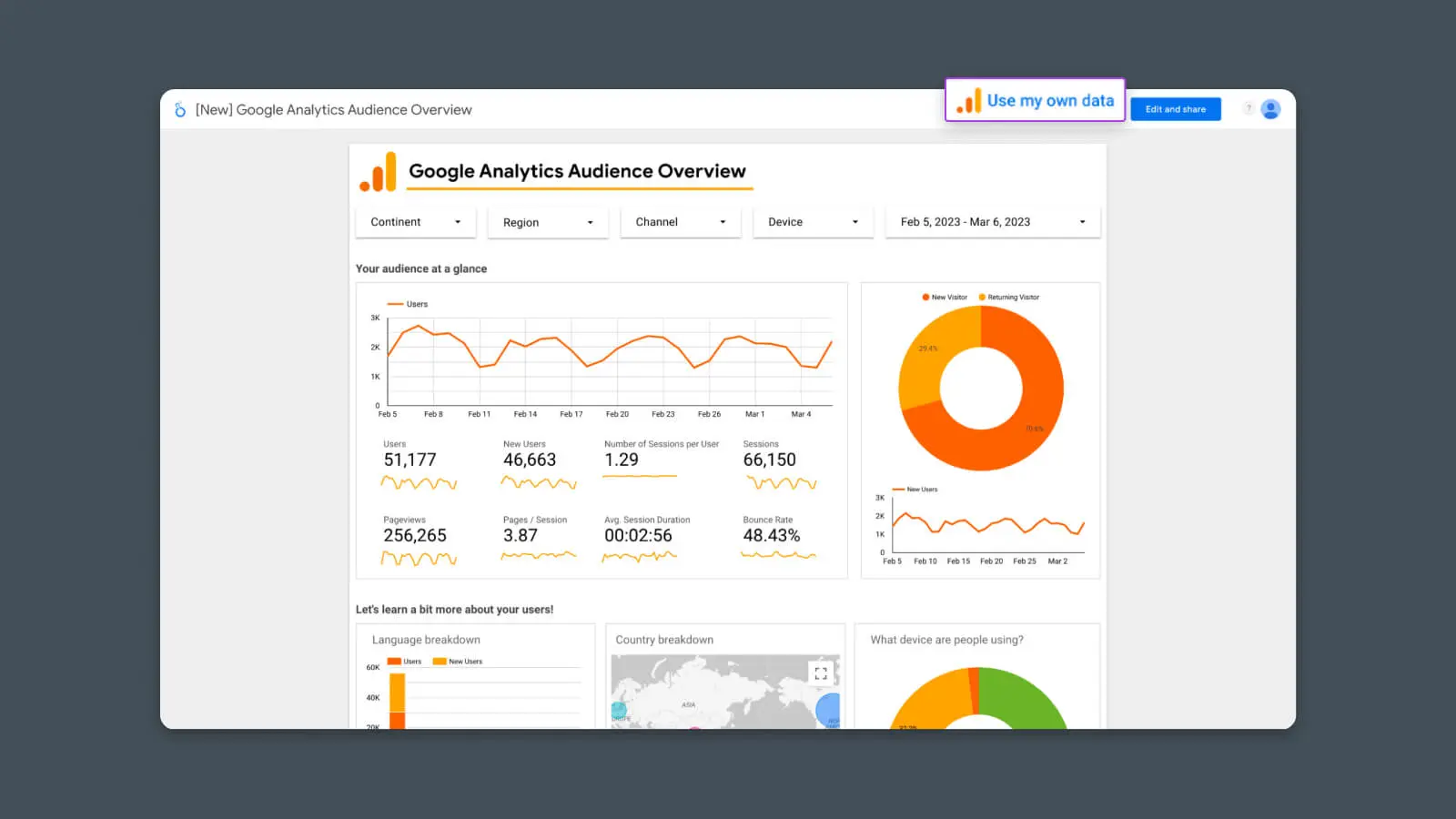
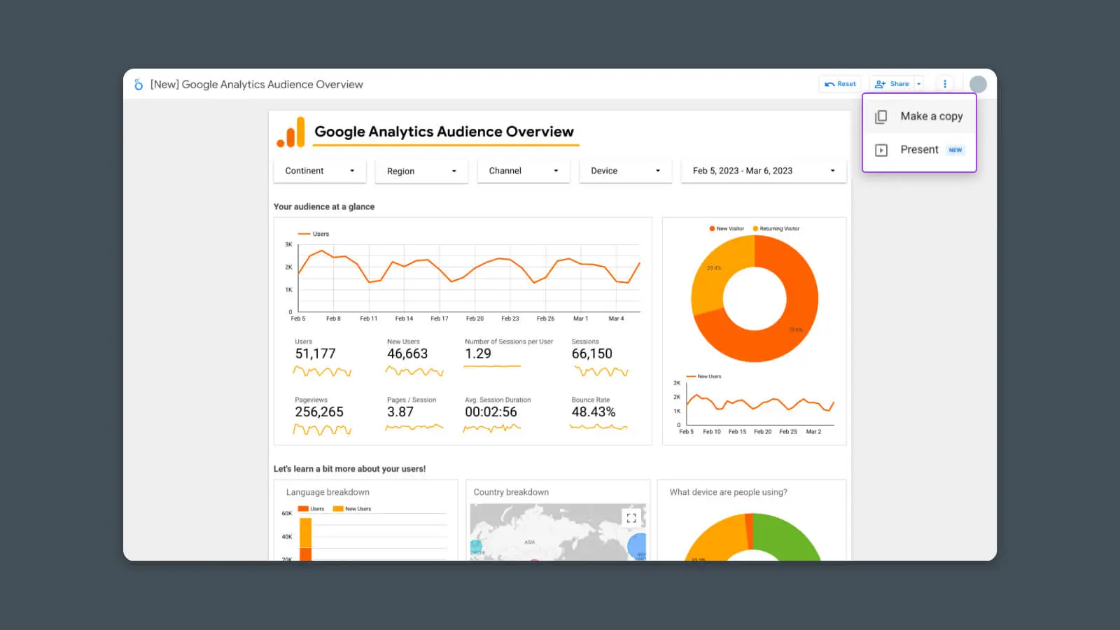
In some cases, you may not see this button. If it’s missing, click the 3-dot menu and select “Make a copy”.
Step #2 – Connect Your Data Sources
As soon as you click “Use my own data,” you should see a new screen asking you to authorize Google Analytics access for Looker Studio.
Click the “Authorize” button.
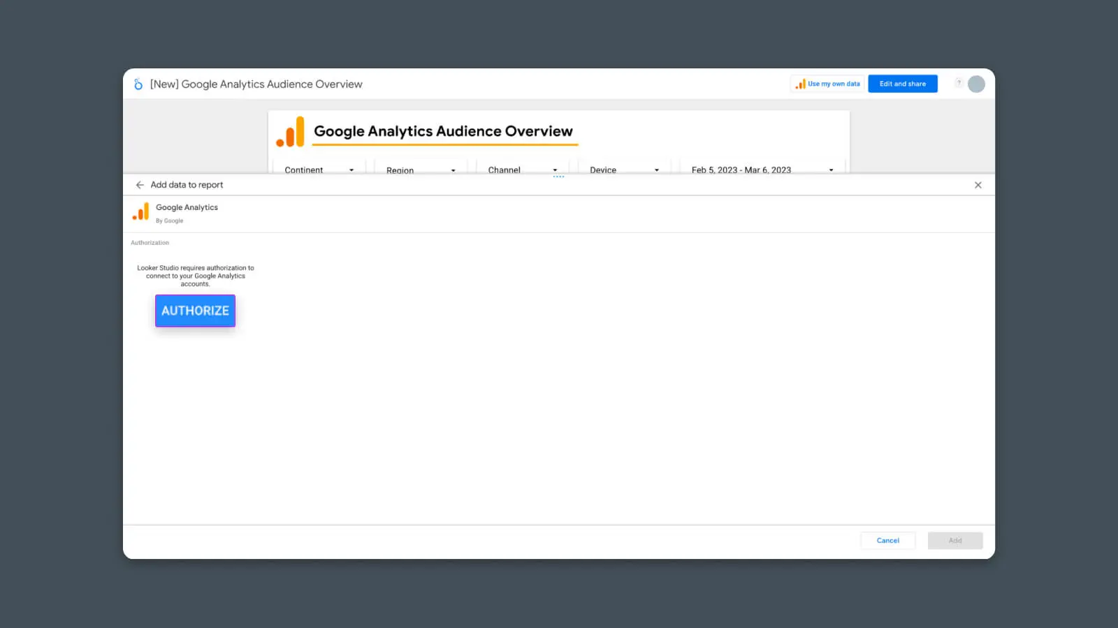
This allows Looker Studio to access your analytics data.
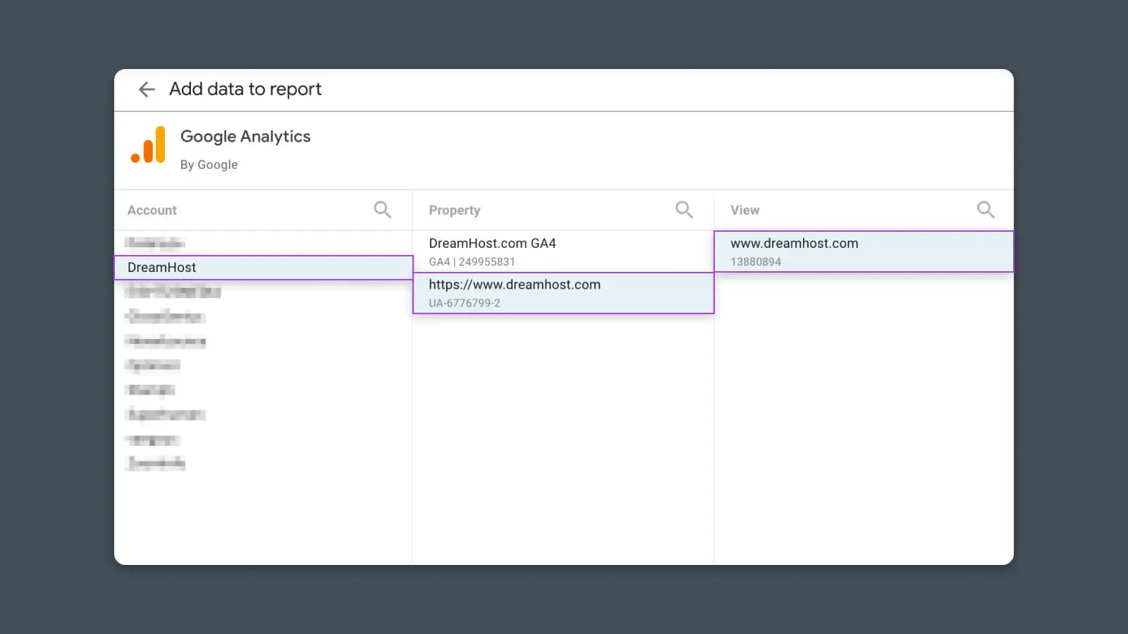
After you click “Authorize” and confirm, you should see a list of your connected Google Analytics accounts. Select the Account, Property, and View that you want to use for this report.
Voila!
With that done, the report should refresh and display your data!
You’ve just created your first Looker Studio analytics report! Take a second to soak in the glory.
Step #3 – Customize the Report
With the basic analytics report set up, now we can think about customization.
Start by clicking “Edit and Share” in the top right corner.
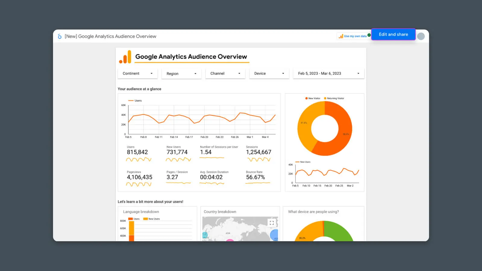
Now the report should refresh again, and you’ll notice that:
- It’s in “Edit” mode
- The report is now a “Copy”
From here, you can start to change the report to better fit your needs.
Ways you can customize Looker Studio analytics reports:
- Change the layout or design by moving charts from one spot to another
- Delete data that isn’t relevant to your use case
- Add new charts by clicking “Add chart”
- Add another page of data by clicking “Add page”
- Connect more analytics tools by clicking “Add data” to display or combine metrics from multiple data sources (e.g., Google Search Console, Google Ads, Google Sheets)
- Edit the existing charts and reports to change the data they display and how it appears
- Set the date range for individual charts to create static views or benchmarks
8 Analytics Dashboards for Tracking Different Metrics & KPIs
The first example is just the start.
Using Looker Studio, you can quickly and easily create analytics reports for almost any use case, industry, stakeholder, or campaign.
Website Visitors and Traffic Behavior
Better understand how people use your website by building dashboards that show vital metrics for the success of your website or blog.
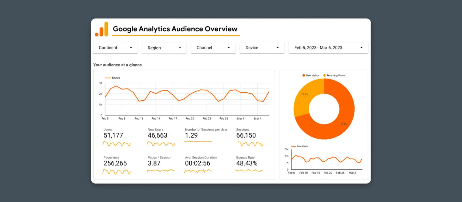
Get a real-time, at-a-glance look at how many people find your website, how often they’re returning, and how quickly your site is growing in popularity.
This report includes these metrics:
- Overall website traffic
- Page view numbers
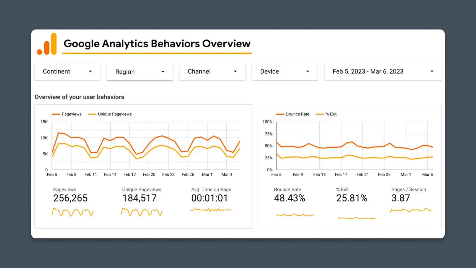
Assess the functionality of your website by building a dashboard for crucial UX metrics like:
- Session duration
- Bounce rate
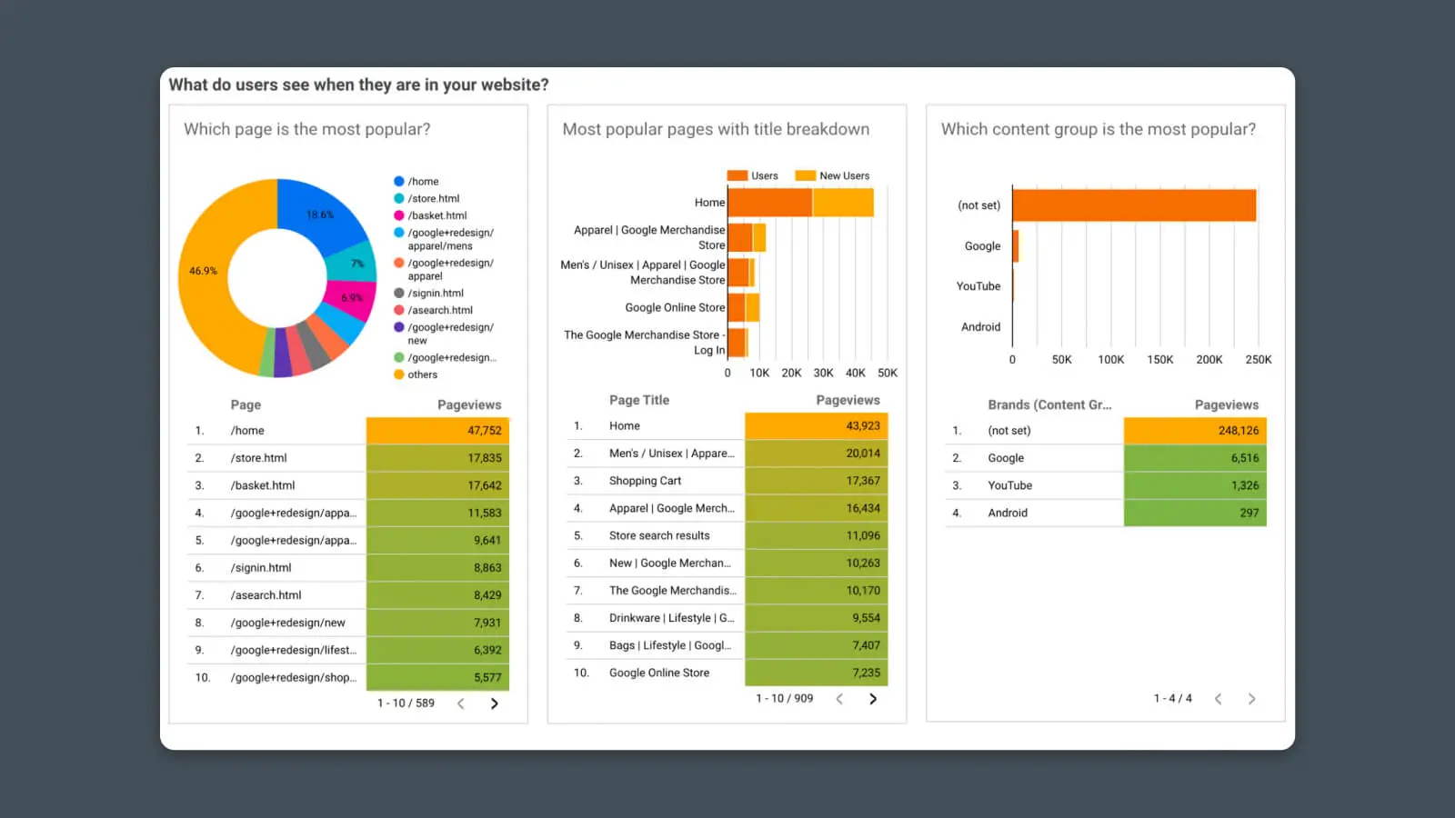
Better understand how users find your website and navigate it. Looking deeper into the behavior report, we can see the most popular content and interactions.
- Site content data (traffic to specific web pages)
- Landing page reports
Traffic Sources, Acquisition, and Marketing
Once you know how much website traffic you’re receiving, then you’ll probably want to know how users are finding out about your website in the first place.
You can create custom analytics reports to track your traffic sources and marketing channels using Google Analytics and other sources.
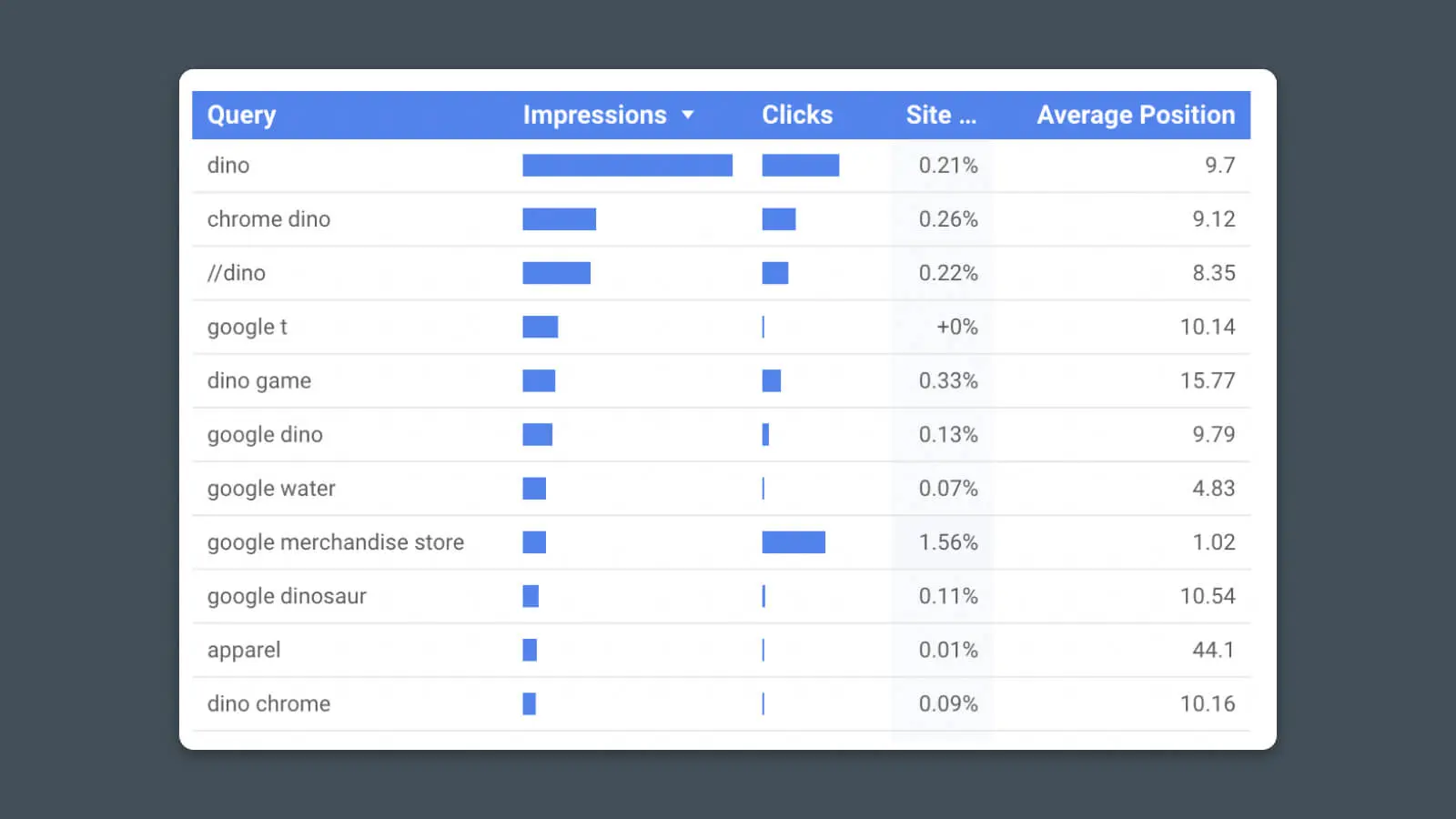
See how much traffic you receive from search engines like Google and which pages perform best in search. This report template uses data from Google Search Console.
Click-Through Rate (CTR)
Click-Through Rate (CTR) refers to the percentage of users that click on a specific link. Ideally, you want as many users as possible to click on URLs leading to your website or to the products and services you’re promoting.
Read MoreMetrics:
- Search impressions
- Clicks per page
- Click-through rate (impressions/clicks)
- Ranking (position) for important keywords
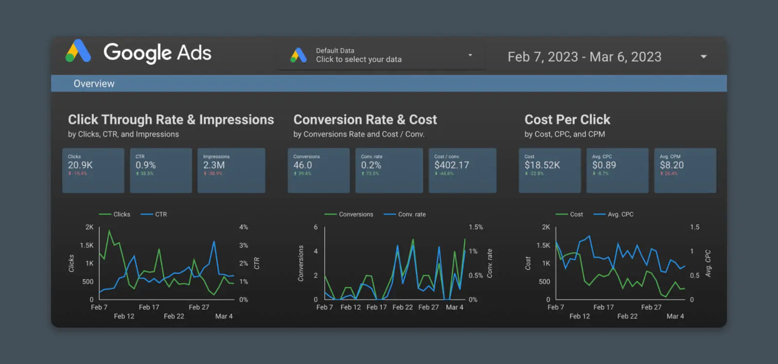
Track the performance of your advertising campaigns. Whether it’s Google Ads (PPC), or the latest billboard you put up on Route 66, with the correct tracking, you can see exactly how your ad dollars are working for you.
Metrics:
- Traffic and visits
- Click-through rates and ad impressions
- Cost per click (CPC)
- Conversion rates and cost per conversion
6. Marketing Dashboard
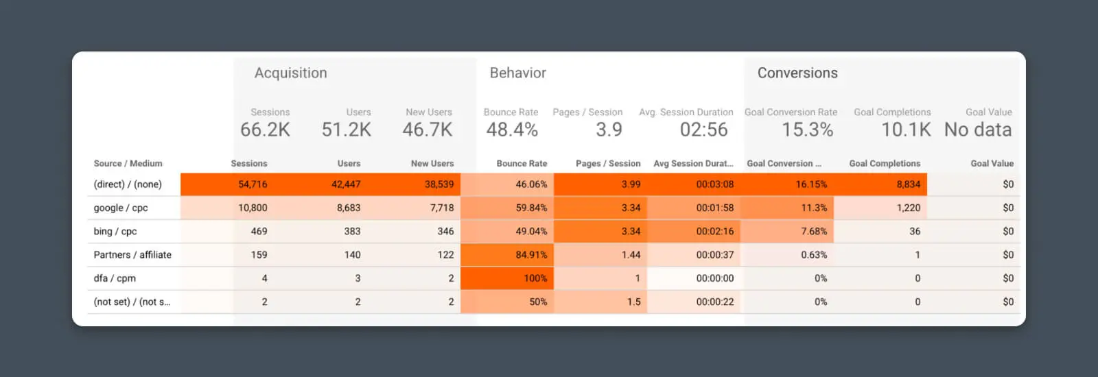
Decide whether all those marketing efforts are paying off with a marketing dashboard. View a snapshot of traffic from your digital marketing channels, content marketing, social media, and more.
- Traffic by channel
- Referral traffic from other websites
Conversion Performance
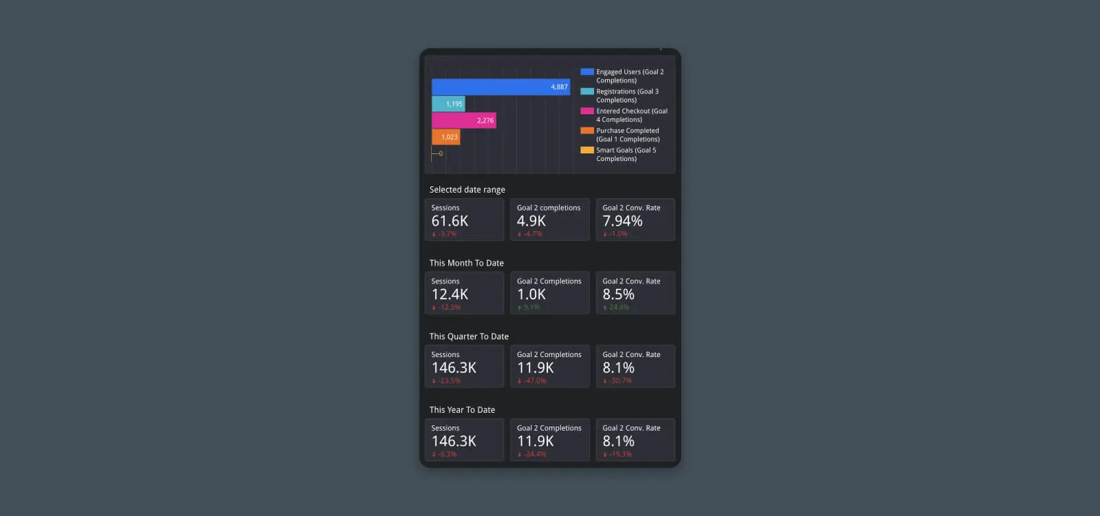
The buck stops here. Drill down into the performance of your website to better understand revenue attribution, conversion rates, and more.
Metrics:
- Goal completions
- Goal conversions
- Conversion rate
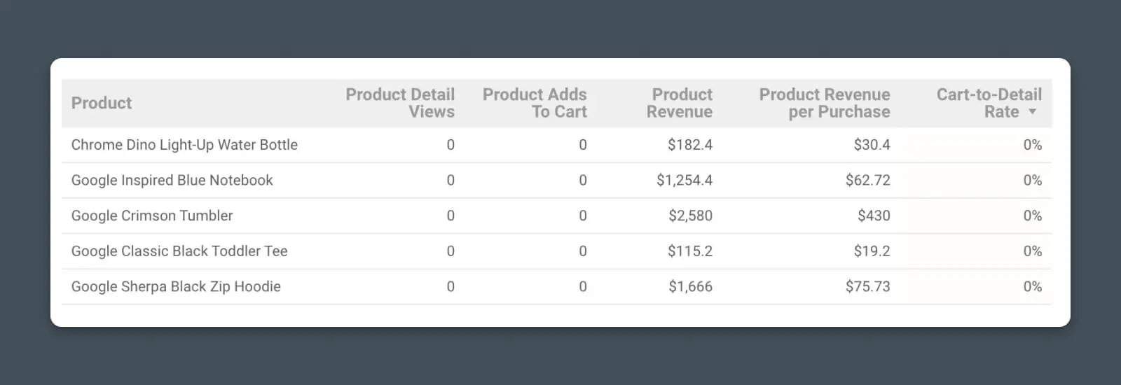
Whether you’re selling widgets or wool coats, you can pipe data from Analytics and e-commerce platforms to track key business performance:
- Product sales and revenue
- Product conversion rates
- Shopping and add-to-cart data
(Bonus) Creating a Custom Looker Studio Analytics Report
Okay, you asked for it.
We’ll go one step beyond the basic report and show you, step-by-step, how to create a custom chart from scratch and add it to your analytics report.
Once you’ve mastered this process, you’ll basically be unstoppable with Looker Studio.
Step #1 – Connect Data Source
We begin by adding a new page to my Looker Studio report (Page > New Page), but you can also follow the steps to add a new chart to an existing page.
Once you have the page where you want to add data, you’ll need to connect your data source. This can be Google Analytics, Google Search Console, Google Ads, Sheets, or various other sources.
Click “Add data” and select your data source.
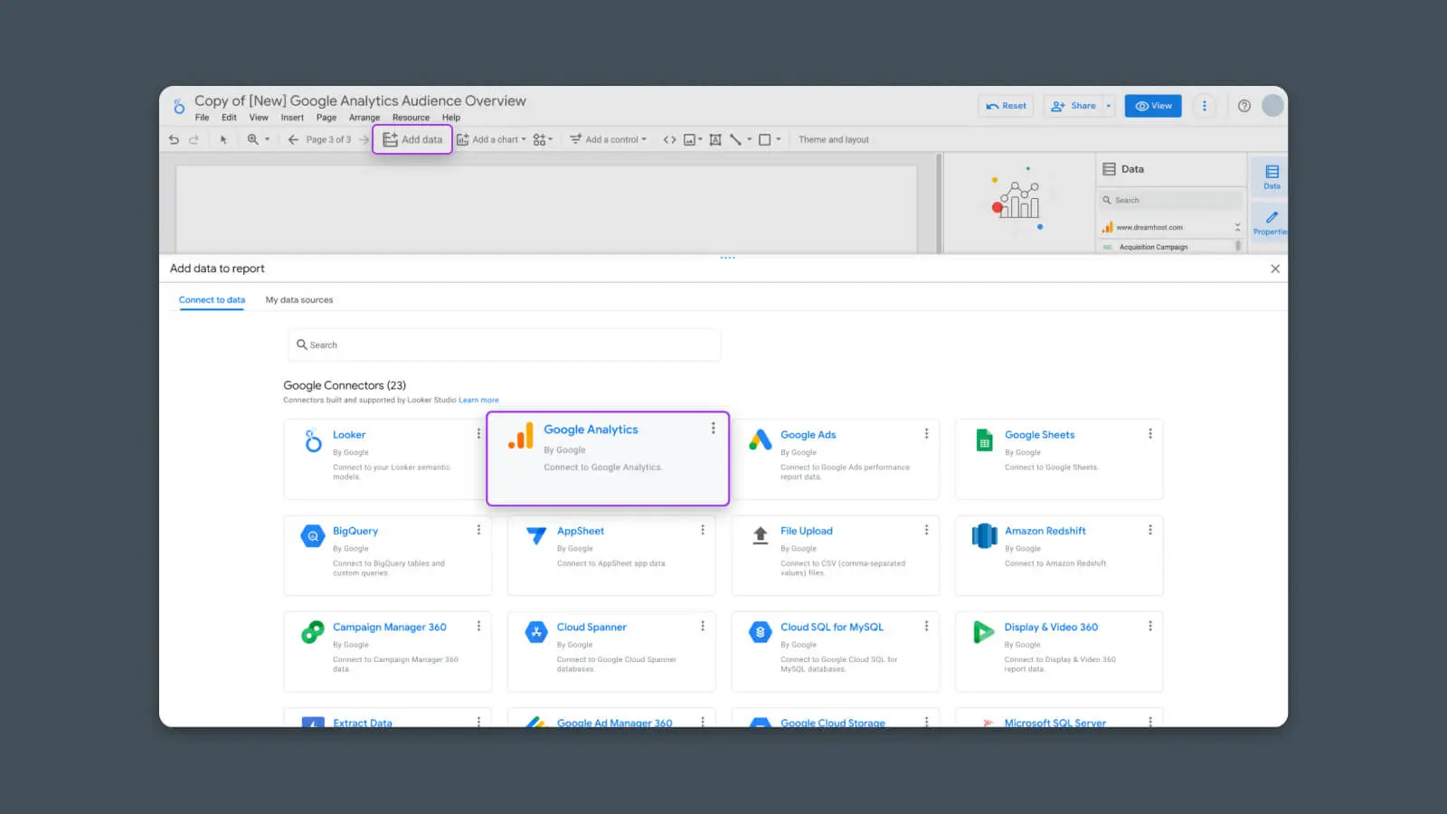
I’ll use Google Analytics for this example.
Once you select your data source, it will ask you to connect to Looker Studio and enable permissions. Follow the prompts to log in or authorize accordingly.
Step #2 – Choose the Correct Chart Type
Now that Looker Studio can access the data source, we can choose how we want to display the data.
Click “Add chart”.

Here, you’ll see a list of chart options.
(I’m using “chart” as a broad term. Looker Studio considers tables, standalone stats, and everything else a type of “chart.”)
Choose the kind of chart that you want to add to the report.
- Table – Plain-text table for comparing a snapshot of multiple dimensions and metrics
- Scorecard – Plain-text stat for highlighting top-line KPIs
- Time Series – Chart for tracking 1-3 metrics over a period of time
- Bar – Chart for comparing relative amounts or sizes of multiple metrics
- Pie – Chart for showing which dimensions comprise a whole metric
For this example, I’m going to choose a Time Series.
Once you select the chart type, you can click anywhere on the page to add it.
Step #3 – Configure Chart Data Source
Next, you need to configure the chart to pull data from the source you just added.
Click on the chart, and in the right-hand sidebar you should see a section called “Data Source”.
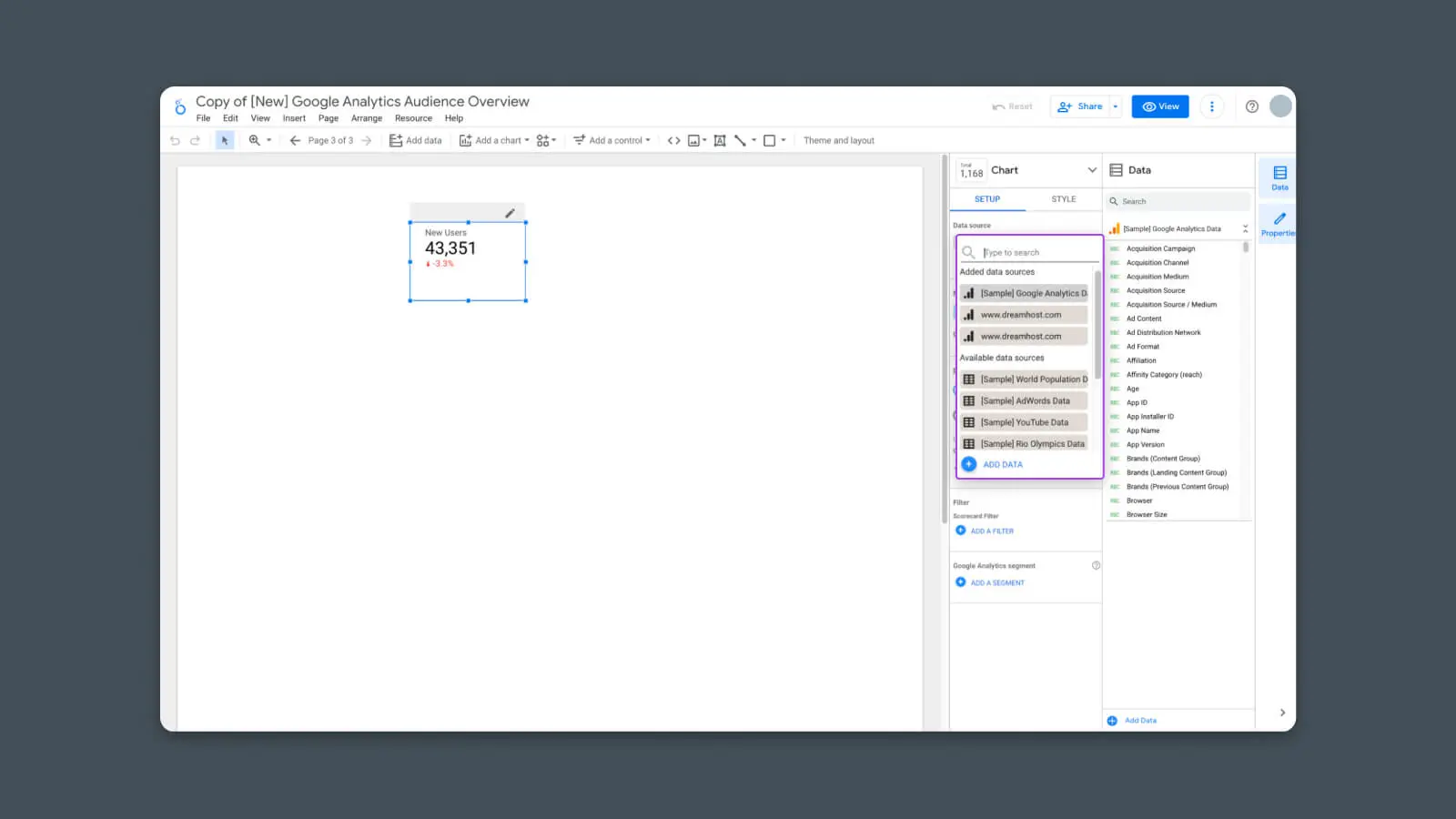
Click on the gray box to select any data sources you’ve added to this report.
Step #4 – Configure Chart Dimensions
Next, choose the dimensions you want to display.
Dimensions are the way we want the data to be segmented. For instance, we may want to display the data by date in a Time Series, or we may want to segment the data by Source if we’re creating a Table of our traffic from various marketing efforts.
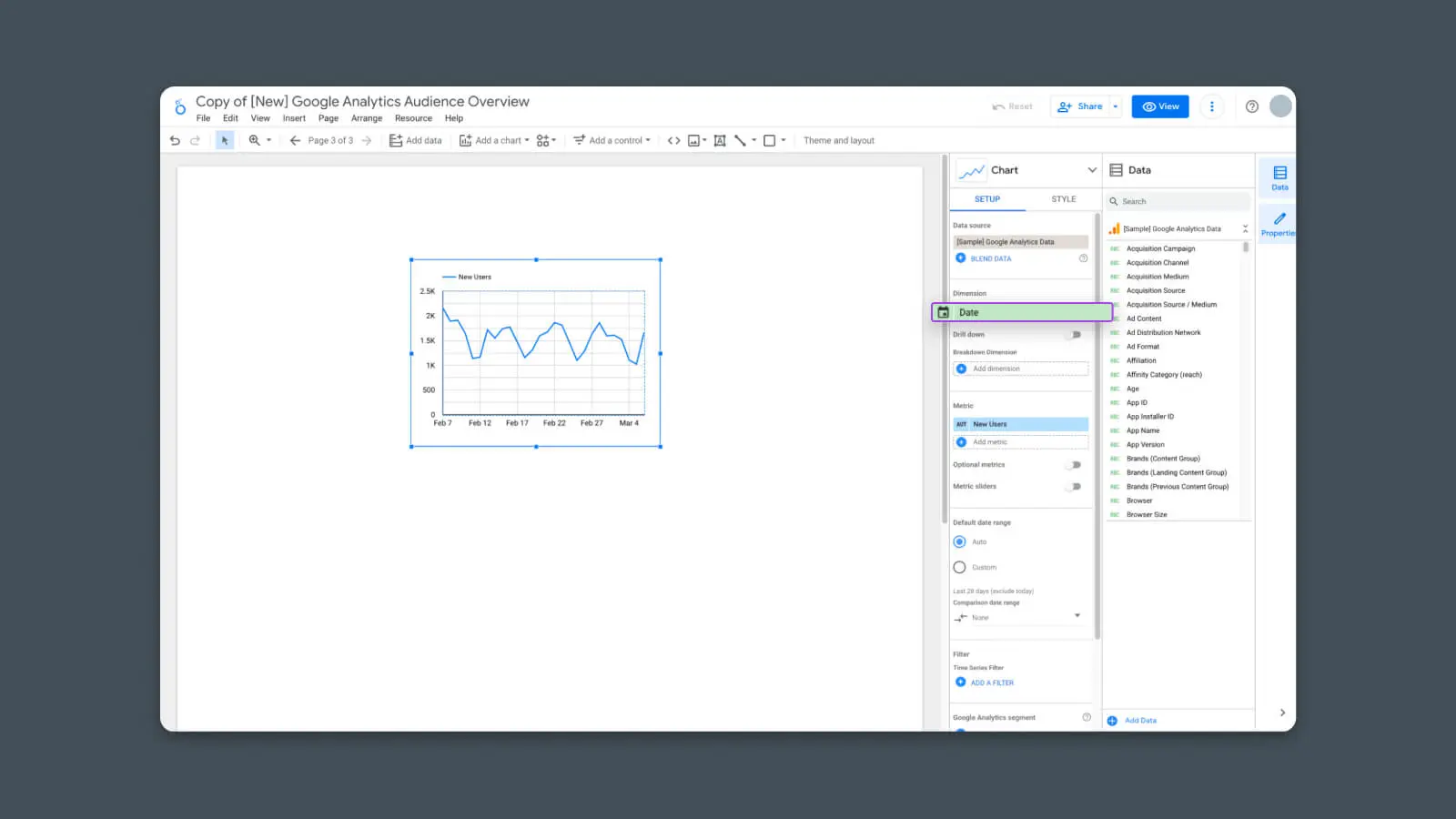
Looker Studio will show relevant dimensions depending on which type of chart you’ve selected.
Since I’m using a Time Series, I’ll choose “Date” as my one and only dimension.
Step #5 – Configure Chart Metrics
Once we’ve chosen the data dimensions, we can now select the metrics.
Metrics are the actual data points we want the report to show. It could be things like Sessions, Conversions, Time on Page, or any other numerical value. You can add multiple Metrics to compare them in the same chart.
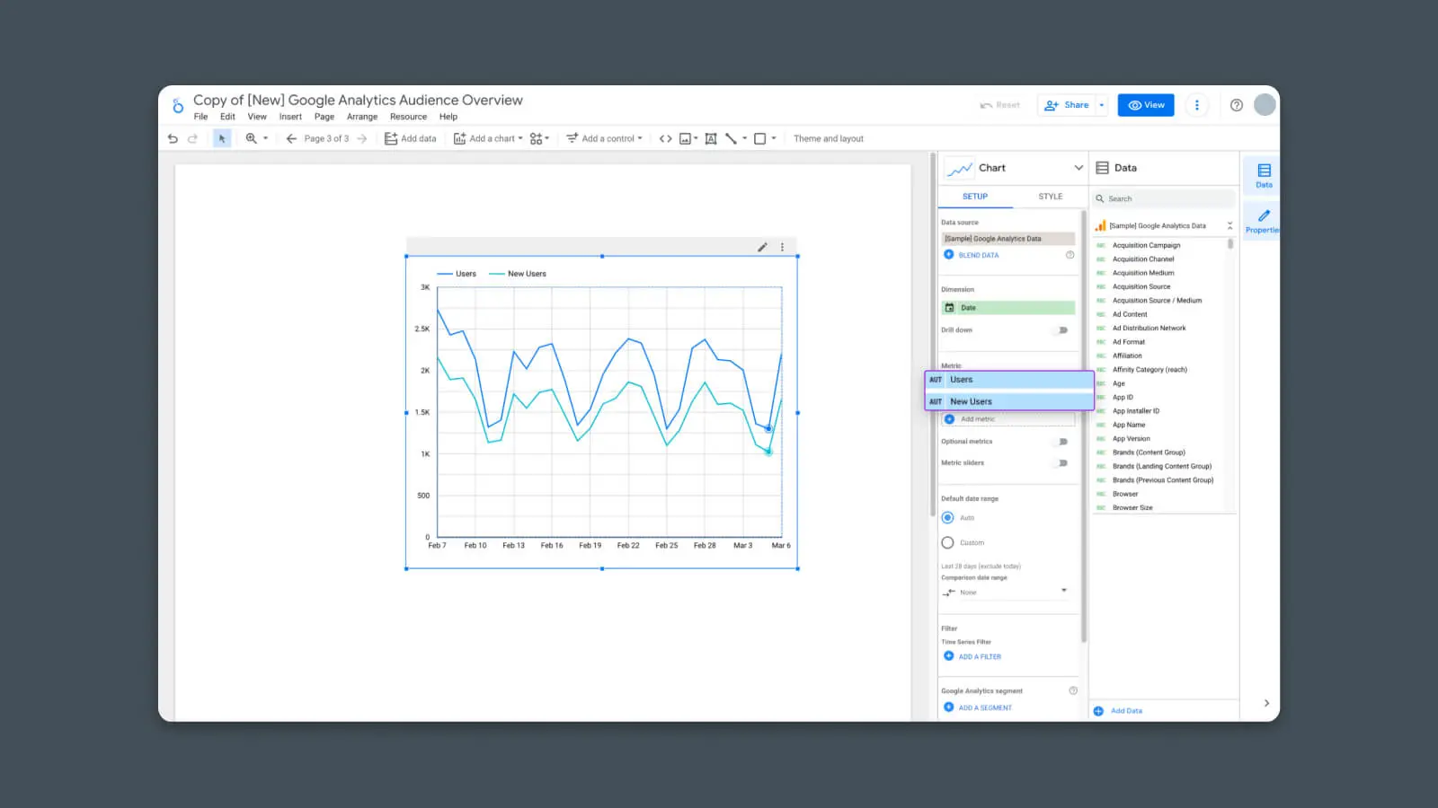
In my example, I chose to show both Users and New Users. You can see in the chart that there are now two lines comparing these two metrics versus the selected dimension (Date).
And now the chart is finished — It’s displaying the data that I’ve selected.
But we can go one step further.
Step #6 – Configure Comparison (Optional)
As an optional step, you can also compare the data here with data from a previous period. For instance, if you want to see how this month’s performance compares to last month’s.
To do this, simply find the option in the right-hand sidebar that says “Comparison date range”.
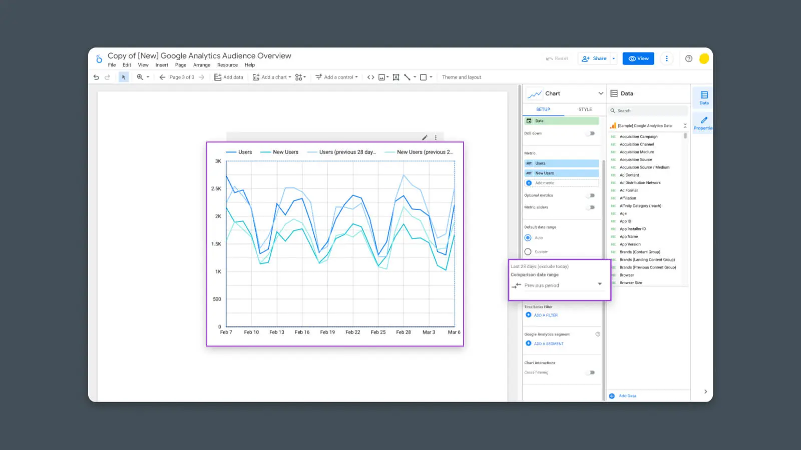
Open the drop-down to choose the previous dates you want to compare.
Choosing “Previous Period” is a good default option that will show you an apples-to-apples view of data from this current time period (which defaults to the last 28 days) versus the previous time period (prior to 28 days).
Now, there you have it — It’s a brand new, built-from-scratch chart!
A Final Note: Google Analytics 4 is Nigh
As we’re writing this, Google Analytics 4 is about to replace the current version of Google Analytics (Universal Analytics or “UA”).
But one thing you should know for this guide: any report templates that use Universal Analytics will not work with GA4 data. Bummer, I know.
Most of the current GA4 templates cost money, but a few examples, like the one from Metricized, are free with your email address.
We’ll continue to update this post in the future when there are more GA4 templates and reports available.
Armed with these new skills, you should be able to create and showcase any data you need to help you run your website with the precision of a heart-surgeon-turned-website-owner. For now, go forth and build the reports of your dreams. (Or your boss’s dreams.)

Grow with Confidence
Our marketing experts can help you build perfect reports and dashboards for your business.
Learn More