If you work in any design field — graphic design, UX design, web development — you need a portfolio.
For designers and other creatives, an online portfolio helps serve as a record of your work, where you can see your progress over time and show off past projects to potential clients and employers. It also helps you establish credibility, build your personal brand, network with others in your field, and demonstrate your skills.
But as we all know, self-promotion is never easy. That’s where this guide comes in. If you need some inspiration for your personal portfolio, keep on scrolling. Below, we have 26 design portfolio examples — from the best of the best — to help you get the ball rolling on your own. Learn from these greats and get ready to show off your best work.
What Is a Design Portfolio?
A design portfolio is a collection of your work as a designer, showcasing your skills, experience, and creativity. It is typically a digital collection of images, videos, or other media that displays your design work in a professional and polished manner.
Why Do You Need a Design Portfolio?
As a designer, a portfolio is essential because it serves as a visual representation of your skills and experience to potential clients, employers, or collaborators. It allows you to showcase your design work and demonstrate your ability to solve design problems, work within constraints, and deliver effective design solutions.
Here are a few reasons why you need a design portfolio:
- To showcase your skills: A design portfolio is a great way to showcase your design skills and expertise to potential clients, employers, or collaborators. By presenting your work in a professional and polished manner, you can demonstrate your design abilities and communicate your value as a designer.
- To differentiate yourself: In a competitive design field, having a portfolio that stands out can help you differentiate yourself from other designers. By showcasing your unique style, approach, or perspective, you can demonstrate your creativity and show that you bring something special to the table.
- To build your brand: A design portfolio is also an opportunity to build and develop your personal brand. By presenting your work in a consistent and cohesive manner, you can establish your identity as a designer and create a lasting impression on potential clients, employers, or collaborators.
- To attract new clients or employers: A design portfolio can help you attract new potential employers and clients by demonstrating your ability to deliver effective design solutions. In addition, by showcasing your past successes and highlighting your design process, you can build trust with potential clients, employers, or collaborators and increase your chances of being hired.
26 Design Portfolio Examples You’ll Want to See
Ready to build your own portfolio? Before you get started, check out these portfolio websites and examples — some of the trendiest, most creative, most innovative portfolios on the web — to inspire you.
1. Bruno Simon
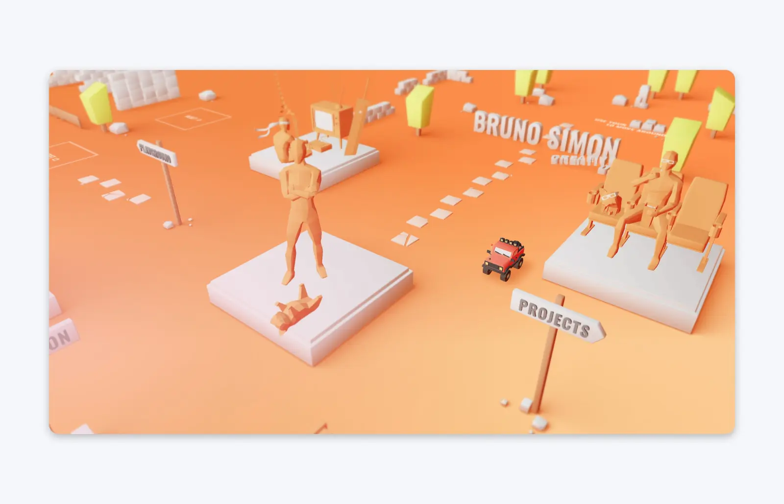
Bruno Simon, a creative developer based in Paris, has one of the most unique portfolio sites you’re going to see anywhere. After entering the portfolio, you can use your keyboard to drive a small car around a virtual world, parking it at Simon’s past projects to view them in more detail.
In 2020, Simon’s incredibly creative portfolio won Site of the Year at awwwards. This format isn’t one that would work for every designer — but if you can pull off an eye-catching, standout design like this, it’s a great way to make your portfolio stand out from the crowd.
2. Sophie Brittain
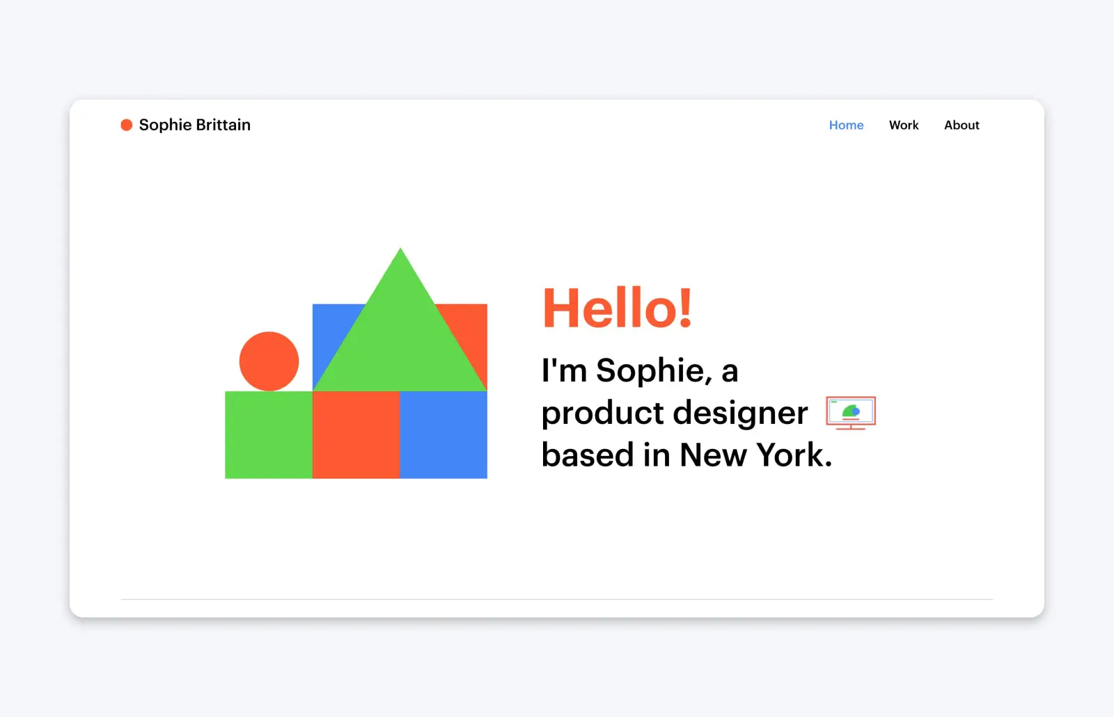
Sophie Brittain, a product designer based in New York, went a much simpler route with her online portfolio. After a fun, colorful loading page, Sophie’s portfolio looks similar: Lots of color (amid plenty of white space to make it pop) and a simple, scrollable homepage that highlights a few of her best projects. It’s designed with minimal flash, but is still effective and memorable.
3. Jessica Hernandez
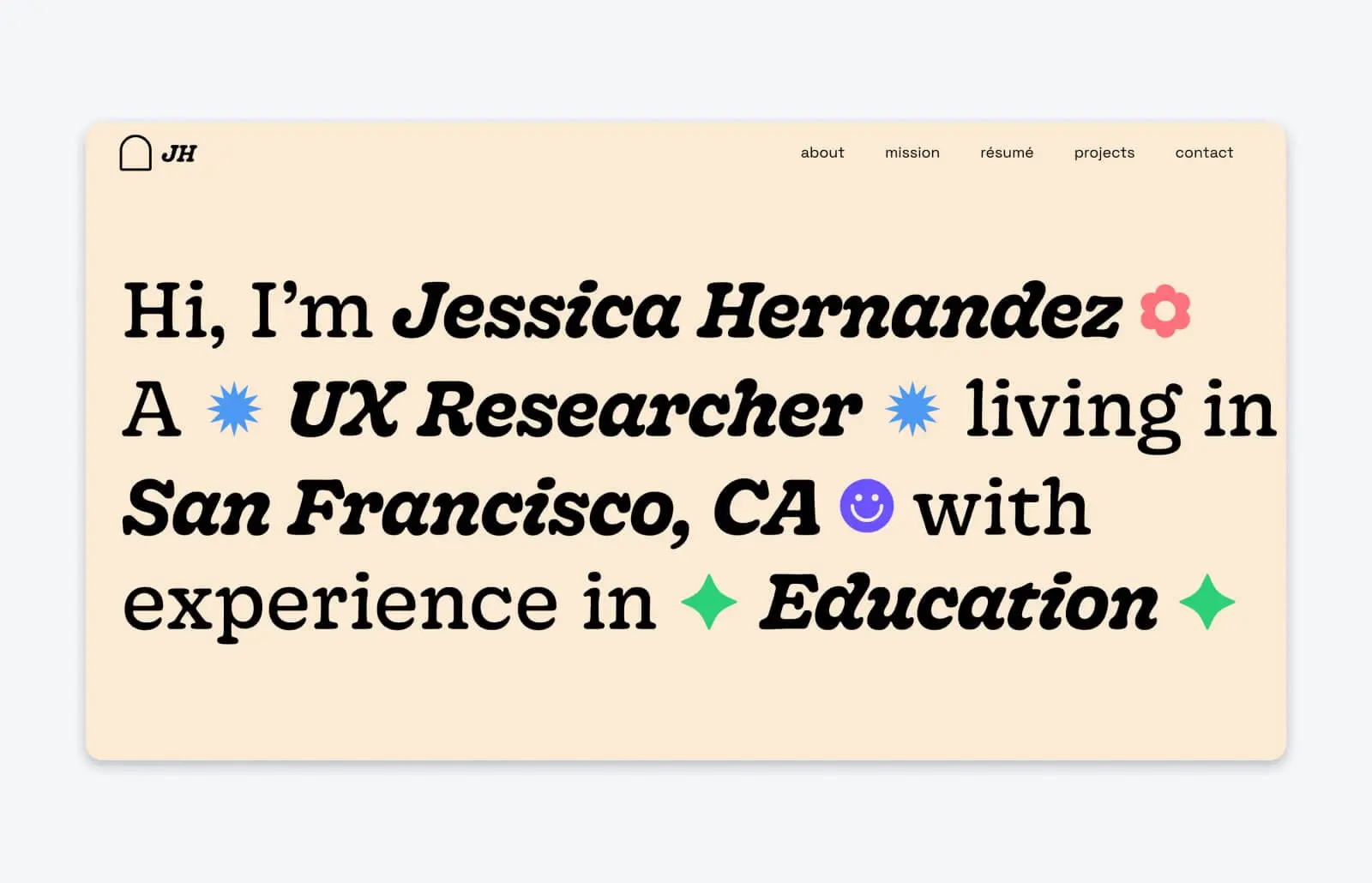
Jessica Hernandez is a UX researcher and school counselor who lives in the Bay Area. Her portfolio is a bit different because of her unique work experience, but it’s still absolutely bursting with personality.
User Experience (UX)
User Experience (UX) refers to how online visitors interact with a website. Users often evaluate their virtual experience based on a site’s usability and design, as well as their general impression of its content.
Read MoreJessica uses emojis and illustrations to let her love of color and design show through in every part of her portfolio. She even includes an interactive section where visitors can “meet” her dog, Neo, and help pick up his virtual toys.
The result is a portfolio that shows Jessica is creative and fun-loving—and if that’s the vibe you need for your project, you’ll certainly want to hire her.
4. Diana Tatarenko
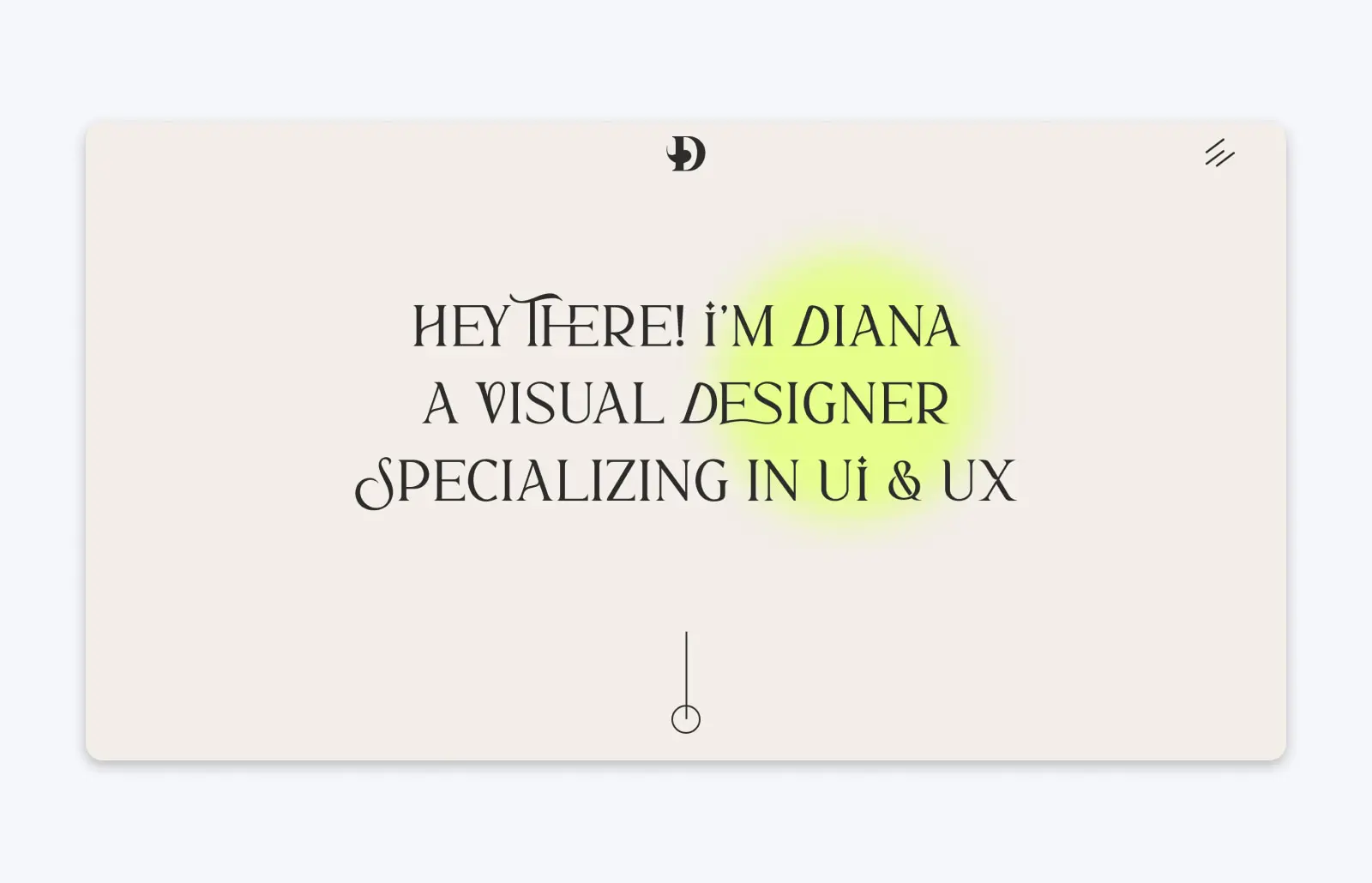
Diana Tatarenko is a visual designer specializing in UX and UI design. Her portfolio has an eye-catching design, filled with clean lines and unique fonts. But what really sets it apart is how Diana presents her previous work to prospective new clients and employers.
Instead of just displaying her designs on a project page, Diana invites her portfolio viewers to get to know her process. For each project, she explains the problem her client needed to solve—and how she helped address it with design. It’s a unique approach that’s sure to help prospective new clients build confidence in her work—before they even meet her.
5. Studio Feixen
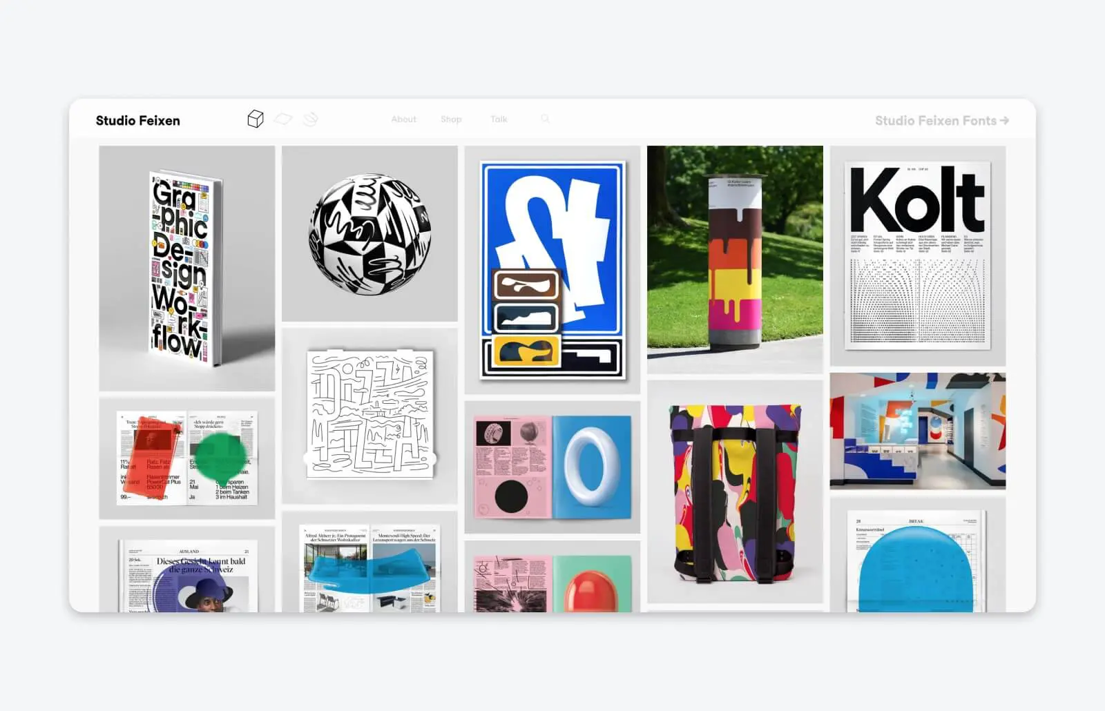
Studio Feixen is a Switzerland-based design studio with a massive amount of work to show off. The studio maximizes its portfolio with different-sized screenshots and graphics that display a ton of their past work—and the images all fit together like a puzzle, making them look cohesive even though they’re all different sizes. It speaks to the studio’s design abilities, helping build confidence in their work.
6. Christina Kosik
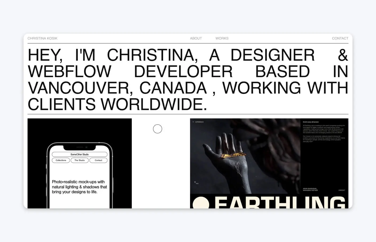
Canadian designer and webflow developer Christina Kosik uses her portfolio to ensure the most important part shines: Her work.
With a simple, minimalist design, Christina makes sure her featured projects stand out — and she makes the unconventional choice to put her work at the top of the landing page, and introduce herself after you’ve scrolled past her work experience.
7. Run Wild Design
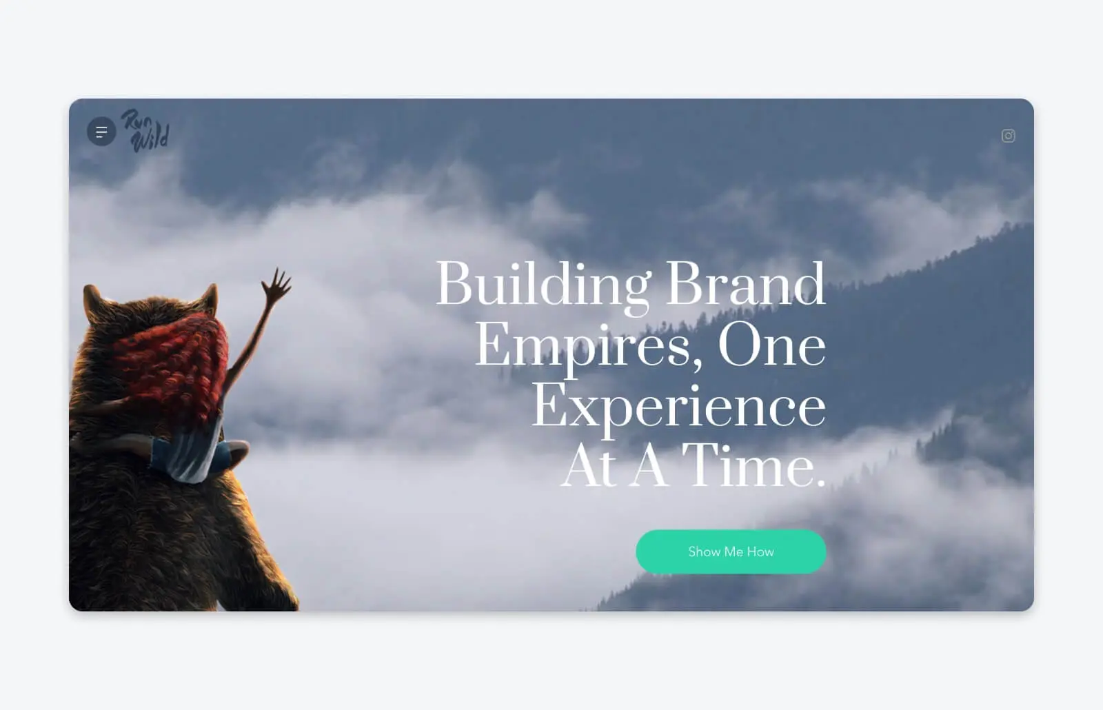
Chris at Run Wild Design wears a lot of hats: UX/UI designer, illustrator, brand developer, and art director, just to name a few. But what Run Wild did well in their portfolio is showcase all of that different experience and expertise without making the site feel cluttered or too long.
Combine that with the creative video background on the landing page, and you have a web design that speaks to Run Wild’s branding capabilities — their page is a study in brand cohesion, showing that this is an agency you can trust to build and develop your project or company’s brand.
8. RoAndCo
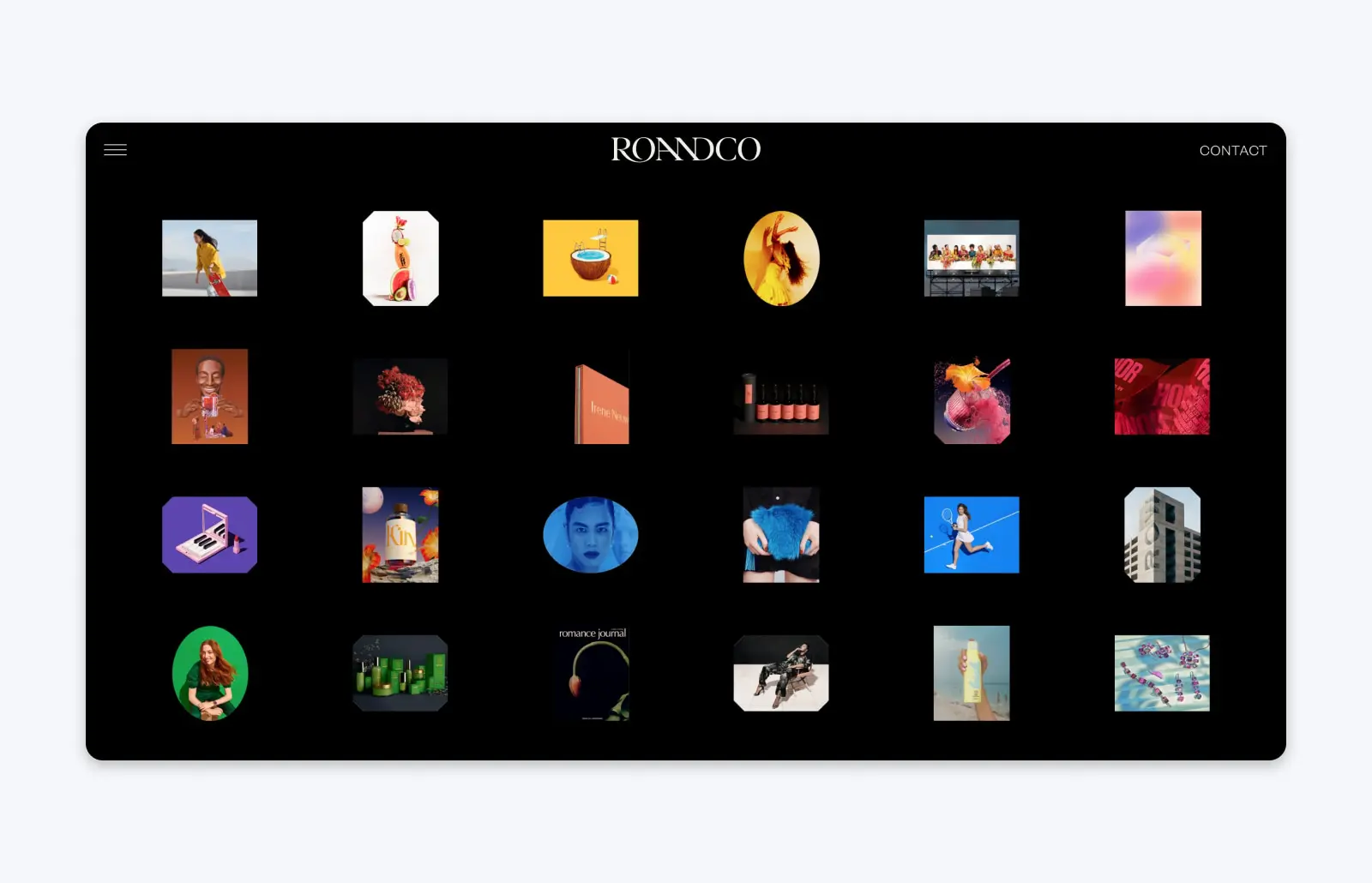
New York City-based design studio RoAndCo was founded by creative director Roanne Adams. The portfolio site really captures Roanne’s editorial experience with its visually pleasing grid layout, split-screen graphics, full-screen videos, and other eye-catching design elements.
What sets RoAndCo’s portfolio apart is how beautiful it is on both a large desktop screen and on mobile. Responsive design can be tricky when you have so many visual elements, but this portfolio shows how it’s done.
9. Brenna Hamilton
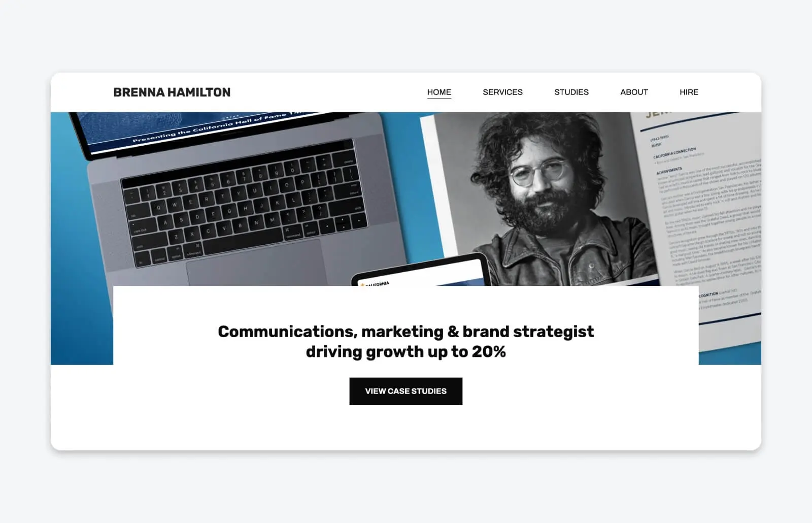
Creative director Brenna Hamilton has a lot of past work to show off on her portfolio, but she uses a sleek, elegant layout to make sure she can fit it all in without making the page seem cluttered or overwhelming.
One of the things that helps Brenna stand out from the crowd is how she backs up the impact of her work. She has an entire page of her portfolio dedicated to case studies of her past clients, showing not only the work she did, but the real-world results it helped deliver.
10. Timothy Maurer
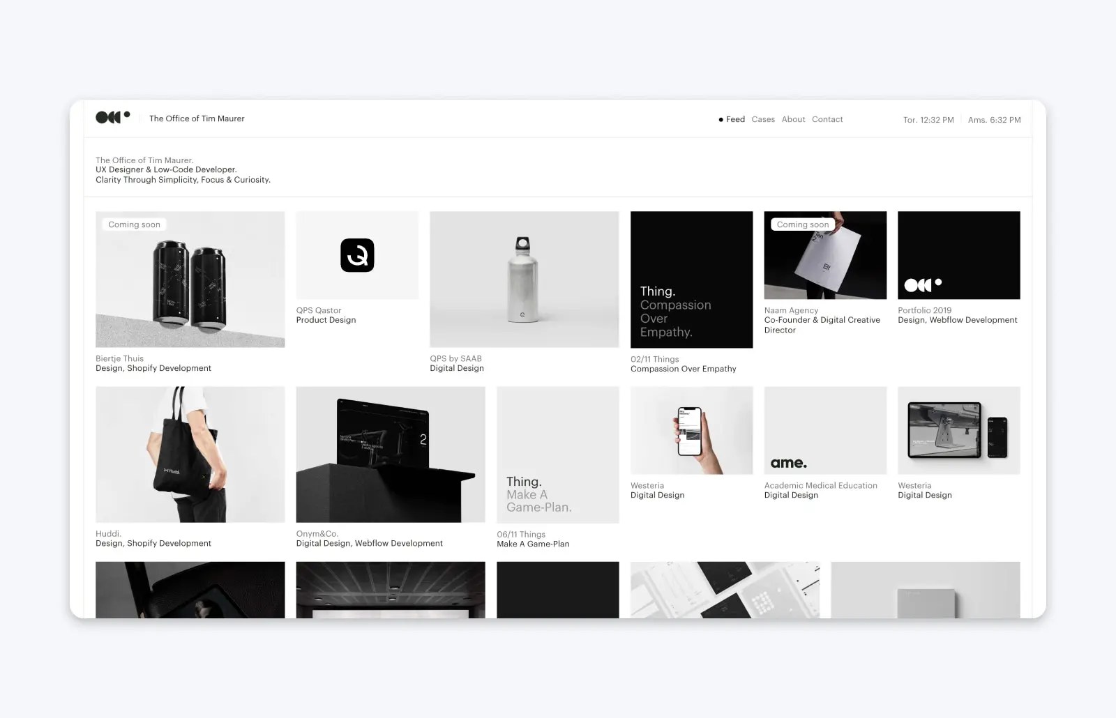
As a UX designer and low-code developer, Timothy Maurer describes his work as: “clarity, simplicity, focus, and curiosity.”
It shows in his portfolio, where he uses a simple layout that creates a long, flowing feed of all his past projects. He has years of experience to put on display, and the simplicity of this portfolio helps him demonstrate the true breadth of what he’s accomplished for past clients — without making the portfolio feel overwhelming.
11. Saloni Joshi
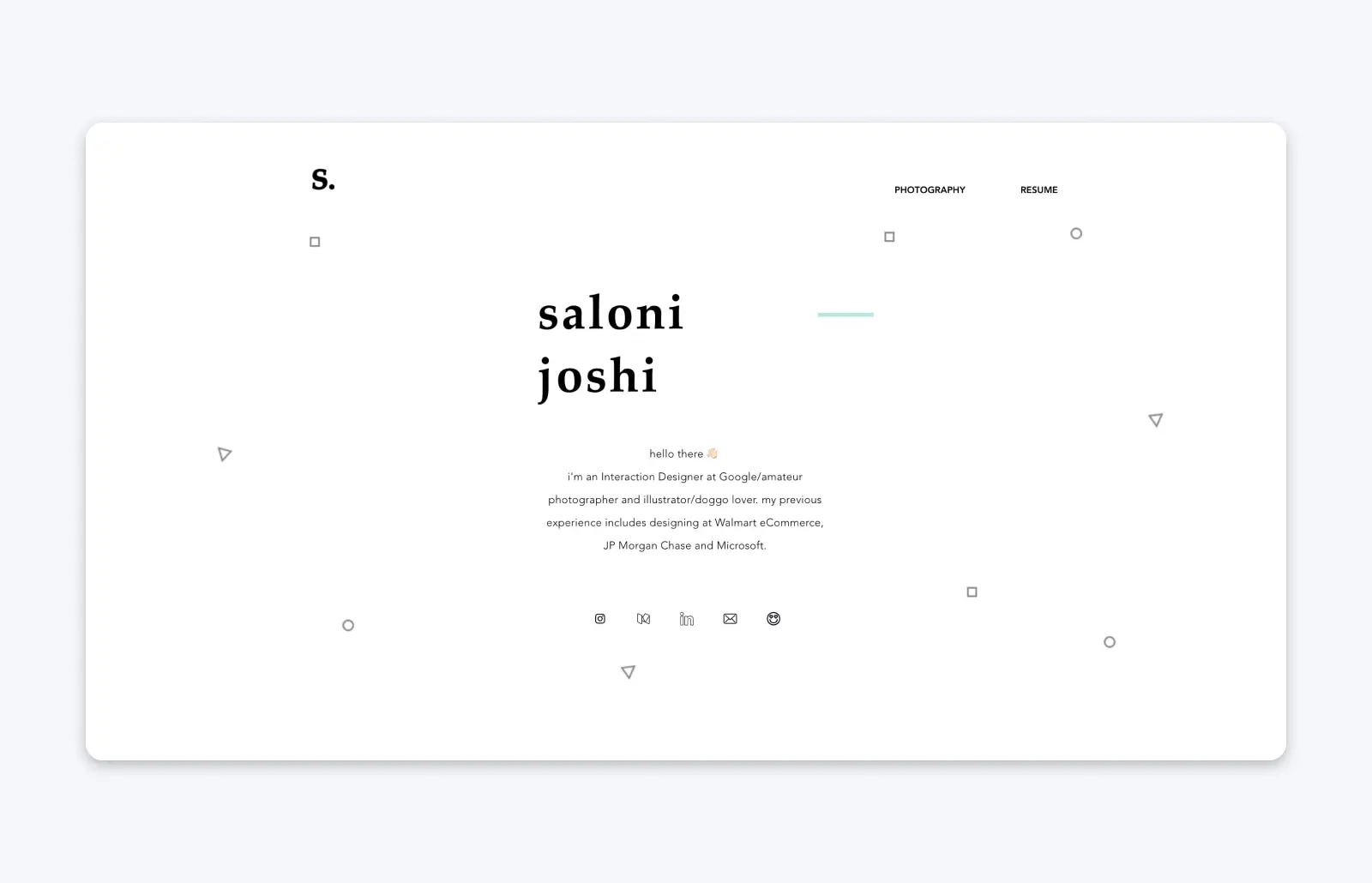
Saloni Joshi is a designer with experience in UX who currently works at Google — but her portfolio spans her career with past projects for companies like Sam’s Club and Dynamic Signal.
Saloni uses a simple, interactive layout that allows visitors to scroll through her work, seeing screenshots and graphics representing the finished project. But clicking on a project takes you to a detail page with a comprehensive case study, where Saloni explains the challenges and process for each piece of work she shares on her site.
12. Robin Mastromarino
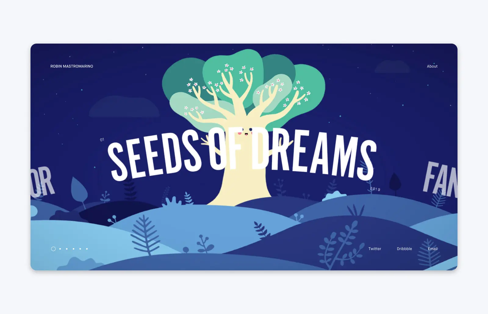
Robin Mastromarino, an interface designer based in Paris, uses some truly unique and memorable website design for a portfolio that stands out from the crowd — and stays on your mind.
Robin’s portfolio uses horizontal scrolling, with animations that make it look like each project is on a wheel, rolling into a full-screen view. The resulting user experience is whimsical, but still highly effective — you get hit with all the color and boldness of Robin’s designs, within an example of the kind of interface you can get if you hire him.
13. Andre Givenchy
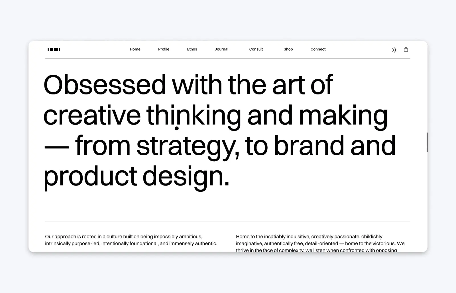
Andre Givenchy is the founder of Segern, a design agency that’s worked with brands like Everyday Unicorns, Bambu Care, and Gander. Andre’s portfolio is straightforward, but there are some key elements that set him apart from the sea of portfolios on the web. He has a keen understanding of social proof — and how important it can be in driving business decisions in the digital age — so his site is bursting with social proof of the impact of his work: examples, reviews, and testimonials to help highlight how many clients he’s done great work for.
14. Dalya Green
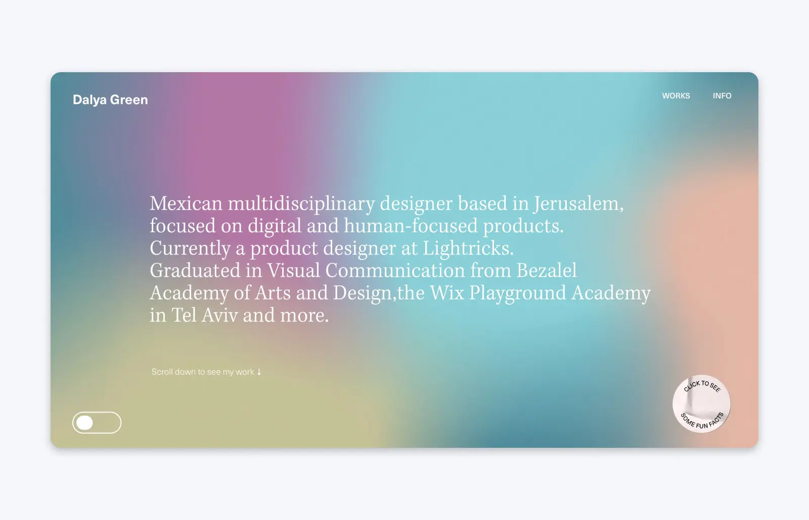
Dalya Green is a multidisciplinary designer based in Jerusalem, and her simple-yet-creative and effective portfolio is only one page, yet still packs a serious punch.
Loaded with color and eye-catching typography, Dalya’s portfolio gets right into what matters: Her work. But while her portfolio puts her experience front and center, she still infuses her personality (and gives visitors the chance to get to know her on a more personal level) with a button you can press for pop-up fun facts about her, like how she starts each morning by watering her balcony garden.
15. Active Theory
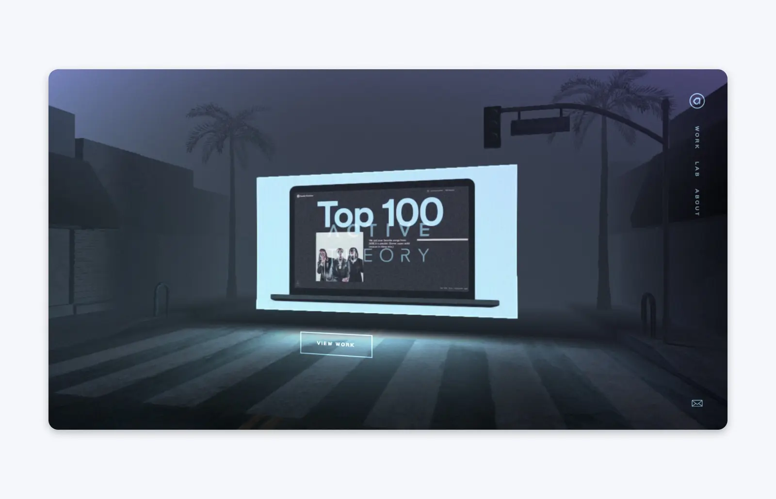
Active Theory, an LA-based creative digital agency, uses its portfolio as a masterclass in balancing your personal brand with the need to cleanly showcase your work.
From the moment you enter Active Theory’s site, it becomes an immersive experience designed to set a mood: dark, grungy, and a little bit cyberpunk. The experience is made even more arresting by mouse-activated screen glitches and other animations.
But when you navigate to Active Theory’s collection of work, the page becomes a lot more simple, with full-page videos guaranteeing that now, you immerse yourself in the agency’s experience and designs. It ensures every visitor focuses fully on what this agency can do, and it’s incredibly effective.
16. Dan Machado
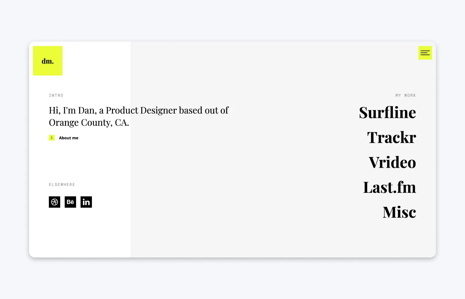
At first glance, Dan Machado’s portfolio looks simple and minimalist. But when you mouse over his list of work, the page explodes with visuals to offer a sneak peek of each project.
Once you click on a project, you’re taken to a detail page where Dan uses a combination of imagery and compelling copywriting to tell each project’s story — he doesn’t just show his work but also his process and impact.
17. Lital Karni
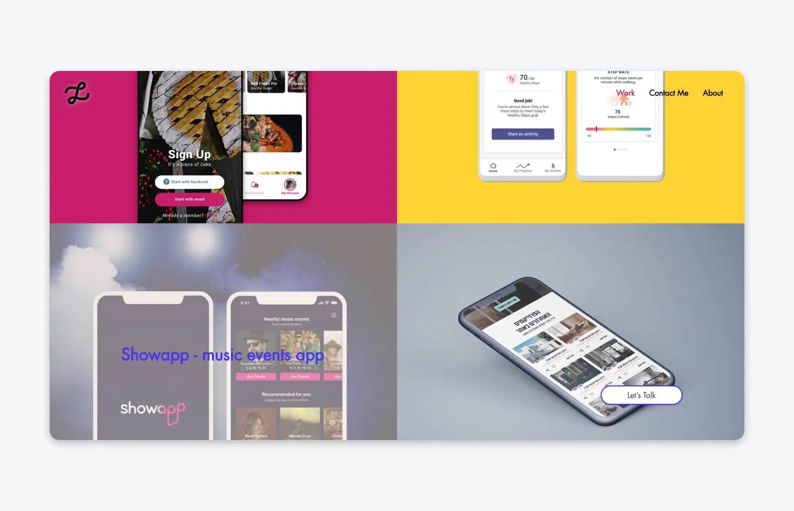
Lital Karni, a UI and UX designer based in Tel Aviv, has a portfolio that looks pretty simple at first glance. But she uses a number of clever design tricks to draw visitors in and constantly reinforce her own personal brand.
First, there’s the way that each project on display has a custom-colored background, designed to make each part of her experience pop.
As visitors scroll through Lital’s portfolio, they might notice the one thing that stays static on the page: Her unique logo design, which allows you to click from anywhere and go back to the “About” section at the top of the page. It keeps Lital as the designer front and center, even as you look through her work.
18. Velvet Spectrum
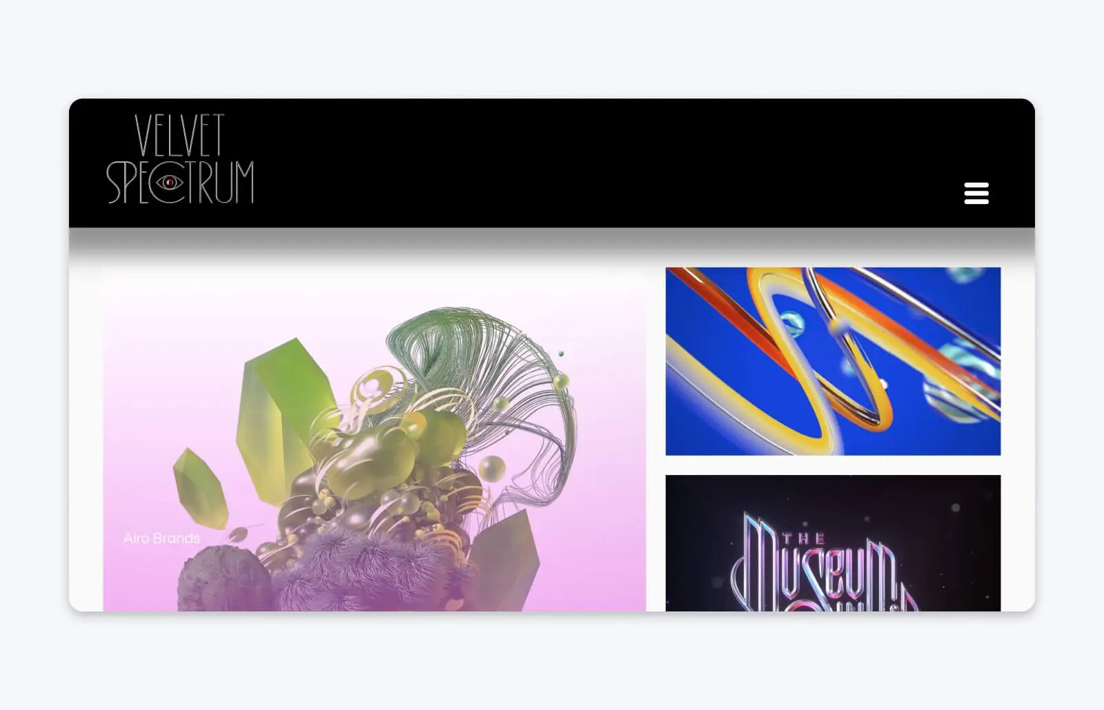
Velvet Spectrum is a professional moniker for Australian digital artist Luke Choice. With his online portfolio, Luke lets his work speak for itself, displayed in a grid that mixes static images, 3-D graphics, and animations to demonstrate the wide range of talents and skills on display.
Everything on Luke’s portfolio site is bursting with color, immersing visitors in his unique design style without a lot of words — because they simply aren’t needed here.
19. Greg Christian
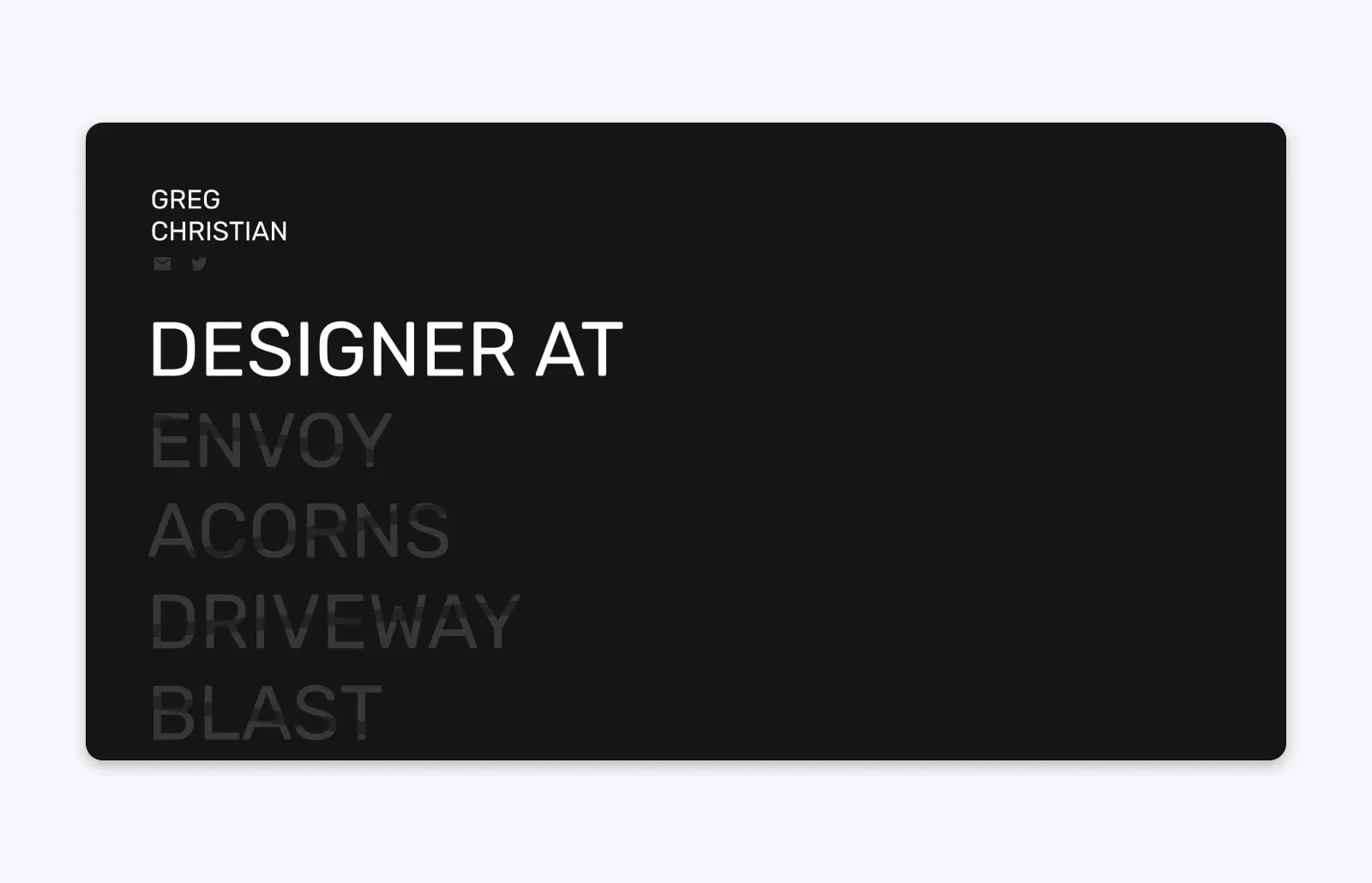
New York City-based designer Greg Christian has built his portfolio to be like a (very modern, extremely cool) take on a resume. He starts by listing his past roles, experiences, and locations, then transitions to a showcase of some of his projects. The entire portfolio lives on a single page, making it easy for visitors to scroll through and get acquainted with his work.
20. Jung Hoe
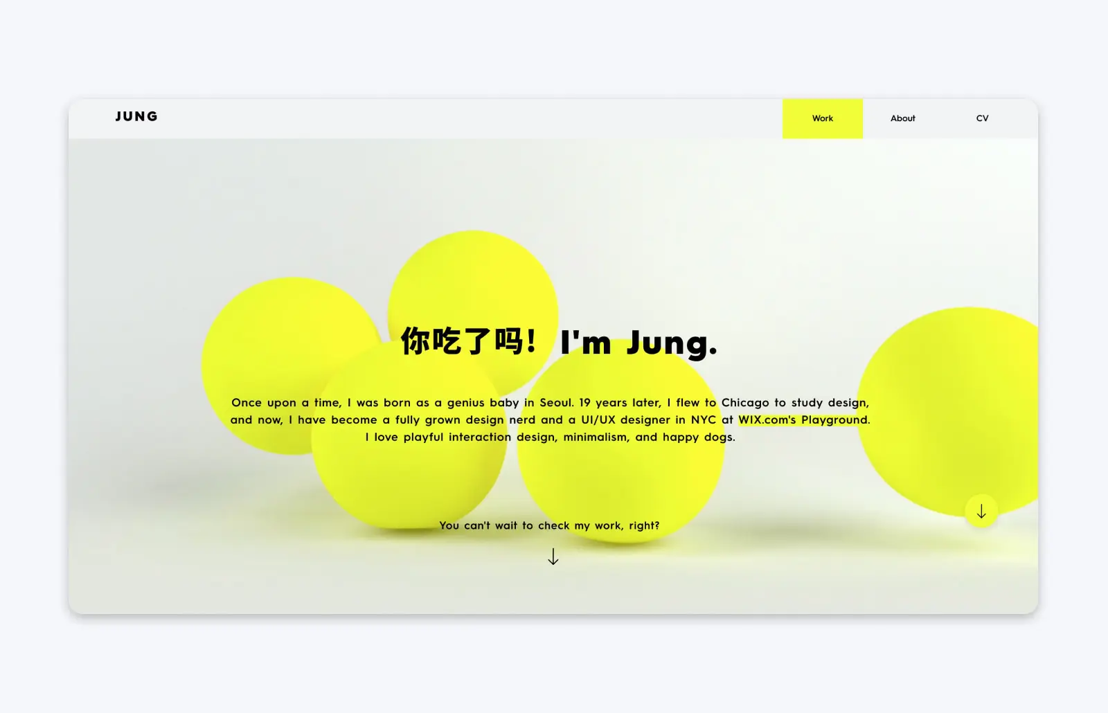
UI/UX designer Jung Hoe keeps his portfolio simple, with one scrollable page that introduces who he is and then jumps right into the important part: His work. What sets his portfolio apart, though, is the toggle switch that allows visitors to see his professional portfolio — or a portfolio of work he’s done for fun.
That small feature allows visitors to really get a sense for who Jung is and what he cares about, injecting a ton of personality into his portfolio while simultaneously making it more effective.
21. Locomotive
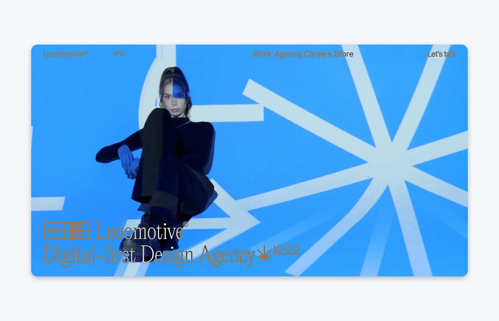
Montreal-based digital-first creative agency Locomotive specializes in creating digital experiences, and didn’t waste the chance to demonstrate that with their own portfolio of work. Their site is highly engaging and interactive, drawing visitors in more and more as they keep exploring.
One of the most striking things about Locomotive’s portfolio site is how they use playful, entertaining animations to add more visual interest. Of course, that’s a gamble — those kinds of touches can seem gimmicky or become distracting. But Locomotive shows that when high-quality animated flourishes are used correctly, they make all the site’s little details pop.
22. Kerem Suer
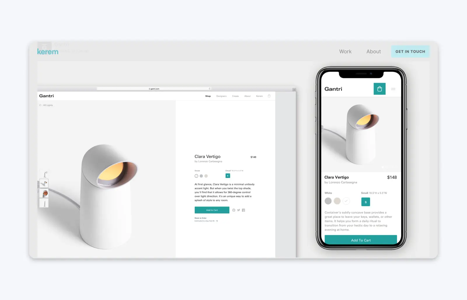
Kerem Suer, an interdisciplinary designer based in San Francisco, puts himself front and center in his portfolio — after all, potential clients aren’t just hiring his work, they’re hiring him.
He adds personality to his “About” page with quotes from his speaking engagements, as well as snippets and feeds from his social media profiles. And to go above and beyond for prospective clients, he adds some helpful touches to his contact page: his availability for hire, and his average response time.
23. Sophie Westfall
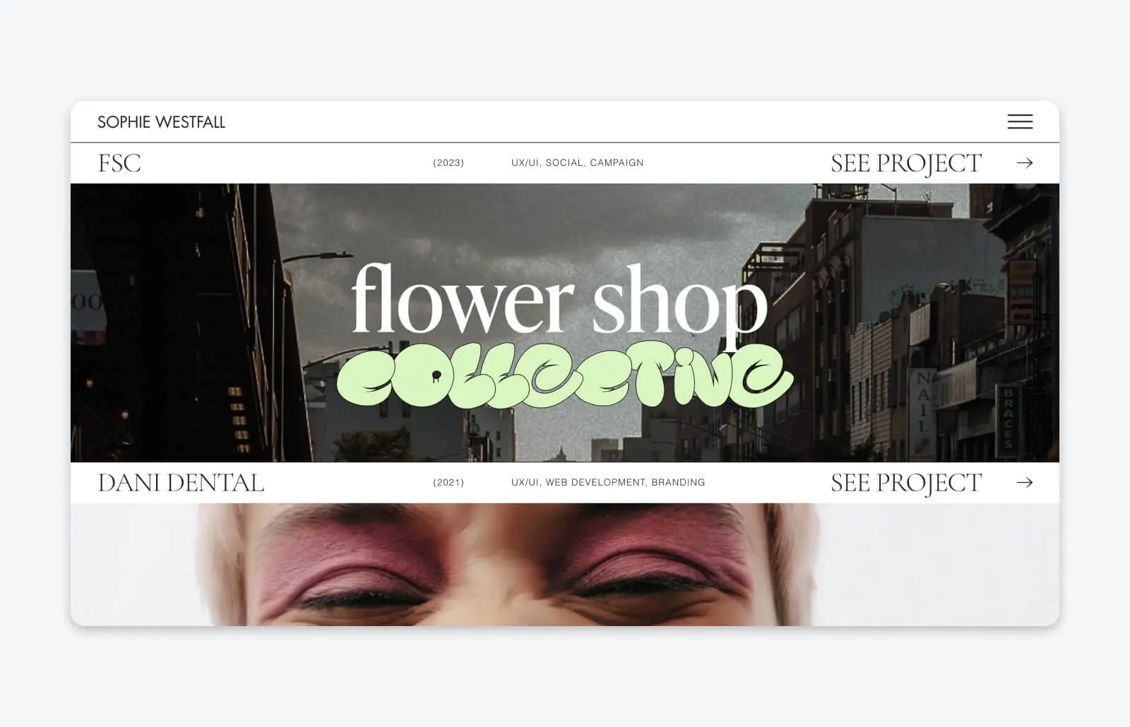
If you want trendy, modern UX/UI design, you’ll want to hire Sophie Westfall after viewing her portfolio. With its simple, clean lines, creative design, and use of the most current design trends, Sophie’s portfolio is all about her style, which is young, bold, and modern.
24. Studio Thomas
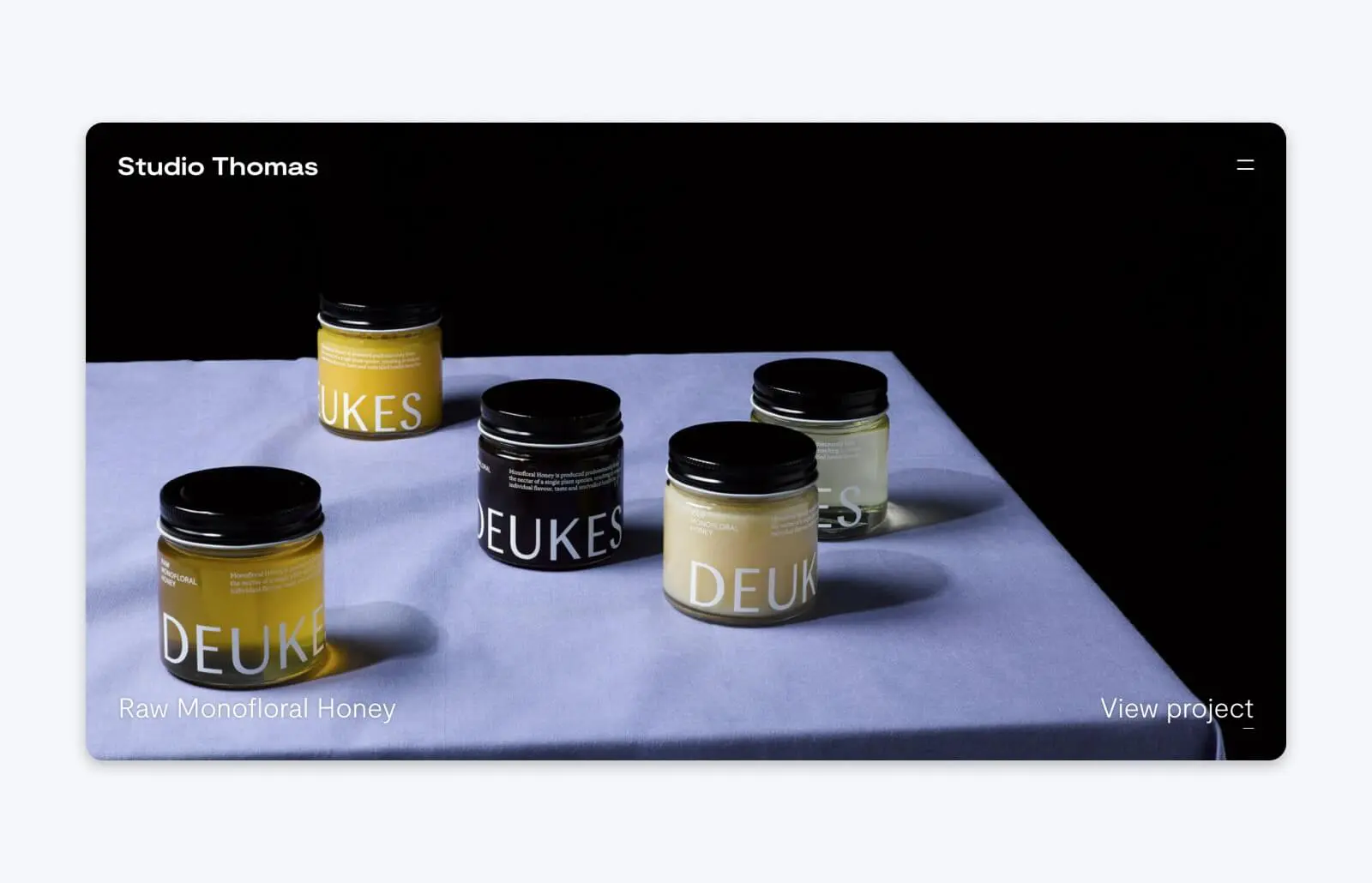
Studio Thomas also has a portfolio that’s all about the vibes. This London-based Agency, founded by a pair of Thomases, Thomas Austin and Thomas Coombes, claims to be all about “Design for Bold Brands.”
Of course, their portfolio backs that up. With bold color blocking, striking animation, and full-screen images for each project included in their work history, Studio Thomas has worked to build their personal branding into every detail of their portfolio. The final product is a website that’s eye-catching, memorable, and visually stunning.
25. Alex Beige
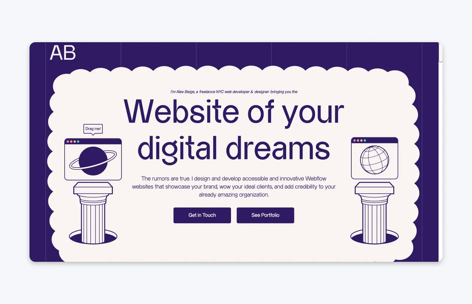
Alex Beige is a freelancer based in New York City. Their web developer portfolio is one to check out if you need ideas for blending functionality and user experience with personality and fun.
Alex includes all the information a prospective client might want to know: His experience and skills, featured website projects (with an image of each one), his process, what it’s like to work with him, and how to get in touch. In addition, it’s all done in a way that showcases Alex’s lighthearted style — like how his process is laid out in cloud graphics that you can click and drag to rearrange all over the page.
Alex’s care for the customer experience also shows in his custom contact form, which includes helpful fields to choose which of his specialties you’re interested in, and your budget for your project, so it’ll be easier for you both to determine if working together will be a good fit.
26. Pierrick Calvez
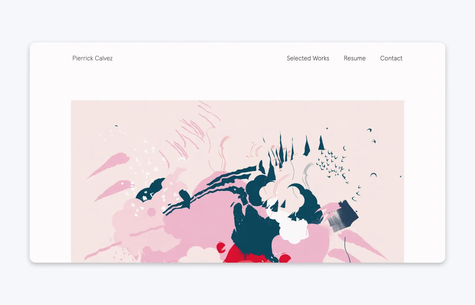
If the purpose of a design portfolio is self-promotion, China-based illustrator Pierrick Calvez has it down to a science.
His straightforward portfolio displays his works as framed works of art on a digital gallery wall, a visually striking way for visitors to take his art in.
But what’s even more clever is how Pierrick’s portfolio doubles as an e-commerce store. If one of his works is available for sale, visitors can make a purchase from the page with just a few clicks. His portfolio is a great way to spread the word about his art and make some sales in the process.

Do More with DreamPress
DreamPress Plus and Pro users get access to Jetpack Professional (and 200+ premium themes) at no added cost!
Check Out Plans