If you focus only on selling products and services on your website, potential customers might not find your business trustworthy. You may find it difficult to build connections with new visitors without explaining your story and core values.
By creating an About Us page, you have the chance to win over visitors with a compelling introduction to your brand. A well-designed About page helps you connect with your audience and build trust. This trust can ultimately increase your conversions and boost retention rates.
In this post, we’ll explain what an About Us page is and how to create one for your website. Then, we’ll show you 45 inspiring examples. Let’s get started!
Conversion
A website conversion is any action a user takes on a site that moves them further into the sales funnel. Examples include filling out a web form, clicking a call to action, or purchasing a product.
Read MoreWhat Is An About Us Page?
An About Us page is a dedicated section of your website that provides background information about your business or organization.
An About page is not a place to push a hard sell or boast about your business. It should help visitors to understand who you are, what you do, and what makes your company unique.
The Purpose Of An About Us Page
Having a well-crafted About Us page is crucial for branding, and earning the trust of visitors and potential customers. Here are some of the ways it can enhance your website:
- Builds trust: Your About Us page presents the history of your business and how it came to be. This backstory helps site visitors to connect with your brand on a more personal level.
- Highlights your values: By communicating what motivates you and the principles that guide your work, you can use your About Us page to show visitors what you stand for. This transparency helps to build trust.
- Shows your expertise: Detailing your experience, training, certifications, and accomplishments demonstrates you are qualified and skilled in your work. This expertise establishes credibility, meaning visitors are more likely to trust your opinions and spend money with your business.
- Enhances your brand identity: Well-written About Us content (paired with photos, GIFs, and videos) helps reinforce your desired brand image. This cohesive identity separates you from competitors; visitors are likely to remember the picture you paint.
- Encourages engagement: The most effective About Us pages encourage visitors to take action, whether that is learning more about the brand, starting a conversation, or becoming a customer. This engagement helps to build lasting relationships.
- Introduces your team: Most of us tend to trust faces more than names. Many About Us pages include a section that introduces key team members, meaning visitors can “meet” the people behind the operation.
- Improves search engine optimization: If you fill up your About Us page with great content, it can be a great SEO asset, drawing curious visitors to your website for more information.
SEO
Search Engine Optimization (SEO) is the practice of improving a site’s ranking in search results. Search results are aggregated based on a number of factors, including a site’s relevance and quality. Optimizing your site for these factors can help boost your rankings
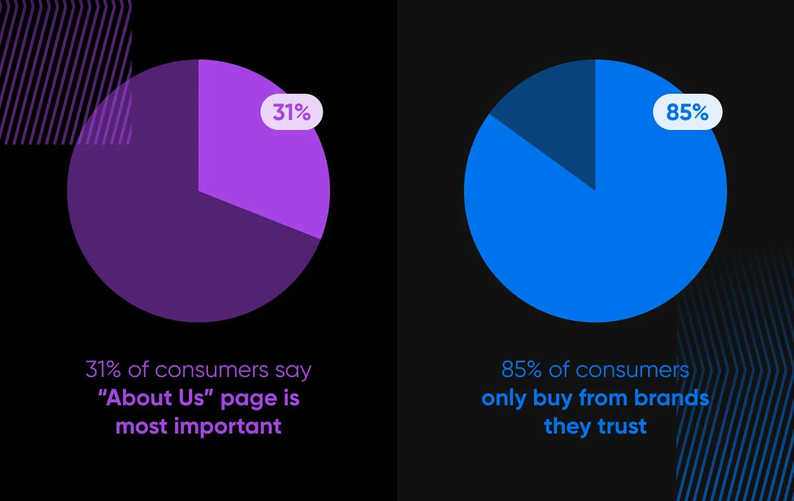
Read MoreThese potential benefits are backed up by plenty of evidence. For instance, one recent survey found that 31% of consumers believe that an About Us page is the most essential element on a business website.
What’s more, 85% of consumers said they will only consider buying from brands they trust. A good About Us page can help you to build that kind of bond with new visitors.
In other words, it’s worth getting your About Us page just right.
How To Create The Perfect ‘About Us’ Page (4 Tips)
You should now have a decent idea of what an About Us page should contain. To follow up, here are a few tips to help you create a page that will make you stand out from the crowd:
1. Tell A Story
One of the best ways to make your About page unique is to tell your company’s history. Often, stories can get visitors more invested in your brand and compel them to keep reading. This can naturally lead to more conversions.
First, remember to be transparent. Your About Us page serves to sell your unique story and get buy-in from your visitors. Transparency is incredibly important to win your visitors’ trust.
You can talk about how your business got started, as well as your personal background. To help readers understand your goals, you can even write a mission statement. This text will vary depending on your brand, but it’s best to be as authentic as possible.
Once your business reaches a certain age, you could also consider summarizing your full brand story. Mention the key milestones along the way, and how it led to the company that visitors can see today.
2. Keep It Simple
When writing your About page, don’t use industry jargon and confusing copy. The words should leap off the page and inspire your new customers to take action. A block of text that visitors have to read six times to grasp is not going to cut it.
It’s also essential to consider your audience. New visitors will likely want a simple introduction to your business without having to read your entire life story. Ultimately, consider what readers will be looking for and make a value proposition with that in mind.
After you describe yourself and your company, be sure to add your contact details. If a visitor has got as far as looking at your About Us page, there’s a good chance they’re thinking of working with you or using your service. Don’t miss that opportunity to convert them by making them search for a separate contact page.
Lastly, don’t forget about a call-to-action (CTA). This important element can convert visitors, making it clear what you want them to do next. Good examples might include a link to your online store, contact information, and social media accounts.
Call to Action (CTA)
A Call to Action (CTA) is a button or link that prompts users to complete an action, such as joining the email list, making a purchase, or downloading a document.
Read More3. Use Engaging Visuals
If your About Us page has an aesthetically pleasing design, it can engage visitors and encourage them to read more. Readers may struggle to understand your story when the content is poorly laid out with too much text.
Since the human brain can process images much faster than words, consider integrating them into your About page. Even if someone doesn’t read the full page, they can view the other visual elements to understand your business.
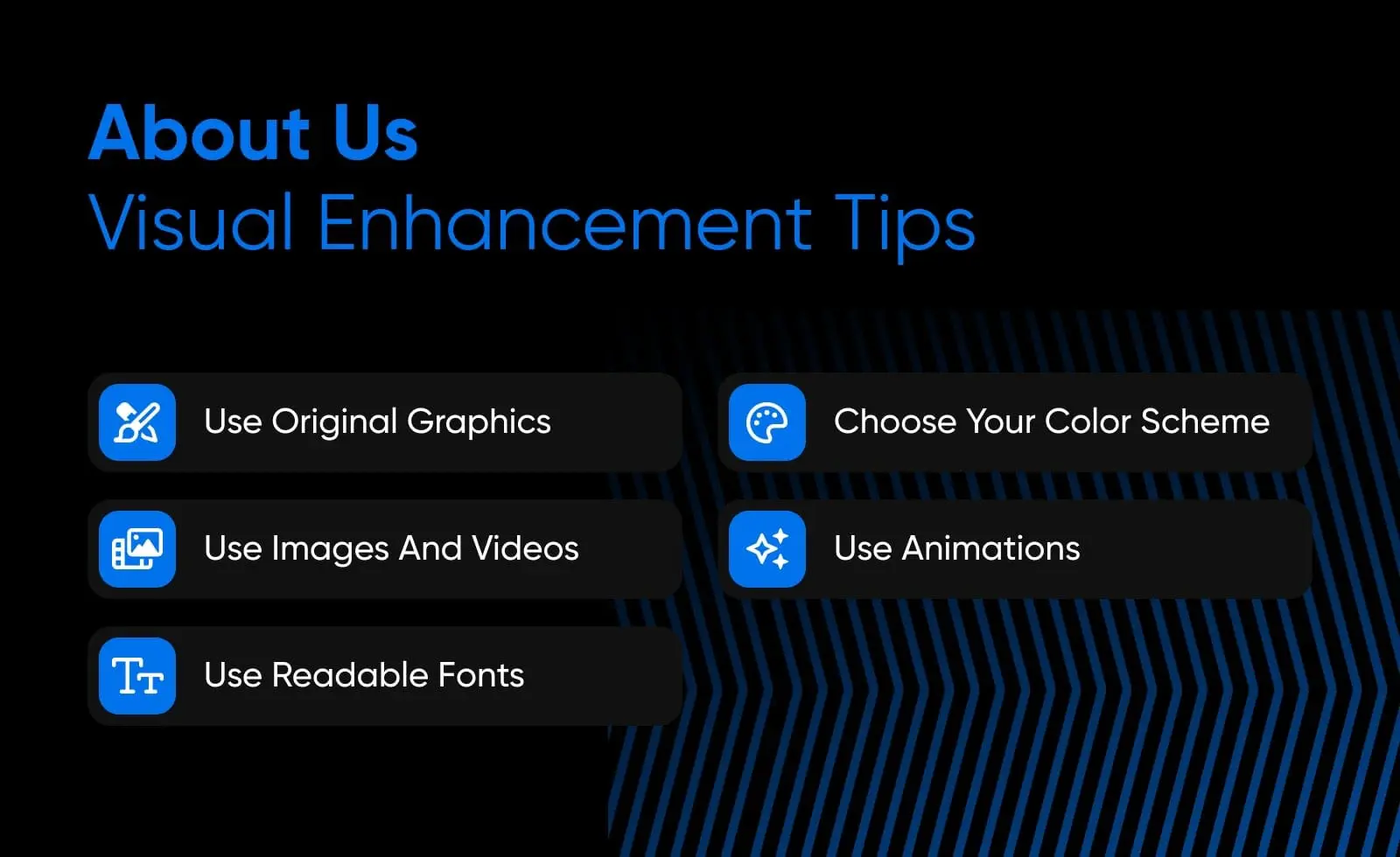
Having the right design can avoid scaring away new visitors. Here are some great ways to improve your About Us page visuals:
- Be creative and use original graphics.
- Choose a suitable color scheme.
- Include images and videos.
- Create animations.
- Use readable fonts for accessibility.
Ideally, all important information should be positioned above the fold (or on the top half of the page). However, you can also guide users to scroll down and read more.
While it varies from industry to industry, more than half of Internet browsing now takes place on mobile devices. So make sure your About Us page, and your site as a whole, is built for mobile first. (Pro tip: use a responsive template)
Then, you can check if a page is mobile-friendly using Google’s Mobile-Friendly test.
4. Make Sure The Page Loads Quickly
Whether you run a small business or a large company, your website needs to be fast. This is one of the best practices for improving user experience. If your About page takes too long to load, users will likely leave your site without reading its content.
This, of course, goes for every page on your site, but your primary conversion pages must load as fast as possible. You can find out exactly how long a particular page of your site takes to load with Google’s PageSpeed Insights. This will evaluate your Core Web Vitals:
If you receive a poor score, there are steps you can take to improve your page speed. This speediness is necessary to keep visitors on your website and ensure they return.
45 Great ‘About Us’ Pages To Inspire You
Knowing the theory is one thing, but what does a great About Us page actually look like? To help inspire your work, we’ve scoured the Internet to find some of the best About Us page examples out there.
What’s more, we have studied each example in detail to discover what makes them so appealing.
Big Brands
When money is no object, you can make a truly eye-catching About Us page that is full of interactive elements and captivating content. Here are some examples from the world’s biggest online brands:
1. Nike
What makes this a good About Us page?
- At the top of the page, Nike establishes itself as one of the leading brands for all types of athletes. It also explains its mission to help people reach their full potential in sports.
- The page clearly identifies Nike’s audience as athletes but remains inclusive by emphasizing that anyone with a body is an athlete and could benefit from Nike products.
- To engage readers visually, this page has full-width moving graphics of athletes competing in various ways.
- Below the fold are links to the latest stories and blog posts about Nike’s impact on sports.
2. Zendesk
What makes this a good About Us page?
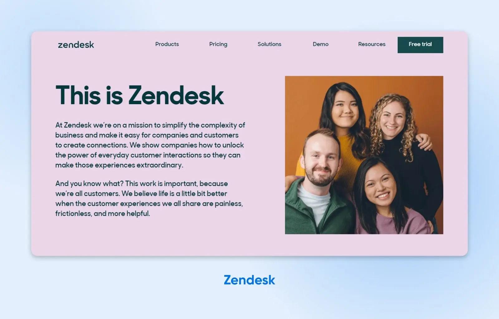
- Right away, there is a short, concise summary of Zendesk and what the company focuses on.
- The simple page design, bold contrasting color scheme, and limited word count make this About page readable and understandable.
- By explaining how Zendesk invests in communities and promotes diversity and inclusion, the reader can relate to the brand and its ethics.
- In the backstory of a “zen desk,” the writers include a little bit of humor. This makes the story more distinctive and memorable.
3. Etsy
What makes this a good About Us page?
- Since Etsy is a creative marketplace, starting with the tagline, “Keep Commerce Human,” makes sense. This compelling call-to-action lets readers know the core message of the company.
- In the introduction, this About page features Etsy’s primary guiding principles. If readers have a similar love of sustainability and creativity, they can identify those values here.
- The page also outlines how Etsy works. With cute and simple animations to guide the way, visitors will learn the benefits of becoming a buyer or seller on the platform.
4. Amazon
What makes this a good About Us page?
- Unlike other brands, Amazon divides its About information into a few basic pages: Who We Are, What We Do, Our Workplace, Our Impact, and Our Planet. This layout avoids having too much information on one page.
- You’ll find easy-to-navigate links to essential information about Amazon’s services, principles, community impact, and more in each tab.
- Using short paragraphs and links to other resources, this About page neatly summarizes everything about Amazon.
- As you scroll down the page, Amazon provides related articles if you want to learn about its hiring practices or company progress.
5. WordPress.com
What makes this a good About Us page?
- To introduce WordPress.com to new visitors, this About page starts with the company’s mission statement.
- The designers use contrasting blue and white backgrounds throughout the page to align with the brand’s logo and increase readability.
- WordPress.com clearly considers its target audience, with frequent calls-to-action to get people’s websites online.
- The page also explains how WordPress.com supports its users with diverse, free tools. Reading this, visitors can realize they have everything they need to build a website immediately.
WordPress
WordPress is an open-source Content Management System (CMS). Since it is free and accessible, WordPress is used to power almost any type of website, from blogs to e-commerce businesses.
Read More6. Canva
What makes this a good About Us page?
- This About page is an excellent example of a simplistic design. It focuses on visual elements rather than excessive paragraphs. Although there aren’t many words on the page, they are descriptive enough to encapsulate Canva and its goals.
- It also highlights Canva’s popularity, listing the number of designs created with this software.
- This page includes an image slider of Canva’s brand values. The engaging graphics explain the core ideas that the business stands for.
7. Mailchimp
What makes this a good About Us page?
- Despite being a big company, Mailchimp successfully manages to avoid any corporate tropes. Instead, its About Us page makes you feel like you’ll be working with a small team.
- Each section is only a couple of paragraphs long. Despite having a ton to talk about, Mailchimp understands that the reader only needs top-level ideas (though you can go off and learn more, thanks to pages dedicated to the company’s culture and history).
- At no point does the page feel like a sales pitch. It simply pulls you into what Mailchimp stands for and what it represents as a company.
8. GIPHY
What makes this a good About Us page?
- If you’ve ever used a Graphics Interchange Format file (aka GIF), then you’re probably aware of GIPHY. Since GIFs are fun, GIPHY made its About page quirky, engaging, and completely on point when it comes to reflecting the brand and its identity.
- Plus, it’s done almost entirely using — you guessed it — GIFs. This promotes GIPHY’s products without including a hard sell. After seeing the fun GIFs on this page, visitors can be motivated to use them.
9. 500px
What makes this a good About Us page?
- As an online network for photographers, you would expect great visuals on the 500px About page, and it doesn’t disappoint — especially if you happen to be a dog person!
- The page explains what the company is and how it is committed to its customers, and it’s completely free of fluff.
- It clearly describes how photographers can benefit from joining 500px, followed by a simple call-to-action.
10. X (the website formerly known as Twitter)
What makes this a good About Us page?
- X’s About page hits the nail on the head when it comes to copy with brevity. It lays out who the company is and what it stands for without too much detail. You know precisely what you’ll get from the social network just by looking at its About Us page.
- It does an excellent job of moving visitors down the funnel and getting them to sign up and begin using the site. X does this in part by pulling trending content into the page. This provides a CTA to try the platform.
11. LEGO
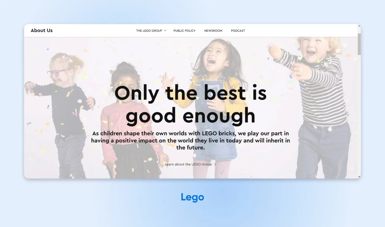
What makes this a good About Us page?
- While LEGO makes toys, the main pitch of this About Us page is aimed at parents. After all, they are the ones who will (mainly) make purchase decisions.
- The page includes a one-sentence description of LEGO’s history, with links for visitors to follow if they want to explore the extensive timeline of the brand.
- A map of the world, made entirely out of LEGO bricks, illustrates the global reach of the brand in a colorful and fun way.
12. Uber
What makes this a good About Us page?
- Like other companies, Uber highlights its mission statement on its About page. This includes an emotional appeal, explaining that the main goal is to give people the freedom to go wherever they want.
- Uber also includes a picture of its CEO and a personal letter from him. By having a call-to-action button, this section motivates visitors to read about the company’s history, achievements, and plans.
- As Uber is a transportation brand based around car travel. Potential customers may have questions about the company’s sustainability, so Uber provides information about its goal to become fully electric.
13. Wendy’s
What makes this a good About Us page?
- Wendy’s may be a popular fast food brand, but that doesn’t mean people know its history. To solve this problem, this About page links to information about the founder, Dave Thomas, and the foundation of Wendy’s.
- It also emphasizes Wendy’s goals to serve fresh food and make every customer feel at home.
- Some visitors may want to start working with the company. Therefore, Wendy’s provides details about investing and franchising.
14. Eventbrite
What makes this a good About Us page?
- Featuring an image of a band performing, the Eventbrite About Us page focuses on its niche audience. If someone wants to experience live performances, they can immediately know that this company specializes in that area.
- After explaining what Eventbrite is, the page further discusses what you can expect from this platform. Whether you want to go to a music festival, fundraiser, or marathon, you can find tickets with Eventbrite.
- Plus, this page tells visitors how successful the company has been in previous years. It explains Eventbrite’s achievements, as well as a high level of customer satisfaction.
15. HubSpot
What makes this a good About Us page?
- HubSpot’s About page has a simple but effective layout, explaining the company’s story, mission, and history.
- Along with a written story of how HubSpot was founded, there is a video featuring its CEO. This makes the story more personal since you can hear it straight from the founder.
- Instead of having blocks of text, it lays out HubSpot’s history, point by point, in an image slider. Visitors can navigate through the business’s initial goals, improvements, and successes.
16. Spotify
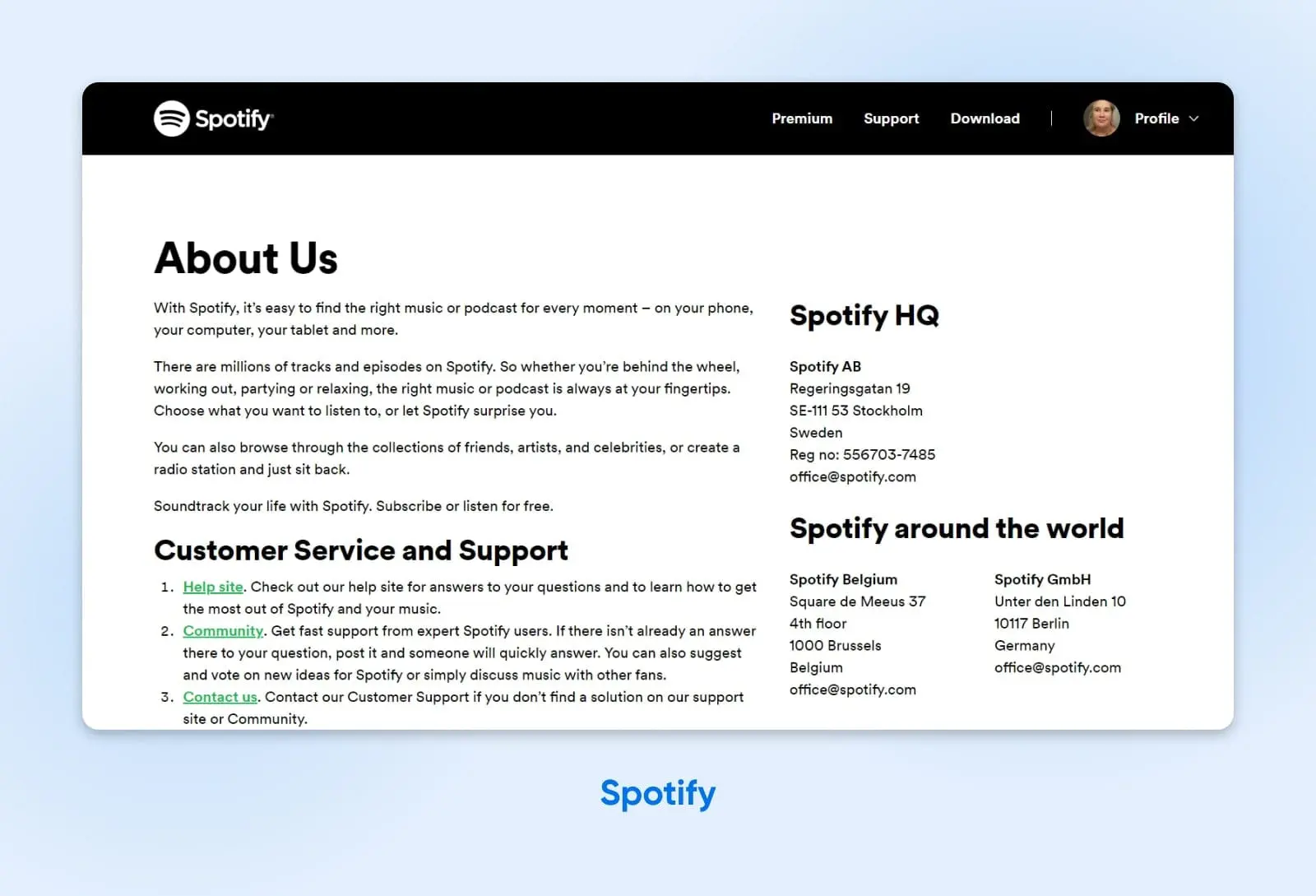
What makes this a good About Us page?
- Although this About Us page doesn’t include images, it simplifies the text and includes only necessary information. Plus, headings effectively separate each section in an easy-to-understand way.
- This page isn’t very long, thereby avoiding the need to scroll to the bottom of the page to find specific details about the company.
- The simple black-and-white color scheme provides maximum readability. With additional links in bright green, visitors can easily navigate across Spotify’s website to locate customer service, advertising information, or employment applications.
17. IBM
What makes this a good About Us page?
- In spite of being a massive company with many different departments and products, IBM’s About page doesn’t feel cluttered.
- A menu of quick access links allows visitors to find the parts that most interest them, and the page begins with a short mission statement, quoted directly from the CEO.
- Tab-based navigation allows IBM to introduce the multiple facets of the business, without making the page too lengthy. Visitors can also explore the extensive history of this tech brand through an interactive timeline. These features create an excellent user experience.
18. FedEx
What makes this a good About Us page?
- Rather than forcing visitors to read reams of text, FedEx has created an About Us page that links to multiple related resources. These are organized under three key headings: Who we are, What we value, and How we give back.
- Along with the usual About content, FedEx provides quick links to other important information about the company, including careers, news, and investor relations.
- At the bottom of the page, visitors can also check out the company blog and access essential contact information. It’s almost like a landing page for the whole company.
19. Colgate-Palmolive
What makes this a good About Us page?
- The first thing you notice about this Who we are page is the array of faces on display. The header contains multiple high-quality shots of individuals at work, along with a group employee photo. Instantly, visitors are learning something about the people behind the company.
- A quote from the CEO welcomes visitors, as if they were arriving in person. There’s a link to a full-length letter here, as well.
- One interesting section highlights the top three company values, each with a short paragraph for extra detail. If you are learning about Colgate-Palmolive for the first time, this section would help you to understand the business.
20. Moz
What makes this a good About Us page?
- After an initial statement about company values, this About Us page is formatted like one big story, broken up into tiny chapters.
- The first section talks about the origin of the business, with a portrait of one of the co-founders. Instantly, this is building a human connection.
- The following sections provide a timeline of the business up until the present. Each part is only a few sentences, meaning you don’t have to wade through long paragraphs to follow along.
- At the bottom of the page, there is a CTA that links to Moz’s current offerings. This provides a neat conclusion to the timeline, while guiding visitors toward the money.
Small And Medium-Sized Brands
The businesses mentioned above are all in the elite category, with thousands of staff and plenty of brand recognition.
Below this level, you can find a variety of businesses that aren’t quite on the same level, but still doing very well. Here are some example About pages that perfectly suit a medium-sized company:
21. Barkbox
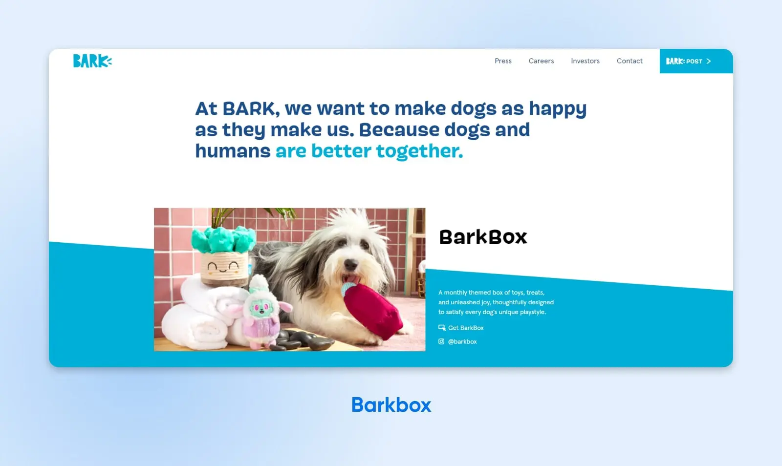
What makes this a good About Us page?
- Since Barkbox provides monthly subscription boxes to pet owners, it makes sense to use fun, adorable images of dogs on its About page.
- Even though the page doesn’t explain the company’s history, its mission statement to, “Make dogs as happy as they make us,” lets you know exactly what Barkbox sets out to do. Plus, it resonates with dog owners on a personal level.
- As you scroll, you’ll see different sections for each Barkbox subscription. This layout prevents visitors from having to navigate to a separate page.
22. Chime
What makes this a good About Us page?
- Chime takes a more simplistic approach, explaining its history, mission, and values without fancy graphics. Since the audience will likely be people looking for a new bank, it makes sense to keep things simple.
- Right away, readers can learn how Chime differentiates itself from its competitors. Chime presents itself as a good alternative to other well-known banks because it doesn’t have standard banking fees.
- This About page emphasizes the benefits of using a smaller bank by featuring the Chime leadership team and company culture. When visitors see that employees are happy and content, they assume they’ll also be treated well.
23. Allbirds
What makes this a good About Us page?
- With a looped video of sheep running across a beautiful landscape, the Allbirds About page immediately displays its sustainable values. Adding the tagline, “Mother Nature Made Us Do It,” summarizes the company’s goal to work with nature rather than exploit it.
- There is a picture of the founders and a short and personal story about how they started Allbirds.
- Along with an animated graphic of Allbirds shoes, this About page states what makes this product unique. Any reader who wants simple, comfortable, sustainable shoes can benefit from ordering a pair.
24. ToyFight
What makes this a good About Us page?
- As a creative design agency, ToyFight avoids using a standard, boring About page with blocks of text. Instead, it features engaging graphics that move as you scroll down the page. Mirroring the company’s name, you’ll see two fighting toys that enhance the reading experience.
- When describing the founders of ToyFight, they are portrayed as deconstructed action figures. This text gives the page a lighthearted and silly feel. They’re even given fun names such as, “Beardless wonder” and “Napoleon complex,” to make readers laugh.
25. Yellow Leaf Hammocks
What makes this a good About Us page?
- Unlike some other companies, Yellow Leaf Hammocks tells an interesting story about its manufacturing process. Describing how each hammock is handwoven by women in the Mlabri Tribe adds strong emotional appeal.
- Yellow Leaf Hammocks encourages readers to think about where products come from. It supports paying weavers a fair wage, empowering women with financial independence.
- As you scroll down the page, you can even see pictures of the weavers and read their stories. These elements can encourage readers to believe in and support a good cause.
26. Chattanooga Renaissance Fund
What makes this a good About Us page?
- This About Us page starts with a historical overview of Chattanooga and how it is a hub for entrepreneurs. Then, it explains how the Chattanooga Renaissance Fund fills a need in this community.
- Visitors can read about the main members and their roles in the Chattanooga Renaissance Fund.
- It also describes how this fund can help individual readers. Whether someone is looking at this site as an investor, a third party, or a startup, they can evaluate how the Chattanooga Renaissance Fund can support their ideas.
27. Purple, Rock, Scissors
What makes this a good About Us page?
- Since Purple, Rock, Scissors is a creative agency specializing in technology, it wouldn’t make sense to have a boring About Us page. There are engaging visuals, including motion graphics, to highlight the agency’s skills.
- In a one-minute video, this company displays quickly moving animations that perfectly encapsulate a wide range of creative abilities.
- Purple, Rock, Scissors highlights its previous work experience by including a case study. This can help potential clients decide if this company is the right fit for their needs.
28. Hydrant
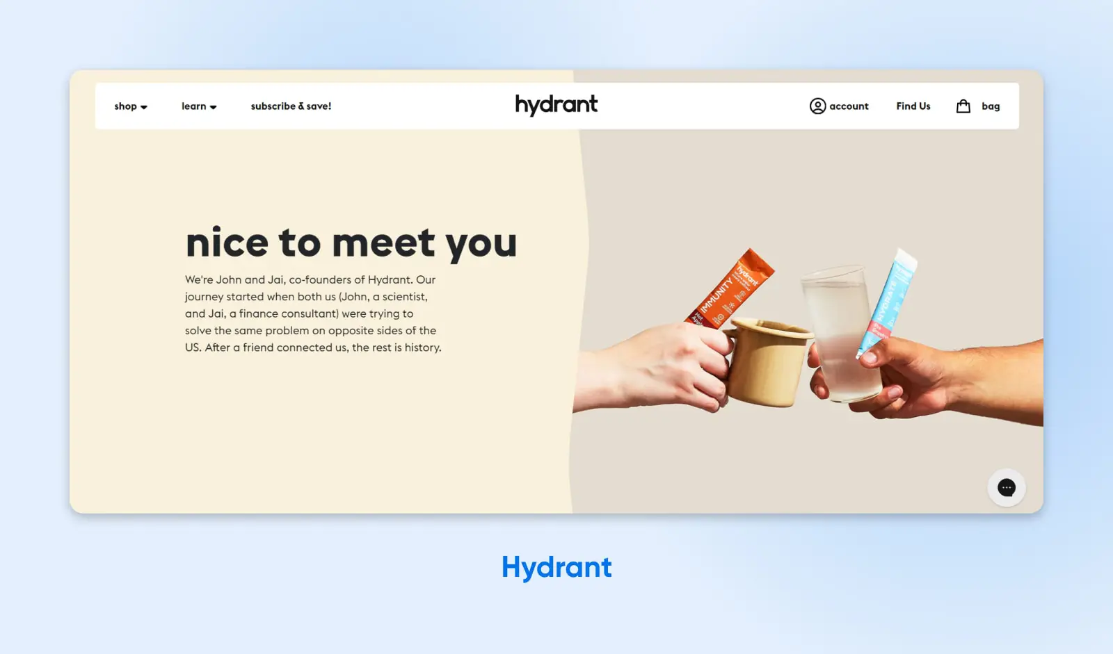
What makes this a good About Us page?
- After a brief introduction to the company, Hydrant explains the main problem that it attempts to solve.
- Visitors can see Hydrant packs and their various flavors in all the pictures. Plus, if you click on one of the images, you can immediately add the product to your cart.
- The founders recommend their favorite Hydrant packs, giving a personal touch to the company.
- At the bottom of the page, you can read positive reviews from other customers. These real-life testimonials can motivate visitors to buy a Hydrant pack.
29. Wheel
What makes this a good About Us page?
- At the top of the page, the main tagline, “Putting great care within everyone’s reach,” is highlighted in bold green. This color draws the eye and lets readers know how dedicated Wheel is to making healthcare accessible.
- Dividing each section by different colors, Wheel makes its About page readable and easy to follow.
- Rather than featuring huge blocks of text, this healthcare company summarizes its vision, purpose, and story in short paragraphs.
30. Brady
What makes this a good About Us page?
- The About page for Brady starts off by displaying an impactful brand tagline, and an image of the seven-time Super Bowl winner behind this business — a recognizable face that instantly builds trust with sports fans.
- It follows up with a short conception story about the brand, with a mention of all three founders and their respective expertise.
- The design of the page is clean and uncluttered, with visually striking black-and-white images and plenty of white space.
31. Wild One
What makes this a good About Us page?
- The About page for this pet accessories brand contains plenty of content, but it is broken down into bitesize sections.
- The top section provides a neat summary of the brand, including a mission statement, a description of the kind of products they create, and the type of people for whom those products are made.
- In later sections, you learn about Wild One’s unique approach to product design.
- Each section includes an eye-catching photo that illustrates the target audience for this brand.
32. TalEx
What makes this a good About Us page?
- For a start, this HR business uses “Our Story” as the headline rather than “About Us.” This immediately puts visitors in the right state of mind for learning more.
- Next, TalEx provides a one-sentence description of the company mission. If visitors want to learn more, they can scroll down and get the full backstory of the brand.
- The content includes links for more information about the co-founders, and plenty of figures to back up the credibility of the business, including revenue and workforce statistics.
34. Wild Fork
What makes this a good About Us page?
- With an autoplay video at the top of the page, Wild Fork grabs the attention of visitors with a slick, visually attractive promo before diving into the details. The showreel contains plenty of shots of prime cuts, including some sizzling steak.
- Below this, a menu provides quick access to the various sections of the About page, while also highlighting the key features of this brand.
- Further down the page, visitors get an extensive description of how Wild Fork sources and delivers fresh meat, along with sections on convenience, delivery, and sustainability.
35. Athletic Greens
What makes this a good About Us page?
- This supplement maker hits visitors with its mission statement straight away. It spans nearly the full width of the page, written in a large yet classy font.
- The rest of the page is broken into three concise sections, which summarize the main value proposition of the brand. If visitors want to learn more, they can click a link to the relevant web page.
- Images back up the copywriting, and the entire page sticks to brand colors — even when highlighting the logos of partner organizations.
36. LiveAgent
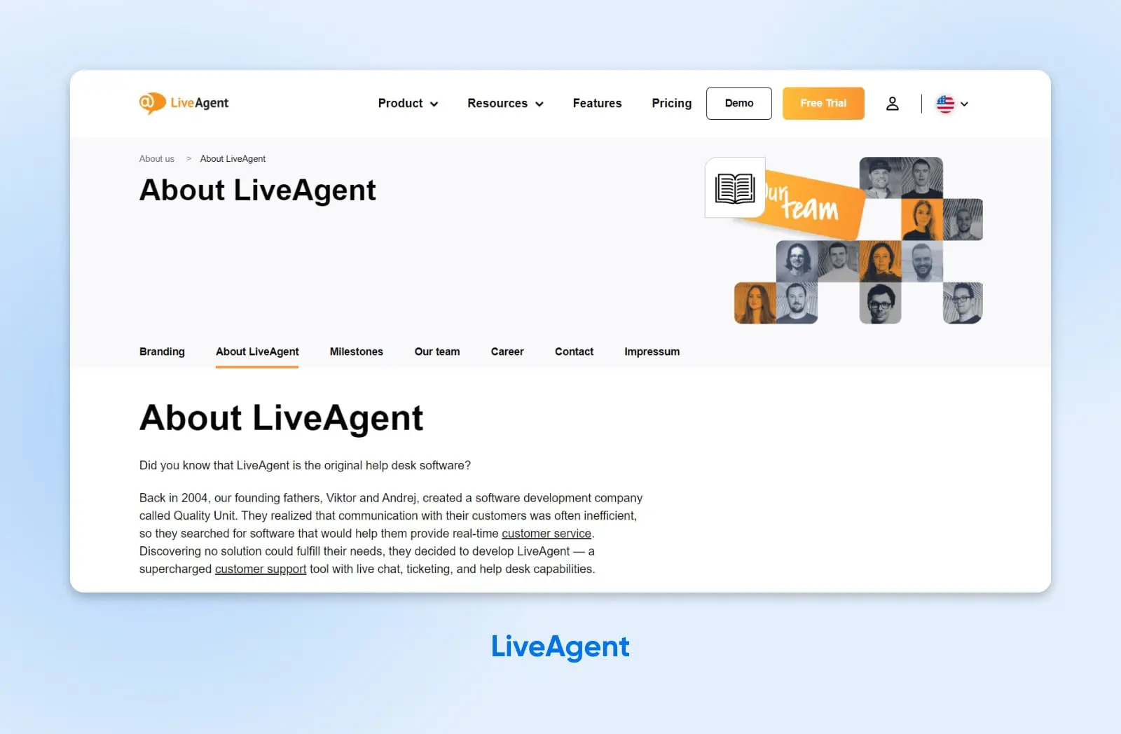
What makes this a good About Us page?
- This About page does a really nice job of summing up a 15-year-old company in just a few paragraphs. Bold headers help to break up the text, and photos of the co-founders add a human touch.
- Links within the text give visitors the opportunity to dive deeper, and there’s a menu just below the header that provides access to other company pages.
- The company introduction includes social proof in the form of the number of users and businesses served. The location of the company also gets a mention; this small addition can build a lot of trust with potential customers.
37. Chubbies
What makes this a good About Us page?
- In one short paragraph, the About page of Chubbies explains exactly what this brand is all about. Rather than diving into the manufacturing process or history of the company, the copy talks about the exact moment and mood that the brand was made for.
- Interested visitors can scroll down to see a complete backstory, accompanied by bold product photos. Everything about the content screams “fun.”
- The page also highlights five core values, introduces the staff in a giant team photo, and directs visitors to the e-commerce side of the website.
38. Caraway
What makes this a good About Us page?
- As a starting point, Caraway’s Our Story page is a beautiful example of web design. It features various animations to catch the eye, and large blocks of complementary colors that match the various shades of cookware made by this brand.
- Most of the page is dedicated to the value proposition of Caraway products, with an entire section dedicated to sustainability. Visitors who scan through this section see a promo video alongside, which highlights the quality and aesthetic appeal of the cookware.
- Every new idea on the page is highlighted with an icon. This helps visitors who want to scan the page or focus on particular sections.
39. VineHealth
What makes this a good About Us page?
- The main content of this About page is a personal letter, written by a co-founder of the company. It explains the motive behind forming the company, and the values of the business today. Given the sensitive nature of health tech, this is a great way to make an app feel more trustworthy.
- Portraits of the two co-founders put a face to the business, along with multiple “patient advisors.” Each person has their own quote, sharing how VineHealth helped them. It’s powerful social proof.
- Elsewhere on the page, visitors can learn about the principles and frameworks behind the technology. This type of transparency usually earns more trust.
40. 6am City
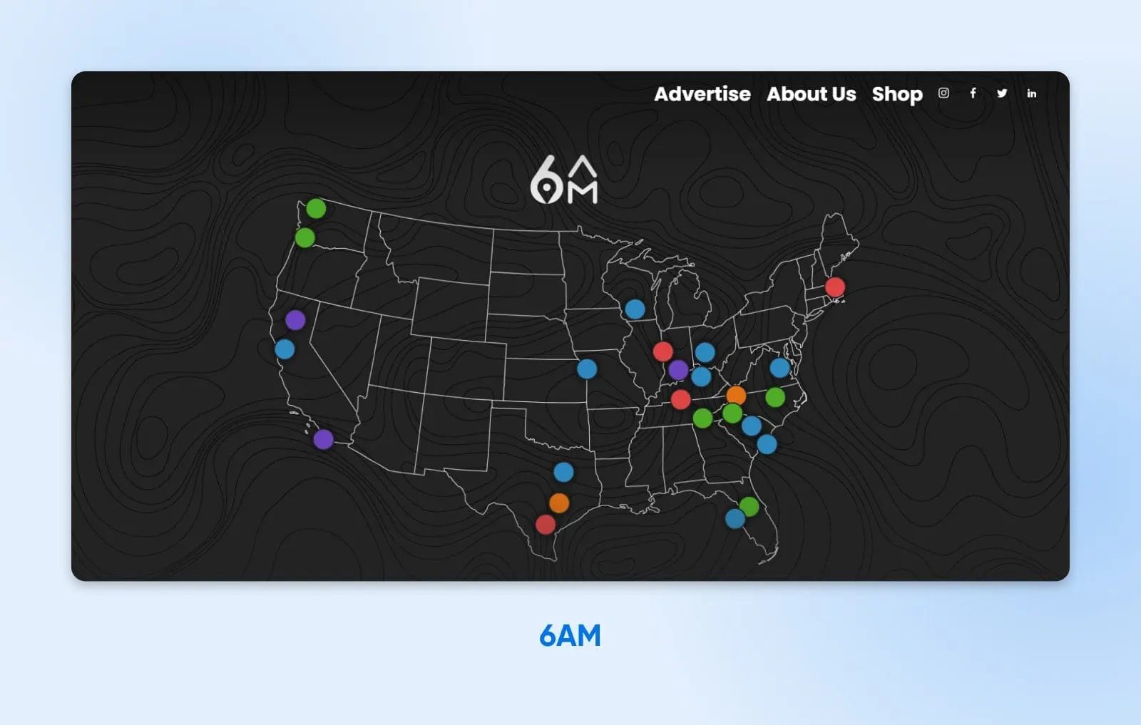
What makes this a good About Us page?
- As a regional news network, 6am City illustrates that it is “local everywhere” by displaying a big map of the U.S. with colored dots showing every branch of the business. Visitors will automatically start looking for their nearest office.
- The five core values of the business get top billing, with big fonts and keywords underlined. Terms like “PRIDE IN PLACE” and “RESPONDING” are sure to get the attention of potential readers.
- Further down the page, 6am City presents the company’s “brand anthem.” This is a kind of manifesto, which helps visitors to understand what the company represents on a deeper level. News is all about trust, so this is a smart move.
41. Dave
What makes this a good About Us page?
- Thanks to a highly visual layout, the written content on Dave’s About page is very easy to read. It almost feels like flicking through Instagram stories.
- In spite of this, the written copy tells a story. It talks about why Dave (a banking app) was founded and who it can help.
- Lines like, “Fighting for the underdog,” reinforce a sense that this company is on the side of its customers. These mission statements are followed up with key figures that prove why the product is needed.
42. RXBAR
What makes this a good About Us page?
- The content on RXBAR’s About Us page takes us back to the time when the company was founded. In a few short paragraphs, visitors can learn about what the founders set out to achieve, and how they started — making protein bars in their own kitchen.
- Visitors also learn about the founders through some very honest copy: “Starting a business with your best friend is great. It’s also really challenging.”
- A slideshow further down the page acts as a company photo album, and the images show how the founders grew up together. It’s a very human tale that should melt the hearts of even the most skeptical customers.
43. Superfluous
What makes this a good About Us page?
- Being a small design studio, Superfluous is all about the two founders of the business. The Profile page reflects this, with a complete bio for each partner.
- These introductions read like excerpts from a magazine, complete with profile pictures. It’s a fun way for the pair to introduce themselves to potential customers.
- Below each bio, the social media links for the founders are listed. This will make it easy for visitors to reach out and engage with the business.
44. 3DLOOK
What makes this a good About Us page?
- This particular About Us page template delivers a lot of information at the outset. After a brief written introduction to this body scanning startup, visitors get to look at a big team photo and some key stats about the company.
- The sections for Our Mission and Our Vision are limited to one sentence, making them very quick to absorb.
- Other sections include a letter from the CEO, a video promo for the product, a full Meet the Team area, and an array of accolades.
45. Mr. President
What makes this a good About Us page?
- The About page of this creative agency uses very conversational language to describe what potential clients can expect in working with Mr. President.
- A slideshow of images shows the team at work (and play), providing a further glimpse of future business relations.
- At the bottom of the page, notable past clients are displayed in a gallery of logos, providing powerful social proof. Making each icon monotone helps to maintain a clean design throughout the page.
Tell Your Story With An ‘About Us’ Page
As you might have noticed, there’s no one way to design an effective About Us page. Depending on your goals, the page can be casual and fun, informational and focused, or a combination. Ultimately, an About Us page is a reflection of your brand, helping users to feel a little bit closer to your company — as well as to the people behind it.
To review, here’s how you can build an effective About Us page:
- Tell a story.
- Keep things simple.
- Use engaging visuals.
- Make sure the page loads quickly.
If you want an About Us page that ticks all the boxes, you might consider hiring a professional designer. With DreamHost’s custom web design services, you can get one-of-a-kind pages customized for user experience and speed. Contact us today to learn more!

DreamHost Makes Web Design Easy
Our designers can create a gorgeous website from SCRATCH to perfectly match your brand and vision — all coded with WordPress so you can manage your content going forward.
Learn More