Everyone loves window shopping, and honestly, what’s not to love? Walking down the street, pumpkin-spiced beverage in hand, checking out all the latest and greatest fashion, books, and gadgets.
All the shops — and their enticing window displays — have something in common: they’re all trying to get you to engage with their stores. “Come on in,” the open door beckons. Free samples! Maybe the occasional sign flipper or wacky, waving, inflatable-arm tube man.
Just like these storefront sales tactics urge window shoppers to enter their stores, there are ways you can nudge visitors toward a desired action on your website. When people take the action you want them to online, it boosts your website conversion rate. But did you know that the average website conversion rate across industries hovers around 2.2%? Whether you’re beating that benchmark or struggling to convert visitors into paying customers, one thing is clear: every click counts.
For small business owners, site managers, and web developers, driving traffic is only half the battle won. Turning that traffic into conversions is where the magic happens. But how do you make sure your visitors don’t just browse but take action?
In this guide, we’ll break down proven techniques to help you optimize your website for conversions, from simple design tweaks to advanced technical strategies. Whether you’re running an online shop or a service-based website, these actionable tips will help you convert more visitors into loyal customers — faster.
Let’s dive in!
What Is a Conversion Rate?
A conversion rate is the percentage of website visitors who take a desired action. This action could be anything from making a purchase or signing up for a newsletter to filling out a contact form or downloading a free resource. In essence, it measures how well your website turns casual browsers into engaged customers or leads.
For example, if 100 people visit your site and five of them complete a purchase, your conversion rate for that action is 5%. Conversion rates can vary widely depending on your industry, target audience, and the goals of your site.
Understanding and improving your conversion rate is crucial because it shows how effective your website is at meeting its objectives, whether that’s driving sales, building an email list, or promoting engagement.
How To Calculate Your Conversion Rate
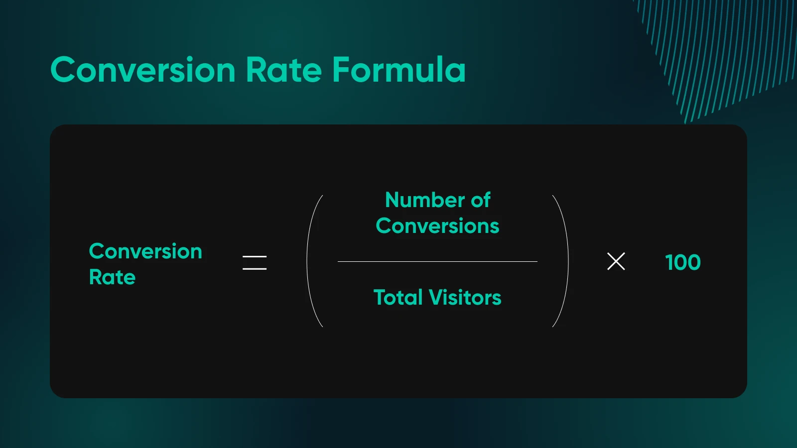
Calculating your conversion rate is simple. Here’s the formula:
Conversion rate = (Number of Conversions/Total Visitors) x 100
Let’s break it down with an example.
Say you own a small online store selling handmade candles. Over the course of a month, your site received 5,000 visitors, and 150 of them made a purchase.
To calculate your conversion rate:
Conversion rate = (150/5,000) x 100 = 3%
This means that 3% of your visitors completed the desired action of making a purchase. You can apply this formula to any type of conversion goal, such as sign-ups, downloads, or leads.
Tracking your conversion rate over time helps you measure the effectiveness of any changes or optimizations you make to your website, giving you insights into what’s working and where there’s room for improvement.
What Is a Good Conversion Rate?
A “good” conversion rate can vary depending on your industry and what action you’re tracking.
According to Statista, the average website conversion rate across all industries is about 2.2%. However, the specific benchmarks can look different depending on your niche:
- Food and beverage: 3.7%
- Beauty and skincare: 3.3%
- Sporting goods: 2.3%
- Toys: 2%
- Electronics: 1.9%
- Furniture: 0.8%
- Luxury handbags: 0.4%
As you can see, what’s considered a “good” conversion rate will depend heavily on the type of business you run. Rather than aiming for a specific number, it’s important to set realistic expectations and focus on steady improvement. If your current conversion rate is below the industry average, don’t be discouraged.
The tips in this guide will help you move toward higher rates with consistent effort and optimization.
Why Conversion Rate Matters
Conversion rate is one of the most important metrics for evaluating your website’s success. Why? Because it directly impacts your business’s bottom line. Even small improvements in conversion rate can lead to significant increases in revenue or leads without needing to drive more traffic to your site.
Let’s say your online store currently has a 2% conversion rate, and you drive 10,000 visitors each month. That results in 200 sales. Now, imagine you boost your conversion rate to 3%. With the same traffic, you’re now looking at 300 sales — an increase of 50%, just by improving the percentage of people taking action.
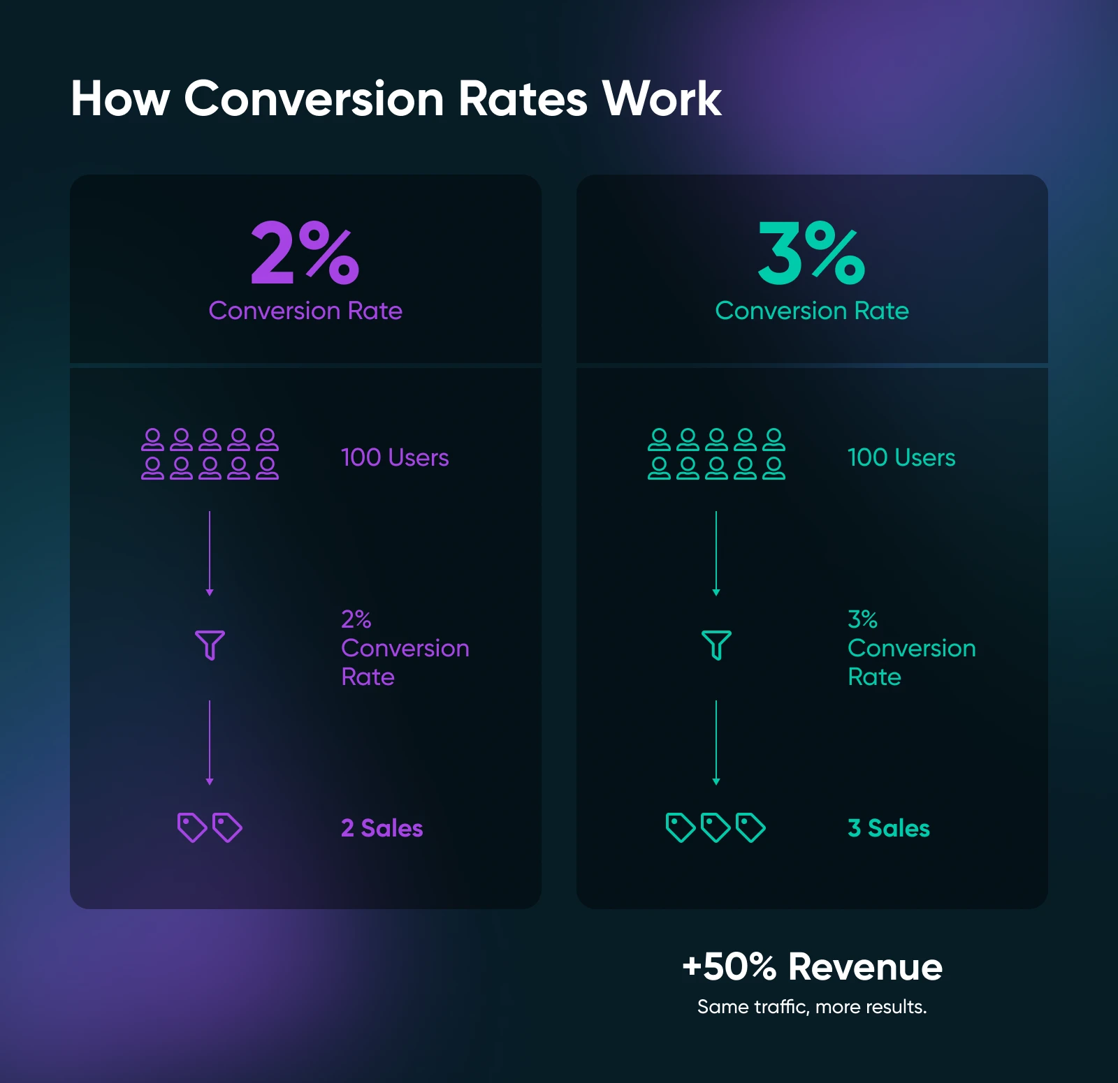
A higher conversion rate means more customers, more leads, or more engagement with your content, all without increasing your advertising spend or website traffic. In other words, you’re getting more out of the visitors you already have, which can be especially valuable for small businesses with limited marketing budgets.
So, why should you focus on improving your website’s conversion rate? Because it’s one of the most cost-effective ways to grow your business. Whether you’re aiming to sell more products, generate more leads, or increase engagement, boosting your conversion rate can help you achieve those goals with less effort and more efficiency.
Now, let’s dive into some strategies to help you turn more clicks into customers.
An Introduction to Conversion Rate Optimization (CRO)
Conversion rate optimization (CRO) is the process of enhancing your website to increase the percentage of visitors who take a desired action — whether it’s making a purchase, signing up for a newsletter, or filling out a form. Instead of just driving more traffic, CRO focuses on making your existing traffic more effective, turning visitors into customers with tweaks to your website design, copy, or functionality.
When To Start Using Conversion Rate Optimization
While CRO can help you get more results from your web pages, there are a few factors to consider before implementing it. Here are some situations that indicate it may be a good time to start using CRO:
- When you have a sufficient amount of target market data: Marketing personas are great places to start. Or, you can use tools like Market Finder to determine the actual market for your business.
- When you’ve tracked metrics: Data is the key to understanding whether CRO is working. As such, it’s a good idea to track key performance indicators (KPIs) such as bounce rate, page load time, user experience (UX), page views, and traffic numbers.
- When you have enough traffic: CRO practices are designed to take your existing traffic further. Therefore, it’s important to attract enough visitors to your site.
- When you have other marketing campaigns in place: CRO is the next logical step following data tracking, a decent amount of web traffic, and lead funnels.
If you aren’t at these stages yet, we recommend gathering some more data first. However, if you’ve determined that it’s the right time to implement CRO, read ahead to find out how to get started.
How To Increase Your Website Conversion Rate (17 Ways + 6 Tools)
Below, we’ll go through five quick wins, 12 bonafide strategies, and six tools to increase conversion rates
A Quick Note on A/B Testing
A/B testing, also known as split testing, is a powerful method to determine what works best on your website by comparing two versions of a web page or element (e.g., a headline, CTA button, or layout) to see which performs better.
It’s a data-driven way to improve conversion rates without guessing. We’re starting with this tip because you’ll likely use A/B testing to see how effective all of these tips are as you implement them.
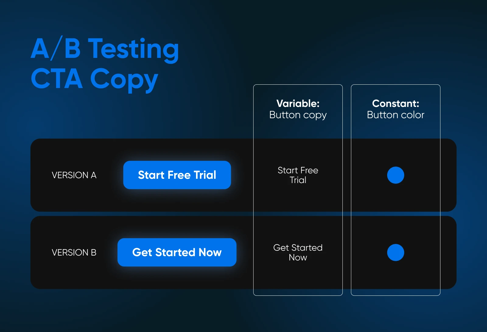
Start small by testing one element at a time, such as a CTA button or headline. Use a tool like Optimizely to set up your test.
For example, you could create two versions of a landing page: one with a red CTA button and one with a blue button. Then, see which color gets more clicks. Run the test until you have enough data, then implement the winning version across your site.
A/B testing allows you to continually refine your website based on real user behavior, leading to more effective pages and higher conversions.
5 Quick Wins for Boosting Website Conversion Rates
These quick, actionable fixes can help boost your website’s conversion rate with minimal effort, making them perfect for busy small business owners and site managers looking for fast improvements.
1. Write Strong Calls to Action (CTAs)
A clear and compelling CTA can make or break your conversion rate. For a quick win, make sure your CTAs are action-oriented and direct.
Use strong verbs like “Get,” “Start,” or “Claim” to motivate visitors. Keep it simple and specific, such as “Start Your Free Trial” or “Shop Now.”
Make your CTA buttons stand out by using contrasting colors and positioning them prominently above the fold on key pages like landing pages or product pages.
2. Improve Your Site Speed
Site speed plays a critical role in user experience and conversion rates. As page load time goes from one to three seconds, your site’s bounce rate increases by 32%. A quick win here is compressing large images, enabling browser caching, and minimizing CSS and JavaScript files.
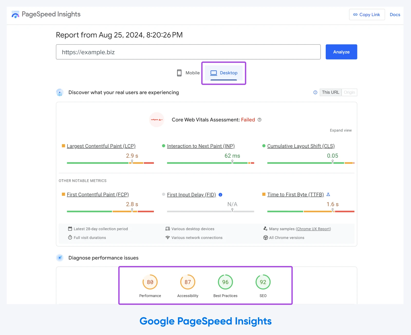
Use free tools like Google’s PageSpeed Insights to identify speed bottlenecks and apply simple fixes like image optimization (e.g., using tools like TinyPNG or JPEGmini) to boost load times.
You can also improve website speed by using a high-quality web host. At DreamHost, we offer a range of hosting options, including managed WordPress hosting. With one-click staging, unlimited content delivery network (CDN), and built-in caching, our plans are designed for optimal performance.
3. Make Sure Your Site Is Responsive
Since mobile users account for almost 60% of global web traffic, it’s important to design pages that display seamlessly across various screen sizes, such as desktops, tablets, and mobiles. A responsive site automatically adjusts to fit different screen sizes, delivering a consistent experience across devices.
Test your website’s responsiveness using a tool like MobileTest.me. If your site doesn’t pass, consider implementing a mobile-first design or using a responsive theme.
Quick fixes like resizing buttons and simplifying layouts can improve the mobile experience fast.
4. Provide Simple Navigation
Visitors should be able to find what they’re looking for quickly and easily. If your site’s navigation is cluttered or confusing, people will abandon it. Simplify your navigation by limiting the number of menu items and grouping related content logically.
Review your current menu and trim it down to only the essential categories. You can also add a prominent search bar at the top of your site so visitors can find what they need instantly. This can drastically reduce friction in the user journey.
5. Use Social Proof and Testimonials
Adding social proof, such as customer reviews, testimonials, or trust badges, boosts credibility and can lead to immediate increases in conversions. Display positive feedback from satisfied customers or showcase logos of brands you’ve worked with.
Place testimonials or reviews on your homepage, landing pages, and product pages. Have a look at how the subscription toothbrush company quip uses this approach on their site to generate some buzz.
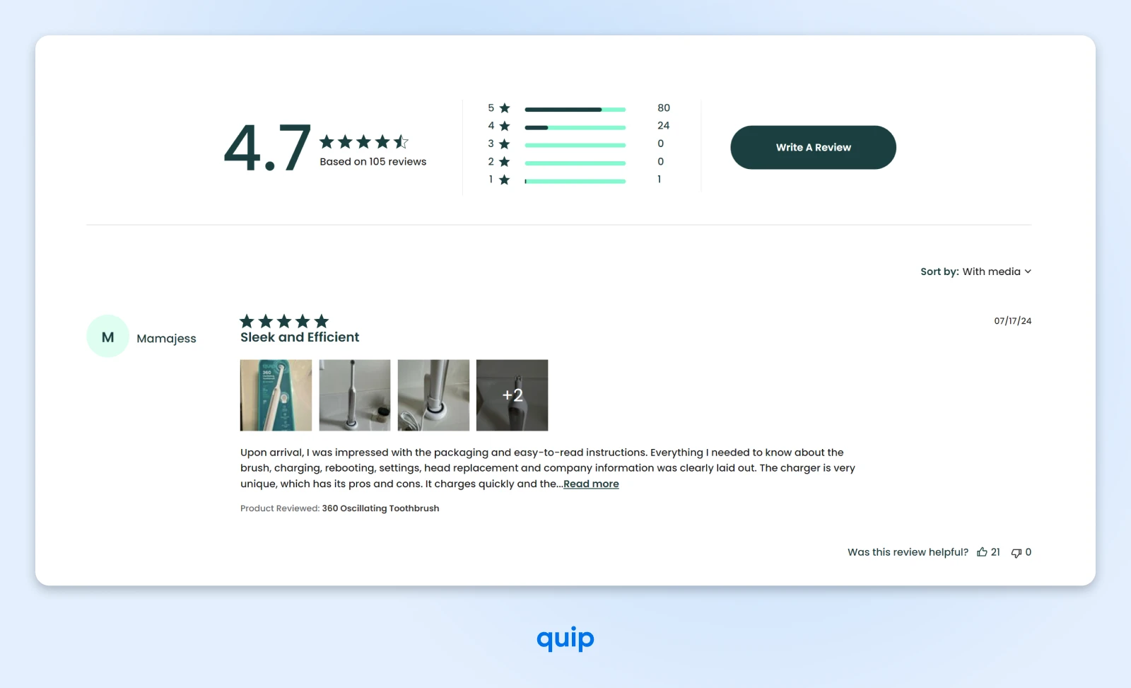
If you don’t have testimonials yet, consider using user-generated content from social media or offering a small incentive for customer reviews.
12 More Ways To Improve Your Site’s Conversion Rate
1. Use the Right Typography
A study at the University of Michigan found that people are more likely to view content as credible when it’s easier to understand. That being said, the fonts you use on your website can affect readability and overall user experience.
Clear, legible typography helps visitors engage with your content and makes navigation smoother. Avoid using overly decorative fonts that may be hard to read, and make sure there’s enough contrast between your text and background.
- Stick to easy-to-read, web-safe fonts like Arial, Helvetica, or Georgia.
- Make sure your font sizes are large enough for comfortable reading (usually 16px or more for body text).
- Test the readability on both desktop and mobile devices to ensure consistency across platforms.
You can even amplify your message by opting for a font with a particular personality, tone, or mood. Serif fonts have a classic look that exudes tradition and authority. On the other hand, handwriting fonts add warmth and character to their content.
Whatever you choose, stick with simple, clean typefaces since they’re more user-friendly.
2. Build Focused Landing Pages
Landing pages are distinct pages on your website dedicated to a single conversion. You might create a page for each of your services with relevant copy, unique CTA buttons, and testimonials.
Landing pages should focus on one clear goal, such as getting users to sign up for a service or purchase a product. The simpler the page, the more effective it is at driving conversions. Remove any unnecessary links or distractions that could divert attention from the main CTA.
It’s important to get right to the point on a landing page. You can do this with a clear headline. However, it’s also helpful to include information about your offer before introducing your CTA. This can warm up potential customers to the idea of sharing their email addresses, or parting with their money.
- Create separate landing pages for each campaign or product, with a single call to action.
- Use compelling headlines and concise, benefit-driven copy to guide users toward conversion.
- Include only the essential information needed to make a decision, along with a prominent CTA.
3. Create Captivating Headlines
Your headline is the first thing visitors see, and it needs to grab their attention immediately. A well-crafted headline can encourage people to stay on your site and learn more, while a bland or unclear headline may cause them to leave.
For example, 90% of visitors who read your headline also read your CTA copy. This statistic tells us that it’s essential to hook your audience at the beginning to drive action later on.
Additionally, your headlines can impact shareability. This allows more users to engage with your content, increasing your chance of scoring conversions.
It’s also been shown that you have less than 10 seconds to hook your audience before they bounce to a different website. Therefore, your content must be straightforward, creative, and get to the point quickly.
- Use a headline that clearly conveys value or solves a problem your visitors face.
- Experiment with different headline styles — questions, numbered lists, or benefit-driven statements.
- A/B test to see what resonates best with your audience. Keep it concise but impactful.
4. Make Your Messaging Clear
One of the biggest mistakes you can make with your website is not sticking to one goal for each web page. For instance, if you discuss web hosting in your copy and then switch to a CTA to sign up for an email marketing service, you can easily confuse visitors.
Clear, concise messaging helps visitors understand your value proposition quickly. If your message is too complicated or vague, users will leave. Focus on simple language that addresses the benefits of your product or service, rather than technical jargon.
There are various ways that you can optimize copy for readability on your site:
- Lead with active voice.
- Keep sentences and paragraphs short to assist with scanning.
- Adopt clear, direct language.
- Break up long chunks of text with visuals or bullet points.
Revisit the copy on your key pages and ensure it’s easy to understand in one glance.
Speak directly to your audience’s pain points and explain how your solution can help. Use bullet points or short paragraphs to break up text and make it more digestible.
5. Clean Up Your Site Structure
A well-organized site structure makes it easier for visitors to find what they’re looking for, reducing frustration and increasing the chances of conversion. A cluttered or confusing site can cause users to bounce before they’ve even engaged with your content.
Audit your website’s layout and simplify its structure by creating a clear hierarchy. Group related content together and reduce the number of clicks it takes to reach important pages. Use intuitive navigation labels and add breadcrumb trails to help users track where they are on your site.
6. Design Short, High-Converting Forms
Long or complicated forms can be a major barrier to conversions. By shortening your forms and only asking for the essential information, you can reduce friction and make it easier for visitors to complete the desired action.
For example, Warby Parker disguises its sign-up form as a fun visual quiz. Since visitors don’t feel like they’re completing a standard lead generation form, this approach can help increase conversions.
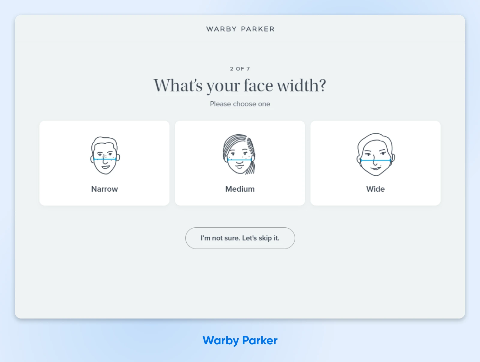
Your form completion rate can also depend on the type of information you ask visitors to submit. For instance, when you ask for a phone number, conversions can drop by 5%.
Trim your forms down to the most important fields (e.g., name, email, and one additional piece of info). Use inline form validation to help users avoid errors as they fill out the form. Test different form designs to see which format results in higher completion rates.
Here are some other ways to persuade users to complete your forms:
- Make your forms short.
- If forms need to be long (to collect relevant information), use a progress bar to extend users’ patience.
- Break up questions into sections or tabs to make forms feel more manageable.
What’s more? You might want to consider offering incentives to readers who fill out your forms. Maybe provide coupons, discounts, free trials, eBooks, or samples to show appreciation.
7. Eliminate Distractions and Friction
Too many distractions on your website — such as pop-ups, autoplay videos, or excessive links — can overwhelm visitors and cause them to leave without converting. Reducing friction by removing unnecessary elements helps create a smoother user experience.
- Review your key pages and eliminate anything that doesn’t directly contribute to your conversion goal.
- Keep your design clean and focused, and ensure your CTAs are easy to find.
- Simplify the checkout or sign-up process by removing any unnecessary steps.
8. Include Visual Elements
Strong visuals like images, videos, or infographics can capture attention and communicate your message quickly. They also help break up long sections of text, making your content more engaging and easier to consume.
There are many different types of visuals you can include on your website: product images, graphics, screenshots, videos, and illustrations are all great options, depending on your niche.
- Add high-quality images or short, informative videos to your landing pages or product pages.
- Ensure that all visuals support your messaging and enhance the user experience rather than distracting from the main goal.
- Use alt text for images to improve accessibility and search engine optimization (SEO).
9. Add Pop-Ups to Your Pages
Pop-ups can be a powerful tool to capture leads or offer special deals before visitors leave your site. When used strategically, they can boost conversions without being intrusive. In fact, pop-ups have a higher conversion rate than any other type of ad.
To make the most of pop-ups on your site, consider timing them effectively to make them less distracting. Use exit-intent pop-ups that appear as a user is about to leave a page, offering a discount or free resource.
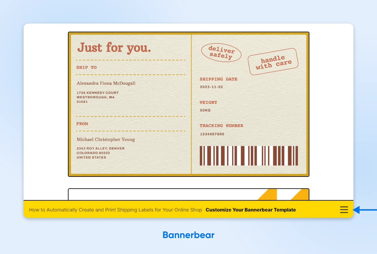
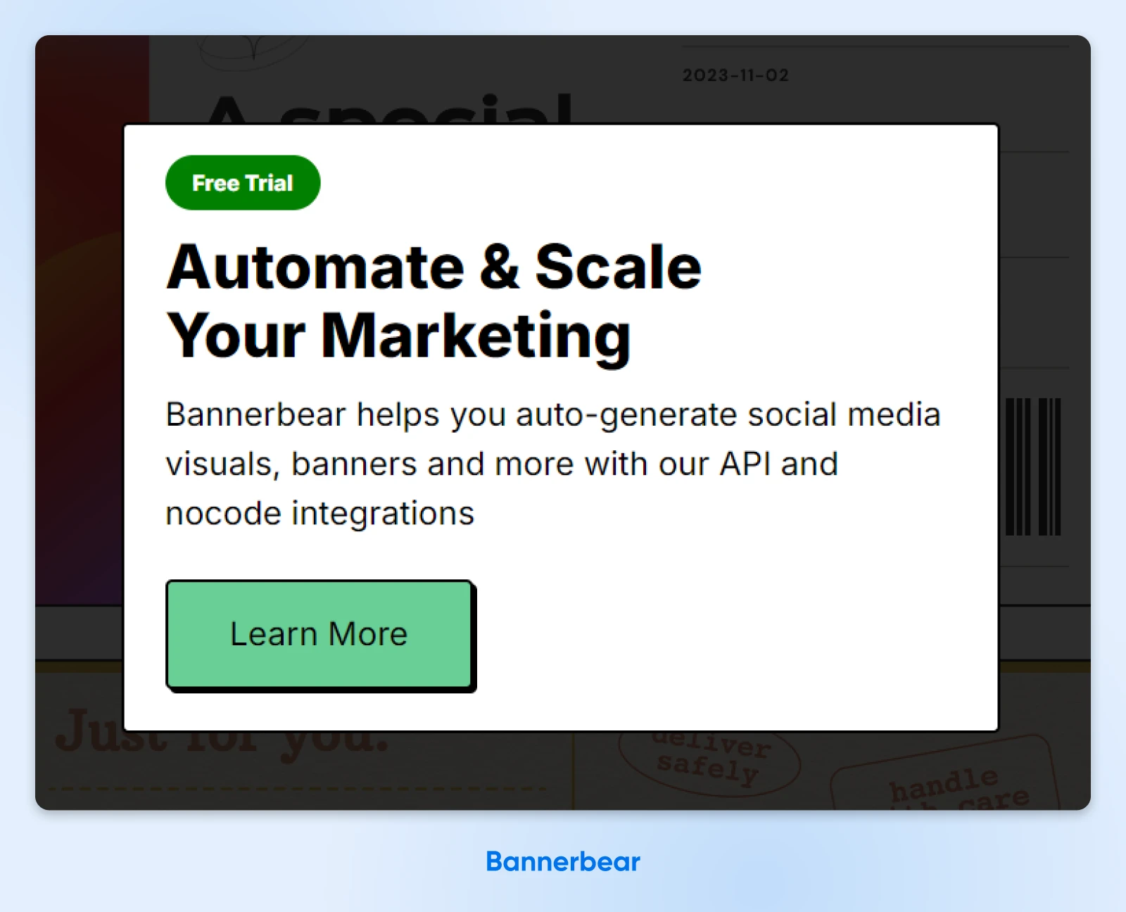
Analytics and insights company Bannerbear uses pop-ups in two ways. One is a discreet pop-up footer that appears when you scroll through the blog.
The second is a timed pop-up that appears after you spend a certain amount of time on a page.
Keep the messaging short and compelling, with a clear CTA. A/B tests different designs and offers to see what resonates most with your audience.
10. Launch an Email Newsletter
An email newsletter helps you stay in touch with potential customers and nurture them over time. It’s a great way to keep your brand top of mind and drive repeat traffic back to your site.
- Add a prominent sign-up form on your homepage and blog pages, offering an incentive such as a discount or exclusive content.
- Keep your newsletters consistent and valuable, sharing tips, updates, or promotions.
- Use a clear CTA in each email to encourage engagement.
11. Highlight Your Highest Converting Content
Certain blog posts, product pages, or services may already drive more conversions than others. Highlighting these high-performing pages can help guide visitors toward the content most likely to convert them.
Use analytics tools like Google Analytics to identify which pages have the highest conversion rates. Feature links to these pages in your navigation, sidebar, or at the end of blog posts. You can also promote them via email newsletters or social media to drive more traffic to those pages.
12. Ask People What Works
Sometimes, the best way to improve your site is to get feedback directly from your visitors. Surveys, feedback forms, or user testing can give you valuable insights into what’s working and where visitors are getting stuck.
Add a simple feedback form on key pages asking visitors why they did or didn’t complete a purchase or sign-up. You can also use tools like Hotjar to run short surveys or analyze heatmaps to see how users are interacting with your site. Apply the feedback to remove pain points and improve the overall user experience.
6 Best Conversion Rate Optimization Tools To Implement on Your Site
Now that you know how to optimize your website for conversions, let’s look at some helpful CRO tools. These platforms and plugins can supercharge your strategy and boost conversions in no time!
1. Google Marketing Platform
Google Marketing Platform provides an entire suite of tools that can be used within your CRO framework. It’s also a great choice for small businesses because you can access the tool for free.
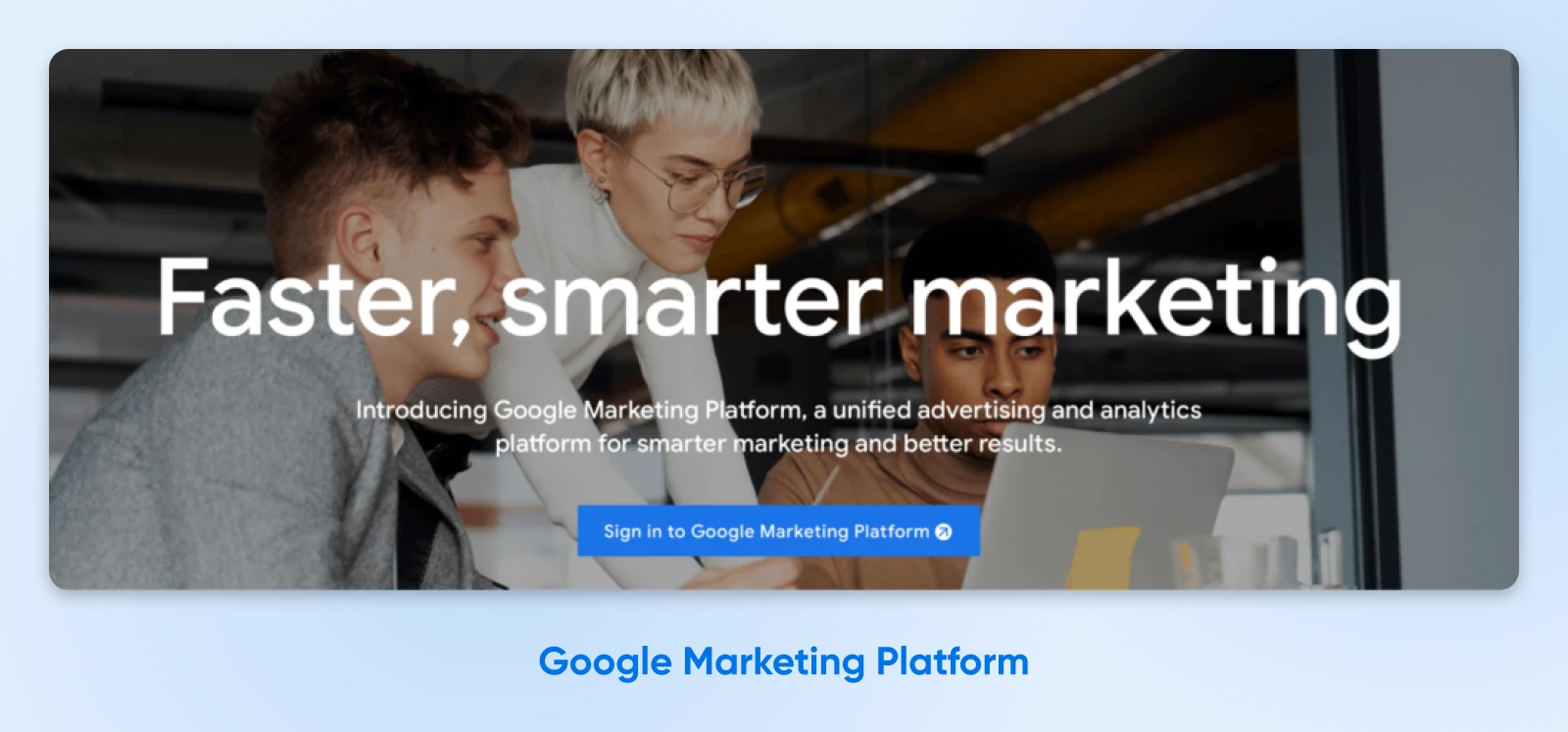
Better yet, as a suite of tools, these solutions are designed to work together so that your data is accessible across all the applications. For instance, you can gather your tracking data with Google Analytics and set up your tests with Google Optimize.
2. Five Second Test
Five Second Test lets you access and understand a user’s first impression of your website. It’s a unique concept, relying on testers who have five seconds to view your page before being asked a series of questions.
For example, users might be asked about the main elements they remember from your page.
You can also get two free minutes of testing each month, which is more than enough for most businesses. Or, if you opt for a paid plan, you can increase testing time, brand your experiments, and implement A/B testing.
3. Mailchimp Signup Forms
Mailchimp is one of the most popular email marketing service providers. With Mailchimp signup forms, you can create custom signup forms within any widget or content area on your website.
A Mailchimp widget is prominently displayed on your page, making it easier for people to notice and complete your forms. Plus, Mailchimp has a free version that’s great for beginners and small websites. By sending high-converting emails and newsletters, you can warm your audience up to the idea of a purchase.
4. Monarch Social Sharing
Since it arrived on the scene in 2015, Monarch has remained one of WordPress’s most popular social sharing services. Although this is a premium plugin, the ROI alone makes it worth the cost.
Since Monarch makes it easier for readers to share your content, you can grow your readership and boost your conversion rate.
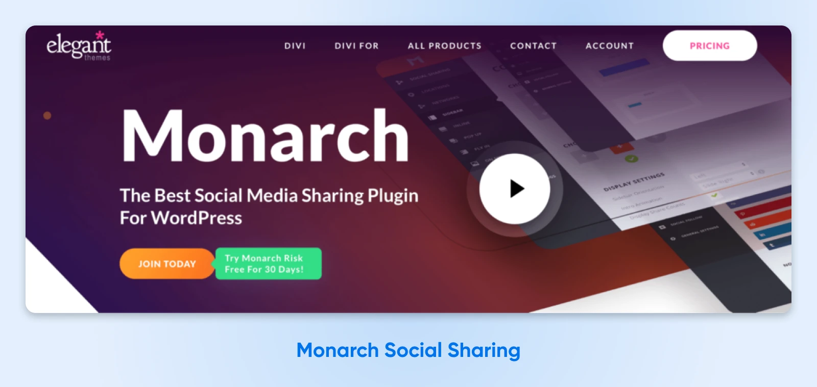
You can also use its intuitive dashboard to view your sharing statistics and discover where your content performs best. Then, you can focus your social media marketing efforts on those specific platforms.
5. Popup Builder by OptinMonster
OptinMonster is a pop-up builder plugin that enables you to attract more subscribers and grow your business. Several plugins provide this functionality. However, we like OptinMonster because it excels at re-engaging visitors who are about to exit your website.
With OptinMonster, you can present users with beautiful, interactive pop-ups that won’t annoy them. Because the plugin targets and personalizes your message to receptive readers, you get to maintain a superb user experience.
6. Page and Website Builders
Page and website builder plugins make it easier to build beautiful landing pages that are sure to impress your visitors. They’re excellent options for people with little design experience because you can access pre-designed templates and customize them to suit your branding.
Moreover, most page builders, like Elementor, let you drag and drop elements into place to create pages visually.
Therefore, it’s suitable for all abilities. Plus, you can include a ton of high-converting elements on your pages, such as CTA blocks, pop-ups, and subscribe forms.
Increase Your Conversion Rate Today
It can be challenging to encourage users to convert. Fortunately, CRO helps you minimize the risk of users leaving your site without interacting with your pages. All that’s left to do is get visitors to your site —and DreamHost can help. We provide professional SEO marketing services to help grow your audience and increase organic traffic. Learn more about our professional SEO marketing plans!

Get More Visitors, Grow Your Business
The best-designed site is worthless if no one can find it. Leverage proven online marketing strategies and techniques to help more of your target audience find you.
See More
