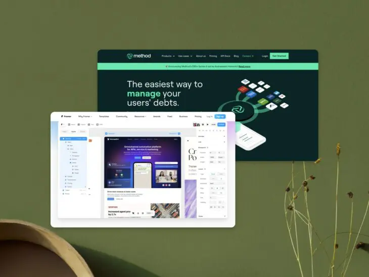
From startup to enterprise, SaaS companies have dominated the tech space. Regardless of their size, there’s one thing all SaaS companies have in common: They need great websites.
Building an excellent SaaS website is no easy feat, but with the right inspiration, you can sell your SaaS product with a site that stands out. Below, you’ll find 12 of the best examples of SaaS websites on the web. But first, a few basics–let’s get started.
What Is A SaaS Website?
“SaaS” stands for Software as a Service. Some well-known examples of SaaS products include Google’s G Suite (now Google Workspace), Microsoft’s Office 365, Salesforce, and Slack. These are web-based software applications where the software and associated data are hosted on the cloud, and users typically pay a monthly or yearly fee to access the software.
A SaaS website is the marketing website for a SaaS company–It’s the platform where potential customers learn about the product, see its features and benefits, learn about pricing models, and ultimately sign up or make a purchase.
What Does A SaaS Website Need?
This website provides the primary point of contact between a SaaS business and its customers, so it needs to fulfill some important purposes.
Here are some key components typically found on a SaaS marketing website:
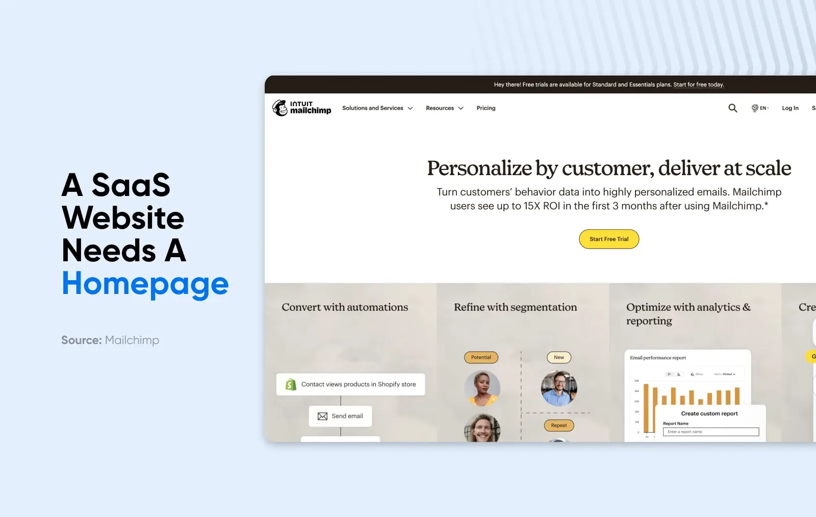
- Homepage: The first page visitors land on, which includes a clear and compelling headline, a brief description of the product, and a call-to-action (CTA) like “Start a free trial” or “Sign up now”. It may also include some high-level benefits or features of the product.
- Product pages: These should have detailed overviews of the product’s features and benefits, often broken down into sections. This might include screenshots or videos showing the product(s) in action. They may also be designed as SaaS landing pages for particular marketing campaigns or customer segments, which often have a specific focus and a clear CTA (call-to-action.)
- Pricing page: This outlines the various pricing plans available, what features each plan includes, and whether there’s a free trial or freemium option. The aim is to make it incredibly clear what the customer will get at each price point.
- About page: A page with information about the company behind the product — This might include the company’s mission, team bios, and details on the company’s expertise and experience in the field.
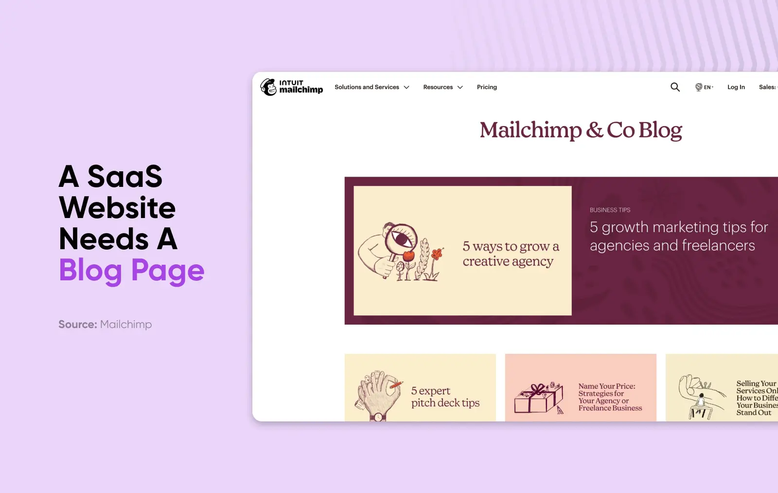
- Blog: A place where the company can share useful content related to the product or industry. This helps to drive organic traffic through search engine optimization (SEO), establish the company as a thought leader, and engage potential customers.
- Testimonials and case studies: These are used to build social proof and demonstrate that the product works as promised. Testimonials are usually short endorsements from satisfied customers, while case studies are more in-depth and show how a customer successfully used the product.
- Resource library, FAQ, and customer support: Here, customers can find answers to common questions and get support if they need it. This could be a series of help articles, a chatbot, or contact information for the support team.
- Contact page: A place where visitors can get in touch with the company for support, sales inquiries, or general questions.
The best SaaS websites are easy to navigate, have a clear value proposition, and guide the visitor toward a conversion goal, whether that’s signing up for a free trial, scheduling a demo, or making a purchase.
Navigation Menu
A navigation menu is a collection of links that lead to a website’s main pages. Typically, navigation menus are located either at the top of the screen or in a sidebar. However, that location may vary.
Read MoreIn addition to all the pages above, your site should have a few key features to help it stand out from the crowd:
- Clear navigation: Everything listed above should be easy to find on your SaaS website. A clean, intuitive navigation menu helps visitors quickly find what they’re looking for. Whether it’s product details, pricing, customer testimonials, or support, all of the important pages should be easily accessible from anywhere on the site.
- Functionality: Your website should load quickly, provide a smooth user experience, and meet SEO standards. This can be achieved through optimization techniques like minimizing the size of images and JavaScript files.
- Responsive design: The website should work equally well on all devices, from desktops to tablets to smartphones. A responsive design ensures that the website automatically adjusts to provide an optimal viewing experience on any device.
- Clean, visually appealing aesthetic: The overall aesthetic should be attractive and reflect your brand’s identity. This means choosing a suitable color scheme, typography, and layout. A clean, minimalist design can help focus attention on the most important elements. Oftentimes, this means going beyond website templates or WordPress theme and investing in professional web design.
4 Benefits Of A Well-Designed SaaS Website
Why put so much time and effort into your SaaS website? While it may be a big investment upfront, having a great website can pay off in many ways. Here are just a few of the benefits.
Better User Experience
A well-designed website is intuitive and easy to navigate, making it easier for visitors to find what they’re looking for and understand what the product offers. This results in a better user experience, encouraging visitors to spend more time on your site and engage more deeply with your content and product.
More Conversions
Conversion
A website conversion is any action a user takes on a site that moves them further into the sales funnel. Examples include filling out a web form, clicking a call to action, or purchasing a product.
Read MoreA clear, compelling website with strong calls-to-action will guide visitors toward taking the desired action, whether that’s signing up for a free trial, requesting a demo, or making a purchase. By making the path to conversion as smooth as possible, a well-designed website can boost your conversion rates.
Boosted Customer Loyalty
Providing a positive, seamless experience from the first interaction can help build trust and loyalty with your customers. This includes having a visually appealing site, easy-to-understand content, and efficient customer support.
Stronger Online Presence
A professionally designed, SEO-optimized website can enhance your online presence, making your business more visible in search engine results and helping to attract more organic traffic. This can increase brand awareness with your target audience and bring in new potential customers. It also strengthens your brand across different channels and touchpoints.
12 Excellent SaaS Websites To Inspire You
Now that we’ve covered the benefits, let’s get to the real reason you’re here: The best SaaS website designs on the internet today. The 12 examples below will inspire you to make your SaaS website the best it can be.
1. Mailchimp
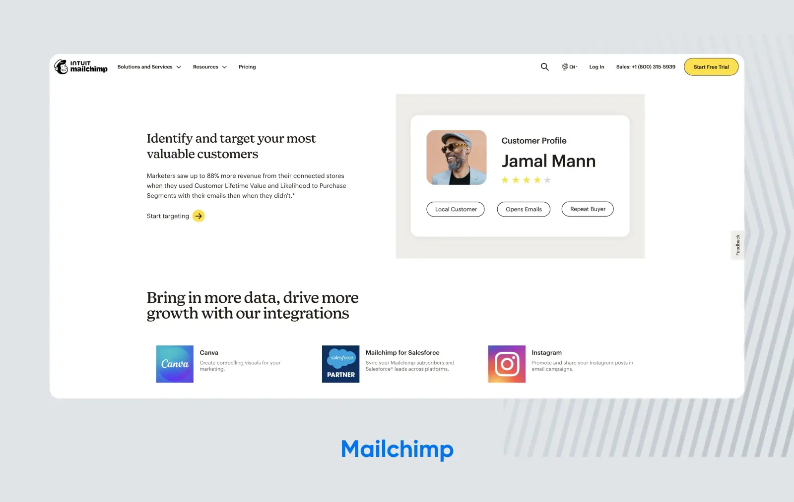
Mailchimp is one of the most recognizable brands in the SaaS space, and its brand cohesion certainly extends to its website. By using unique typography, bright colors, and a ton of white space, they make sure visitors’ attention is focused on their message–which is written in the tongue-in-cheek Mailchimp style we’ve all come to know and love. If you landed on Mailchimp’s site and, for some reason, you didn’t know where you were, you’d be able to figure it out almost instantly, which makes this one of the best SaaS websites on the internet.
2. Dropbox
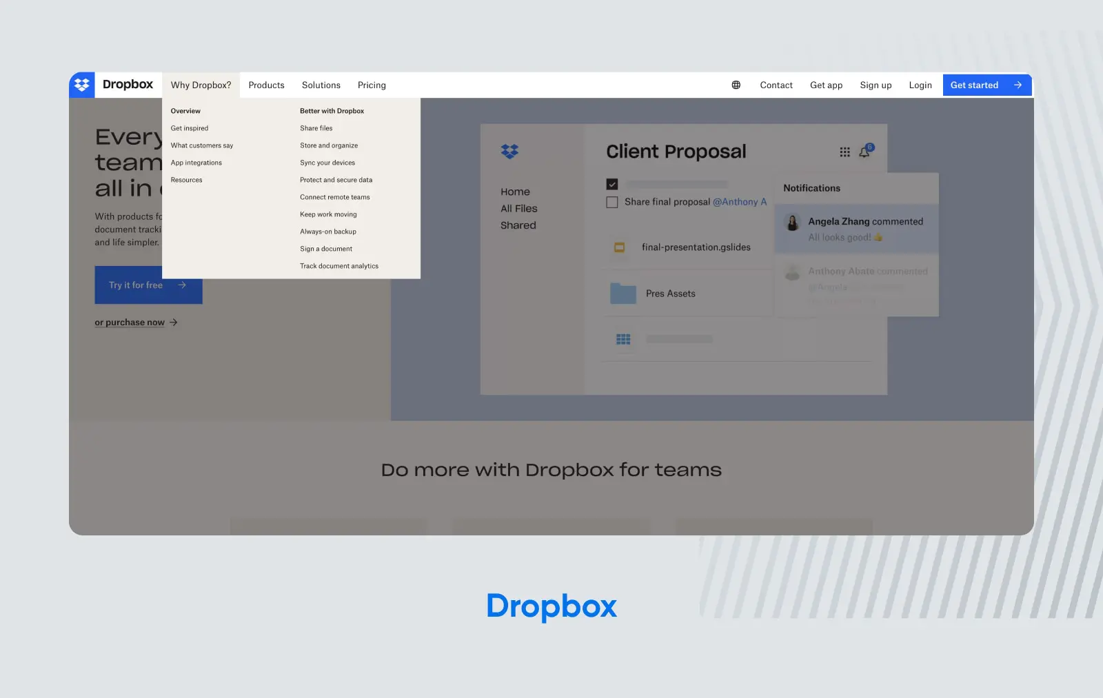
Dropbox is another SaaS company that’s legendary for its design and branding. Aside from an instantly recognizable website, Dropbox gets props for its navigation bar, which makes it simple for users to see the value proposition through a simple “Why Dropbox?” section that lists all the different use cases where Dropbox can streamline their workflows.
3. Framer
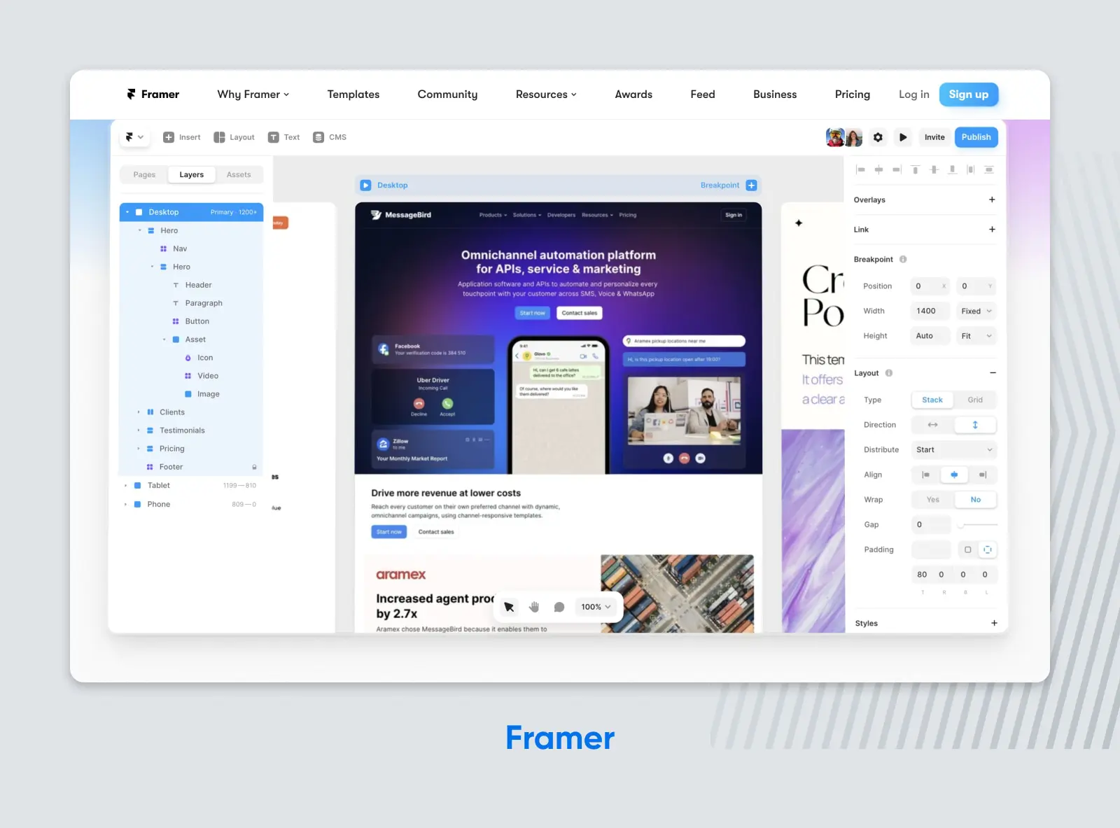
Sometimes, it’s better to show than to tell. That’s the philosophy behind Framer’s website, and it really works–rather than just tell visitors how they can use AI to build a custom website without knowing any code, Framer’s homepage launches right into a video that shows them that.
Coupled with a nav bar across the top of the screen that takes visitors straight to use cases, templates, pricing, resources, awards the company has won, and other tools and integrations it Framer works with, the result is a powerful site that feels super easy to navigate and lays out the value proposition quickly and clearly.
4. ClickUp
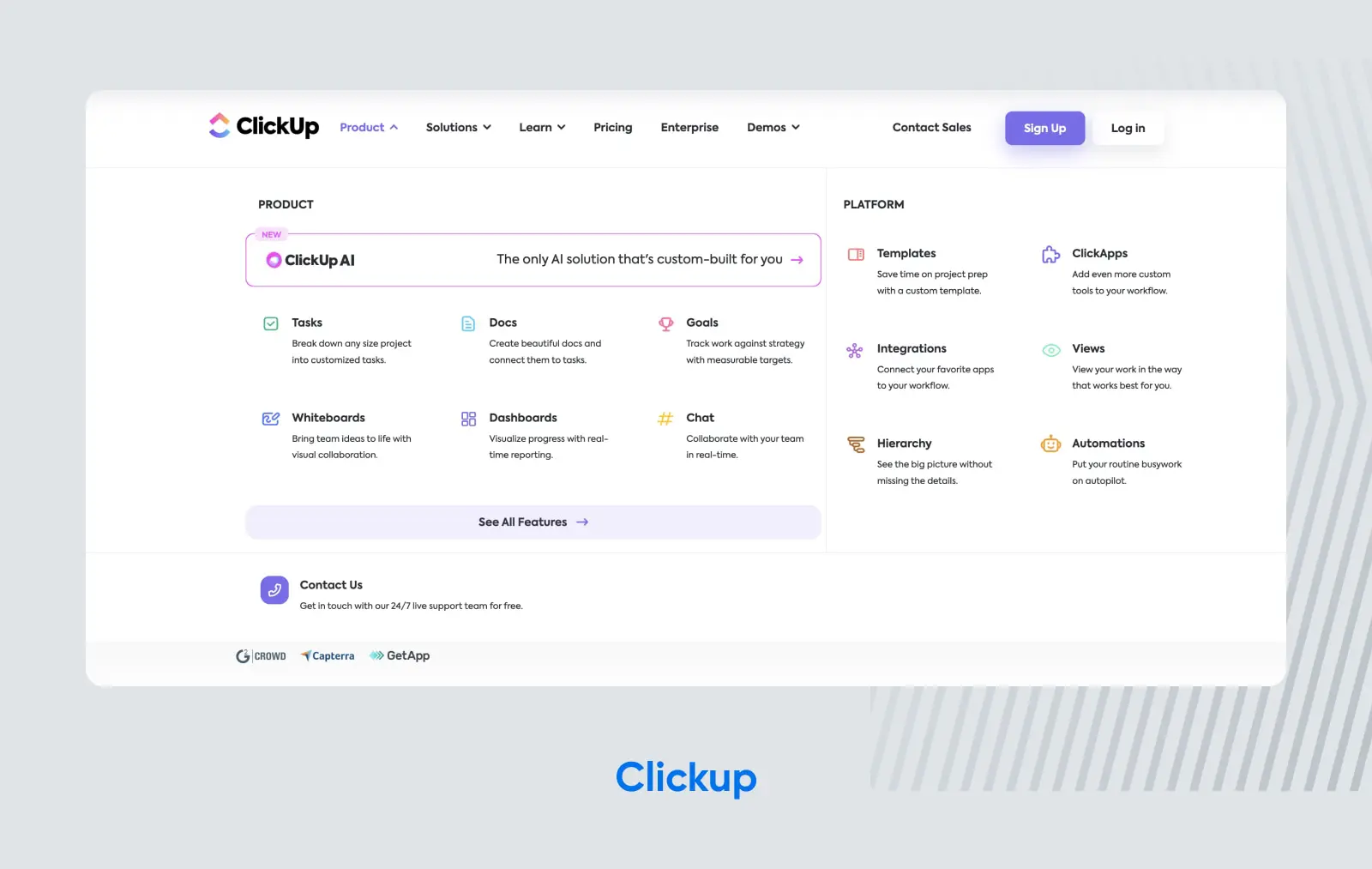
Project management tool ClickUp has another strong SaaS website–and it’s an especially splendid example to follow if you want to build a website focused on SEO.
When you mouse over ClickUp’s header, you see it’s filled with landing pages, each one focusing on a different feature (and SEO optimized to rank for a keyword closely related to that feature). At first glance, it may seem overwhelming, but when you look closer, you see that all the features are carefully organized to help visitors see ClickUp’s vast range of powerful capabilities–and capture a ton of organic traffic from search.
5. Spline
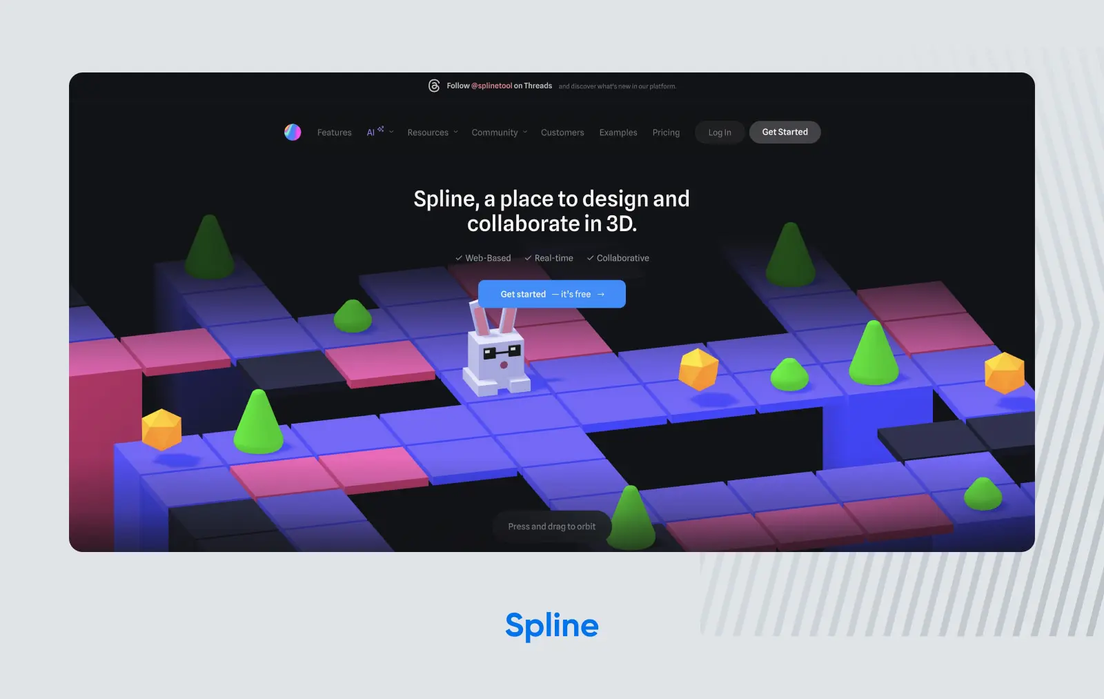
3-D animation and graphics can be intimidating, which is why Spline, a tool for creating them, has made its homepage all about being interactive and approachable. Visitors can click and drag characters and elements on the homepage to rotate and move them around the page. It’s a great way of showing what the actual tool is capable of producing–and a simple nav bar encourages users to either sign up right away or follow the company on social media.
6. Lattice
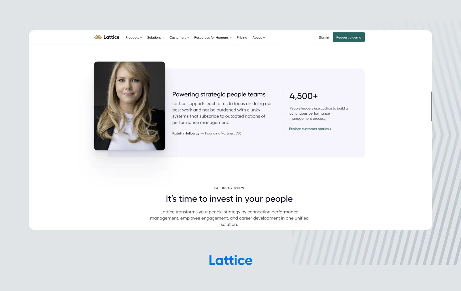
Lattice, a software for HR companies, is a more traditional B2B SaaS. It’s a bit of a departure from the example above, which is all about being playful and fun. Still, given the nature of the work Lattice (and the company’s customers), it’s no surprise that their website is no-frills and uses clean lines, simple images, and white space to help visitors focus on what’s important: the copy.
A simple nav bar guides potential customers through Lattice’s product features, plus how it solves different problems for different sizes of businesses across industries. By the time you leave this site, you should have a solid understanding of how this software can help you–which is likely to help boost Lattice’s conversions.
7. Zoho CRM
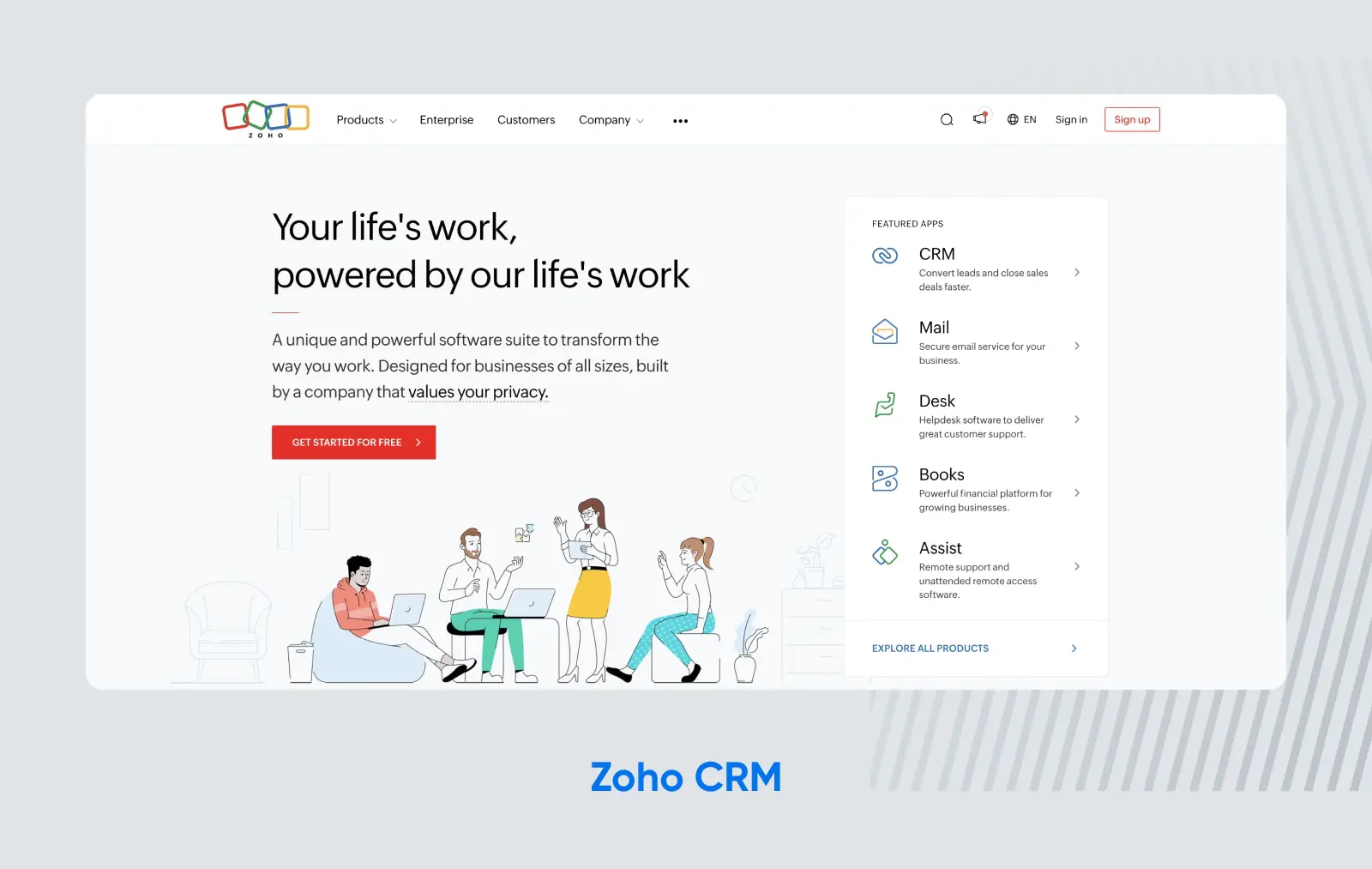
One challenge for Zoho CRM is that it doesn’t have just one piece of software to sell–it’s an entire suite of apps in one. So, how does it effectively describe its products and features without overwhelming potential customers?
Using bold fonts and colorful iconography, Zoho has managed to strike this delicate balance. It features a few of its most-used apps on the homepage, but the navigation bar in the header lists more of its offerings–and offers visitors more details on each one. It takes a little time and some exploring, but Zoho has carefully mapped out its site to make it easy for visitors to explore all of its different product offerings without getting lost or overwhelmed.
8. beehiiv
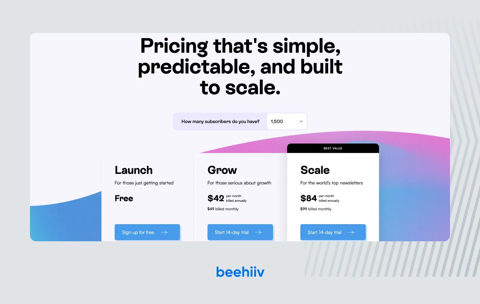
When you want your email newsletter to catch readers’ eyes, the first step is for your newsletter company to catch your eye. beehiiv certainly does that, with modern design elements and a sleek color palette.
Another part of beehiiv’s site that stands out is the pricing page, which makes it easy to understand exactly what users will get at each pricing tier–and which tier is the best fit for their needs based on their current number of users.
9. Basecamp
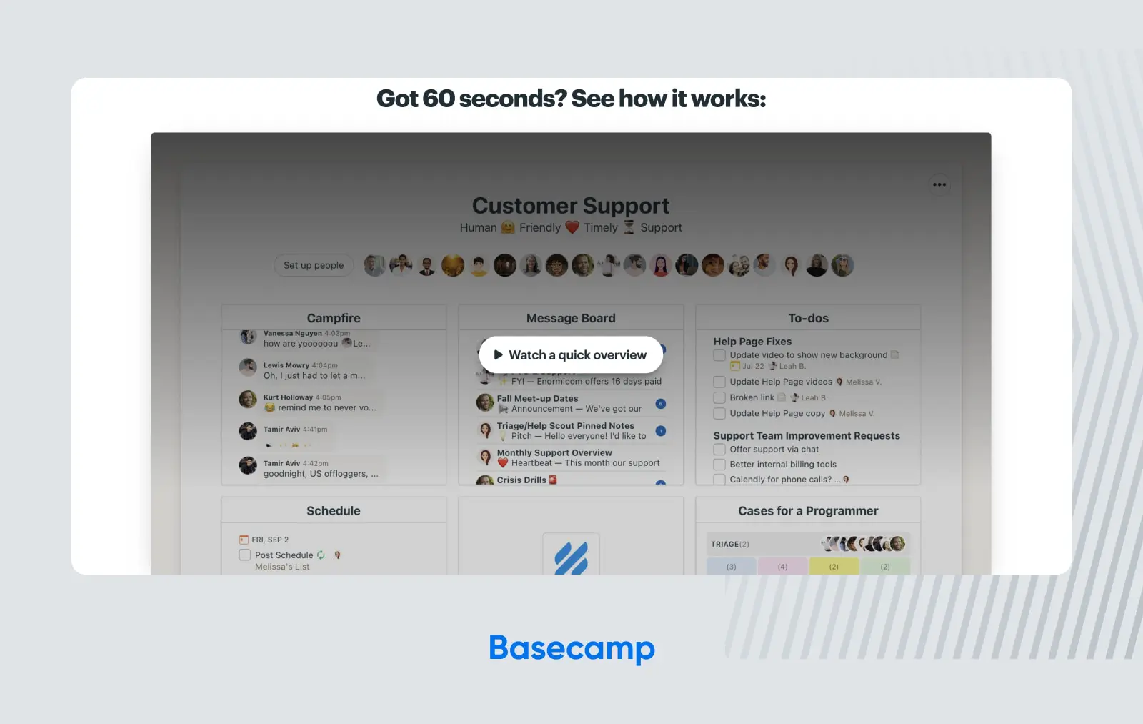
In the age of remote work, tools like Basecamp are invaluable. As a collaboration tool, Basecamp helps its users work together on everything from designing a marketing strategy to coordinating a product launch. Alas, when a tool is this versatile, it can be tough to communicate its wide range of use cases to potential users.
That’s why Basecamp is an example of a great SaaS website. It also takes the “show, don’t tell” approach, asking visitors to invest just 60 seconds in watching a video to get the gist on how it works. Then, it transitions to some solid social proof, with a huge list of testimonials from users. Combined with fun typography and bold colors, Basecamp is an example of SaaS web design that took risks, and they paid off.
10. Method
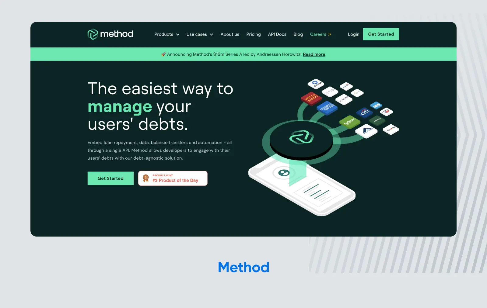
Fintech software isn’t known for being the most user-friendly. That’s why the designers behind the web page for Method, a debt repayment platform, went out of their way to create a simple, streamlined user interface. Also worth noting is the straightforward pricing page–something else that’s typically overly complex for finance-related products.
11. Pipe
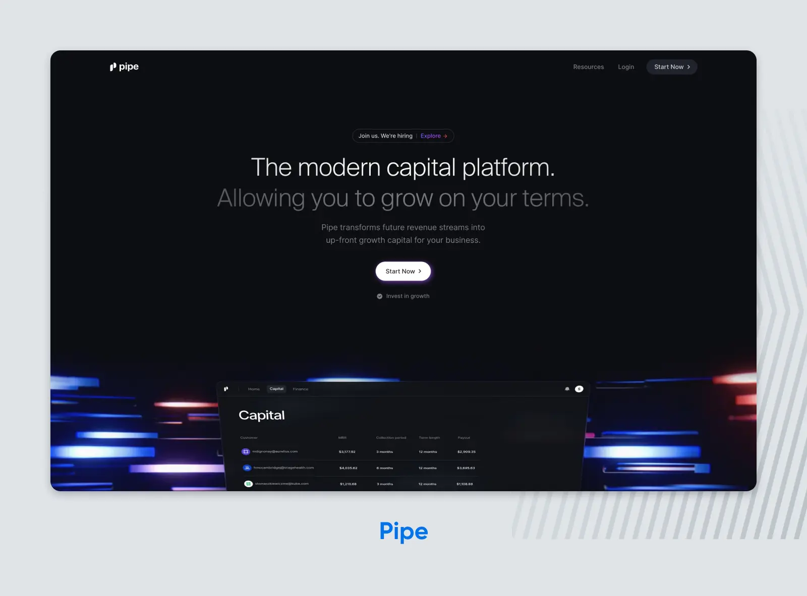
Pipe is proof that you don’t need to hire the best web design firm out there to get a top-tier SaaS website. They built their site in Webflow, a no-code website builder. Its minimal, clean design highlights the product features, ensuring site visitors focus on what they came for.
12. Gumroad
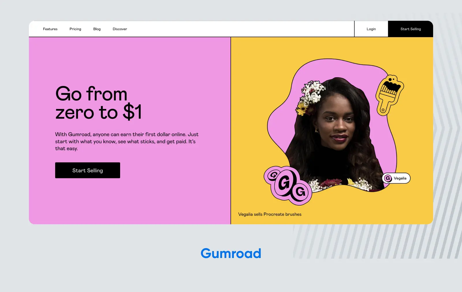
Gumroad is an e-commerce site that allows anyone to sell any digital product online. After a complete site redesign, they’re an example in the SaaS space for their bright, playful branding that helps them stand out.
They also get a nod for their pricing page, which is colorful and simply designed so it’s easy to understand, even with just a glance. Overall, Gumroad’s site helps reinforce the company’s brand while staying easy to navigate and use–all attributes that any SaaS website should strive for.
Start Building Your SaaS Website With Managed WordPress Hosting From DreamHost
When you’re building your SaaS website, don’t start from the ground up. Give yourself a competitive edge with DreamPress managed WordPress hosting.
We offer multiple plans at pricing levels that will fit your business, wherever you are now–and grow with you as you scale. Your domain, unmetered bandwidth, SSL certificates, 27/4 WordPress support, on-demand backups, one-click restore, free pre-installed Jetpack, and more are included at all pricing levels. Plus, if you already have a website, we’ll migrate it to WordPress for you for free.
DreamPress is fast, secure, and optimized for WordPress, one of the most popular CMS platforms in the world. It’s the perfect foundation to build your SaaS website, and DreamPress makes WordPress even easier. Ready to pick the DreamPress plan that’s best for your SaaS website needs? Check out our plans and pricing.

DreamHost Makes Web Design Easy
Our designers can create a gorgeous website from SCRATCH to perfectly match your brand and vision — all coded with WordPress so you can manage your content going forward.
Learn More