While working on your website’s design, you might feel tempted to focus on the Home, About, and landing pages. However, you won’t want to ignore the Contact Us page — Without it, your customers won’t be able to reach out and ask questions.
Fortunately, you can easily create a well-designed Contact Us page. By including contact forms, email addresses, phone numbers, and other business information, people can easily get in touch with you. When you are more accessible to visitors, you can increase customer satisfaction.
In this post, we’ll explain what a Contact Us page is and how to create one. Then, we’ll show you 25 of the best examples. Let’s get started!
What Is a ‘Contact Us’ Page?
As you might expect, a Contact Us page enables users to contact you. These often include a form that visitors can use to ask questions, write feedback, and submit other helpful responses.
The goal of any good Contact Us page is to encourage your website visitors to complete an action or conversion — whether that be submitting their contact information, making a phone call, or initiating a live chat conversation.
Website Conversion
A website conversion is any action a user takes on a site that moves them further into the sales funnel. Examples include filling out a web form, clicking a call to action, or purchasing a product.
Read MoreHaving a Contact Us page can also make your business seem more accessible and trustworthy. Instead of just talking about yourself on an About page, you signal to visitors that you’re available for further questions.
Around 44% of online users leave a website if they don’t see contact information. Especially for corporate or business sites, where some customers may need to ask about shipping times, delivery details, and other important information.
Furthermore, many people have come to expect contact methods on a website. By creating a Contact Us page, you can improve your User Experience (UX). This can reduce bounce rates and keep potential customers on your site.
How to Create the Perfect ‘Contact Us’ Page (4 Tips)
Now that you know what a Contact Us page is, let’s discuss some best practices for creating one. If you put these tips into action, visitors will want to reach out to you!
1. Provide Multiple Ways to Contact You
You might not know what information to include when building your first Contact Us page, but in general, it’s best to provide a variety of methods for visitors to contact you. This way, you can account for different preferences.
A contact form is one of the best features to add to this page. It enables users to fill out specific fields and quickly send their questions or feedback:
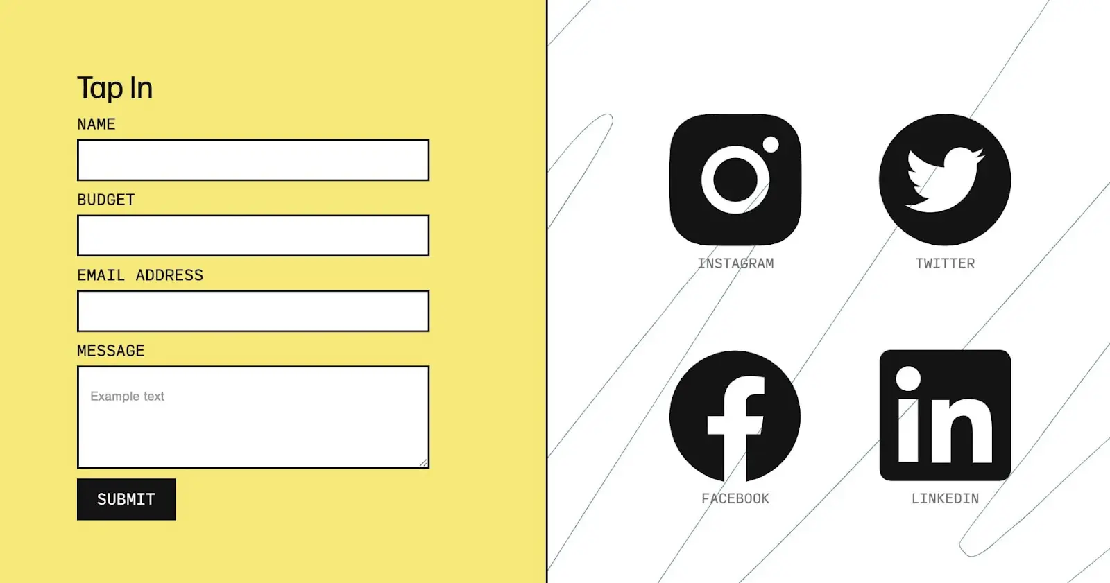
Using a plugin like WPForms, you can create contact forms that are easy to use. With a custom form, you’ll also remove the extra steps required to send a personalized email or call a phone number.
However, some customers may prefer more traditional customer support methods. In cases like these, it’s also important to list your business email address, phone number, and physical address.
Including all of this information is a great way to make yourself more accessible. Through phone calls, emails, or in-person conversations, you can solve customers’ problems and ensure they return to your business.
2. Include Personalization
Sometimes, a website owner will stick a basic contact form on a page and call it a day. However, it can be beneficial to include information about you, your services, and why visitors might want to contact you.
For example, you might explain how you can solve a problem for visitors. By discussing your custom services, you’ll encourage prospective clients to submit a proposal:
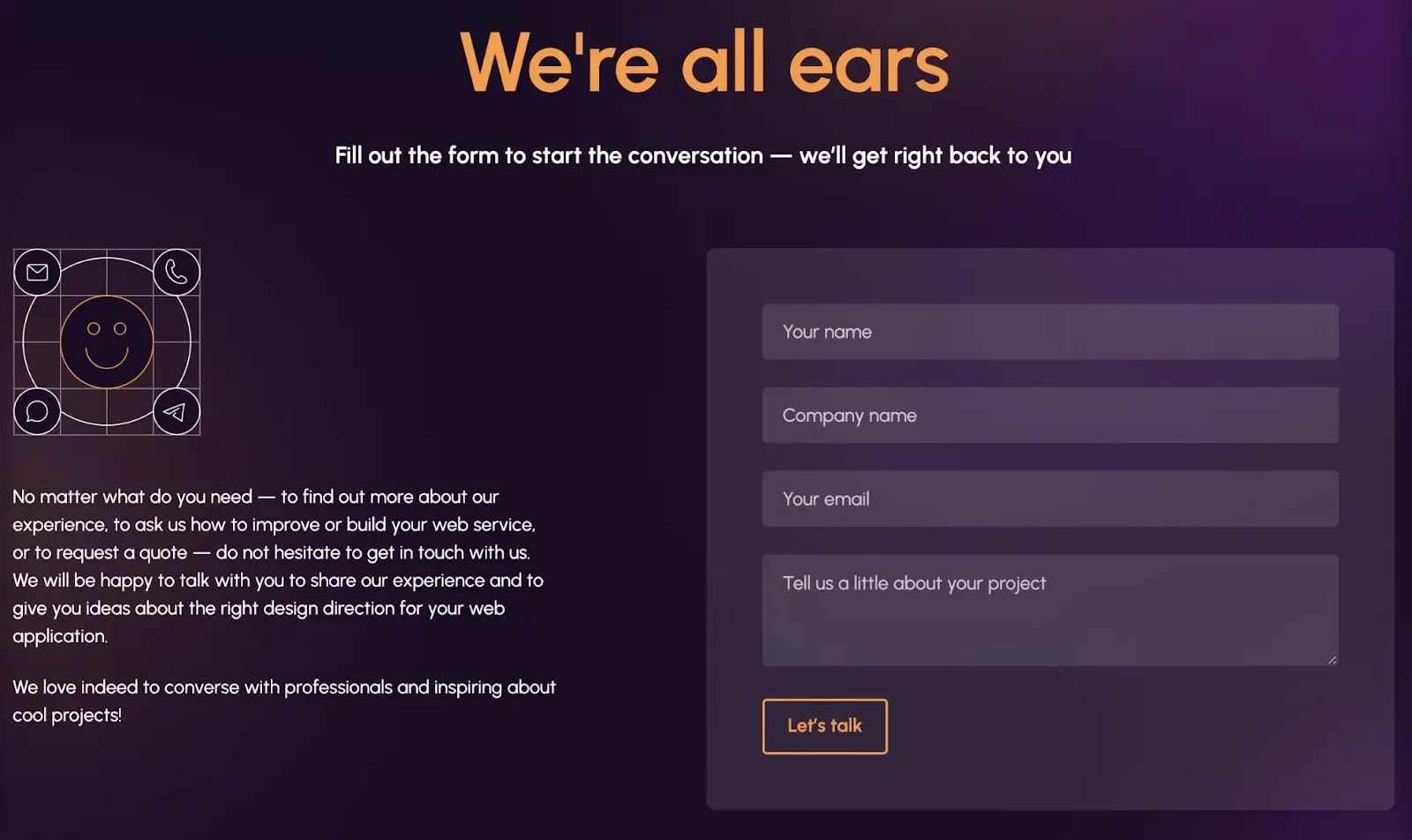
Additionally, ensure that your Contact Us page aligns with your website’s branding. You should use a similar web design approach so that your site has a consistent look and feel.
3. Make It Accessible
If you want visitors to see your Contact Us page, you’ll need to make it clearly visible on your website. Since it will be an evergreen page that people can look at any time, it’s a good idea to include it in your main menu:
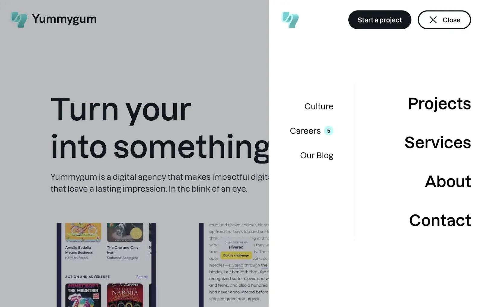
Many websites also feature contact page links in a footer. This placement can make the page easy to find no matter where a visitor lands on your website:
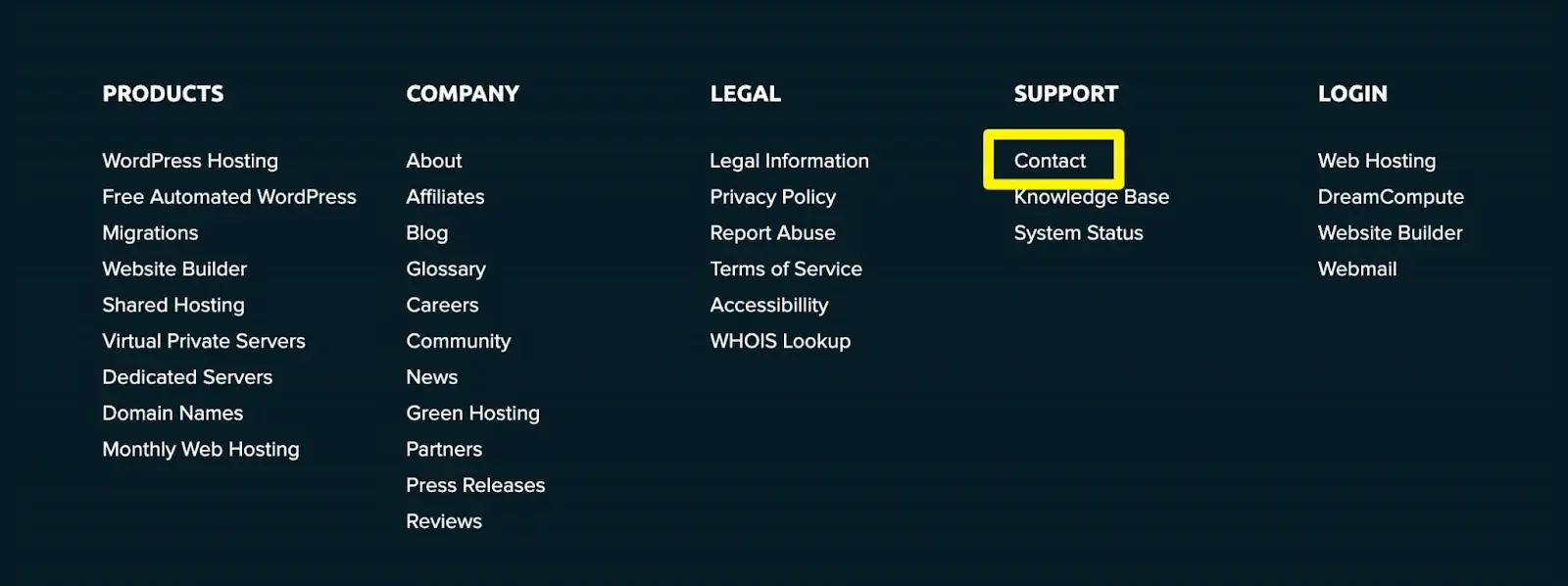
Ultimately, it’s important to make your Contact Us page as accessible as possible. When website visitors don’t have to go through hoops to ask a question, they’ll be more willing to reach out to you.
4. Don’t Ask for Too Much
When creating your contact forms, carefully consider which fields you will add. Although you could request different information like mobile phone numbers and addresses, it’s important not to over-complicate things. If you ask too much of your visitors, they might not want to fill out your contact forms.
For example, you may want prospective clients to reach out to you for new projects — In this case, you wouldn’t need to include fields for payment information or physical addresses. Instead, you can simply have visitors fill out their names, email addresses, and custom messages about the project:
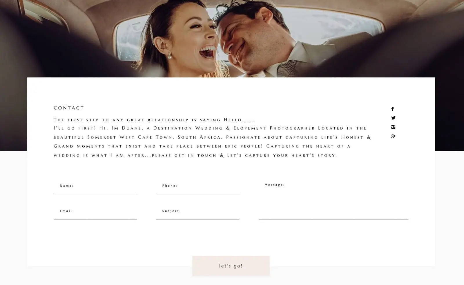
Overall, it’s best to think about what your online visitors will be comfortable with. Then, consider why they’d be reaching out to you, and add custom form fields accordingly.
25 Great ‘Contact Us’ Pages to Inspire You
If you’re new to web design, you might need a little inspiration. To help you get started, here are some of the best Contact Us page examples we could find!
1. Swab the World
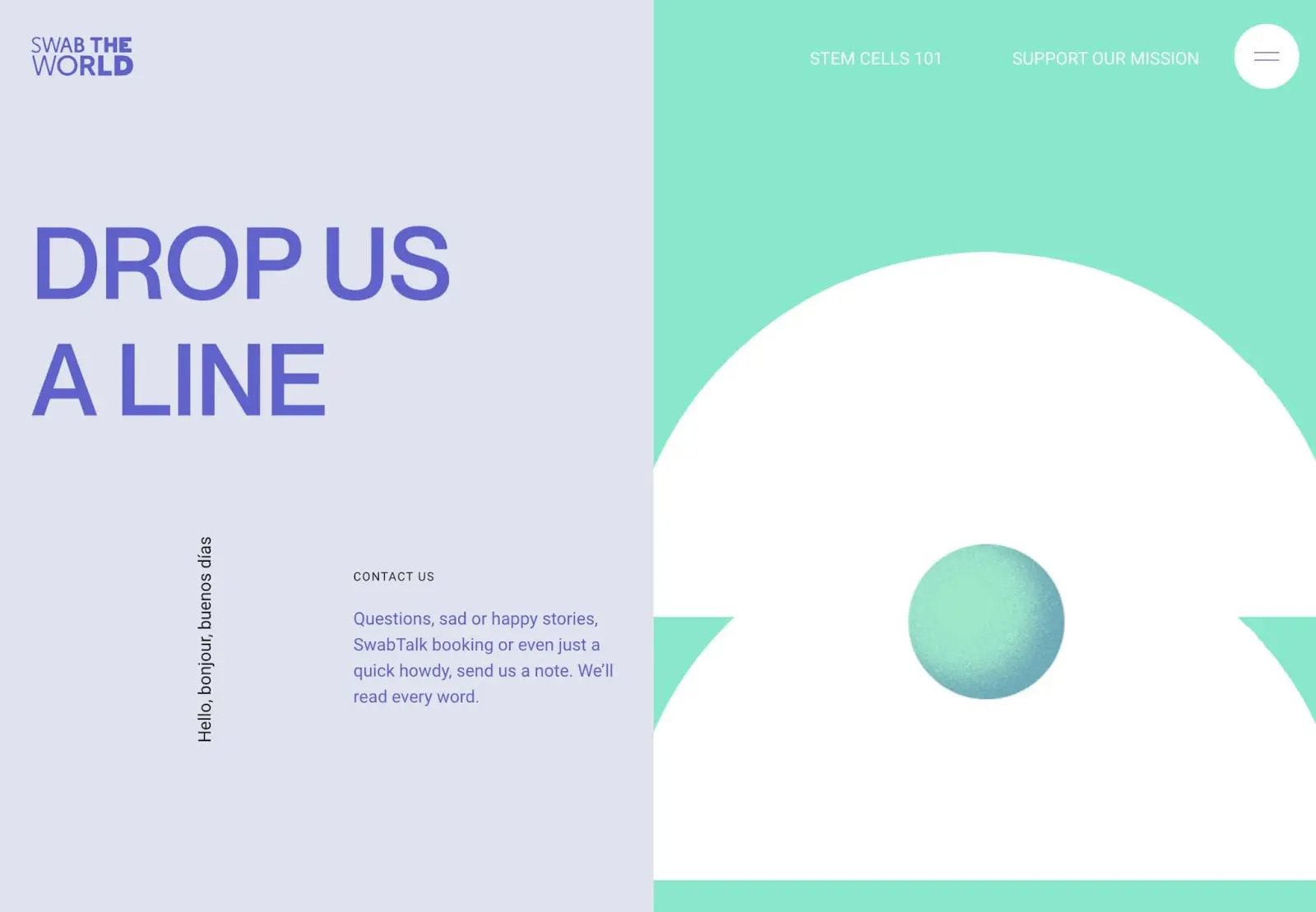
What makes this a good Contact Us page?
- In its copy, Swab the World explains that it is open to a wide range of communication.
- There is an engaging animation of a phone ringing.
- Visitors can use a contact form, visit the company in person, and even send a letter in the mail.
2. Sezzle
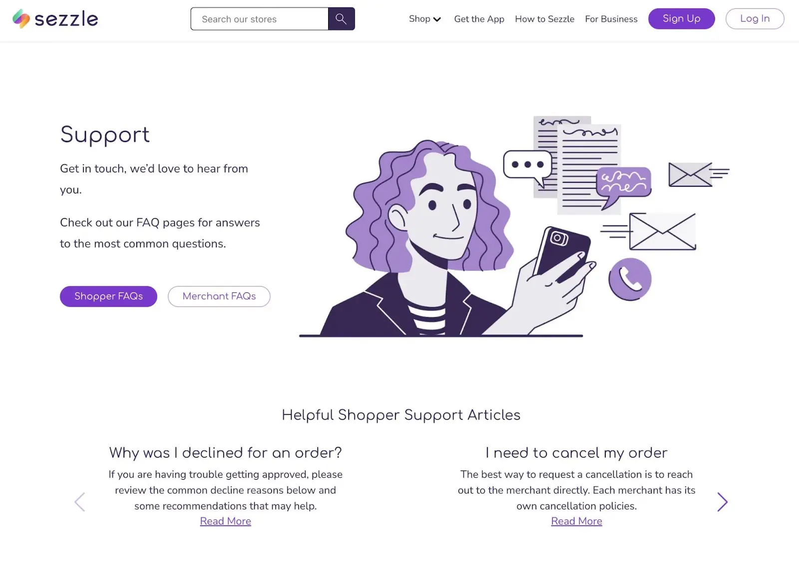
What makes this a good Contact Us page?
- Sezzle begins its Contact Us page as a knowledge base. At the top of the page, it provides links to FAQs and helpful articles.
- There are separate request forms for shoppers and merchants.
- Additionally, customers can contact the sales team with more specific questions about the app.
3. Buzzworthy Studio
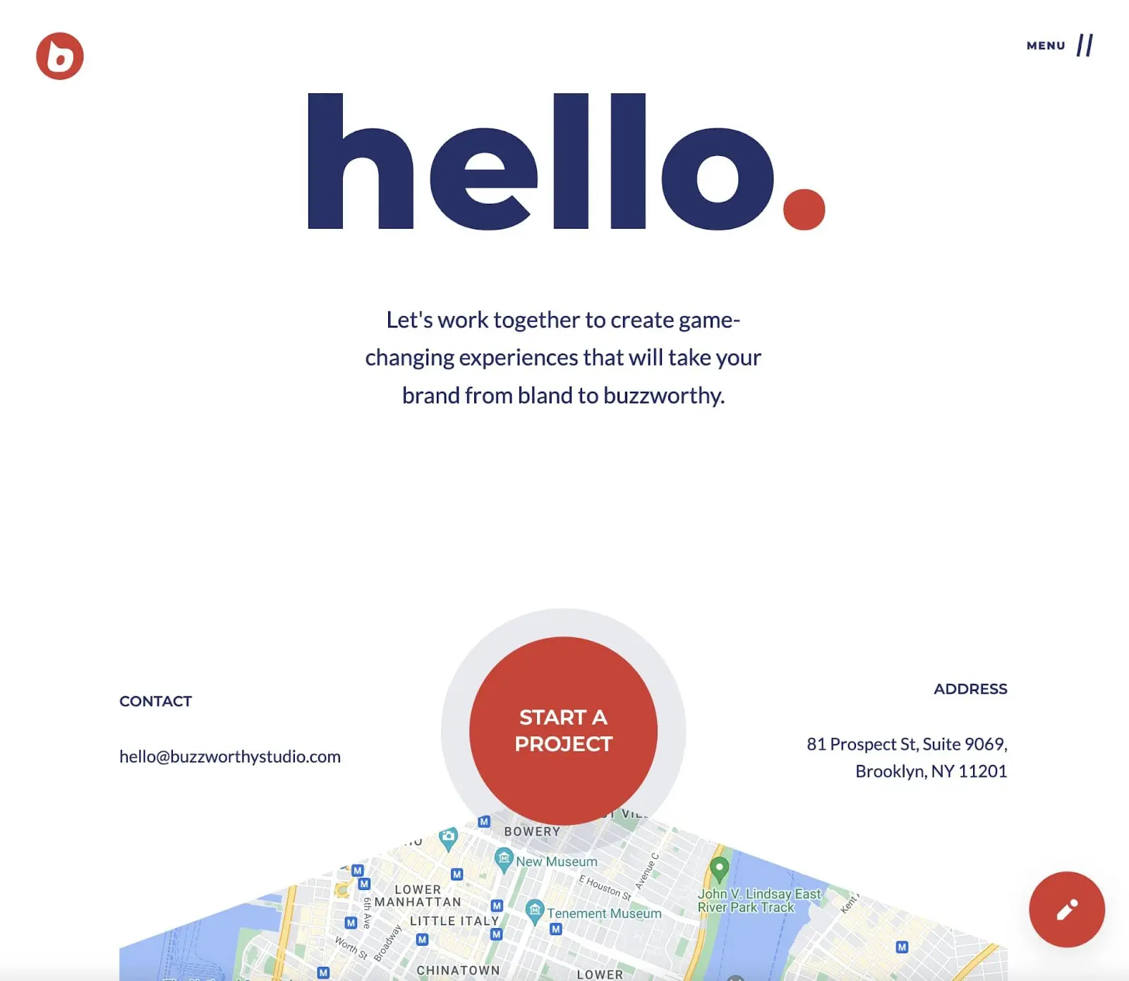
What makes this a good Contact Us page?
- Buzzworthy Studio uses a lot of white space to separate its Call to Action (CTA) and contact details.
- A map is embedded in the page so local visitors can visit the physical address.
- Online users can contact the business about various topics like building a website, brand, or marketing strategy.
4. InVision
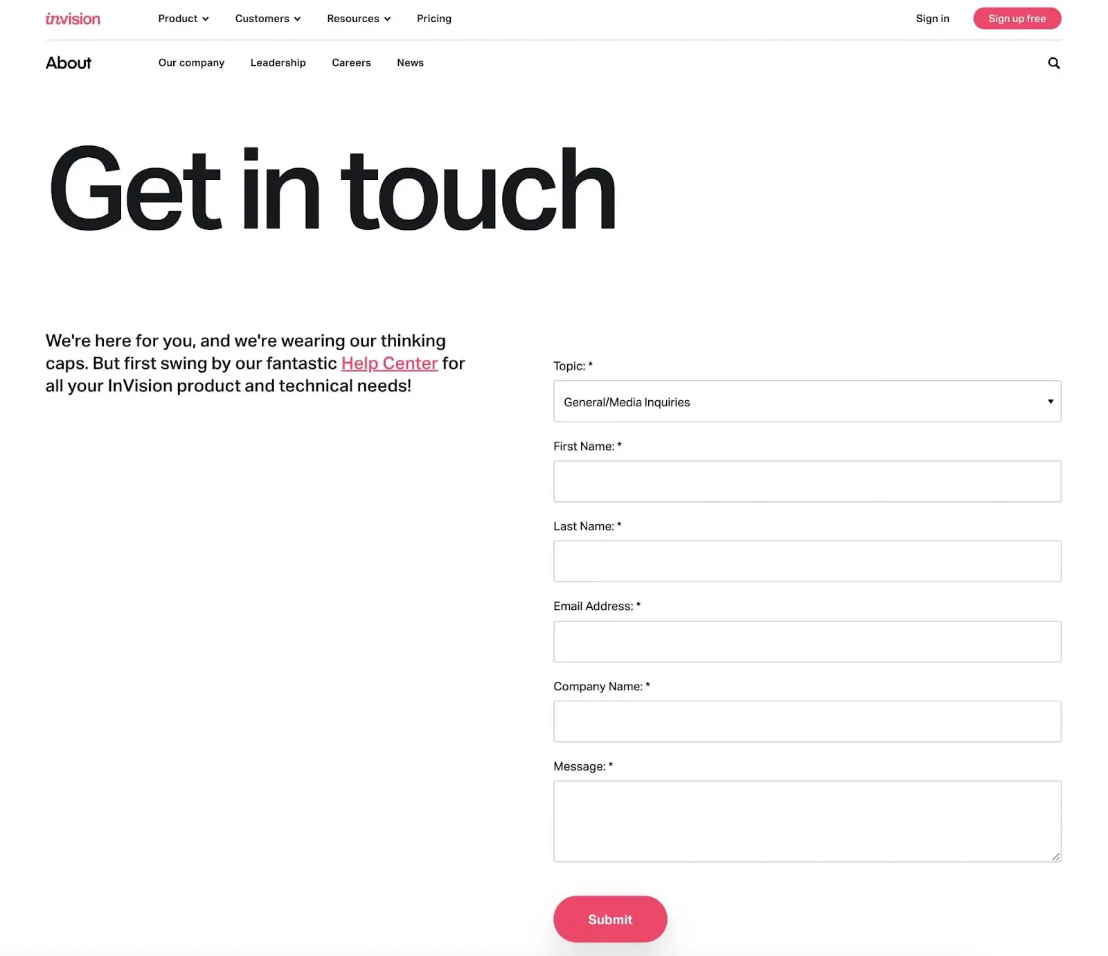
What makes this a good Contact Us page?
- Visitors can choose a specific topic that they need help with.
- Using a pop-up, users can start chatting with a live team member if needed.
- InVision adds links to its Help Center for FAQs and a community forum.
5. MeUndies
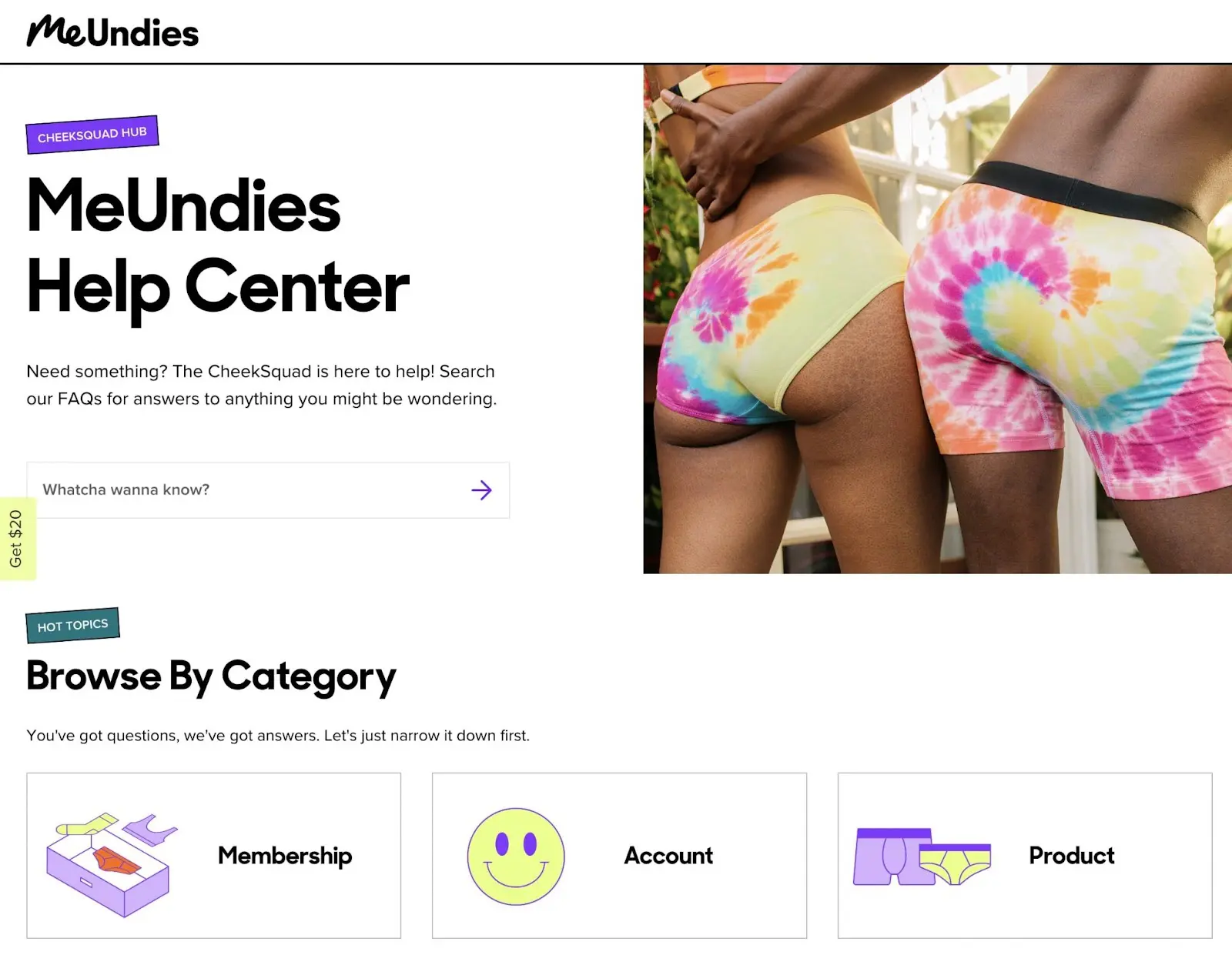
What makes this a good Contact Us page?
- MeUndies separates its FAQs into clearly labeled categories, like membership or payment options.
- Visitors can use the live chat feature to talk to an employee, leave a message, or view FAQs.
- There are multiple customer service channels, including email, text, and social media.
6. RedBull
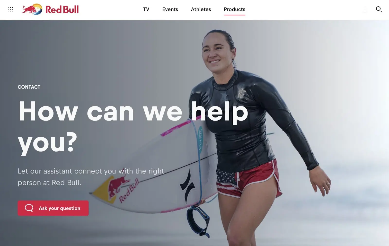
What makes this a good Contact Us page?
- RedBull directs customers to use an artificial intelligence chatbot to find the correct information.
- There are links to relevant resources like current events.
- This Contact Us page includes information about the RedBull company so visitors understand its branding and primary goals.
7. Leeds Golf Centre
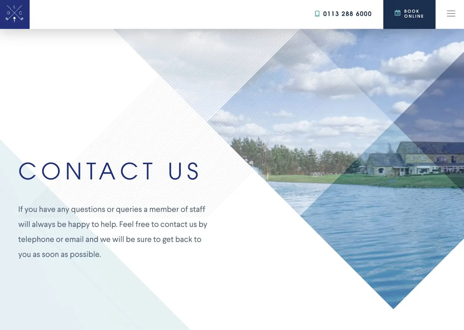
What makes this a good Contact Us page?
- Instead of having a Contact Us page with a solid background, Leeds Golf Centre includes images of its golf courses.
- Users can see when the golf course is open and where it’s located.
- There are simple contact forms to send business emails and register for the newsletter.
8. Sleeknote
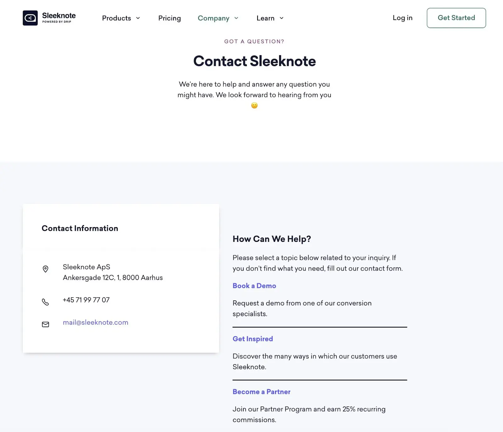
What makes this a good Contact Us page?
- Sleeknote has created a simple Contact Us page that eliminates any unnecessary information.
- There are multiple ways to contact the company.
- Sleeknote has added calls to action for booking demos and joining its affiliate program.
9. Mostly Serious
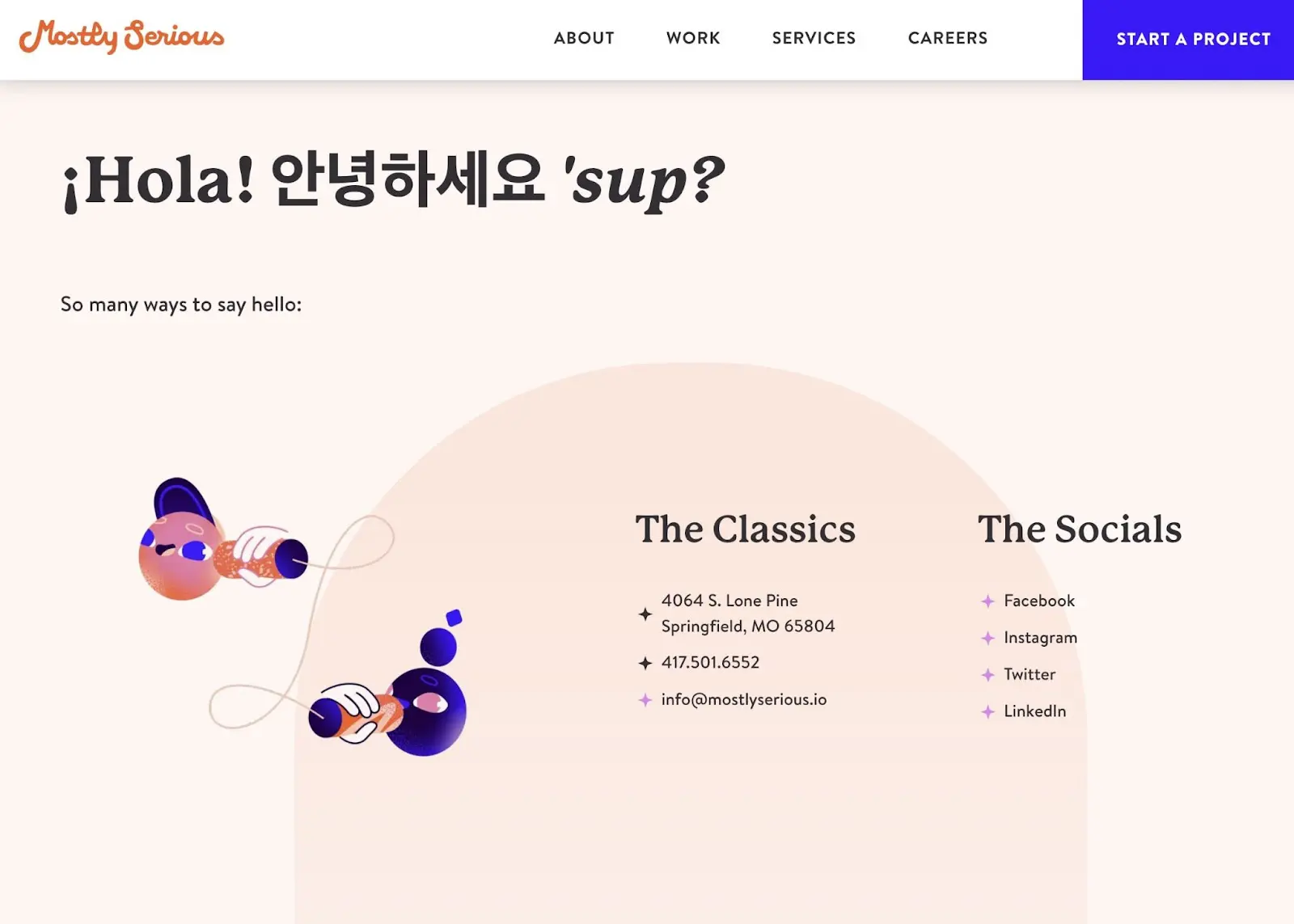
What makes this a good Contact Us page?
- Since Mostly Serious is a web design agency, its Contact Us page features quirky, on-brand graphics.
- By providing social media links, a phone number, an email address, and a physical address, there are “many ways to say hello”.
- The contact form allows visitors to reach out about prospective projects.
10. Marvel
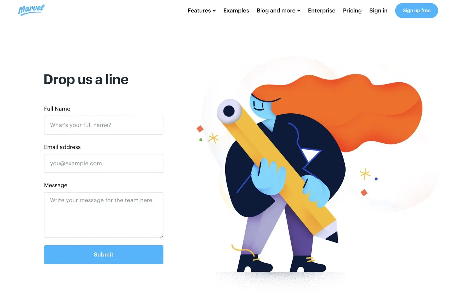
What makes this a good Contact Us page?
- Marvel app has created unique and fun graphics to label specific support channels.
- The contact form only has three fields, which encourages visitors to provide information without feeling overwhelmed.
- This design and layout perfectly match the rest of the website.
11. Infinum
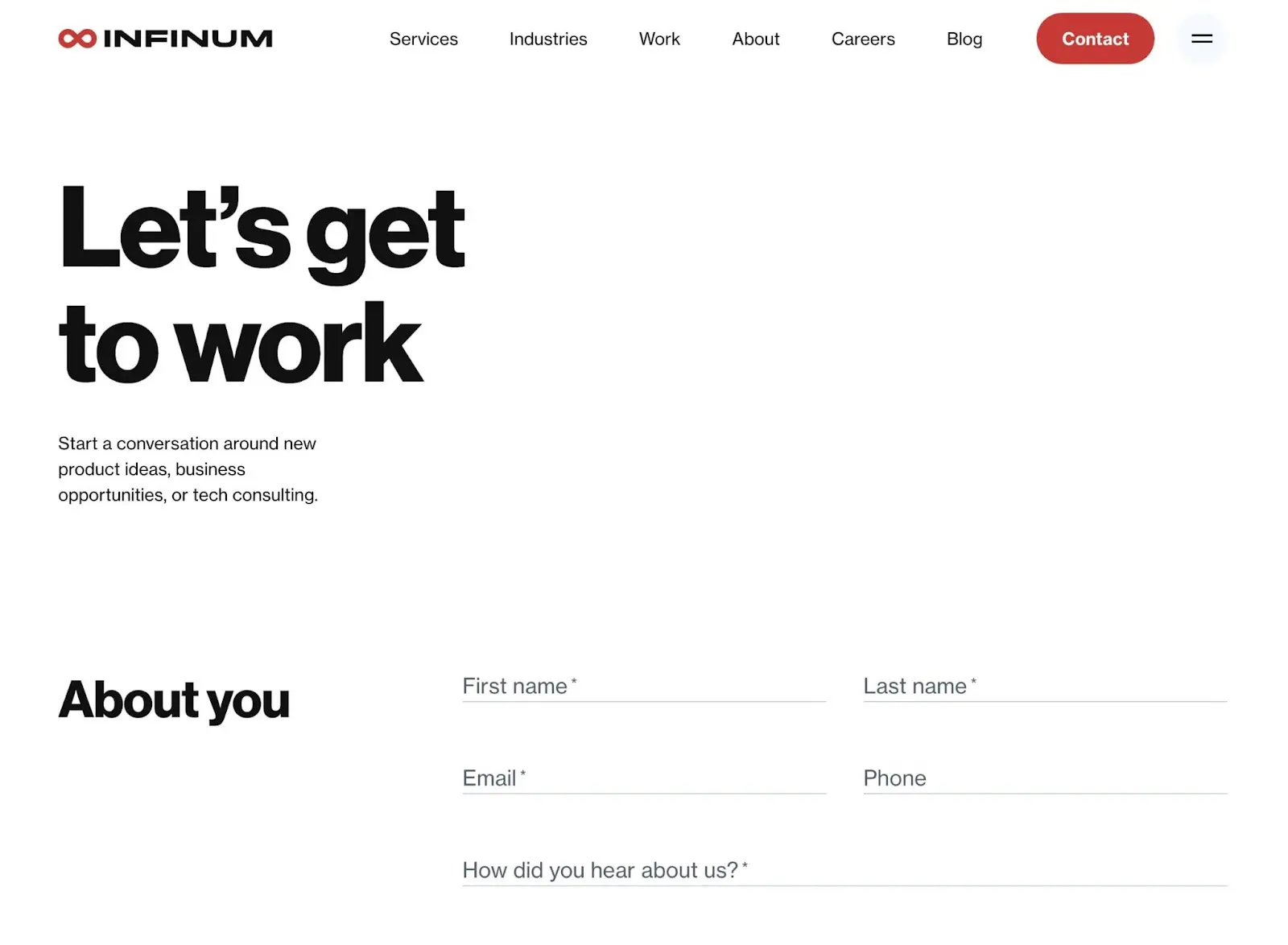
What makes this a good Contact Us page?
- The call to action, “Let’s get to work”, is simple but effective.
- Since Infinum is a large company, it includes information about its office locations.
- Visitors can directly email the company or fill out a helpful contact form.
12. Dollar Shave Club
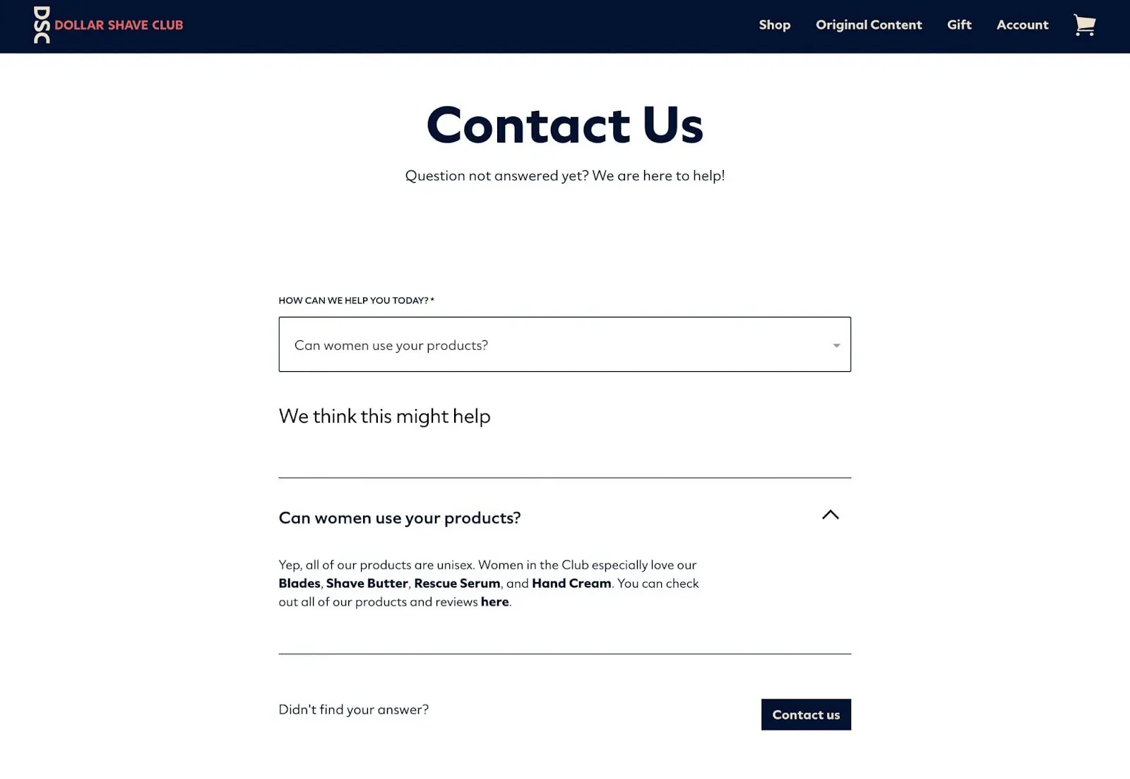
What makes this a good Contact Us page?
- Using a dropdown menu, customers can find the answers to specific questions.
- Dollar Shave Club links to its help center, live chat, and Facebook Messenger account.
- There are email addresses listed for people looking for partnership opportunities and media inquiries.
13. Tune
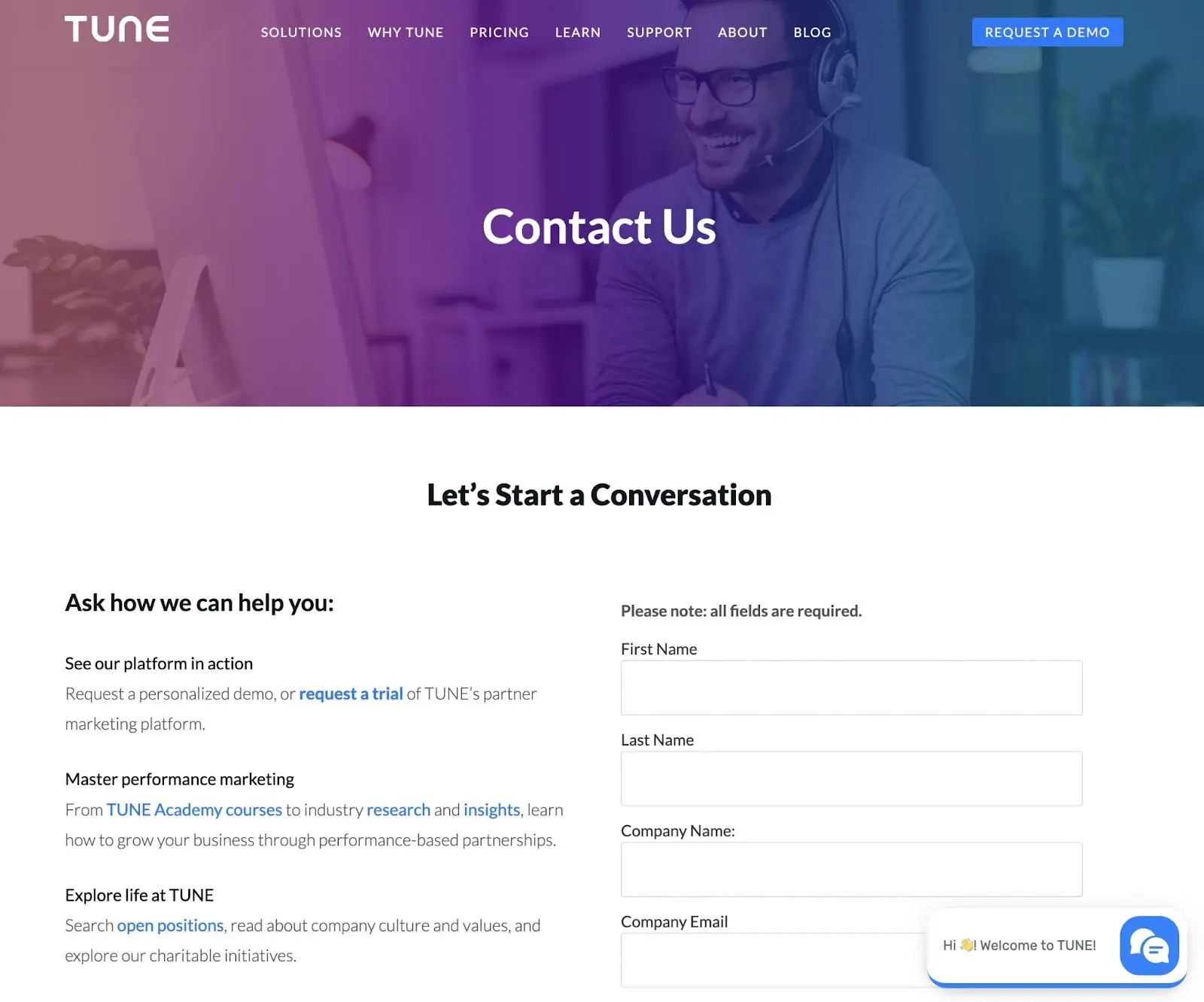
What makes this a good Contact Us page?
- Tune makes it easy to start a conversation using a simple form.
- Online users can explore career opportunities and courses.
- There are multiple points of contact, including business emails and addresses.
- Like many other examples on this list, Tune includes a chatbot.
14. Foundation
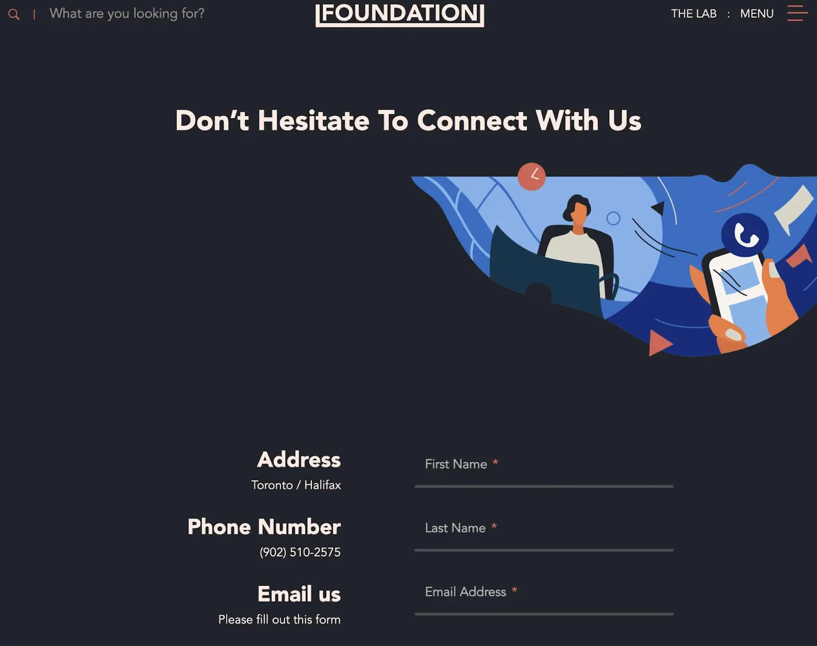
What makes this a good Contact Us page?
- The color scheme, graphic design, and layout seamlessly integrate with the rest of the website.
- New clients can inform Foundation about their digital marketing challenges, priorities, and budgets.
- Foundation features the Contact Us page in its website’s footer.
15. Fortnight
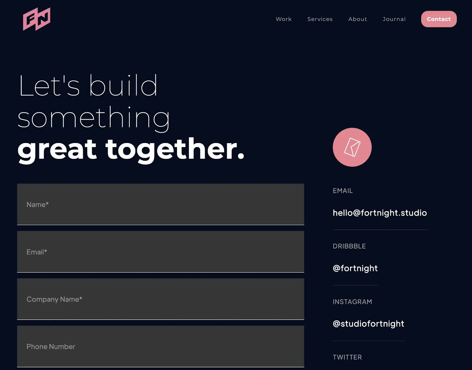
What makes this a good Contact Us page?
- At the bottom of the page, Fortnight links out to further information about the business and its services.
- Users can specify the service they want when filling out the contact form.
- Fortnight uses a bright pink CTA button to encourage online users to visit the Contact Us page.
16. Cult
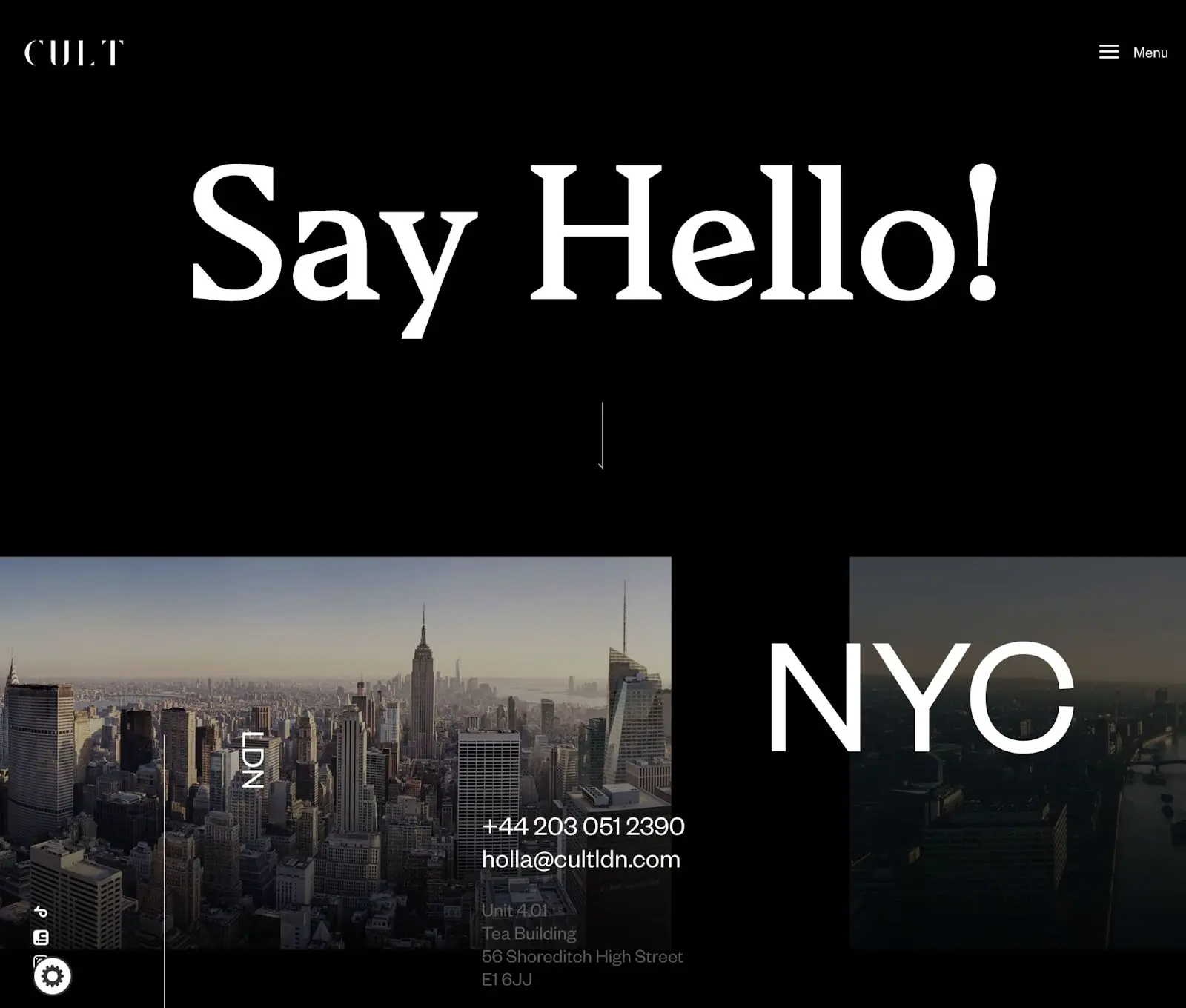
What makes this a good Contact Us page?
- The Cult creative agency uses a content slider to showcase its New York and London office locations.
- Potential clients can email or call the company phone number directly from the Contact Us page.
- There are links to Cult’s various social media accounts.
17. Basecamp
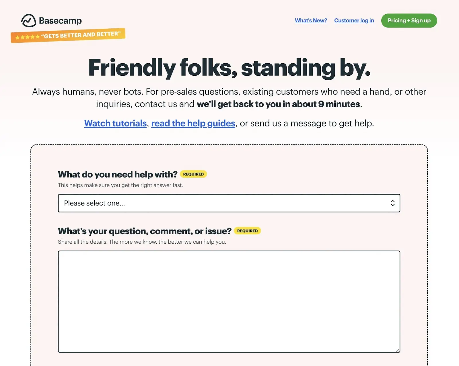
What makes this a good Contact Us page?
- Basecamp tells online users how long they’ll have to wait for a response to their questions.
- Rather than including a chatbot, Basecamp uses real people to communicate with its visitors.
- You can upload a file or screenshot in the contact form that explains your specific issue.
18. Zendesk
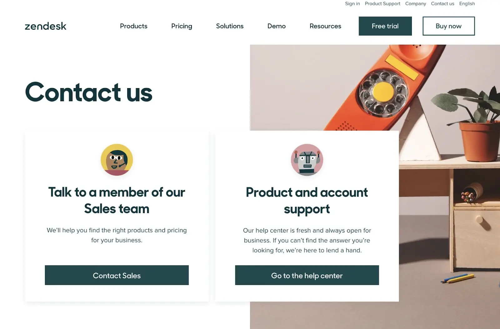
What makes this a good Contact Us page?
- If a visitor doesn’t want to talk to customer service, they can try to find the answer to their problem in the help center.
- There are easy ways to contact a sales team member or chat with a bot.
- Zendesk lists the information for all of its global offices.
19. Notion
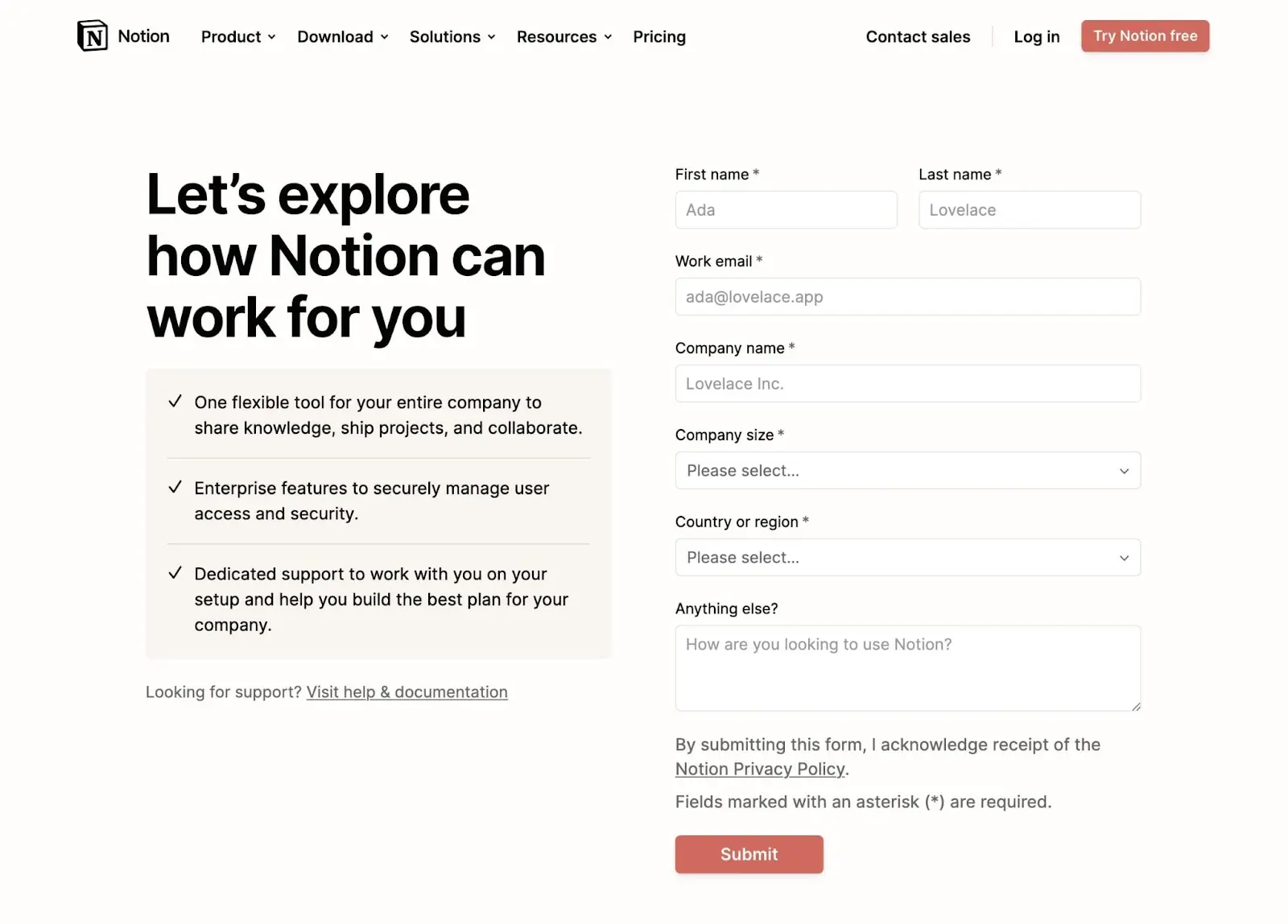
What makes this a good Contact Us page?
- Notion lists some of its key features to continue introducing users to its software and encourage them to start using it.
- There are positive testimonials from other customers.
- The contact form eliminates any unnecessary fields.
20. Urban Influence
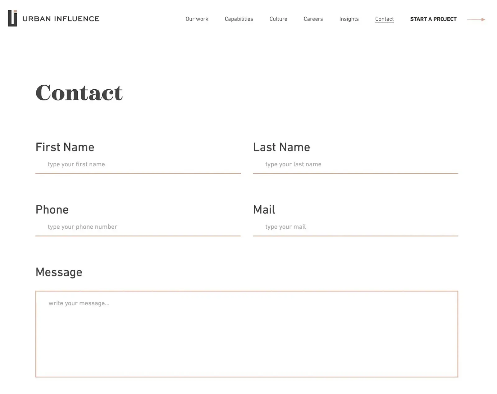
What makes this a good Contact Us page?
- Urban Influence places its contact form at the top of the page, so visitors can quickly send messages.
- Next to each business location, there are engaging images of the city’s prominent landmarks.
- Users can see available job openings for each office.
21. Yeti
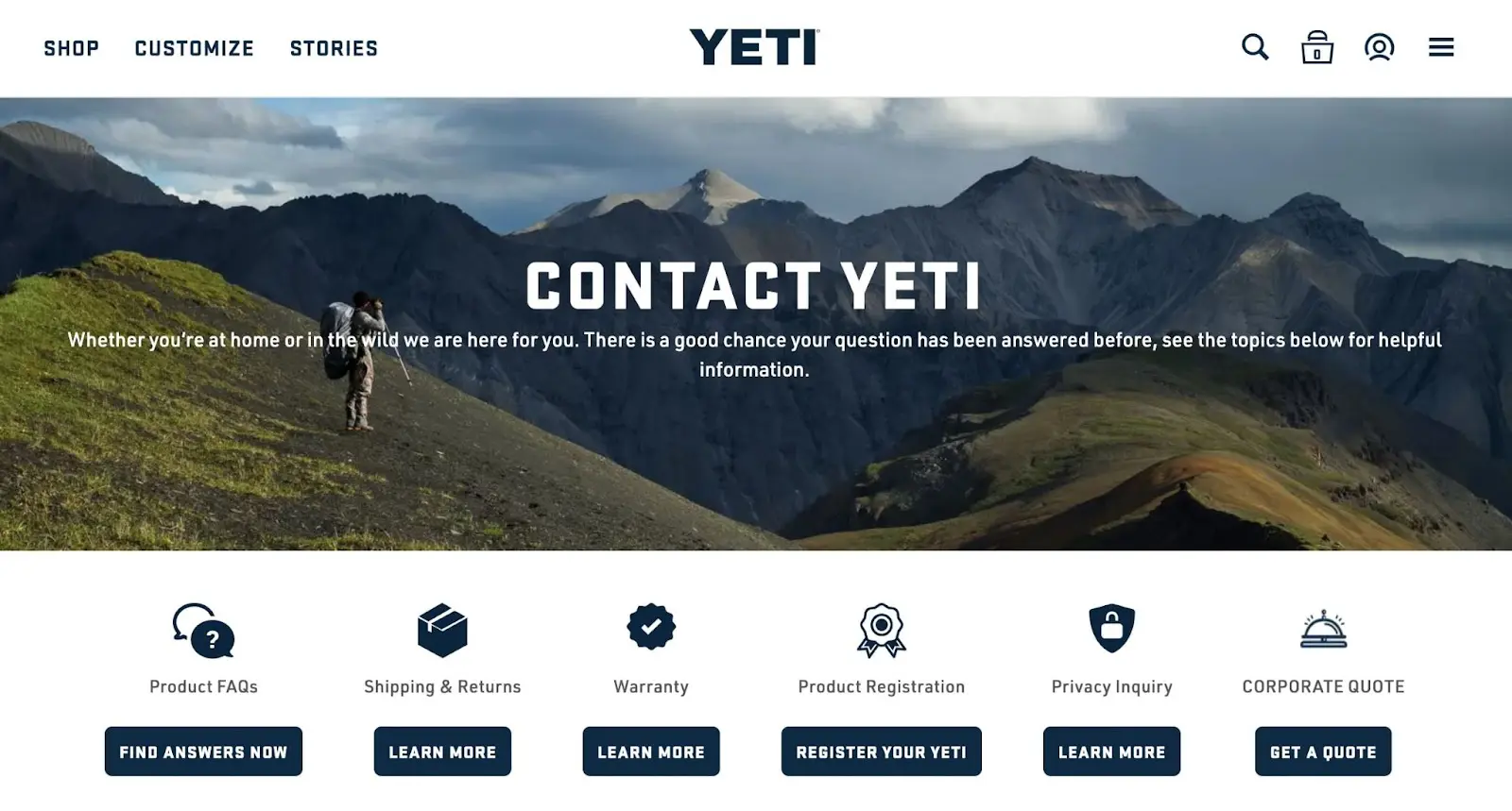
What makes this a good Contact Us page?
- With an image of the outdoors, Yeti immediately features its branding on this Contact Us page.
- There are CTAs for questions about warranties, product registration, and more.
- Yeti includes customer service phone numbers and information about its opening hours.
22. The Charles
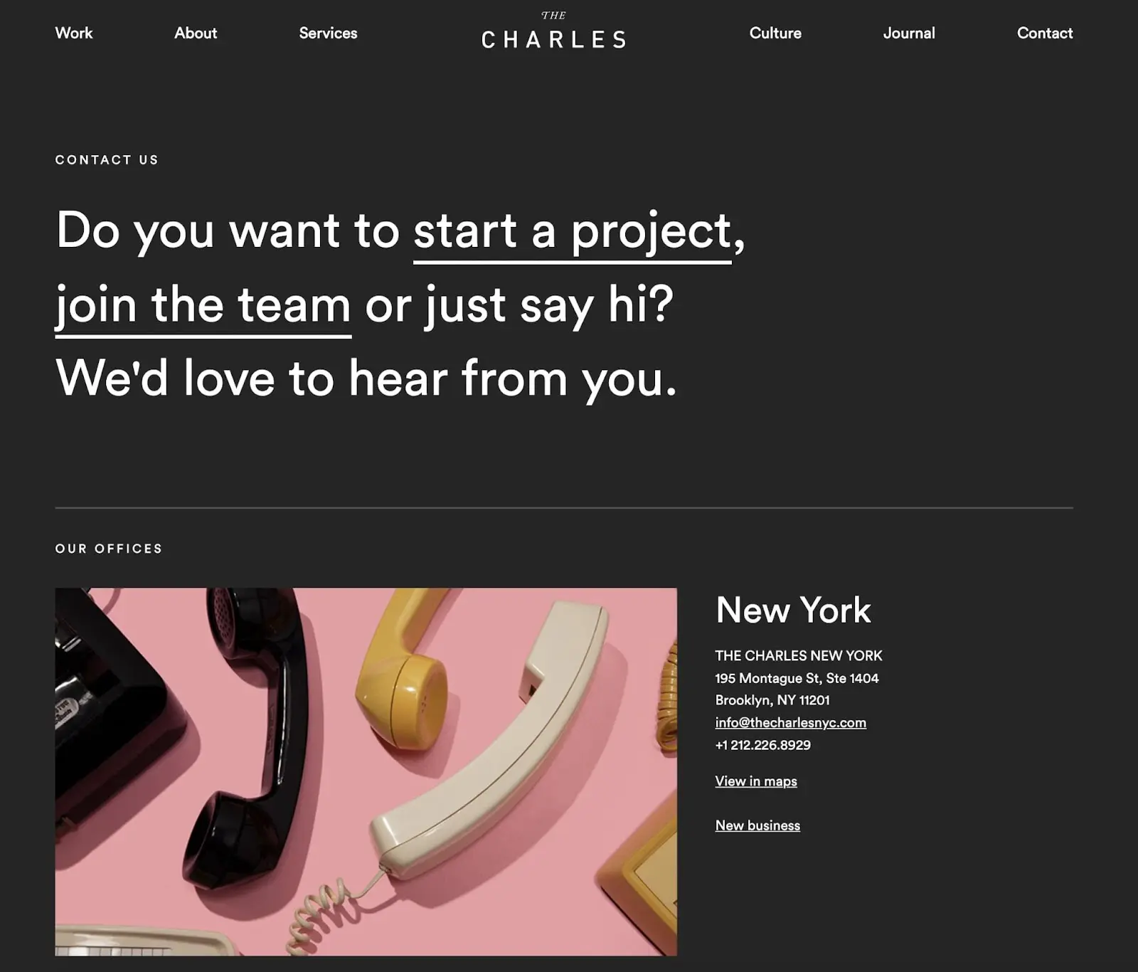
What makes this a good Contact Us page?
- Instead of including multiple contact forms on the same page, The Charles company provides separate links for new businesses and potential employees.
- For each office, you can open the location in Google Maps.
- The Charles includes its Contact Us page in the main menu so any visitor can easily access it.
23. Privy
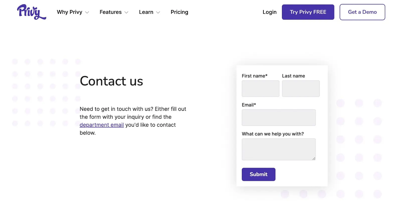
What makes this a good Contact Us page?
- Visitors only need to fill out their name and email address to contact Privy.
- Privy provides email addresses for specific departments like PR, customer support, and sales.
- There are social media links and a newsletter registration form.
24. Greenhouse
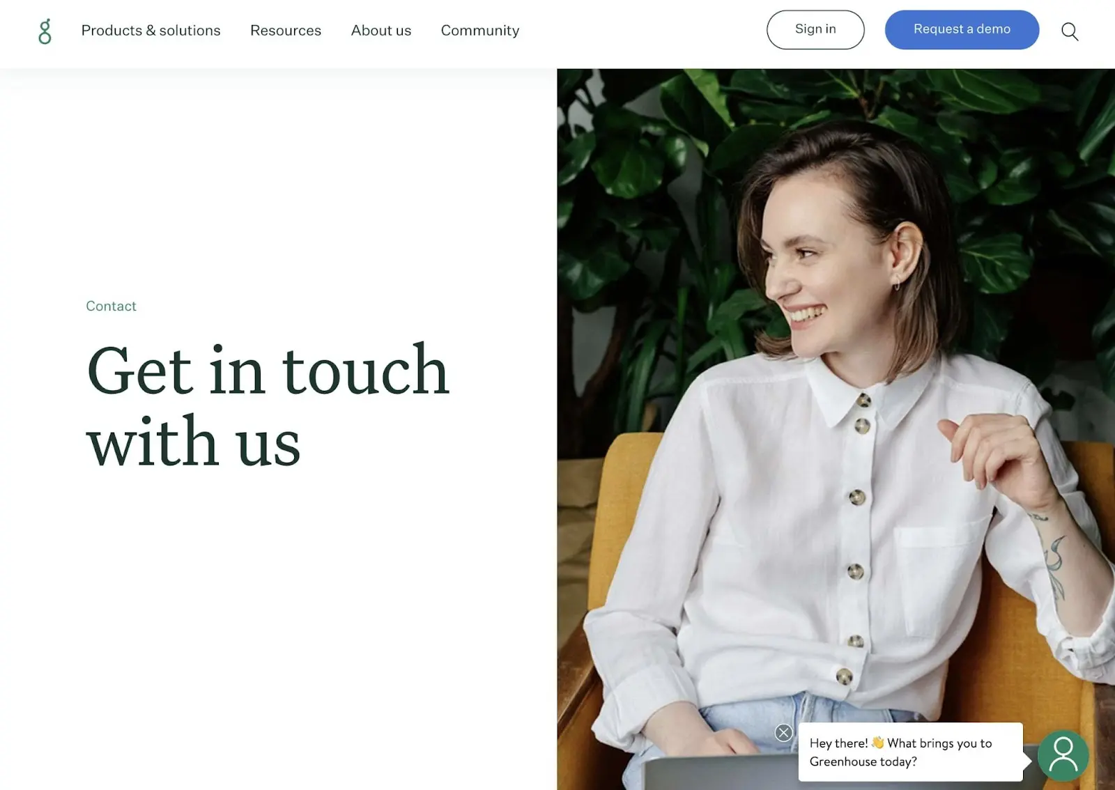
What makes this a good Contact Us page?
- This Contact Us page has a live chat feature for learning more about the store’s products or asking specific questions.
- Greenhouse provides many support channels and explains use cases for each one.
- Visitors can see which business offices are closest to their locations.
25. Survicate
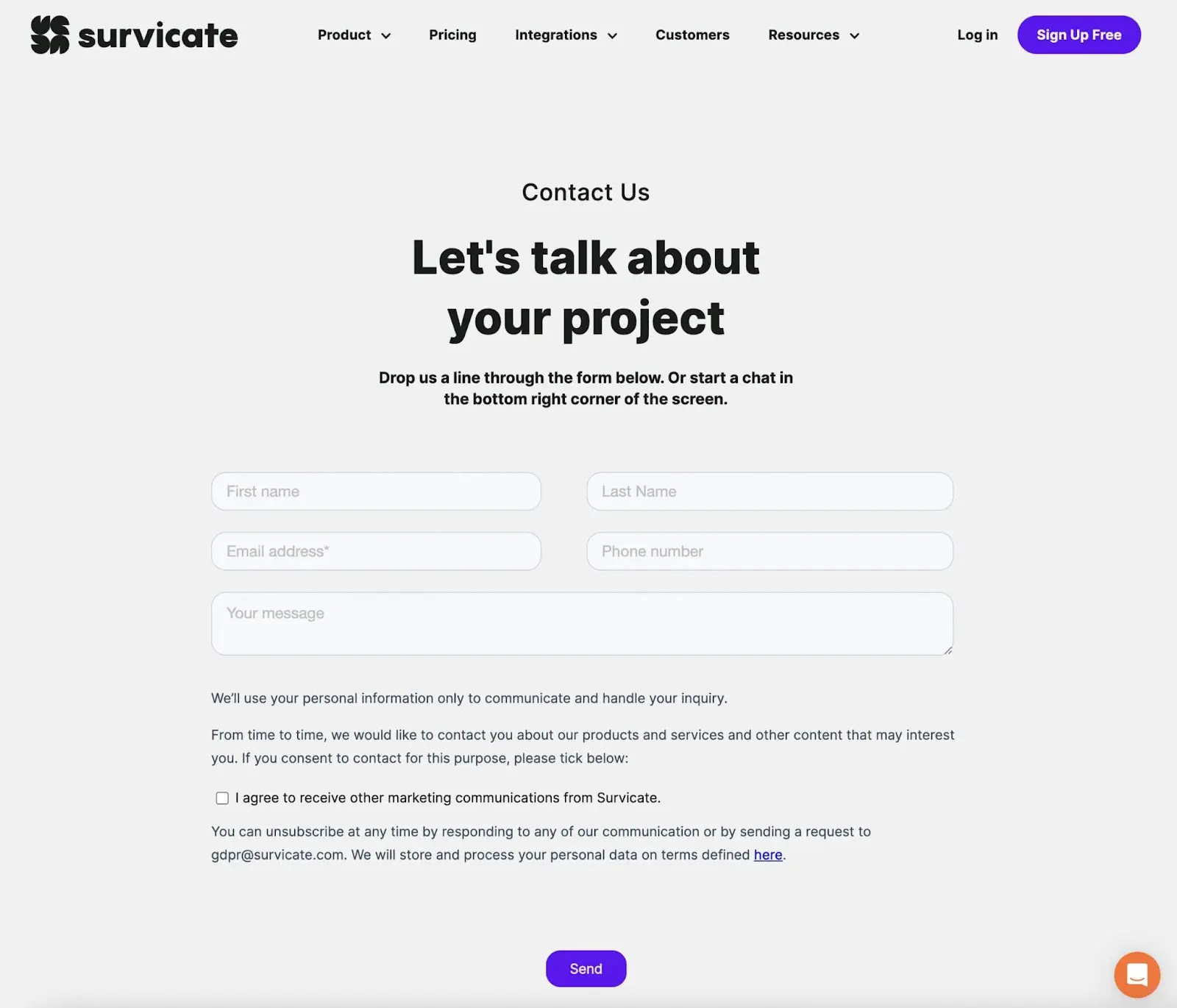
What makes this a good Contact Us page?
- Survicate’s contact form only requires some basic information from customers.
- If users are curious about the software, Survicate explains the best way to use it.
- Customers can book demos or sign up for free accounts from the Contact Us page.
Level Up Your Contact Page
Whether you run a business or blog, online users need to contact you. With a Contact Us page, you can enable visitors to fill out forms and ask necessary questions. This way, your audience will be satisfied and informed.
To review, here’s how you can create the perfect Contact Us page:
- Provide multiple ways for visitors to contact you.
- Include personalization.
- Make it accessible.
- Don’t ask for too much.
Are you still unsure how to develop the right Contact Us page for your business? At DreamHost, we’ll work with you to design your dream website. Sign up for a free consultation for our custom web design services!

DreamHost Makes Web Design Easy
Our designers can create a gorgeous website from SCRATCH to perfectly match your brand and vision — all coded with WordPress so you can manage your content going forward.
Learn More