As a small business owner, you wear many metaphorical hats.
Marketer, accountant, customer service rep — and even web designer.
For your physical store or office, it’s easy to notice if the paint is peeling or the furniture is outdated.
But when did you last give your website a good, hard look?
Your website is often the first impression potential customers have of your business and deserves the same attention as your physical store.
After all, your website works as your 24/7 salesperson, working tirelessly to attract customers and grow your business.
So, maybe you’ve noticed fewer online inquiries lately, or your competitor down the street just launched a sleek new site that makes yours look like it’s stuck in the early 2000s.
Perhaps you’re expanding your product line, but your current website can’t showcase your new offerings effectively.
These are all signs that it might be time for a website redesign.
So, where do you start? How much will it cost? Will it slow your business during the refresh?
This guide to website redesign will help answer all these questions and more. You’ll learn how to:
- Recognize the telltale signs that your site needs an update
- Plan a redesign that aligns with your business goals
- Execute the redesign without breaking the bank or losing your mind
- Make sure that your new site helps you attract more customers and boost sales
Let’s turn your website from just another digital brochure to a powerful engine for small business growth.
When To Redesign a Website?
Anecdotal evidence suggests that a website warrants a refresh every two to three years.
But it all depends on your business and your customers’ expectations.
E-commerce websites would need more frequent updates since the trends change fast and customers also expect to see the new trends implemented.
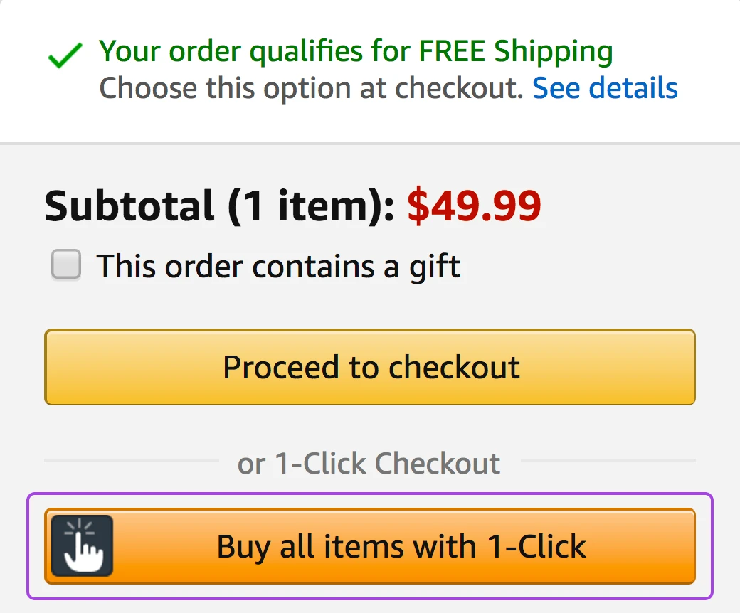
For instance, remember back when everyone raved about one-page checkouts? That has changed, and customers now prefer one-click checkouts.
You don’t always need a full refresh either. Sometimes, a few strategic changes, like updating the checkout page or simplifying the navigation menu, can make a big difference.
And for small businesses, the decision to redesign generally comes down to performance.
- Are you meeting your business goals?
- Are customers finding what they need easily?
- Is your site still attracting the right kind of traffic?
- Are you getting complaints about certain features?
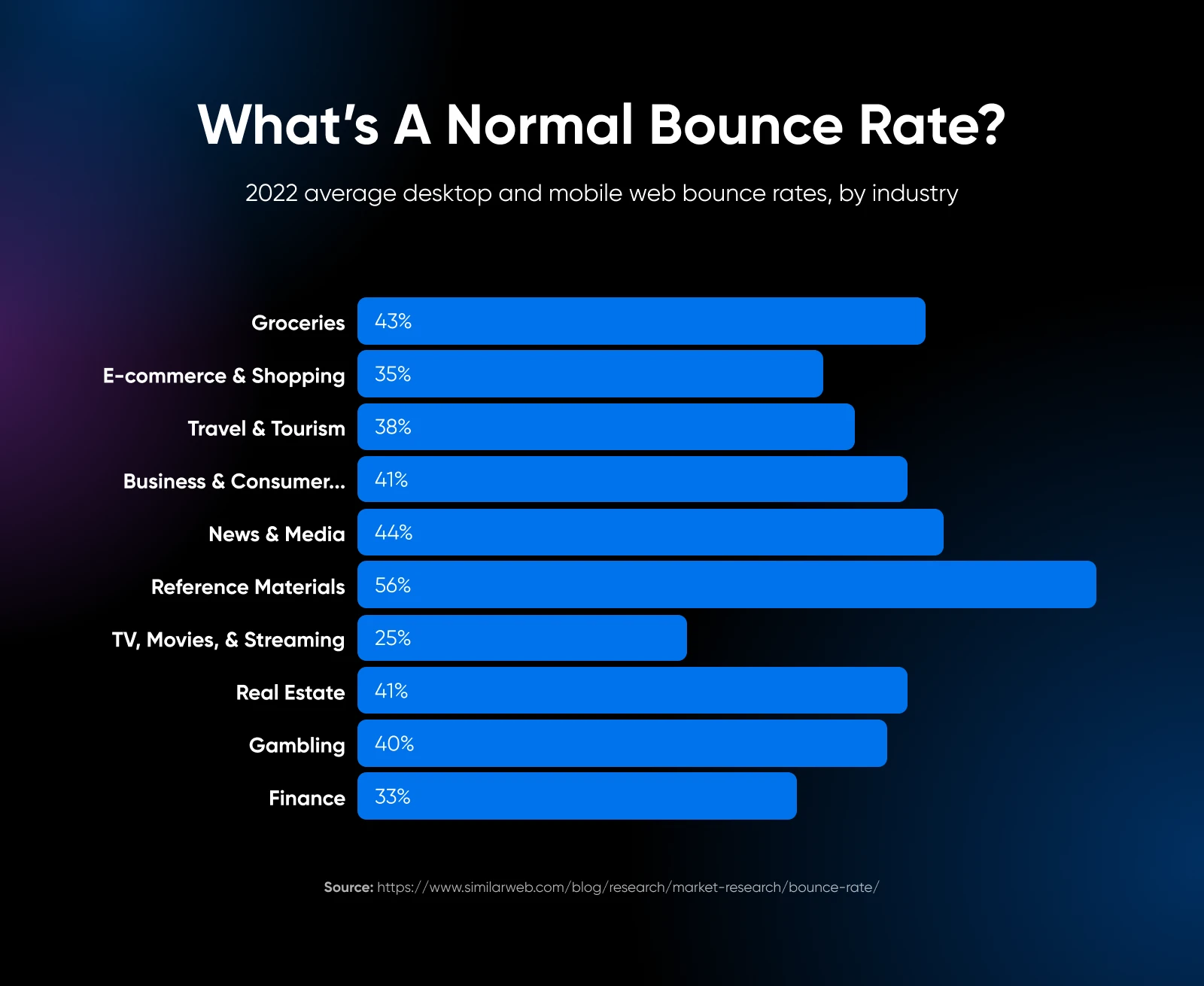
- Has your bounce rate gone up? (over 50% can be a concern.)
If you answered a “no” to any of the above questions, it may be time to redesign..
8 Signs You Need To Update Your Website Design
If you want to be sure you need a website redesign, here are eight clear telltale signs that your website needs a revamp.
1. Your Website Performance Isn’t Meeting Benchmarks
If you have a website, you probably also want it to get you some results — the result could be more money, leads, or interest from potential customers. But you need it to do something for your business.
If that’s not happening, you may want to start looking at data to check if a website refresh could help:
Conversion rate: Are fewer people buying your products or signing up for your newsletter? A study by Wordstream found that the average landing page conversion rate across industries is 2.35%, but the top 25% are converting at 5.31% or higher. If you fall below these benchmarks, it might be time for a change.
Bounce rate: This measures how many people leave your site after viewing just one page. According to Jetpack, a bounce rate between 26% and 40% is excellent, 41% to 55% is average, and 56% to 70% is higher than average. If your bounce rate is slowly inching upwards, it could mean website visitors aren’t finding your site engaging enough.
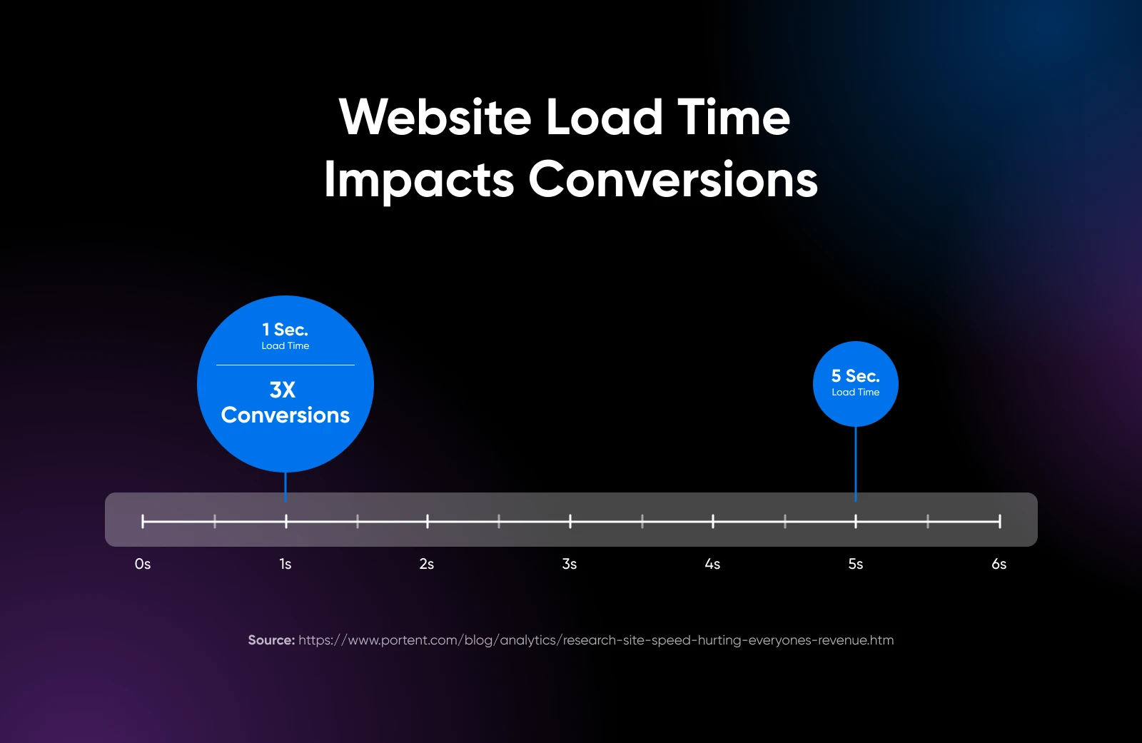
Page load speed: It’s commonly known that page speed affects your conversions. Google found that as page load time goes from one to three seconds, the probability of bounce increases by 32%.
And 53% of mobile site visitors leave a page that takes longer than three seconds to load. Where the small business space is so competitive, you simply cannot afford to lose potential customers due to poor website performance.
2. Your Website Has Fallen Behind Competitors
As a small business owner, it’s important to stand out for the right reasons. To stand out, you need to run a competitor analysis to understand the competition’s strengths and weaknesses.
Start by looking at their websites.
If you find yourself admiring their sleek designs, intuitive navigation, or engaging content while your site feels outdated, it’s probably time for a redesign.
Here are some aspects that you should look out for:
- Visual appeal: Does your website look modern and professional compared to your competitors?
- Functionality: Are your competitors offering features that your site lacks?
- Content quality: Is your content as engaging and up-to-date as that of your competitors?
- Mobile responsiveness: Does your site perform as well on mobile devices as your competitors’?
An alternative and easier approach is to use HubSpot’s Website Grader. It scores the website based on performance, SEO, mobile friendliness, and security.
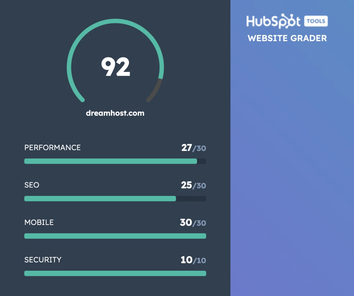
The website grader also gives you the exact technical details on what’s good and what’s bad about the website you check.
Not all benchmarks need to be applied to outcomes.
The technical performance of your site can be just as important.
Almost a third of visitors will leave your site immediately if your website doesn’t load quickly.
What’s more, search engines like Google tend to promote sites that use current best practices in web design.
For instance, a site with a responsive design (able to adapt to different screen sizes) is more likely to rank than a website with an inflexible layout.
Responsive Design
Responsive design enables a website to adapt to the screen size of the device it is being viewed on. The website will therefore look differently on different devices.
Read MoreWith these impacts in mind, it’s worth keeping an eye on the following performance metrics:
- Page load speed: It shouldn’t take any longer than two seconds. Test with PageSpeed Insights.
- Mobile responsiveness: Google’s Mobile-Friendly Test reveals whether your current site design works well on smartphones and tablets.
- Accessibility: Older designs often score poorly when it comes to accessibility. This makes it harder for some users to use your site, and search engines don’t approve.
- Legibility: The average time it takes someone to read your content can reveal whether your color palette and typography are causing problems with legibility.
- SEO performance: In some cases, an outdated front end can hinder search engine optimization efforts.
A subpar result in one of these categories can mean that the website design could be improved. If you find your website lagging in one more area, consider applying the new site design practices.
3. Your Branding and Design Style Has Changed
Your small business won’t remain the same forever. It will evolve with the changing market and customer expectations.
You will refine your target audience, expand your product line, or shift your company values. And your website needs to change along with that.
Take the example of Apple.
Back in the late 1970s, they used a multi-colored fruit as a logo. As time passed and new design trends emerged, the company later decided that a sleek, monotone icon would be more fitting.
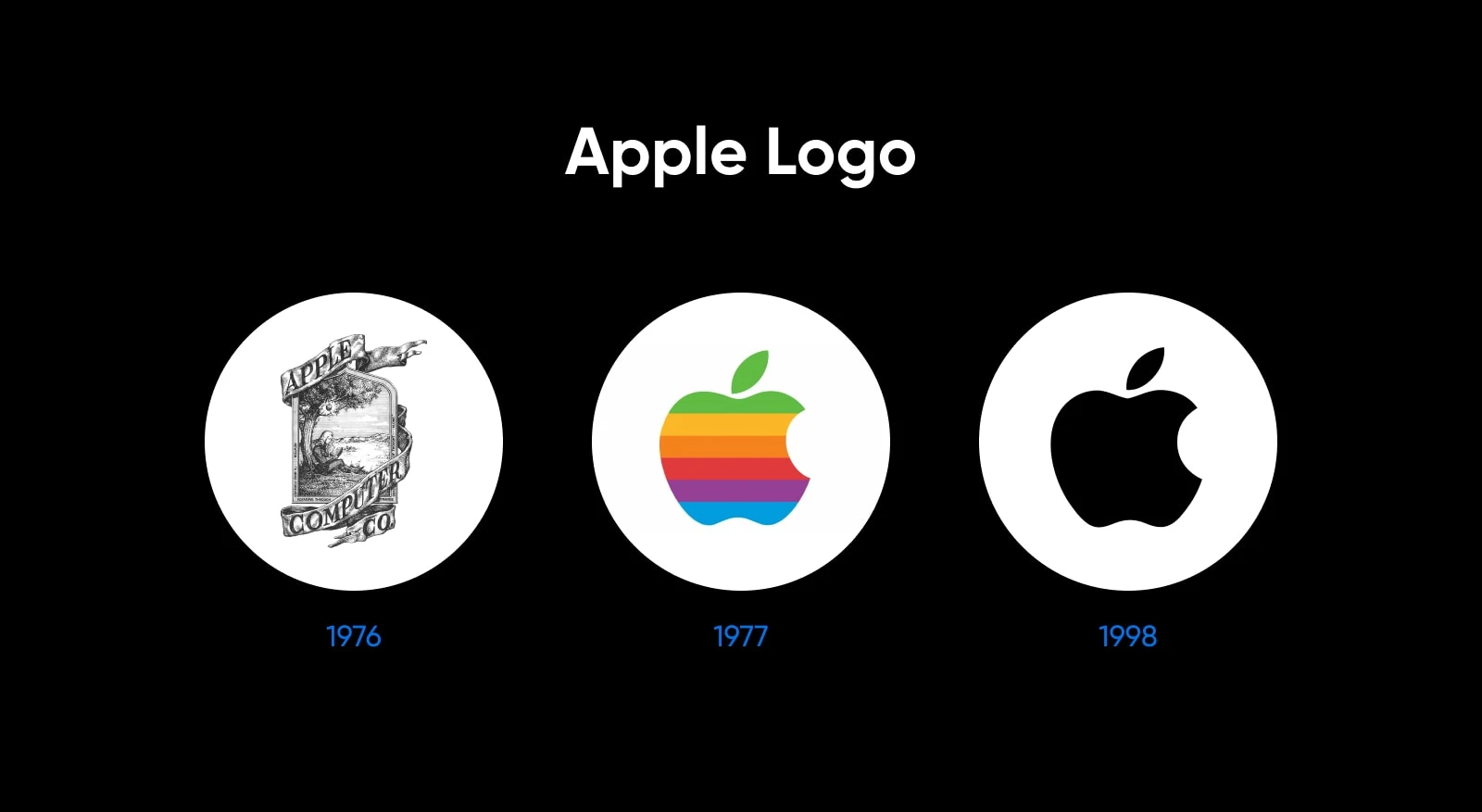
With the earlier logo, a website that’s similarly vibrant might have seemed appropriate.
However, when the logo was replaced with something more subtle and sophisticated, the company also revamped the website to match the new style.
Here’s how the website changed from 2004 to 2024:

If you visit Apple’s website today, you can see that it’s pretty much all black with hues that make it look “premium.”
It matches the logo, reminding visitors of the brushed aluminum and glossy black screens that are the company’s design trademark.
Now let’s go back to your website.
Do you see a misalignment between your website and your current brand identity? can confuse customers or dilute your message?
To understand it, you can start by answering these questions to confirm:
- Does your website’s color scheme match your current brand colors?
- Does the tone of your website content align with your brand voice?
- Do the images on your site represent your current products or services?
- Does your website reflect your company’s current values and mission?
Research by Edelman found that consumers are more than twice as likely to make purchases with brands they trust. They tend to remain loyal and become advocates among their friends, too.
To build trust, you need to make a good first impression. Research tells us that the average consumer takes only 0.05 seconds to form opinions about your website. And 94% of these first impressions are related to visual design.
Some consumers (46.1%) even gauge your brand’s credibility based on your website’s visual appeal — including the general layout, the choice of typography, and color schemes.
Branding also goes beyond your website, extending to all your marketing channels. A study by Lucidpress found that consistent brand presentation across all platforms can increase revenue by up to 20%.
All this tells us that looks matter. If your visitors don’t like what they see, they won’t even consider reading through your content, let alone making a purchase.
4. You Can’t Easily Update Your Website
While large businesses can afford to move slowly, agility is the most valuable asset for small businesses.
If you find yourself avoiding making updates to your website because it’s too complicated or time-consuming, that’s a red flag.
Modern content management systems (CMS) like WordPress make it easy for non-technical users to update content, add products, or make design tweaks.
If your current system is holding you back, it might be time for an upgrade.
Here are some signs you need to upgrade:
- You want to add e-commerce capabilities to your site
- You need to integrate with a Customer Relationship Management (CRM) system
- You want to add a chatbot for customer service
- You need better analytics tools to track user behavior
According to a report by Salesforce, 75% of consumers expect companies to use new technologies to create better experiences.
So keeping your website updated with the latest tools and technologies can give you a competitive edge while improving customer satisfaction.
5. Your Website Isn’t Mobile-Friendly
According to 73.1% of professional web designers, non-responsive design is the primary reason why people leave your website.
Why? Over 56% of online sales come from mobile devices, and at least 79% of mobile users have made a purchase online using their mobile device.
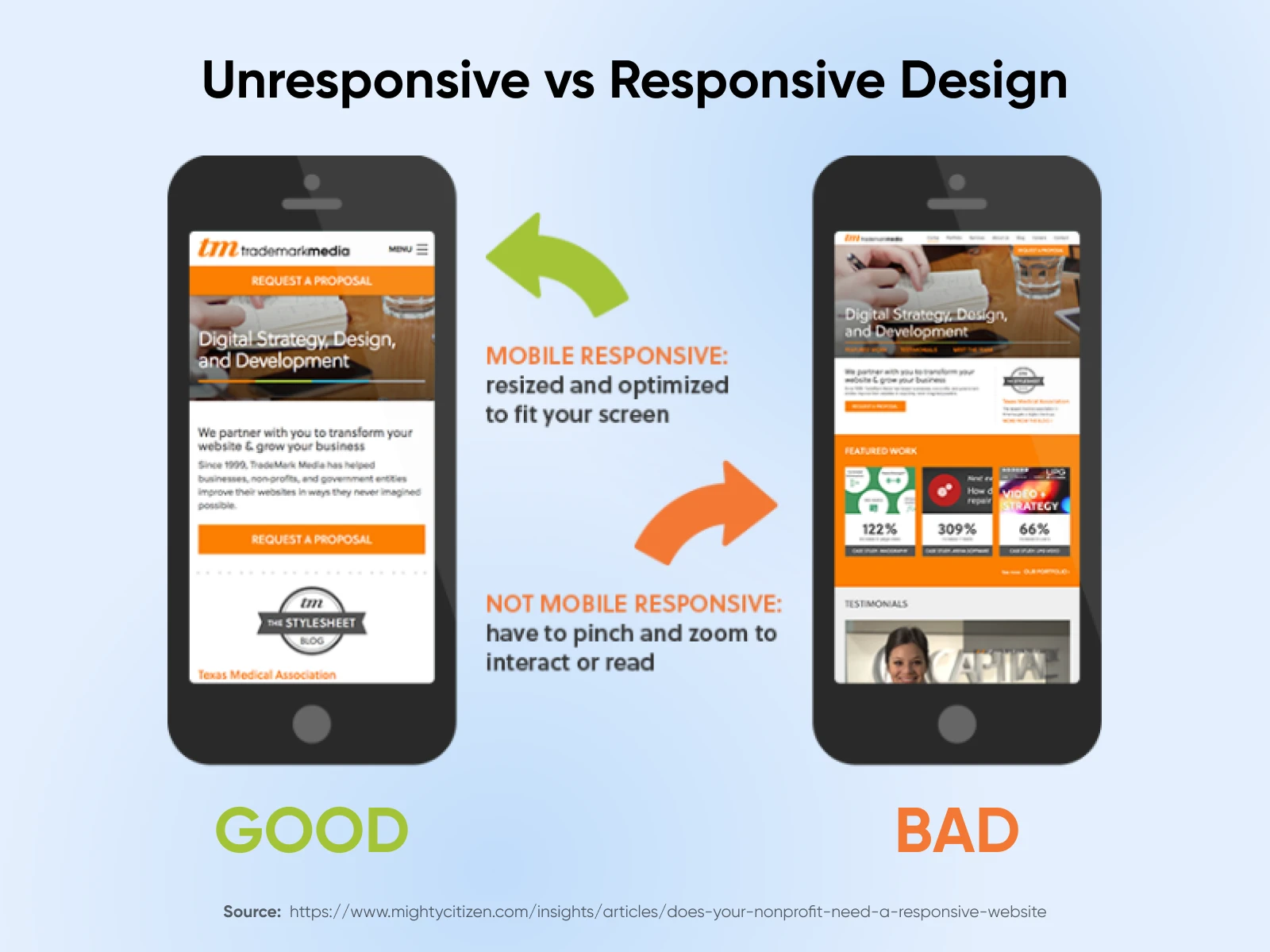
After the announcement of Google’s mobile-first indexing, responsive websites are also ranked higher due to the better user experience they offer — that means investing in updating your website can further improve your website performance.
The vast majority of web designers today understand the importance of responsive design. However, some websites built more than five years ago aren’t optimized for mobile devices. That goes for templates and themes, too.
So if you’re still using an old website that doesn’t automatically resize itself to the device, you should consider doing a site redesign.
6. Your Business Goals Are Shifting
Your goals will likely evolve as your business grows.
Perhaps you started with a simple informational website or a portfolio website, but now you’re looking to generate leads or sell products online.
If your current website doesn’t align with your new business objectives, it’s time for a redesign.
For example:
- You want to start selling products online, but your current site doesn’t have e-commerce capabilities
- You’re focusing more on content marketing, but your current site doesn’t have a blog or isn’t optimized for content distribution
- You’re targeting a new customer demographic, but your current site doesn’t appeal to this audience
- You’re expanding your services, but your current site doesn’t effectively showcase your full offering
A website redesign can help align your online presence with your evolving business goals, ensuring that your site is working hard to support your current objectives.
7. You’re Receiving User Complaints
If you’re consistently hearing things like “I can’t find what I’m looking for” or “Your website is difficult to use on my phone,” it’s a clear sign that your website isn’t meeting user expectations.
Consider adding tools, like Microsoft Clarity for heatmaps, or user session recordings to see how visitors interact with your site.
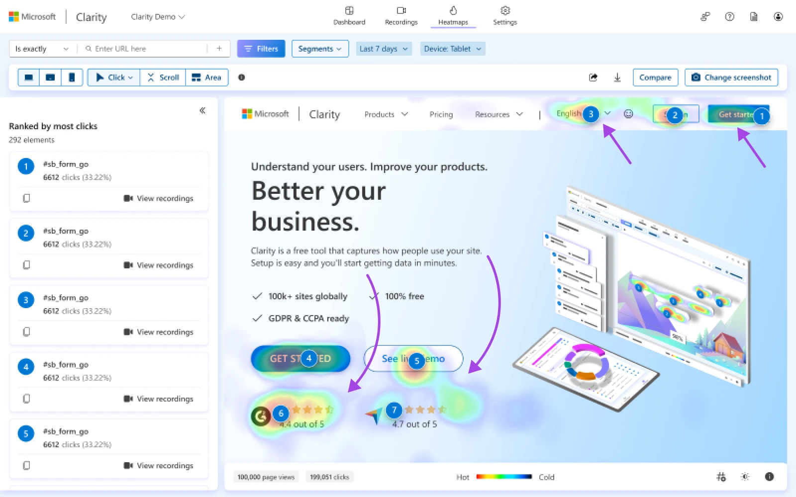
This can provide insights into areas of frustration or confusion that might not be immediately apparent to you.
If you haven’t already, be on the lookout for red flags including the ones below:
- Frequent customer service inquiries about how to use your website
- Negative comments about your site on social media or review platforms
- High cart abandonment rates for e-commerce sites
- Low engagement metrics (like time on site or pages per session)
If you see one or more of these signs, consider a website redesign. Don’t think of it as an expense but as an investment in your business’s future.
A great website can be your hardest-working employee, attracting and converting customers 24/7.
8. It’s Been 5+ Years Since the Last Redesign
Maybe none of the above applies to your website, but if your website is 5+ years old, we would still recommend refreshing the design of your site.
Even without visible signs of reduced performance, older designs often have problems stacking up beneath the surface.
Being proactive ensures that your site won’t suddenly break one day after an update, or descend the search rankings because you’re using old technology.
Step-by-Step Website Redesign Process
Now the question is, how do you get started? There are so many aspects to the website redesign process that it’s hard to know.
What should be the priority? Which part of the website do you update first?
Let’s put this into a step-by-step process.
Phase 1: Setting Goals and Baseline KPIs
Starting a website redesign without clear goals is like renovating a house without a blueprint.
You might end up with something new, but it probably won’t serve your needs effectively.
This first phase of your website redesign project sets the foundation for everything that follows.
Set Measurable Website Redesign Goals
Start by examining your current business challenges and opportunities.
For instance, a local restaurant could start with the problem that they can bring people to their website but can’t convert them into bookings.
Now, their website redesign would have a specific goal: increase online reservations by 30% within three months of launch.
Your goals should connect directly to your business outcomes.
Instead of vague objectives like “improve the website,” set specific targets like:
“Our online flower shop needs to reduce cart abandonment from 75% to below 50% within two months of the redesign launch, which would add approximately $5,000 in monthly revenue.”
“Our consulting firm needs to increase qualified lead generation by 40% within three months, taking us from 20 to 28 quality leads per month.”
These specific goals help you make better decisions throughout the redesign process.
When you’re deciding between different features or designs, you can always ask, “Will this help us reach our target?”
Establish Your Baseline KPIs
You need to know where you’re starting from to measure improvement. Google Analytics provides most of these metrics for free.
Start tracking these core metrics at least one month before beginning your redesign.
Visitor metrics:
A thorough analysis of your conversion rate reveals more than just sales numbers. Break it down by:
- Device type (mobile vs. desktop)
- Traffic source (organic, paid, social)
- Geographic location
- Time of day
- User type (new vs. returning)
The above metrics will help you understand how well your website converts customers across different pages, geographics, and devices.
User behavior metrics:
After you understand where your visitors arrive from, you need to understand what they do and how they behave once they’re on the website.
It’s better to rely on data to understand what pages need to be prioritized when redesigning.
For instance, you may think you need to redesign your homepage.
Then, after looking at the data, you may find that 80% of converting customers have never visited the homepage — they came directly to product pages from Google searches.
To find the right data, track these user patterns over at least 30 days:
- Most visited pages: Look beyond raw pageviews. Study the correlation between page visits and conversions. A high-traffic page with low conversion rates needs attention during your redesign.
- User flow: Where do visitors go after landing on your site? At what point do they leave? For instance, if you see that people abandon your checkout when asked to sign up, you could focus on redesigning your checkout to integrate signup as part of the checkout information.
- Page exit rates: Different from bounce rates, exit rates show where users decide to leave your site. High exit rates on important pages (like your pricing page) indicate problems to focus on while redesigning.
Technical performance metrics:
Page speed has a direct impact on your bottom line. Back in 2006, Google found that an additional half-second delay caused traffic to drop by 20%. You need to monitor:
- Server response time: Your server should respond in under 200 ms. Anything slower indicates you might need better hosting.
- Page load time: Users expect pages to load in under 3 seconds. Every second delay beyond that can cost you 7% in conversions.
- Error rates: Track 404 errors, server errors, and form submission failures. These small issues can add up to significant lost revenue.
Response Time
Response time is how long it takes a web server to process and return data to a browser’s request.
Read MoreIf your current hosting isn’t living up to your standards, try DreamHost’s hosting plans or DreamHost’s VPS plans with built-in CDN to ensure super-fast websites.
Phase 2: Research and Analysis
Many small businesses jump straight into design without proper research. Let’s do this right.
Content Audit
A thorough content audit reveals gaps and opportunities in your current site. Start by creating a comprehensive spreadsheet of all your content. For each page, record:
- Performance metrics: Go beyond the metrics like pageviews and instead analyze time on page, bounce rate, conversion rate, revenue per page, or average revenue per user (ARPU) from your online channels. These are the metrics that drive business results.
- Content purpose: Every page should serve a specific goal in your sales funnel. Map each page to customer journey stages: awareness, consideration, or decision. Then, track to determine where your users drop off and how you can improve each journey stage to retain more users.
- Update needs: Rate content as keep, update, merge, or delete. Be ruthless here; outdated or thin content can harm your site’s credibility and SEO performance.
Competitive Analysis
Study your competitors, but don’t copy them. Look at both direct and indirect competitors to identify what you can do differently to stand out.
Direct competitors: Businesses offering similar products/services in your area.
Indirect competitors: Businesses targeting the same customers with different solutions.
Study their:
- Messaging strategy: How do they communicate value propositions? What language resonates with your shared audience?
- Feature implementation: How do they handle key functions like booking, purchasing, or contact? Note both good and bad implementations.
- Content strategy: What types of content do they create? How do they organize information? Where are the content gaps that your business could fill?
Phase 3: Planning and Structuring the Website
The research phase reveals what needs fixing. Now it’s time to plan how your new site will address these needs. Think of this as creating the blueprint for your digital storefront.
Structuring Website Information
Your site structure should match how your customers think, not how you organize things internally.
For instance, a local bookstore can organize books by the publisher — it’s logical for the owners but confusing for customers.
By reorganizing the same books based on the reader’s interest (fiction, nonfiction, self-help, cooking, etc.), it becomes much easier for the reader to find what they need.
To create a clear hierarchy, start by answering these questions:
- What are visitors trying to accomplish?
- How can they achieve this in the fewest clicks?
- What information do they need at each step?
For instance, here’s what a typical small business website navigation can be like:
- Home
- Services
- Primary Service Pages (detailed info, pricing, FAQs)
- Supporting Service Pages (comparisons, case studies)
- About
- Team
- Process
- Values
- Portfolio/Case Studies
- Contact/Book Now
Here’s a plumbing company’s website with a structured navigation menu. It aligns with the thought process of the visitor as well as what value the company wants to add to the user.

The thought behind it is simple: A visitor would want to know what the business can do for them, then learn more about the business background, see what other clients the business has worked with and what they say about them, and finally, hit the contact button to get a quote or reach out for further details.
Sitemap
You need to know what content is unnecessary on the website and prune pages every once in a while. A sitemap can help you see the structure of your website much more clearly.
A sitemap is essentially a blueprint for your website.
It lists all the major pages and, ideally, shows how they are interconnected. Another way to think of it is as a flowchart that outlines your site’s hierarchy and helps you visualize how content is organized.
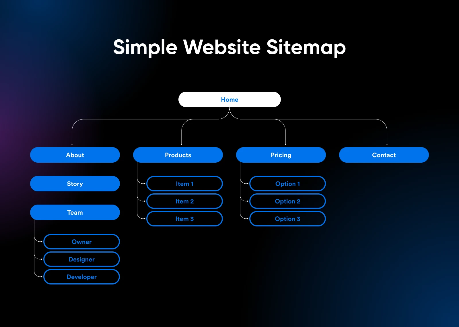
When creating your sitemap for your redesign:
- Check your current site and content first. List what needs to be deleted, maintained, or changed.
- Create a clear page structure. The most important or frequently viewed content should be immediately accessible from the homepage.
- Think about how consumers will navigate from one page to another. A great user experience depends on logical and intuitive navigation pathways.
- Guide your page names and descriptions using keyword research. This strategy helps users know they are on the right page and also helps improve your SEO.
- If your redesign involves adding new content or features, place them on your sitemap to visually understand what the structure would look like on the existing structure.
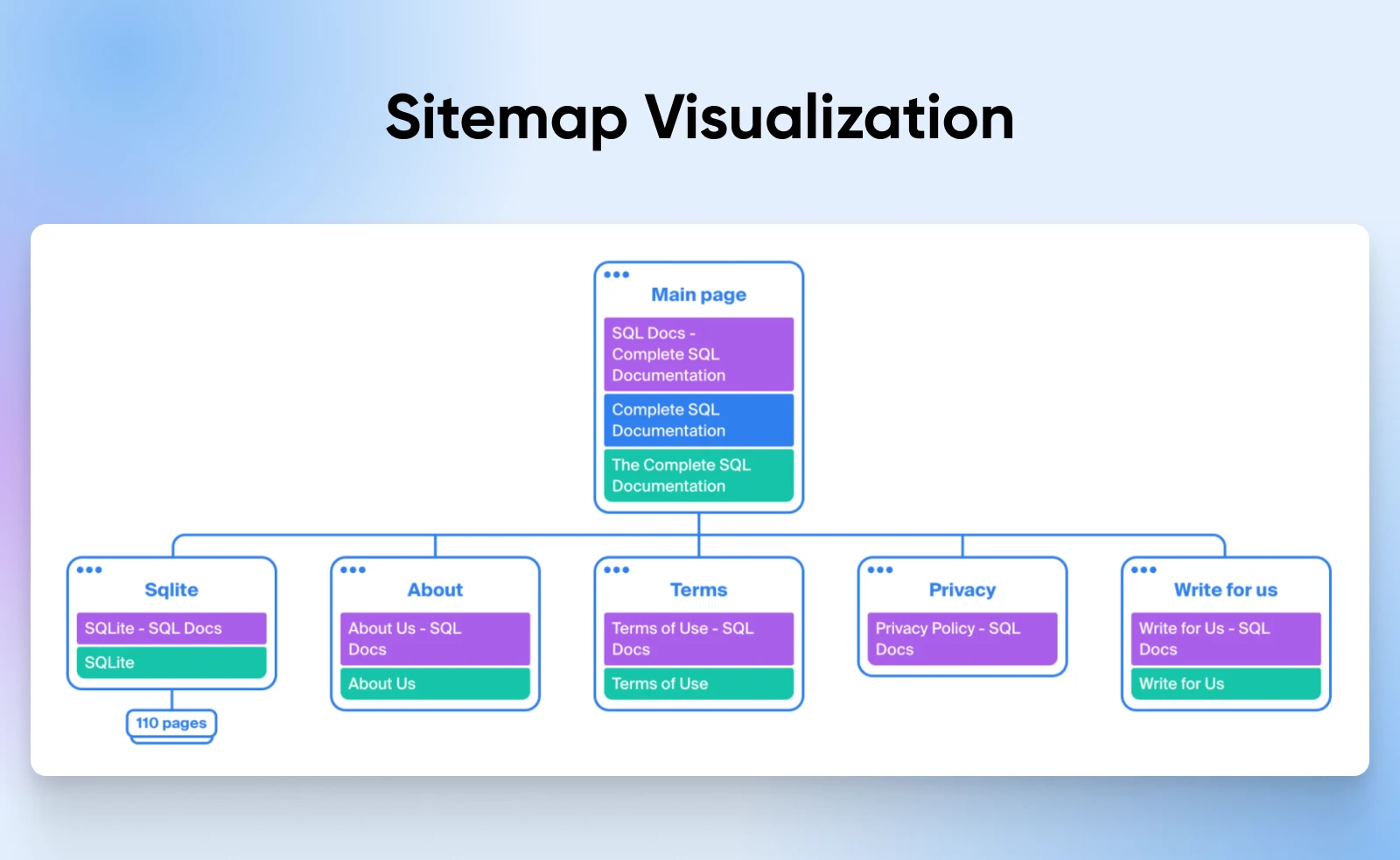
There are quite a few tools to create a visual sitemap from your existing website, like the Octopus Sitemap Visualizer. You can then add or remove pages to this sitemap on the sitemap visualizer to see what it all looks like.
Your hierarchy should reflect your specific business goals.
A cafe’s website might prioritize online ordering and reservations, while a consultant’s site might focus on lead generation by giving out valuable content in return for an email or contact information.
Feature Planning
Features are expensive to build and maintain.
Each one should earn its place on your site. For instance, a fitness studio could spend $2,000 to add a complex class scheduling system, only to find that most clients prefer booking over the phone.
Prioritize features using this framework:
- Must-have features: These directly support your core business functions. For an e-commerce site, this includes a secure checkout, product search, and cart functionality. For a service business, it might be contact forms and appointment scheduling.
- Growth features: These support business expansion. If you plan to start email marketing in six months, build your site with this in mind. Even just planning to create a contact list of interested people is an extremely valuable asset in the long run.
- Nice-to-have features: These improve the user experience but aren’t critical. Live chat might be nice, but if you can’t staff it consistently it could harm rather than help your business.
Technical Requirements
Your technical foundation determines what’s possible with your site. Here are some key areas to consider.
Hosting Requirements:
The hosting plan you choose for your website will depend on a couple of important factors:
- Expected traffic volume: If you already have thousands of monthly visitors, it makes sense to opt for dedicated hosting or VPS hosting instead of shared.
- Security needs (especially for e-commerce): SSL certificates are essential for all websites now, and for those that accept payments, you also need to be PCI compliant. Go with a host that not only supports this but can help you set it up.
- Backup and recovery capabilities: Automated daily backups with quick restoration options protect your business from data loss.
- Technical support availability: Once the website is developed, it may work just fine, but as you add new pages, content, and plugins to it, you increase the chance of things breaking. That’s when you need 24/7 technical support who actually knows how to fix things.
If you are just starting a new website, choose a low-cost shared hosting plan to get started without expensive upfront costs. Sometimes your hosting company can also build a website for you.
At DreamHost, we offer professional web services where we build and set up the marketing for your website from scratch so you can focus on growing your business to meet the increasing demands.
Content Management:
Your CMS choice affects how easily you can manage your website. These are some questions that will help you pick a proper CMS.
- How often will you update content?
- Who needs to make updates?
- What types of content will you publish?
- Do you need multilingual support?
If you need extensive support for additional functionality, choose a CMS with a vast plugin ecosystem like WordPress. Alternatively, if you only want your website to be for blogging and lead generation, go with a lighter CMS like Ghost.
Integrations:
These days, websites rarely stand alone. There are many services from across the web working together to make things happen.
For instance, see if you need any of the following integrated with your website:
- Payment processing: If you’re selling online, you’ll need secure payment gateway integration. Popular options like Stripe or PayPal offer robust APIs and built-in security.
- Marketing tools: Email marketing, CRM, and social media tools should connect smoothly with your site. Look for pre-built integrations to save development time.
- Analytics and tracking: Beyond basic Google Analytics, you might need heat mapping, conversion tracking, or custom event tracking.
- CRM systems: Consider if you need appointment scheduling, reservation systems, or inventory management integration.
Phase 4: Design Planning
Design isn’t just about aesthetics. Smart design choices directly impact your business results. Let’s break down how to plan a design that works as well as it looks.
User Experience (UX) Design
It’s commonly said that ugly websites convert better, but that doesn’t mean you remove all the bells and whistles from your website right away.
In fact, it has nothing to do with what your website looks like. Instead, it’s about how clear the interface is for the user.
Take Craigslist, for instance. It’s a website that hasn’t been redesigned since the late 90s. Is this a pretty website? Absolutely not.
But it works.
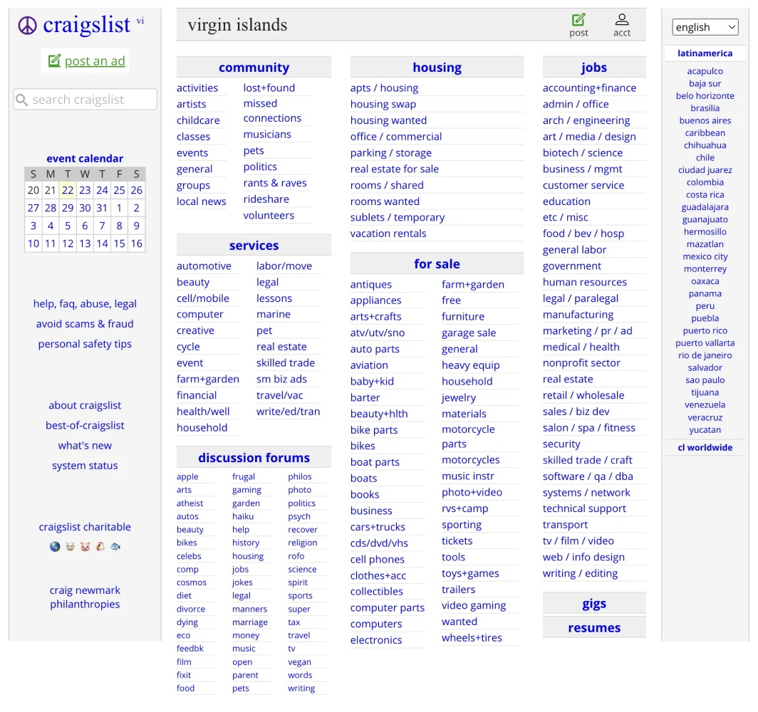
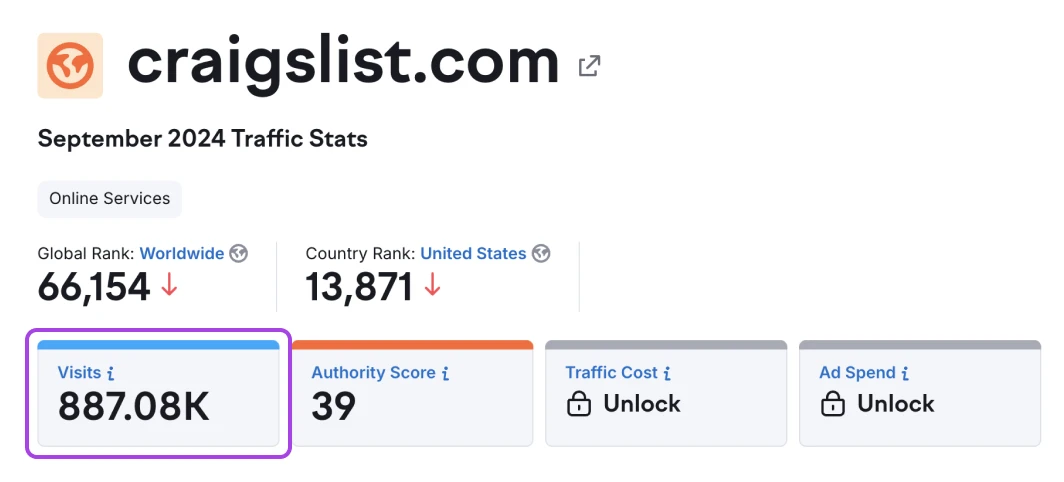
It’s used by hundreds of thousands of monthly visitors because the interface is straightforward and gets the job done.
Another example is DMOZ, the directory of the web. It’s a simple grid of different icons and categories.
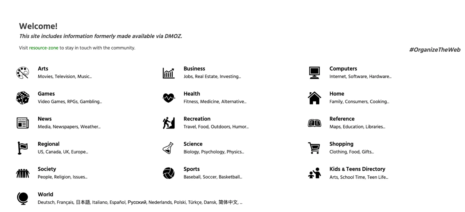
It serves the user exactly what they need, right on the first page without wasting time.
Similarly, make sure your menu and navigation reflect how customers think about your business, not how you think. Give special focus to the “above the fold” area of your homepage, as it’s the first thing your users will see.
Performance Design
Speed isn’t just a technical metric — it’s a key part of user experience. Amazon famously calculated that a one-second delay in page load time costs them $1.6 billion in sales annually. While your numbers might be smaller, the principle remains the same.
Let’s look at Walmart’s mobile site. Their images are highly compressed, not because they can’t afford better quality, but because they know mobile users value speed over perfect imagery. Now, even though their homepage is filled with images, it takes just 1.33 seconds to fully load the page.
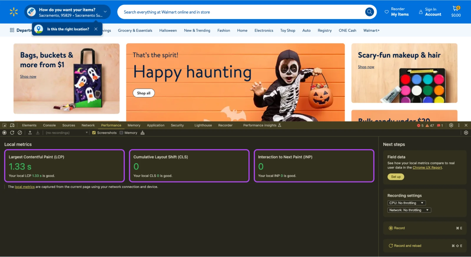
The key is to be intentional about all design elements:
- Does that hero video really need to autoplay?
- Could that image be smaller without losing impact?
- Is that third-party script essential for your business?
You can compare website performance to a racecar. Designers strip away everything that doesn’t make the car go faster. Every fancy animation, high-resolution image, or custom font must justify its impact on load time. If it doesn’t, get rid of it.
Phase 5: Budget and Resource Planning
Your website is a business investment, not an expense. Smart budgeting considers both immediate costs and long-term returns. According to a 2024 WebFX report, websites typically cost between $1,000 and $145,000 to develop or redesign.
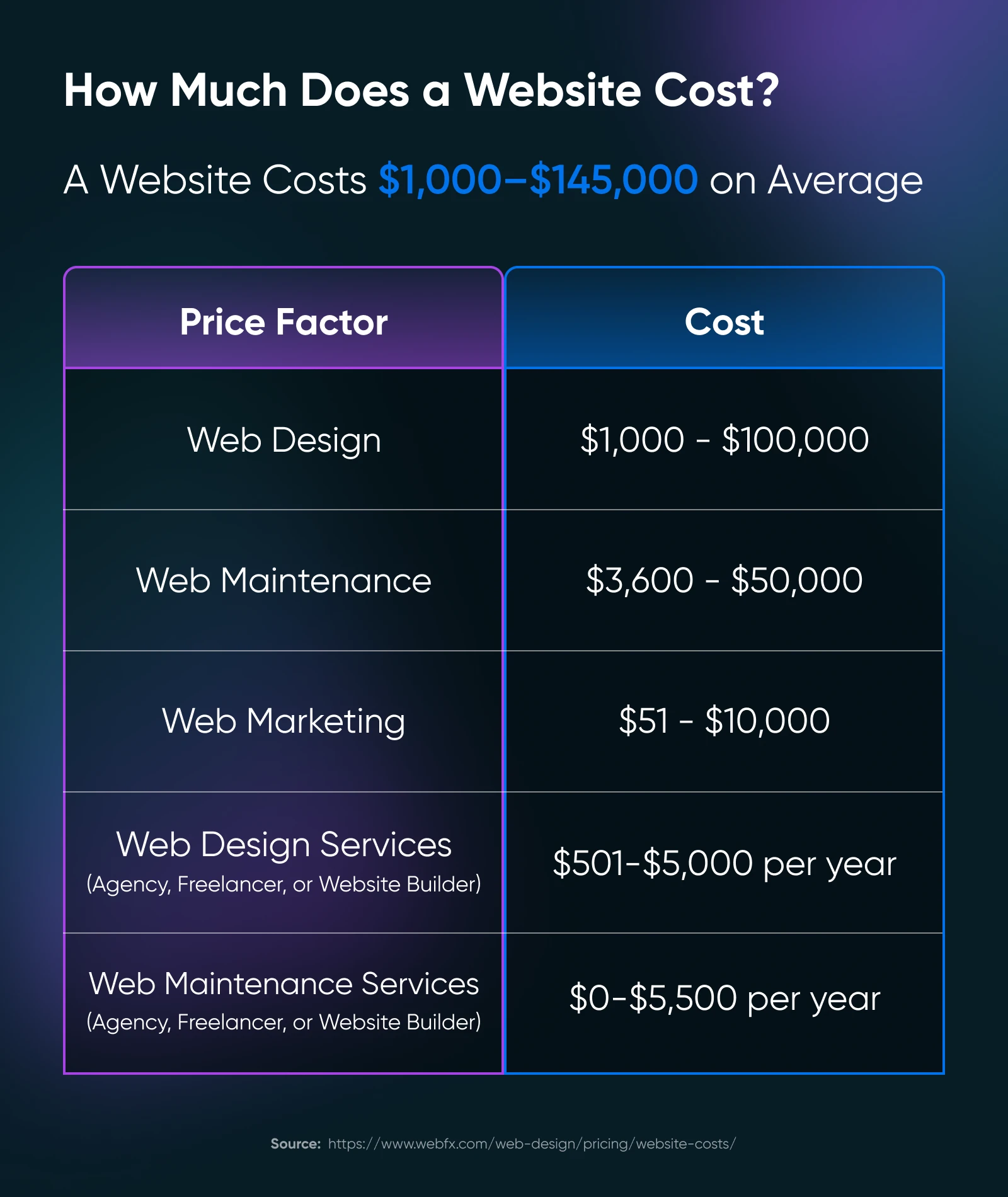
Basic Business Website ($2,000–5,000):
- WordPress hosting from providers like DreamHost: $16.95/month
- Premium theme from ThemeForest: $59–99
- Essential plugins (SEO, security, forms): $200–500/year
- SSL Certificate: Often included with hosting
- Professional stock photos: $100–300
E-commerce Website ($8,000–15,000):
- E-commerce hosting: $30–100/month
- Shopping cart platform (like WooCommerce): Free, but premium extensions cost $500–1,000
- Payment processing integration
- Inventory management systems
- Enhanced security features
Chron’s small business segment suggests businesses allocate 7–8% of their gross revenue for marketing, including their website if the business is doing less than $5 million a year.
Apart from this, you also need to keep some budget for the upkeep of your website. This includes but is not limited to:
- Security updates
- Content updates
- Technical maintenance
- Platform upgrades
- Performance optimization
If you think you can do this yourself, consider the opportunity cost. If you bill $100/hour for your services, spending 40 hours on your website costs you $4,000 in lost billable time.
However, if the lost billable time is money saved for your business at the present moment, by all means, choose that route until you can hand website maintenance to someone else.
Nevertheless, plan your budget based on your business goals and expected returns, not just the lowest possible cost.
Include both initial development and ongoing maintenance in your calculations and see what return you can generate from the website before coming down to a final price.
Phase 6: Build, Launch, and Succeed
Alright, we’re finally down to the last phase of your website redesign — the build and launch.
Development Approach
Choose your development path based on your resources and technical comfort level. These are the three major choices you will be presented with:
- Professional development: This is best for custom needs or complex features.
- Template websites: These are good for simple websites that just need to showcase their online presence.
- DIY with professional support: A nice, balanced approach.
The Build Process
If you’re building the website yourself, start with a staging environment so you can play around and break things without affecting your live website.
However, if you are building a website from scratch and don’t have one, feel free to directly work on the live website.
Here’s a general build process that you can follow:
- Core structure: Build your main pages (Home, Services, About, Contact) and navigation first. Ask a few people to go through the website and observe their flow through the website. If more people visit the About page before the services, you can move the menu items accordingly.
- Essential features: Add your must-have features one at a time, like contact forms, service quote details, email subscription forms, etc., while testing each thoroughly.
- Content migration: If you already have content, start migrating the content slowly, testing each piece to ensure there is no hard-coded formatting carried over from the previous website design.
- Integration setup: Once the content has been moved, start integrating your tools to the website. If you’re using a WordPress website, integration can be as simple as installing a plugin. For custom websites or websites without a plugin ecosystem, you may need to integrate code snippets.
If you need help setting up the website, you can reach out to DreamHost’s Professional Services team to help.
Testing
It’s vital to test websites once you’ve moved to a new setup.
There’s a chance you have plugins that aren’t integrated yet, forms that don’t work, or emails that don’t get triggered.
Test every aspect, starting from the most important parts of your website.
Here’s a checklist of items that you can work with:
- Forms and checkout processes with real transactions
- Mobile experience across different devices
- Load times and performance
- Cross-browser compatibility
- All integrations and automations
Once you’ve tested it personally, ask a few of your team members to do the same, and when everything is set, you are ready to launch!
Launch Strategy
This is the final step of your website redesign strategy.
For a successful launch, you don’t just update your website and be done with it.
Your launch has to build momentum for your business.
And for that to happen, you need to create hype in the market at least two weeks before you launch. You could even hire a marketing agency to help you build the momentum while you work on getting the website ready.
On the day of launch, and for a few days after that, keep a close eye on the following to ensure everything goes smoothly:
- Watch your analytics for unusual patterns
- Check all form submissions
- Monitor server performance
- Track conversion rates
- Test key business functions hourly
Don’t fret if something breaks on the launch day.
Even the largest of businesses have their launch day failures.
Remember the Tesla Cybertruck launch event?
Elon wanted to show how strong the glass panels were by throwing a heavy metal ball at them.

The glass cracked…twice.
Did that deter people from buying the cybertruck? Absolutely not.
As of October 15, 2024, Tesla sold 28,250 Cybertrucks as per the data reported on Forbes.
Just fix the failures, be transparent with your customers, and you should be back on track in no time.
Continuous Improvement
Congrats! You’ve launched your website, and you’re now receiving customer inquiries through your website.
It’s not a sign for you to stop. It only signals to you that the website is working for your business and you need to create a schedule for maintaining and improving it.
Here are a few things you need to keep an eye out for:
- Weekly performance checks
- Monthly analytics review
- Quarterly content updates
- Annual feature assessment
These small improvements add up.
And remember that a successful website redesign is really just the beginning.
The most successful small business websites continuously evolve, driven by customer needs and business goals.
Stay connected with your customers, watch your metrics, and keep improving. Your website can become your most valuable employee, working 24/7 to grow your business.
Before and After You Go Live: A Comprehensive Website Redesign Checklist
We’ve gone through a lot of steps, phases, and technicalities.
This can be quite overwhelming, especially if you haven’t revamped your website before. Here’s a quick checklist to help you through the different phases before and after your website goes live.
Before Going Live
- Back up your current website: Ensure you have a complete backup of your existing site, including all files and databases.
- Test load speeds: Use tools like Google PageSpeed Insights to make sure your new design loads quickly and efficiently.
- Optimize your website for SEO: All pages should be optimized for search engines, including proper use of keywords, meta tags, and alt text for images.
- Check for 404 errors: Crawl your site to find and fix any 404 errors.
- Set up 301 redirects: Implement 301 redirects for all changed URLs to maintain SEO value and user experience.
- Verify internal links: Check all internal links to ensure they point to the correct pages and don’t lead to dead ends.
- Review mobile responsiveness: Test your site on various mobile devices to ensure it’s fully responsive.
- Conduct cross-browser testing: Ensure your site looks and works as intended across different web browsers.
- Validate your code: Use tools like the W3C Markup Validation Service to check for any HTML/CSS errors.
- Ensure accessibility compliance: Check that your website complies with WCAG guidelines for accessibility.
- Test forms and CTAs: Make sure all forms, call-to-action (CTA) buttons, and interactive elements work correctly.
- Review content: Do a final sweep of your content for any typos, inaccuracies, or outdated information.
- Check load capacity: Perform load testing to make sure your site can handle traffic.
- Secure your site: Check that all security measures, like SSL certificates, are in place.
After Going Live
- Monitor site speed: Continuously check site speed and make improvements as needed.
- Track rankings and traffic: Use tools like Google Analytics to monitor any changes in your traffic and keyword rankings.
- Solicit user feedback: Gather feedback from users about the new design and functionality.
- Fix any post-launch issues: Address any unexpected issues or bugs that arise after launch.
- Update your sitemap: Submit your new sitemap to search engines.
- Monitor 301 redirects and broken links: Keep an eye on redirect performance and fix any broken links.
- Continue to optimize for SEO: Regularly update your content and SEO strategy based on performance data.
- Assess user behavior: Analyze user behavior on the new site and adjust UX/UI elements as needed.
- Regularly update content: Keep your site fresh with regular content updates.
- Maintain security updates: Regularly update security features to protect your site from threats.
- Evaluate and adjust based on goals: Continuously evaluate the site’s performance against your set goals and make adjustments as necessary.
Upgrade More Than Just the Design
A successful website redesign can transform your online presence and drive business growth.
And you don’t have to do it alone.
DreamHost’s Professional Web Services team can handle your entire redesign process, from planning to launch, while you focus on running your business.
Along with the design, Dreamhost’s affordable hosting plans and 24/7 support can make your website your best-performing business asset.
Ready to start your website redesign? Reach out to us today!

Get a Beautiful Website You’re Proud Of
Our designers will create a gorgeous website from scratch to perfectly match your brand.
Learn More