Bold is Back, Baby!
Well, maybe it never left.
But let’s just say we are interested in a particular kind of bold today, one accompanied by an overall elevated and sleek, purposeful, cohesive design.
Websites are storytelling tools, taking the user on a brand adventure, and are more emotive, tactile, interactive, and joy-inducing than ever before.
Understanding the reasoning and rationale behind the popular web design trends can help you see why applying these features would be useful in engaging your audience and positioning your brand as competent, authoritative, and innovative.
If you’re about to embark on a total website redesign and are feeling stuck or unsure where to start, give this list a look. We’re sure there’s something in here that will ignite your creativity and inspire you to take that exciting new direction with your own website design.
12 Popular WordPress Web Design Trends
Nostalgia-Inspired Themes
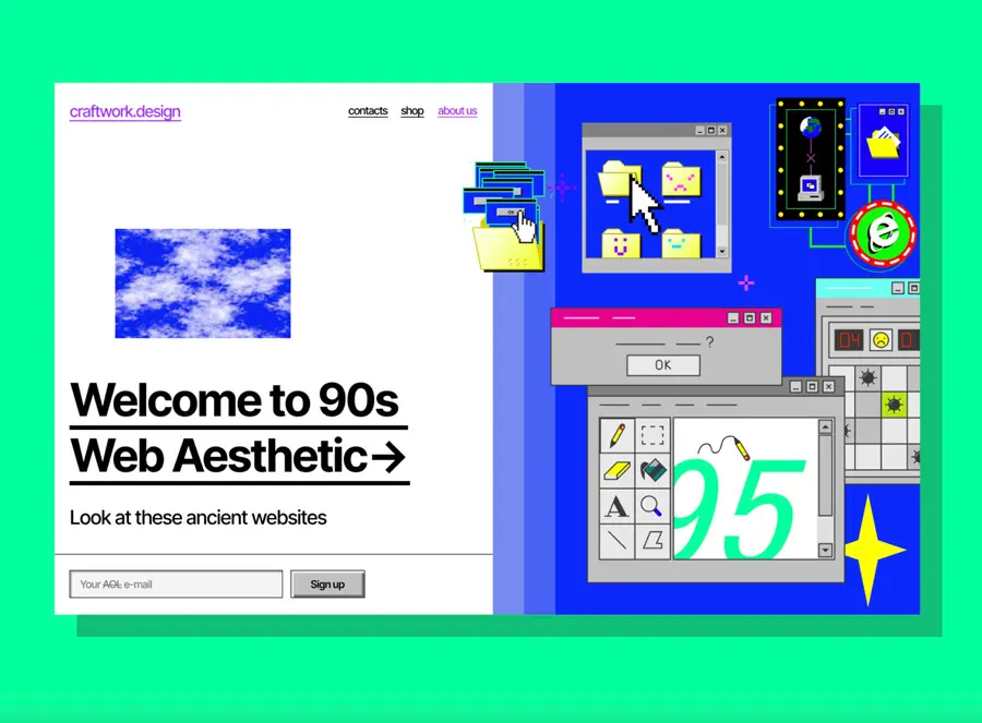
Credit: https://dribbble.com/craftwork-studio
Welcome back, 1990! It’s easy to forget that we once had to “dial-up” to access the internet, wait endlessly for photos to buffer, and surf the web on super pixelated screens to navigate a choppy, colorful, completely new digital world.
Today, we consider this wild west time of the internet to be charming and playful. With the bright colors, clip art images, and crazy gimmicks. We find ourselves reminiscing about the whimsical nature of a site whose only job is to dazzle with entertainment. Splashy, catchy, and fun, the cyclical desire to revamp the past has led to a new wave of Web 1.0 inspired design.
What are some key elements to achieve this retro aesthetic? Play around with colorful backgrounds, table layouts with visible borders, and robotic typography like Courier, Times New Roman, and ITC American Typewriter.
These early days of web design are often seen in a romanticized (or chaotic) light, highlighting a time before best practices were really “a thing,” and unfettered creativity gave every website creator permission to express their brands and ideas in unique ways.
If you feel that your site would benefit from a blast from the past design, take a trip down memory lane and remember some of your favorites sites from that time, draw inspiration from their colors and layouts, and don’t be afraid to take chances and be bold, a dutiful homage to the web we once knew and loved.
Micro-Interactions
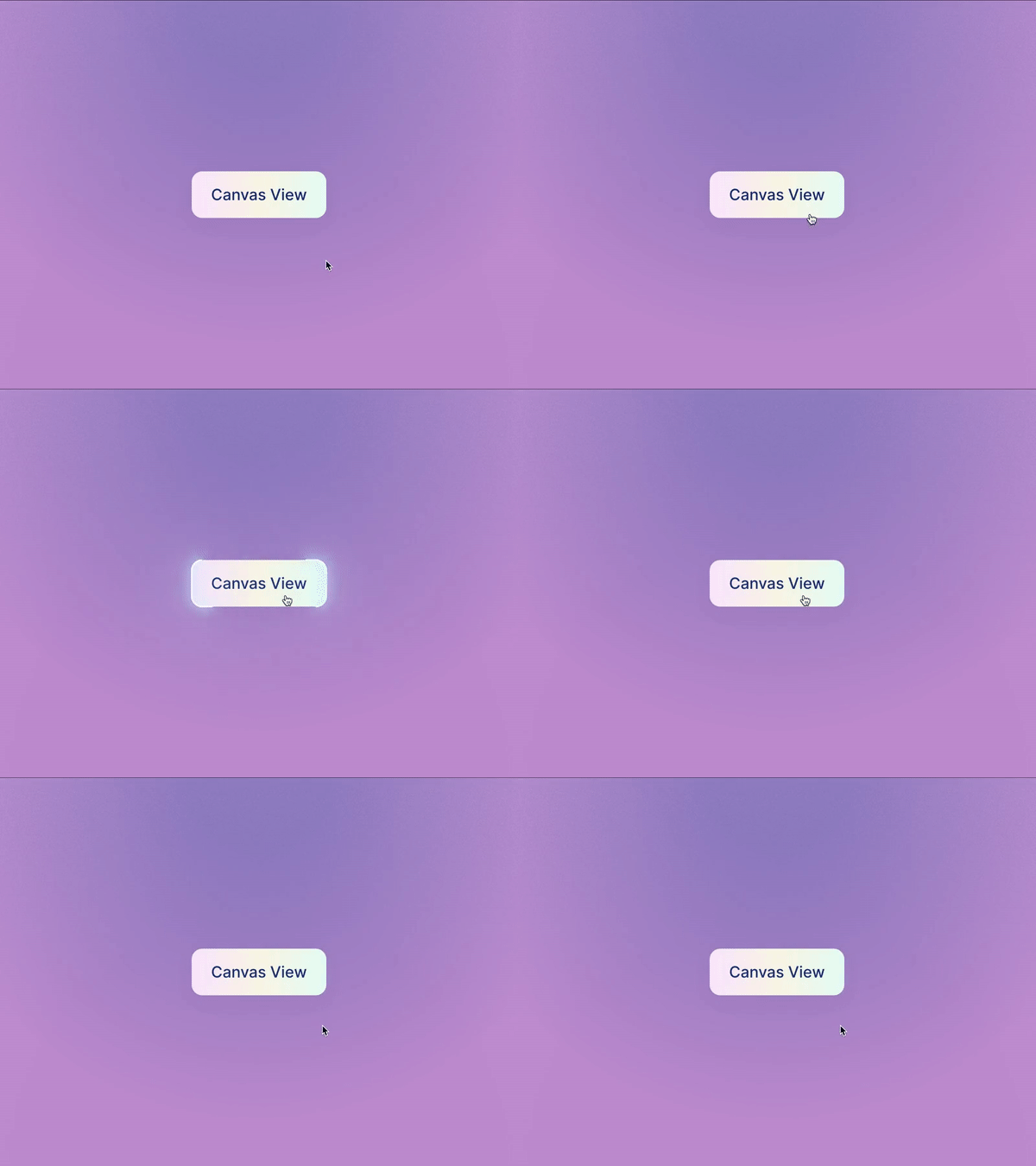
Credit: https://dribbble.com/ai
The satisfying experiences you encounter when websites react to you — as you hover, scroll, and click — are thanks to lovely micro-interactions.
We are seeing this more and more on websites and apps, the way text or images respond to a hover or click of a mouse. We are used to seeing it when it refers to text links that change color to represent that there is a link attached to that specific item. In this evolving iteration, the micro-interaction is a small animation that provides feedback in enjoyable ways. An icon on your homepage could move, change sizes, perform a short action, or any number of possibilities that will give just a little something extra and create an interactive experience for the user.
Bold Text in Hero
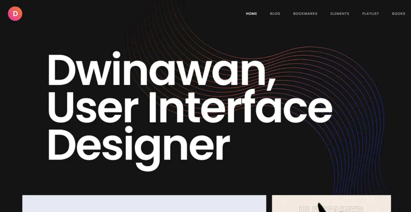
Credit: https://dribbble.com/dwinawan
Your website visitor will first see the hero image on your landing page. That space should make a statement, and now we see trends that take that idea literally.
In using text as your website’s hero image, you direct attention to exactly what you want to say. The ways that we move rapid-fire through websites while searching for answers, information, or inspiration, don’t leave a lot of room for interpretation. Replacing a traditional hero image with a bold line of text that spells out exactly what your visitor will get from you is a clever and commanding way to get your point across effectively.
Dark Mode
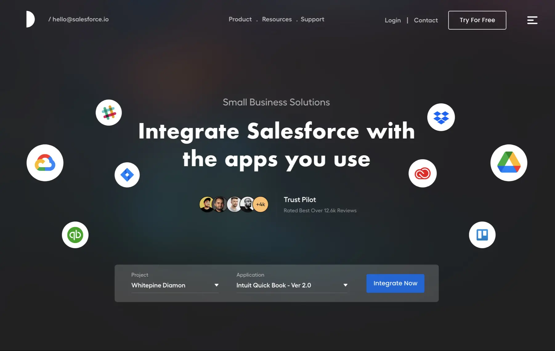
Credit: https://dribbble.com/D-studio
Dark Mode is an attractive and modern approach to web design that gives viewers a break from the overly bright and colorful sites that are more common when browsing.
Like a breath of fresh air, dark mode is contemplative and pulls focus towards certain aspects of your site, allowing you to highlight particular features, products, or ideas by darkening the background around them. Visitors won’t be able to help but pause at your site as the dark, modern aesthetic draws them in, emphasizing your visual content and enhancing your emotional branding.
Memphis Design
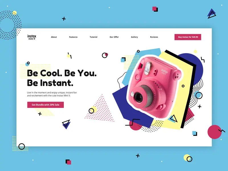
Credit: https://dribbble.com/eugenia_proud
A 1980s design aesthetic characterized by scattered, brightly colored shapes and lines, Memphis design has been one of the most surprising design trends of the past several decades. When poorly executed, this bold and colorful aesthetic can come off as tacky and gaudy, but when properly and thoughtfully implemented, Memphis design is fun, playful, and incredibly memorable — think instant party on a page.
Memphis design was originally a rejection of minimalism. So the use of dots, squiggles, geometric shapes, and bright colors in web design today can also be seen as a contrast to the uniformity of minimalistic web designs prevalent in contemporary styles. Therefore, it is not surprising that this trend is making a comeback as a way to captivate sites visitors and refresh the creativity of nostalgia and fun.
Hand-Drawn Illustrations
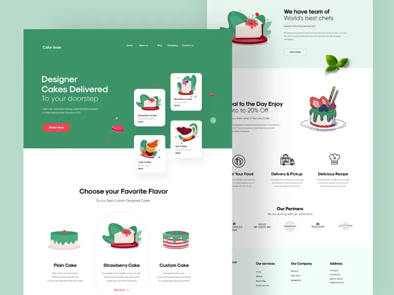
Credit: https://dribbble.com/cuberto
The increasing ease of digital craftsmanship in web design, layout, and aesthetics, inadvertently creates the ideal landscape for a hand-drawn illustration revival. The imperfectness of hand-drawn text and images is incredibly pleasing to the eye; it’s conceptually charming and draws visitors in with a sort of “farm-to-table” appeal. The implication is that these illustrations are special and just for you and not some carbon copy pulled from a digital stockpile.
As they relate to design, these hand-drawn characteristics can be represented through doodles, scribbles, messy cutouts, handwritten text, and textures like crayons, pencils, and paint. Adding these elements to your web design brings a more personal touch that evokes connected feelings and grounds your visitors in familiarity and comfort with your brand.
Website Storytelling
Credit: https://dribbble.com/Zendesk
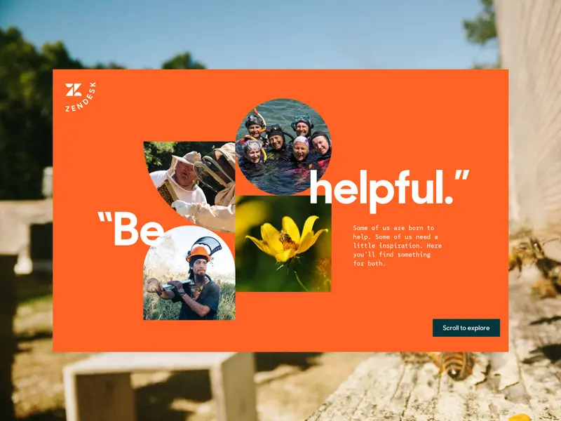
Applying a storytelling approach is an increasingly popular way for web designers to leverage a digital interface to convey a message or tell an intricate story. This is also extremely helpful for communicating complex data to a broad audience in an engaging way. We are visual creatures, and combining the elements of data information with visual effects allows for a more comprehensive understanding of important information and inclusive design.
When used to convey brand messaging, storytelling provides a cadence, rhythm, and evocation to your website. You can help guide people through how they should feel when they move through your website and gives them the space to linger and explore in ways that help them connect to you. Using large text, images, animations, and micro-interactions will help accentuate your value proposition and guide your visitors through a web experience where every element leads you to a new feature and moves them further along the story.
Interactivity
Credit: https://dribbble.com/chopse
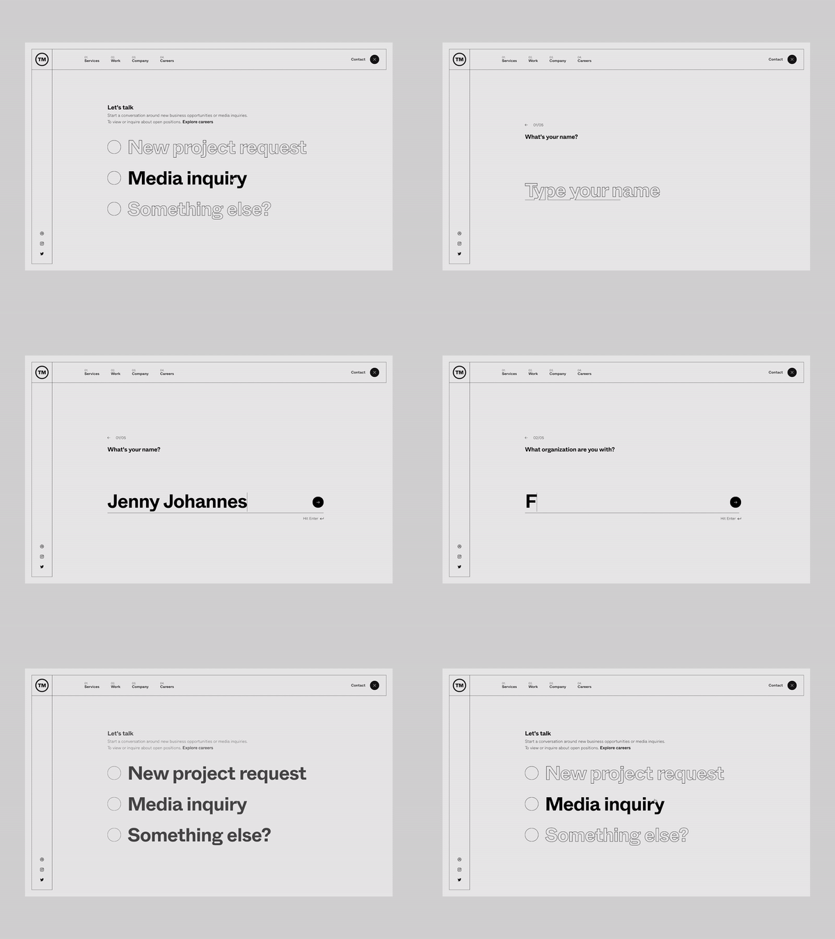
Engagement is a valuable tool and insight. And thankfully, in our social, digital world, we love to engage. So adding interactive elements to your web design is a great way to get your audience directly involved and learn more about them.
Here’s an example: suppose you are a skincare brand and want to know more about what types of products your potential customers are interested in. Setting up a quiz for visitors to take that identifies their specific skin types and suggests products that could help is a fun way for them to interact with your online store and provides you with the ability to collect data and refine your products to match needs.
Other examples of interactive marketing:
- Questionnaires or quizzes
- Polls and surveys
- Calculators
- Contests
Micro-Animations

Credit: https://dribbble.com/gur_m
Like micro-interactions, micro-animations are small, intentional animations that you can weave into your site to add movement and depth to your design. They do not all have to be interactive, but they can be extremely helpful for the user experience.
One great way that micro-animations are being used today is through e-commerce websites. Applying a small animation to the models wearing the products takes the shopping experience to the next level. Customers can see how clothes fit and move or how accessories can be worn, allowing them to imagine how they might look in the real world.
Animations and interactions are helping take websites from a flat plane to a more dynamic virtual world that incorporates movement, 3-D perspective, and a more immersed digital experience.
Creative Scrolling
Credit: https://dribbble.com/outer
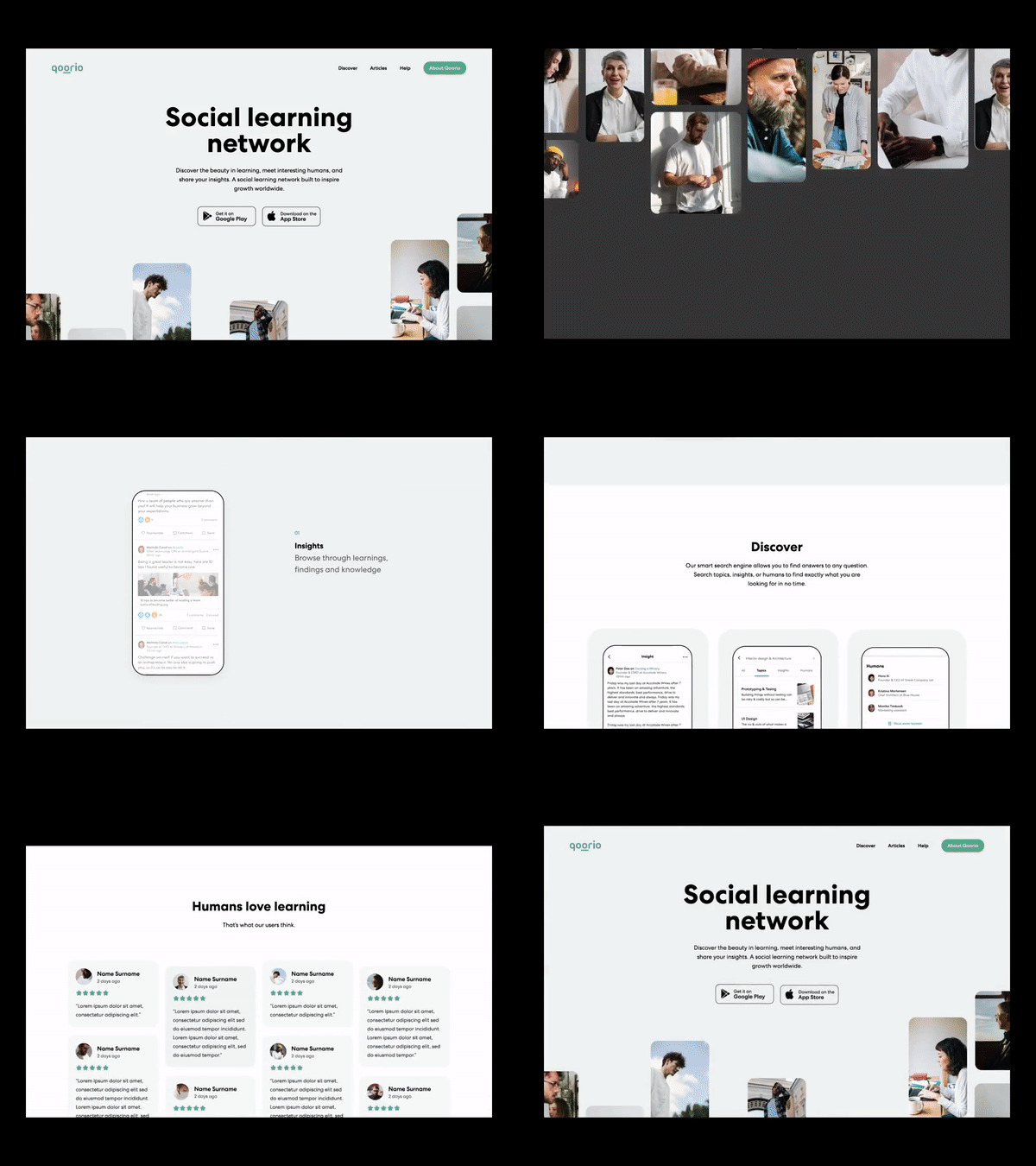
Many new trends in design focus on disrupting the expected by adding elements that force you to pause and reflect on the website in front of you. We are intuitively accustomed to scrolling up and down through websites to access more information and see where the website story wants to go. By mixing things up and using a horizontal scrolling feature, you influence an expected dynamic with the user that entices them to want to see more.
Creative scrolling also involves the artistic use of imagination, transforming web pages into living worlds through psychedelic imagery, parallax effect, and even breakthroughs into the third dimension and virtual reality. Don’t let yourself feel held back by traditional web page setups. Instead, explore some new creative layouts and incorporate scrolling animation into those ideas.
Neo-Brutalism
Credit: https://dribbble.com/yanageenko
Brutalism was an architectural movement that lasted from the 1950s to the 1970s and emphasized the raw simplicity of exposed materials like concrete. This style found a resurgence within web design in the brutalism movement of 2014, as documented on brutalistwebsites.com.
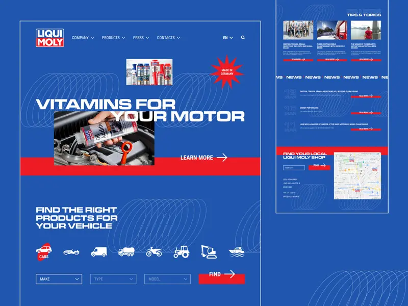
Some of the ways a brutalist design showcases its stylings are barebones HTML, plain backgrounds, asymmetrical layouts, default computer fonts, and untreated photos. It tends to be stark and almost arresting in its effect. This can be confronting and illuminates a self-aware honesty that is endearing and captivating.
The styles that were found too intimidating in brutalism make way for a more subdued and less extreme version — a new neo-brutalism. This combines the rawness of brutalism with the restrained tastes of minimalism and makes this style more accessible for websites with less avant-garde clientele.
Minimalism
Credit: https://dribbble.com/anoshko
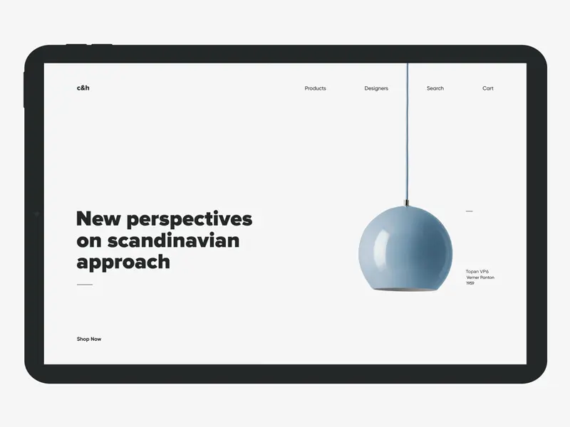
Ahh, less is more, right? Also called “flat design,” minimalism is often associated with the use of a lot of white space (think Apple’s branding)and is a popular style of modern website design. Still, there are newer forms of minimalist design that are becoming popularized that take things up a notch.
Experimenting with colorful minimalism is an emerging trend that is both chic and playful. Minimalism can feature elements such as a bold background color with clean text and minimal design elements, creating a page that is attention-grabbing and easy to enjoy. This moves away from the notion that minimalism is only stark or boring and into a new era of creativity and thinking outside the box.
Ready to Turn Inspiring Ideas into Action?
Hopefully, you are inspired by some of these WordPress web design trends. Like you can’t wait to dig your creative heels into the process and get going on a fresh redesign for your site, or maybe some of these feel more aspirational, and you would love to incorporate them into your website but don’t have the time or the advanced skills to do so.
Just know that creativity and inspiration are the perfect building blocks for turning your ideas into action. The recipe? The perfect domain name paired with engaging web design. And if you need a bit of help beyond simple inspiration, we’re here too.

DreamHost Makes Web Design Easy
Our designers can create a gorgeous website from SCRATCH to perfectly match your brand and vision — all coded with WordPress so you can manage your content going forward.
Learn More